ML Training Platform Landing Page Template
Gymnasium is a split-screen landing page template built for reinforcement learning frameworks and tools. It combines a Feature Tab Switcher header, a scrolling Feature Matrix, and a lead generation form into a single dark-terminal aesthetic. The result is a technically credible page that earns trust from machine learning engineers and researchers before asking them to act.
by Rocket studio
Quick summary
Gymnasium is a single-page landing page template designed for reinforcement learning tools and frameworks. It pairs a 50/50 split-screen layout with a Midnight Blue color system and a Dashboard Pro theme to create a space that feels as focused as a live training run. The page guides technically demanding visitors from curiosity to conversion through layered proof.
Who this template is for
This template is built for teams and individuals operating at the technical edge of reinforcement learning. If your audience reads code before they read marketing copy, this layout speaks their language.
- Machine learning engineers who need to demonstrate API simplicity and environment coverage quickly
- PhD candidates and research teams presenting reproducible baselines and ablation study results
- Robotics teams and applied researchers bridging simulation-to-real transfer who need a credible first impression
What problem this template solves
Technical tools often fail at their own landing pages. A framework that is genuinely powerful loses potential users because the page reads like a brochure instead of a proof of concept. This template solves that mismatch directly.
- Visitors leave early when they cannot verify capability at a glance, so the tab switcher surfaces code and a live-style agent view side by side
- Skeptical engineers distrust vague claims, so the Feature Matrix escalates from environment comparison to API detail to benchmark results in a deliberate sequence
- Researchers ready to commit need a frictionless path, while those still evaluating need an alternative, so two conversion paths are built into the same page
What you get with this template
You get a fully structured, single-page layout that handles the entire visitor journey from first impression to form submission. Every section is purposeful and sequenced to earn technical trust before asking for a decision.
- A Feature Tab Switcher header with a split code-and-visualization panel covering four environment tabs
- A three-stage Feature Matrix scroll flow with environment comparison, API endpoint cards, and animated benchmark reward curves
- A lead generation form with two fields (institutional email and use case dropdown) plus a secondary "Explore the Docs" path
Feature list
This template delivers a set of purposeful, prompt-specified components. Each one serves a distinct role in moving a technically fluent visitor toward a conversion.
Split-Screen Tab Switcher Header
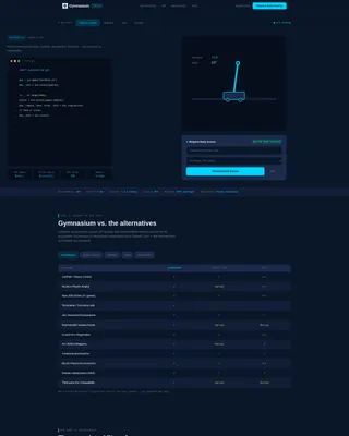
The header divides the viewport 50/50. The left half shows a clean three-line code snippet covering import, environment creation, and a step loop. The right half renders a live-style visualization of the agent in action. Clicking any of the four tabs ("Classic Control," "Robotics," "Atari," or "Custom") updates both sides simultaneously, making the link between Python code and agent behavior immediate and visceral.
Four-Tab Environment Showcase
Each tab represents a distinct use case: classic control tasks like CartPole balancing, robotic manipulation scenarios, Atari gameplay at 60 frames per second, and custom environment configurations. Visitors self-select the context most relevant to their work, which makes the demonstration feel personal rather than generic.
Scrolling Feature Matrix
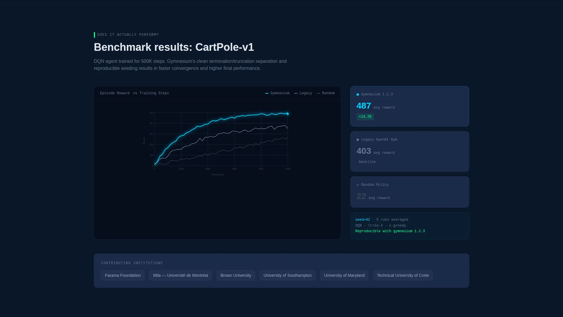
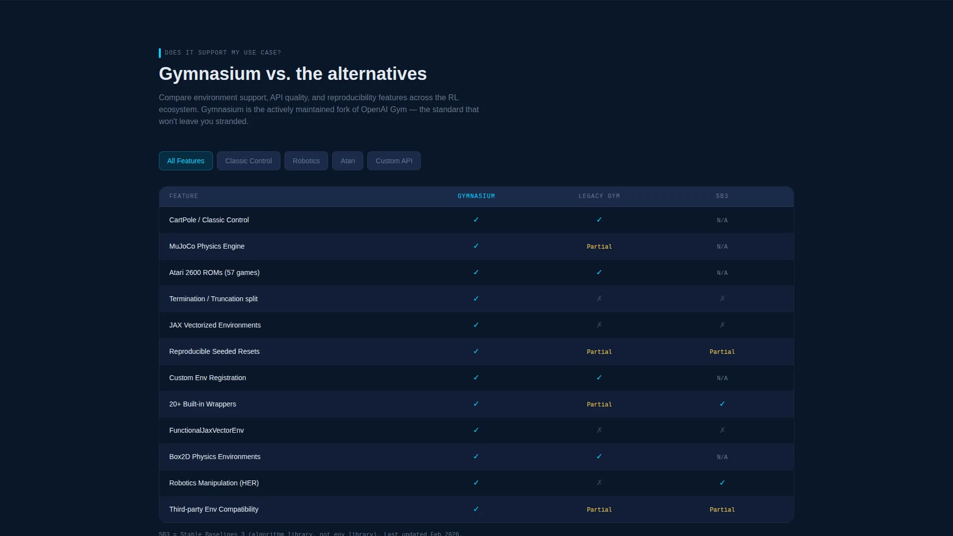
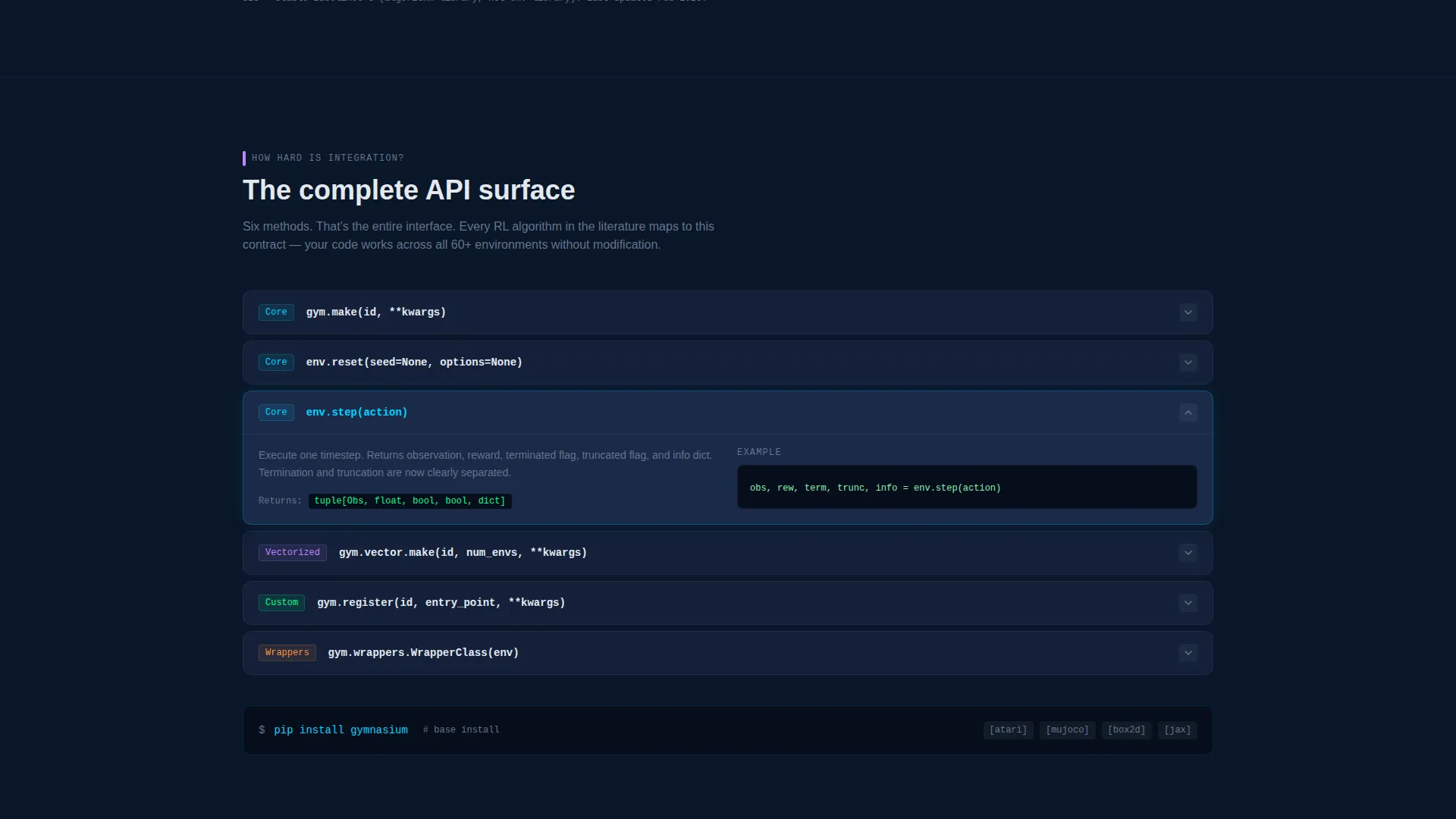
The Feature Matrix is a three-section scroll sequence designed to answer objections in order. It opens with a side-by-side environment library comparison in a filterable grid, then reveals the API surface through interactive endpoint cards that expand on hover, then closes with animated reward curves trending upward through benchmark results.
Dual Conversion Path Design
The primary call to action reads "Request Early Access" and is anchored by a two-field form: institutional email and a primary use case dropdown with options for research, production, education, and robotics. A secondary "Explore the Docs" link captures visitors who are not yet ready to commit. The form appears first in the header section and resurfaces after the benchmark results.
Dashboard Pro Visual Theme
The entire page uses the Midnight Blue color system. Deep terminal navy (#0A1628) fills the background, desaturated slate (#1B2A4A) defines card surfaces and secondary panels, electric cyan (#00D4FF) drives interactive accents and active states, and cool white (#E2E8F0) handles all body and heading typography.
Anchored Lead Generation Form
The two-field form is pinned inside the header tab section so it is visible before the visitor scrolls. It reappears after the benchmark section, where technical proof has already been established. This placement strategy means the form arrives at two moments when the visitor's confidence is highest.
Page sections overview
| Section | Purpose |
|---|---|
| Tab Switcher Header | Introduces the framework with split code and agent visualization across four environment tabs |
| Environment Comparison Grid | Filterable side-by-side grid comparing environment library coverage |
| API Endpoint Cards | Interactive hover-expand cards revealing the full API surface area |
| Benchmark Reward Curves | Animated upward-trending reward curves providing performance proof |
| Footer Conversion Block | Resurfaces the lead generation form after technical credibility is established |
Design & branding system
The Midnight Blue color system is built for extended viewing sessions, not short marketing bursts. Every color decision mirrors the feel of a monitoring dashboard running an overnight training job.
- Background uses deep terminal navy (#0A1628), card surfaces use desaturated slate (#1B2A4A), and interactive states fire in electric cyan (#00D4FF)
- Cool white (#E2E8F0) handles all typography to stay readable against dark surfaces for long stretches
- The overall aesthetic is sparse and purposeful: dark enough to reduce eye strain, with cyan accents that naturally draw attention to reward spikes and active metrics
Mobile & speed optimization
The split-screen 50/50 layout is inherently responsive by design intent. The tab switcher and Feature Matrix both adapt to narrower viewports without losing the core code-plus-visualization pairing.
- The stacked mobile view preserves the tab switching behavior so the code snippet and agent rendering remain linked on smaller screens
- Card-based sections in the Feature Matrix collapse gracefully, keeping the filterable grid and hover-expand endpoint cards functional on touch devices
How this template helps you convert
The page is architected as a linear trust sequence. Each section earns the right to ask for the next commitment, so the final form request feels earned rather than premature.
- The tab switcher header converts initial curiosity into technical engagement by showing code and agent output together, before the visitor has scrolled a single pixel
- The three-stage Feature Matrix dismantles the three most common objections in order: use-case coverage, integration complexity, and real-world performance, turning a skeptical reader into a confident one
- The dual conversion paths ensure that every visitor has a next step regardless of where they are in their evaluation, capturing both the ready-to-commit and the still-exploring segments
Other information about this template
This template is designed specifically for the reinforcement learning tool and framework niche within the broader technology category. It reflects the workflow and mental model of its intended users directly in its layout and interaction patterns.
- The template fits squarely in the reinforcement learning technology subcategory, making it relevant for open-source framework pages, commercial API products, and academic research tools alike
- The Dashboard Pro theme and Feature Matrix creative direction are matched intersection fields, meaning the visual language and scroll narrative are intentionally aligned for this exact niche
- The lead generation direction prioritizes institutional email capture alongside a use case qualifier, which supports downstream segmentation for research, production, education, and robotics audiences
Theme
Dashboard Pro
Creative direction
Feature Matrix
Color system
Midnight Blue
Style
Split Screen (50/50)
Direction
Lead Generation
Page Sections
Split-screen Tab Switcher Header
Four Environment Tab Showcase
Three-stage Feature Matrix Scroll
Dual Conversion Path Layout
Anchored Form Placement Strategy
Midnight Blue Dashboard Theme
Related questions
Who is this landing page template built for?
Can I adapt the four environment tabs to reflect my own use cases?
How does the dual conversion path work in practice?
Does this template include actual reinforcement learning code or agent logic?
Is the Feature Matrix section customizable for different comparison criteria?



