Aisle - Elegant Wedding Landing Page Template
Aisle is a modular card grid landing page built for wedding vendor directories. It connects engaged couples with florists, photographers, caterers, planners, DJs, and more, organized by region, style, and budget. With a logo bar header, interactive category cards, and a two-step lead capture form, it turns overwhelming vendor research into a clear, confident shortlist.
by Rocket studio
Quick summary
Aisle is a single-page wedding vendor directory template designed to help couples find the right vendors fast. It features a scrolling logo bar, a modular category card grid with hover-flip interactions, featured vendor spotlights, and a two-step shortlist form. The layout moves visitors from broad browsing to specific decisions in one focused scroll.
Who this template is for
This template is built for anyone launching or growing a wedding vendor directory. It suits both new platforms looking to attract their first listings and established directories wanting a cleaner, more conversion-focused front page.
- Entrepreneurs building a curated wedding vendor directory or listing site
- Wedding planners creating a shareable vendor shortlist resource for clients
- Couples or parents researching reception venues, photographers, and caterers in one place
What problem this template solves
Finding wedding vendors is stressful. Couples jump between tabs, lose track of recommendations, and waste hours comparing options with no clear structure. This template organizes the entire discovery process into one calm, well-structured page.
- Scattered vendor research gets replaced by a single organized grid sorted by category, region, and budget
- The gap between "I need a florist" and "here are three great ones" shrinks through a focused, step-by-step shortlist flow
- Vendor businesses without a clear listing path get a direct entry point through the "List Your Business" intake form in the navigation
What you get with this template
This template delivers a complete single-page layout for a wedding vendor directory. Every section is purpose-built to reduce friction for couples and generate leads for the platform.
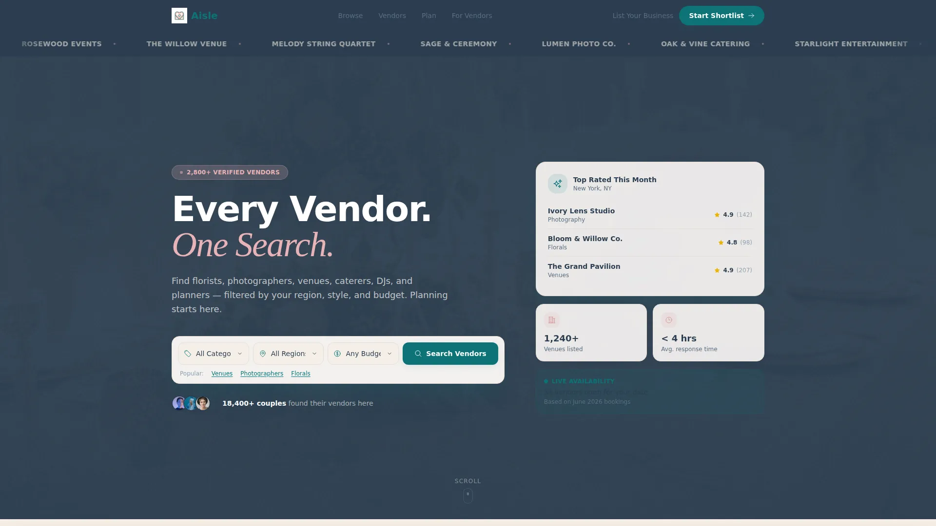
- A scrolling logo bar, bold search header with three-dropdown filtering, and modular category card grid with hover-flip reveals
- A "Build Your Vendor Team" interactive checklist section and a sticky bottom bar with a persistent call to action
- A two-step shortlist form collecting wedding date, location, guest count, and vendor category needs
Feature list
This template packages every core element a wedding directory landing page needs into one focused, modular layout.
Scrolling Vendor Logo Bar
A horizontal ribbon of vendor logos scrolls gently across the top of the page. Logos render in monochrome champagne against a slate background. This establishes immediate trust and signals that the directory is already active and populated.
Three-Dropdown Search Header
The header includes a prominent search bar with dropdowns for category, location, and budget range. A bold headline anchors the section. The primary call-to-action button sits directly inside this bar, making it the first conversion point on the page.
Hover-Flip Category Card Grid
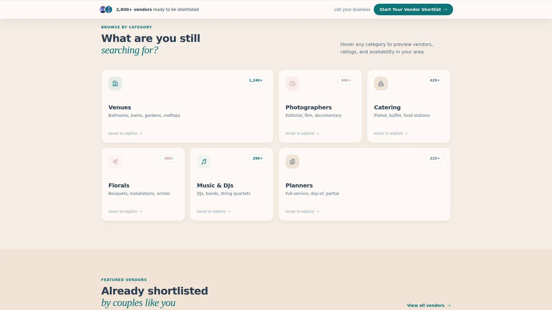
Each modular card represents a vendor category such as Venues, Photographers, Catering, Florals, Music, and Planners. Hovering a card flips it to reveal the number of listed vendors, top-rated names, and a micro-preview gallery. This turns category browsing into an engaging interaction.
Featured Vendor Spotlights
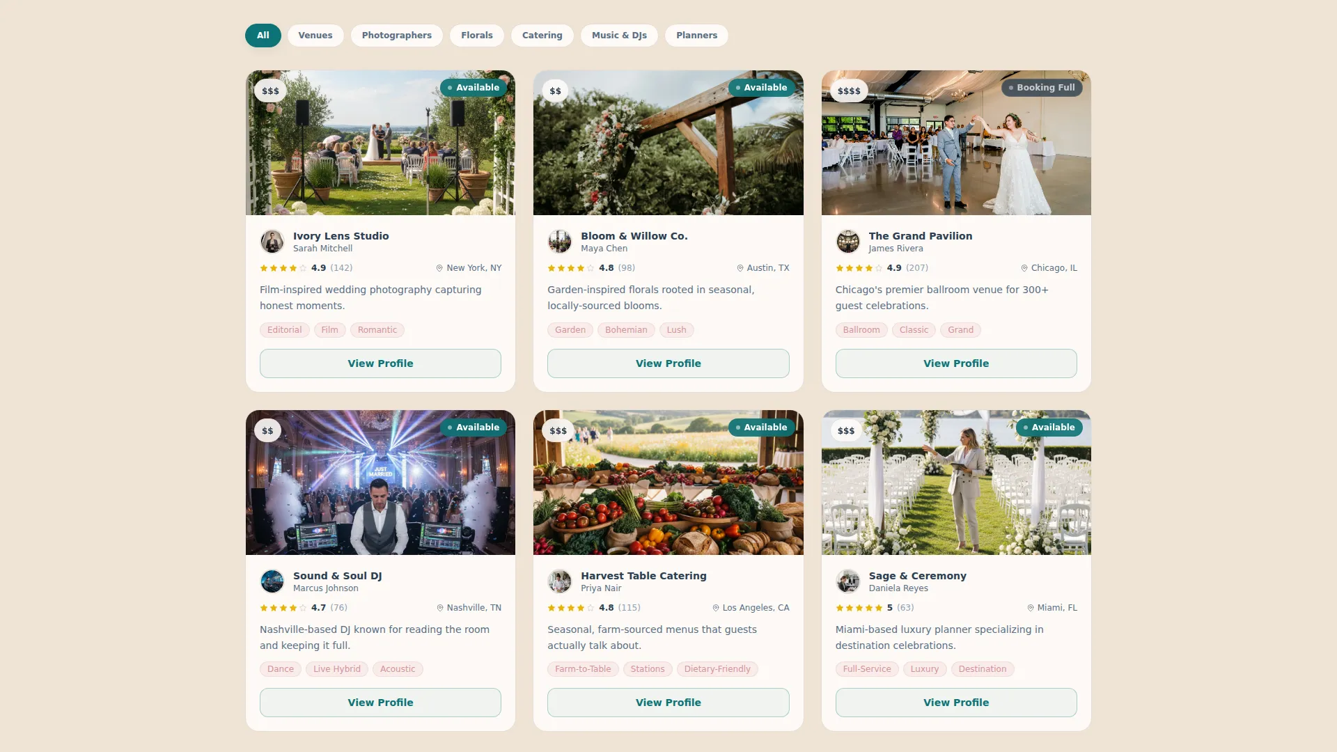
Below the category grid, the layout shifts to individual vendor highlights. Each spotlight shows review counts and availability badges, giving couples enough detail to evaluate vendors without leaving the page.
Build Your Vendor Team Checklist
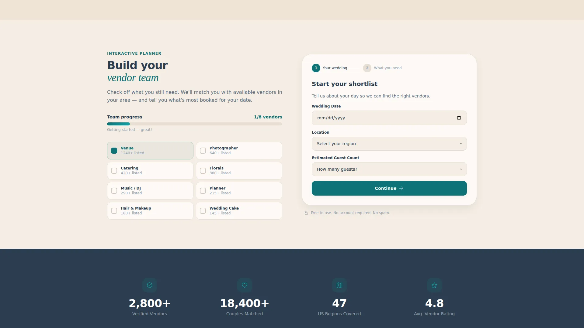
An interactive section lets couples check off which vendor categories they still need to book. The scroll depth naturally narrows from broad discovery to specific action. This section bridges browsing and committing.
Two-Step Shortlist Lead Form
Clicking the primary call-to-action opens a two-step form. Step one collects wedding date, location, and estimated guest count. Step two presents vendor category checkboxes. This progressive structure keeps the form approachable and reduces drop-off.
Page sections overview
| Section | Purpose |
|---|---|
| Logo Bar Ribbon | Builds trust with scrolling vendor logos |
| Search Header Block | Delivers headline, filters, and primary call to action |
| Category Card Grid | Organizes vendors by type with hover-flip reveals |
| Vendor Spotlight Cards | Highlights featured vendors with reviews and badges |
| Vendor Team Builder | Lets couples check off remaining vendor needs |
| Sticky Bottom Bar | Keeps the shortlist call to action visible after scrolling |
| Vendor Intake Nav Link | Routes vendor businesses to a separate listing form |
Design & branding system
The visual identity follows a warm editorial palette that feels both modern and celebratory. Every color choice is intentional, pairing the precision of a planning tool with the warmth of a wedding aesthetic.
- Deep editorial teal (#0D7377) drives all primary actions and interactive states, while soft champagne (#F5EDE3) warms the page background like candlelight on linen
- Charcoal slate (#2C3E50) grounds all body text with quiet authority, and blush rose (#E8B4B8) appears on hover states, category badges, and accent tags
- Typography uses a bold sans-serif for headlines, keeping the layout scannable and modern without losing its celebratory tone
Mobile & speed optimization
The card grid layout is modular by design, which means it adapts gracefully to narrower viewports without requiring a separate mobile layout. Each section stacks cleanly and the sticky bottom bar remains functional on touch screens.
- Modular card blocks reflow naturally from multi-column desktop grids to single-column mobile stacks
- The sticky bottom call-to-action bar stays anchored at the bottom of the viewport on all screen sizes, keeping the conversion path accessible throughout the scroll
- Hover-flip interactions on category cards are designed to translate to tap interactions on touch devices
How this template helps you convert
Every scroll depth on this page is designed to move a visitor one step closer to submitting their vendor shortlist or listing their business. The layout earns trust before asking for anything.
- The logo bar and populated category grid communicate directory volume immediately, so visitors feel they are browsing something real and useful before they ever reach a form
- The sticky bottom bar ensures the "Start Your Vendor Shortlist" call to action remains visible throughout the entire page, reducing the chance that an interested visitor scrolls past without acting
- The two-step form structure lowers the perceived effort of signing up by breaking the intake into two short, focused steps rather than presenting one long form
Other information about this template
This template is part of a broader Dashboard Pro theme system using the Teal Catalyst color framework. It is designed specifically for the wedding directory and listing site niche within the wedding digital presence category.
- The template style is Card Grid (Modular), which makes it straightforward to expand the vendor category grid as the directory grows
- The creative direction is Interactive Explorer, meaning the page rewards scrolling with progressively more specific content rather than presenting everything at once
- The header concept is Logo Bar, a trust-building element borrowed from SaaS and marketplace conventions and adapted here for the wedding industry context
- The lead generation direction is baked into the layout structure, not added as an afterthought, so both conversion paths (couple shortlist and vendor intake) are visible from the first viewport
Theme
Dashboard Pro
Creative direction
Interactive Explorer
Color system
Teal Catalyst
Style
Card Grid (Modular)
Direction
Lead Generation
Page Sections
Scrolling Vendor Logo Bar
Three-dropdown Search Header
Hover-flip Category Card Grid
Featured Vendor Spotlights
Build Your Vendor Team Checklist
Two-step Shortlist Lead Form
Related questions
Who is this landing page template designed for?
Can vendors submit their own business through this page?
How does the two-step shortlist form work?
What vendor categories does the card grid include?
Can the color scheme be adjusted to match a different brand?



