Apex — Professional IT Support Landing Page Template
Uptime is a bold brutalist IT services landing page built for managed infrastructure teams and cybersecurity providers. The page opens with animating uptime and response metrics, then layers in expandable service panels, a persistent lead capture bar, and a progressive scroll structure that moves visitors from raw proof to a low-friction assessment form.
by Rocket studio
Quick summary
Uptime is a single-page IT services landing page template built around hard numbers and zero decoration. It opens with a full-viewport stats wall, guides visitors through expandable service panels, and closes with a friction-stripped lead form. The design speaks directly to operations directors, CTOs, and IT decision-makers who evaluate vendors on results, not aesthetics.
Who this template is for
This template is built for IT services companies that need their website to work as hard as their engineers do. It is particularly suited to teams offering managed infrastructure, cybersecurity, cloud migration, or help desk support.
- Operations directors at mid-market firms managing too many vendors at once
- CTOs at scaling startups who have recently lost key internal technical staff
- Office managers and IT decision-makers at professional services firms, such as law firms, who need reliable, accountable support
What problem this template solves
Most IT services companies look identical online: stock photos of server racks, vague promises, and buried contact forms. Prospects arrive and leave without trusting the team or knowing what they actually do.
- Visitors cannot quickly verify capability, so they move on to a competitor
- Long contact forms and unclear service descriptions create unnecessary drop-off
- There is no persistent, low-friction path for buyers who are researching but not yet ready to call
What you get with this template
You get a fully structured IT services landing page with a defined visual system, interactive service panels, and two distinct lead capture paths. Everything is built to feel decisive and credible from the first scroll.
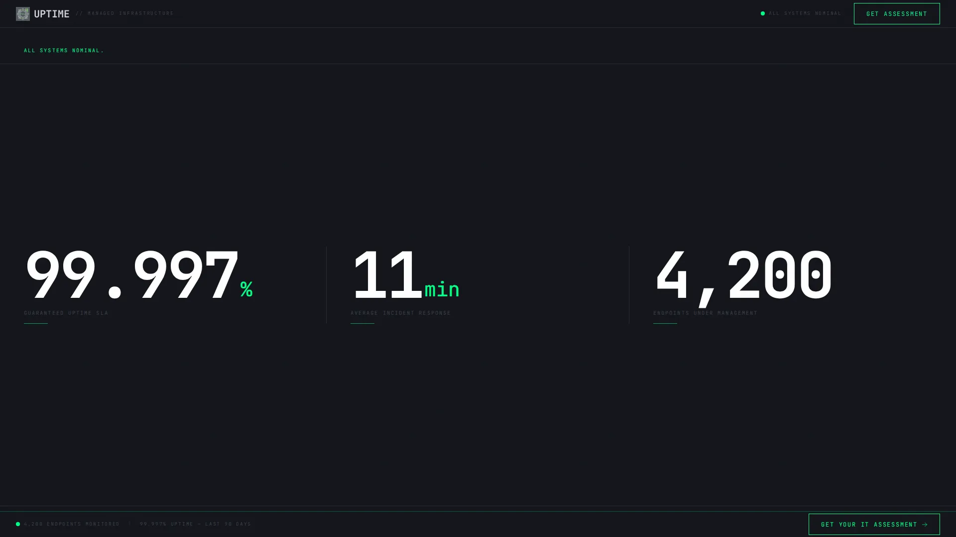
- A stats/metrics header that animates key figures from zero on page load
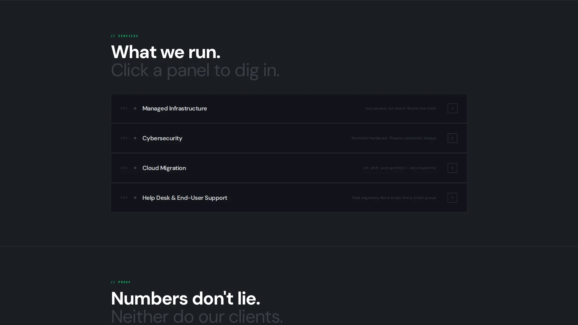
- Expandable service blocks covering managed infrastructure, cybersecurity, cloud migration, and help desk
- A persistent bottom bar with a "Get Your IT Assessment" call to action and a secondary checklist download path
Feature list
This template delivers a set of purpose-built components that work together to communicate capability and capture leads.
Animating Stats Header
The page opens with oversized monospaced numbers filling the viewport: uptime percentage, average response time, and endpoints managed. Each figure counts up from zero like a system boot sequence, with the accent green pulsing once on completion. No hero image, no stock photography, just the numbers doing the talking.
Expandable Service Panels
Each service category, including managed infrastructure, cybersecurity, cloud migration, and help desk, is presented as a collapsed steel panel. Visitors click to expand and reveal scope details, toolchain references, and a mini case-study metric. This keeps the page clean at first glance while rewarding engaged prospects with deeper proof.
Progressive Scroll Reveal
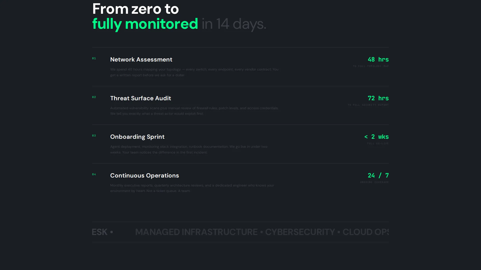
Sections enter the viewport with brutalist hard cuts, not soft easing. The scroll structure layers content from surface to depth: first the what, then the proof, then the people, then the process. Heavier content loads progressively as the visitor moves down, mirroring how a network stack peels from application layer to bare metal.
Persistent Lead Capture Bar
A fixed bottom bar reading "Get Your IT Assessment" stays visible throughout the scroll without obstructing content. On click, it triggers a three-step sequential form: company size, current pain points via multi-select, and work email only. No phone field, no last name, friction reduced to the minimum viable ask.
Secondary Checklist Download Path
Visitors who are not ready to book a call can download a "Network Health Checklist" PDF by submitting only their work email. This secondary path captures researchers and early-stage buyers who are comparing vendors but not yet ready to commit to a conversation.
Bold Brutalist Visual System
Typography is monospaced and raw. Color is limited to four values: deep gunmetal, industrial mid-gray, exposed-concrete light, and a single high-voltage accent green. Every visual decision reinforces the message that this is a team that prioritizes function over decoration.
Page sections overview
| Section | Purpose |
|---|---|
| Stats Metrics Header | Opens with animating uptime, response time, and endpoint figures |
| Managed Infrastructure Panel | Expandable block covering scope, toolchain, and proof metric |
| Cybersecurity Service Panel | Expandable block for security offerings with case-study data |
| Cloud Migration Panel | Expandable block detailing migration scope and outcomes |
| Help Desk Panel | Expandable block for support tiers and response benchmarks |
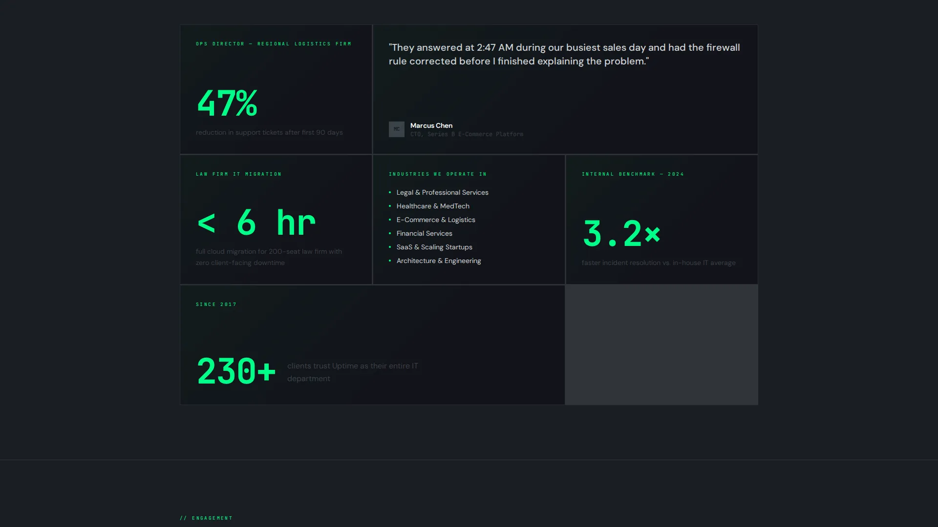
| Social Proof Layer | Mid-page proof section surfacing deeper trust signals |
| Team and Process Section | Introduces the engineers and the operational process |
| Assessment Lead Form | Three-step sequential form triggered by persistent bottom bar |
| Checklist Download Path | Secondary email capture for the "Network Health Checklist" PDF |
Design & branding system
The visual identity follows a Bold Brutalist theme built on a Monochrome Steel color system. The palette is tight and intentional, designed to feel like a terminal interface mounted on a concrete wall.
- Four-color palette: deep gunmetal (#1A1D23) as the base, industrial mid-gray (#3B3F47) for structure, exposed-concrete light (#D2D4D8) for text surfaces, and high-voltage accent green (#00FF88) reserved strictly for interactive states, live counters, and call-to-action borders
- Monospaced typography throughout, with no decorative typefaces, no gradients, and no illustrative elements
- Hard-cut section transitions and zero easing on scroll reveals, giving each content block a stamped, mechanical quality
Mobile & speed optimization
The progressive scroll reveal and expandable panel structure are designed to work cleanly across screen sizes. Collapsed panels reduce visual noise on smaller viewports while keeping all content accessible.
- Service panels collapse by default on mobile, so the initial view stays uncluttered and fast to scan
- The persistent bottom bar scales responsively, remaining visible without overlapping critical content on narrow screens
- Monospaced type and a minimal color palette mean no heavy image assets are required to carry the visual weight of the page
How this template helps you convert
The entire page is structured around reducing the distance between a skeptical visitor and a qualified lead submission.
- The animating stats header establishes credibility in the first three seconds, before the visitor has read a single word of copy, making the decision to scroll much easier.
- The three-step sequential form strips the assessment request down to three fields: company size, pain point, and work email. This low-friction structure increases the likelihood that qualified visitors complete the form rather than abandoning it.
- The checklist download path provides a second conversion option for visitors who are in research mode, ensuring that even cautious prospects leave something behind.
Other information about this template
This template is categorized under IT services company website templates and is designed specifically for the IT services company homepage niche. It suits teams that want a page reflecting operational credibility rather than agency-style polish.
- The template style is Scroll Reveal (Progressive), meaning content builds in depth as the visitor moves down the page
- The creative direction is Interactive Explorer, so visitors actively uncover information rather than passively reading a static layout
- The header concept is Stats/Metrics, replacing a conventional hero image with live-counting performance figures
- The landing page direction is Lead Generation, with both a primary form path and a secondary content download path built in
- This template fits well within the broader category of technology company landing pages, particularly for managed service providers and infrastructure-focused teams
Theme
Bold Brutalist
Creative direction
Interactive Explorer
Color system
Monochrome Steel
Style
Scroll Reveal (Progressive)
Direction
Lead Generation
Page Sections
Animating Stats Metrics Header
Expandable Service Panels
Progressive Scroll Reveal Structure
Persistent Bottom Bar with Lead Form
Secondary Checklist Download Path
Bold Brutalist Visual Identity
Related questions
Can I update the metrics shown in the animating stats header?
How does the three-step lead form work?
What is the secondary checklist download path?
Is this template suitable for a small managed service provider?
Can I relabel the expandable service panels for my own offerings?



