Roofing Solutions Landing Page Template
Shingle is a roofing social media template library built as a modular landing page. It delivers ready-to-post graphics and copy across storm damage carousels, review showcases, crew spotlights, and seasonal promos. Every card is spec-sheet clear: template count, platform support, editable fields, and real engagement numbers, so roofers grab what they need and post without friction.
by Rocket studio
Quick summary
Shingle is a dark-themed, card-grid landing page built to sell a roofing social media template library. Each card presents a template pack with clean specs and a direct call to action. The layout escalates from single posts to full campaign kits, ending with a bundle comparison and a post-volume calculator that shows buyers exactly how far their purchase goes.
Who this template is for
This landing page is designed for roofing businesses that handle their own digital marketing. Whether the buyer is one person or a whole marketing team, the template speaks to people who need fast, professional content and no design learning curve.
- Owner-operators running multiple crews who manage their own social media from the field
- Marketing coordinators at multi-location restoration companies managing several city pages at once
- Roofing sales reps building personal pipelines through consistent social posting
What problem this template solves
Most roofers know they should post consistently, but creating social content from scratch takes time they do not have. Generic templates do not speak to the roofing trade. Shingle eliminates the gap between knowing you should post and actually posting something worth clicking.
- No pre-loaded copy, stats, or layouts mean roofers stall before ever opening a design tool
- Inconsistent content formats undermine trust with local audiences who compare multiple contractors
- Sales reps and coordinators waste hours recreating the same post types every storm season
What you get with this template
The Shingle landing page delivers a complete, ready-to-deploy sales page for a roofing social media template library. Every section is built to inform and convert without needing customization beyond your own branding.
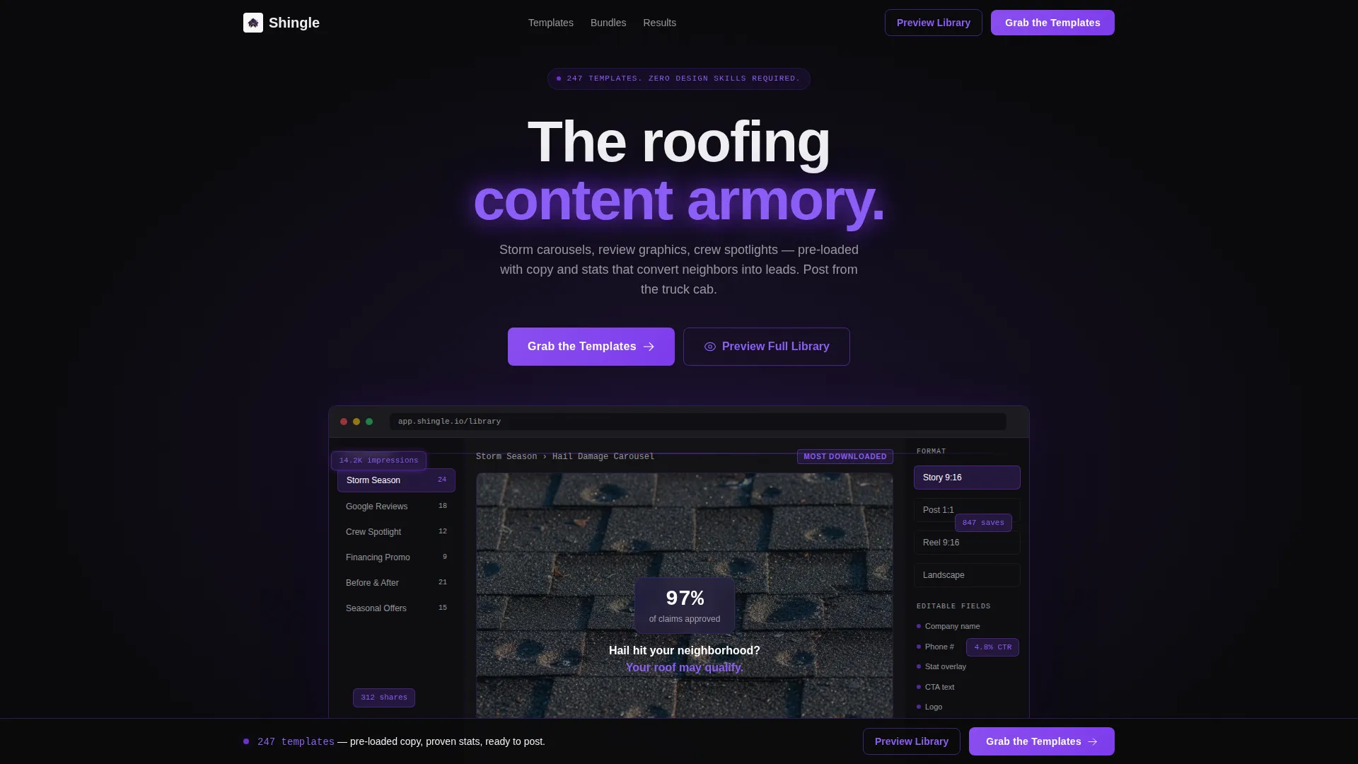
- A dashboard-style header showing the template library in use, with category sidebar, canvas preview, and format toggles
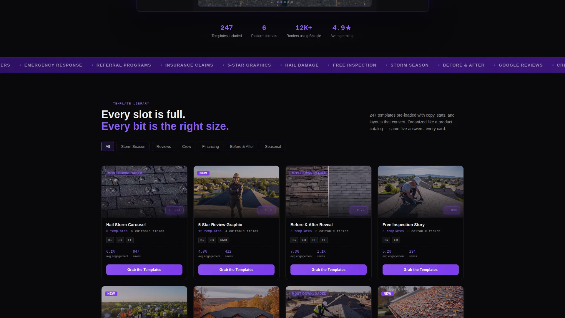
- A modular card grid where each pack displays name, thumbnail, template count, supported platforms, editable-field count, and a badge
- A sticky bottom bar with a primary call-to-action button and a secondary lightbox path for visitors who need more proof
Feature list
This landing page is built around a set of deliberate design and functional decisions. Each one serves the roofing professional buyer who scans fast, trusts data, and commits when the value is obvious.
Dashboard Preview Header
The header frames a browser-chrome interface showing the template library mid-use. A left sidebar lists categories like Storm Season, Google Reviews, Crew Spotlight, and Financing Promo. A center canvas displays a live Instagram carousel template with bold stat overlays. A right panel shows format toggles for Story, Post, and Reel dimensions.
Spec Sheet Card Grid
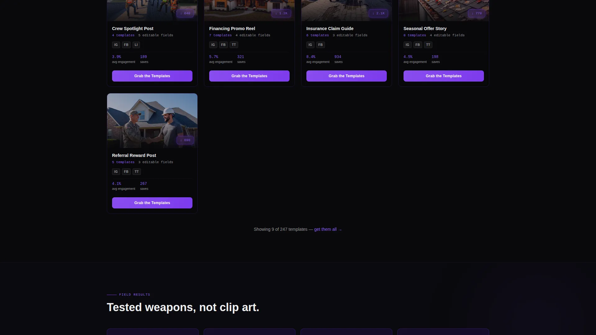
Each card presents a template pack the way a manufacturer presents a roofing product. Cards show the pack name, preview thumbnail, number of included templates, supported platform icons, editable-field count, and a violet badge marking it as "Most Downloaded" or "New." The consistent format builds trust through mechanical repetition.
Floating Engagement Metrics
Small violet badges float over template previews showing real engagement numbers: impressions, saves, and shares. These make the packs feel like tested tools rather than decorative graphics, giving buyers confidence before they click through.
Escalating Section Structure
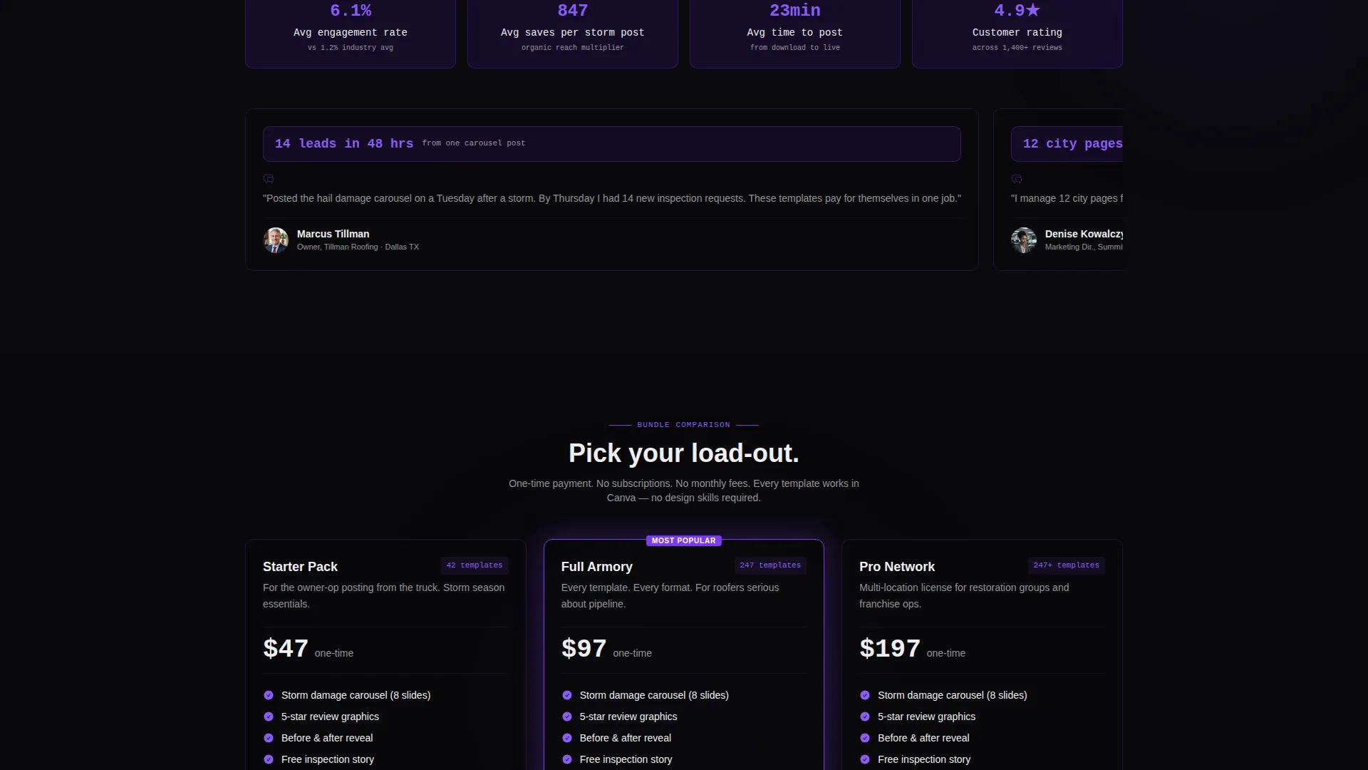
Page sections move from single posts to full campaign kits in deliberate order. A comparison row near the bottom places three bundles side by side with feature checkmarks. This progression guides buyers from browsing to committing without requiring them to scroll back up.
Post-Volume Calculator Row
The page closes with a calculator row that reframes the purchase in practical terms. "Post 3 times per week for 30 days, that is 12 templates. You will have 247." This single block removes doubt about whether the library is large enough to sustain a real posting schedule.
Sticky Bottom Call-to-Action Bar
A persistent bottom bar activates after the visitor passes the third scroll section. It carries the primary call to action "Grab the Templates" and stays visible as the user reads, reducing the distance between decision and click at any point on the page.
Page sections overview
| Section | Purpose |
|---|---|
| Dashboard Preview Header | Show the template library in active use to establish immediate product clarity |
| Hero Copy Block | Communicate the core value proposition to roofing buyers in one pass |
| Template Pack Grid | Present each pack as a spec-sheet card with all key details at a glance |
| Engagement Metrics Layer | Build trust with floating impression, save, and share counts on each card |
| Campaign Kit Escalation | Progress buyers from single-post packs to full multi-platform campaign bundles |
| Bundle Comparison Row | Compare three bundles side by side with feature checkmarks for fast decisions |
| Post-Volume Calculator | Show buyers exactly how many templates they need for a real posting schedule |
| Lightbox Gallery Path | Give hesitant visitors a full preview of the library before committing |
| Sticky call to action Bar | Keep the primary call to action visible across the full page scroll |
Design & branding system
The visual identity follows a Data Command theme built around the Void and Violet color system. The palette feels urgent and precise, like a dispatch screen running during a late-night storm event. Dark backgrounds make glowing violet accents carry weight without competing for attention.
- Absolute void black (#09090B) dominates card surfaces and backgrounds; electric violet (#7C3AED) pulses through hover states, active tabs, and download counters
- Deep plum shadow (#2E1065) fills section dividers and secondary card tiers, while readout white (#EEEEF0) handles all typography and iconography with clinical sharpness
- The Spec Sheet creative direction keeps every card in a consistent format, building brand trust through layout repetition rather than decorative variety
Mobile & speed optimization
The card grid layout is modular by design, which means it reflows cleanly for smaller viewports without losing the spec-sheet readability that makes each card useful. Buyers browsing from a phone in a truck cab can scan packs, read stats, and tap through to checkout without pinching or zooming.
- Sticky bottom bar and floating call to action buttons remain accessible on touch screens throughout the scroll
- Lightbox gallery opens inline without navigating away, keeping mobile visitors in the purchase flow
How this template helps you convert
Every design and copy decision on this landing page is built to reduce hesitation and move the buyer toward a single action. The page earns the click rather than demanding it.
- The dashboard header and floating engagement numbers establish proof before the buyer reads a single word of marketing copy, making the value visual and immediate.
- The spec-sheet card format answers the same five questions in the same order on every pack, so buyers build trust through consistency and spend less energy evaluating each option.
- The escalating section structure, bundle comparison, and post-volume calculator together eliminate the three most common objections: "Is this enough?", "Which plan is right for me?", and "Will I actually use this?"
Other information about this template
This template is built for the roofing digital presence niche and sits at the intersection of trade marketing and social content creation. It is well suited for any business or individual selling a roofing social media template library to a contractor audience.
- The page style is a card grid, also called a modular grid, making it straightforward to add or remove template packs without restructuring the layout
- The Click-Through landing page direction means the page has one job: move the visitor to a checkout or plan selection page, with no distractions or alternate destinations
- The "Preview the Full Library" secondary path through a lightbox gallery gives undecided buyers more evidence without sending them off-page
- The template is suitable for direct-to-consumer digital product sales, agency white-label use, or a SaaS-style template subscription storefront targeting roofing contractors
Theme
Data Command
Creative direction
Spec Sheet
Color system
Void & Violet
Style
Card Grid (Modular)
Direction
Click-Through
Page Sections
Dashboard Preview Header
Spec Sheet Card Grid
Floating Engagement Metrics
Escalating Campaign Structure
Post-volume Calculator
Sticky Call-to-action Bar
Related questions
Who is this landing page template built for?
What template packs does the card grid section feature?
Can I add or remove template packs from the card grid?
What is the sticky bottom bar and when does it appear?
What does the post-volume calculator row do?



