Assure — Intelligent Coverage Management Landing Page Template
Underwrite is a hub-and-spoke landing page template built for insurance AI document processing platforms. It guides claims operations leaders, carrier CIOs, and MGA founders from a vivid intake bottleneck visualization through an animated extraction sequence to a clean integration story. The page drives leads through a progressive two-step form and a gated carrier integration guide.
by Rocket studio
Quick summary
Underwrite is a single-page, anchor-nav template for AI-powered insurance document processing platforms. It follows a Problem-to-Solution arc across four named spokes: Intake, Extract, Integrate, and Deploy. The design uses a Tech Glass visual system to make complex document intelligence feel precise and immediate. Two conversion paths capture leads at different commitment levels.
Who this template is for
This template is built for B2B technology companies selling AI document processing solutions to the insurance industry. It speaks directly to operational buyers and technical decision-makers who evaluate platforms on speed, integration fit, and reduction in manual effort.
- Claims operations directors managing growing document backlogs
- Chief Information Officers at mid-market carriers modernizing legacy infrastructure
- Managing General Agent (MGA) founders competing against paper-heavy incumbents
What problem this template solves
Insurance document processing is slow, expensive, and error-prone when handled manually. Teams spend hours parsing handwritten adjuster notes, scanned PDFs, and legacy system exports. A platform with genuine AI capability still struggles to convert visitors if the landing page cannot communicate that capability quickly and credibly.
- No clear visual proof of how the AI reads and structures raw documents
- No smooth path from "I understand the problem" to "I want to try this"
- No low-commitment conversion option for technical buyers who avoid sales calls
What you get with this template
You get a fully structured landing page layout that walks visitors through the problem, the solution, and the integration story before asking for anything. Every section is designed to earn trust before the call to action appears.
- A four-spoke anchor navigation structure: Intake, Extract, Integrate, and Deploy
- A progressive two-step lead capture form with a work email field and a document-type selector
- A secondary gated PDF conversion path offering a downloadable carrier integration guide
Feature list
This template includes purpose-built layout components designed for AI and insurance technology marketing. Each element is grounded in the source brief and serves a specific role in the buyer journey.
Dark Glass Panel Header
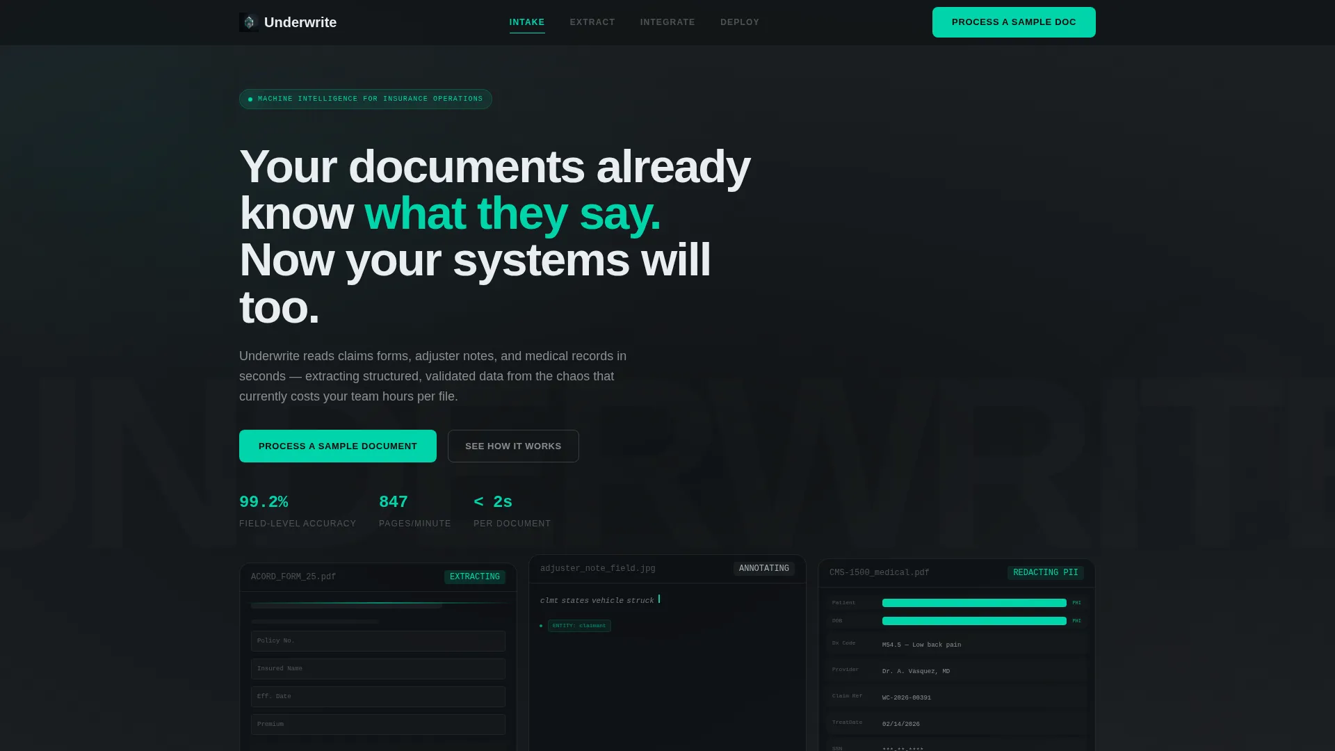
The header features three translucent floating panels, each showing a different document type mid-processing. One displays a scanned ACORD form with fields being highlighted in real time. Another shows a handwritten adjuster note with AI annotations appearing letter by letter. The third shows a medical record with personally identifiable information automatically redacted in teal. Data flows from the bottom of each panel into a single clean JSON output line.
Anchor Navigation Bar
A fixed top navigation bar uses operational labels: Intake, Extract, Integrate, and Deploy. Visitors can jump directly to the section most relevant to their role. This keeps technical buyers oriented without forcing a linear scroll.
Animated Extraction Sequence
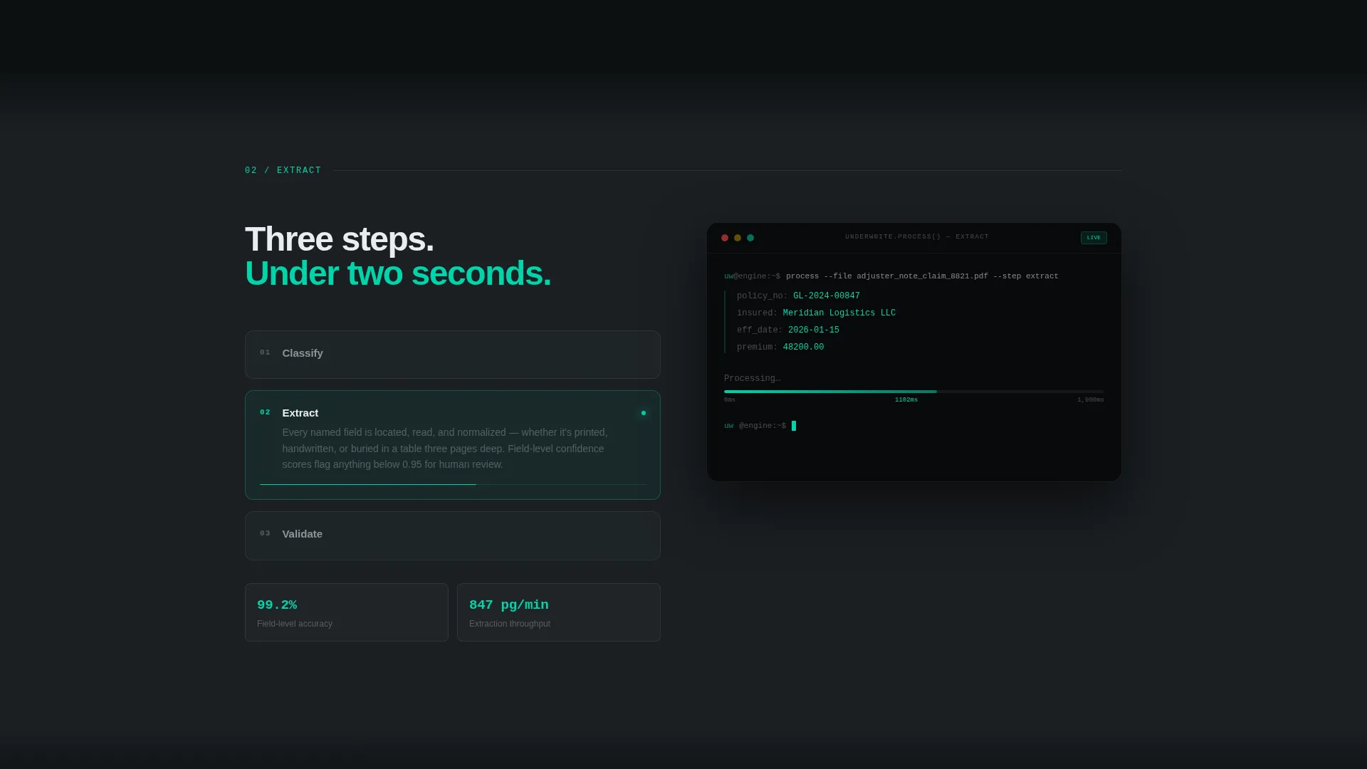
The second spoke (Extract) includes an animated processing visualization. It shows document extraction, classification, and validation as three discrete, sequential steps. This proves platform capability before the call to action is ever shown.
Progressive Lead Capture Form
The primary conversion form uses a two-step progressive structure. The first step collects only a work email address. The second step asks for document type and estimated monthly volume via a slider. No phone number field is included, keeping friction low for technical buyers.
Gated Integration Guide Download
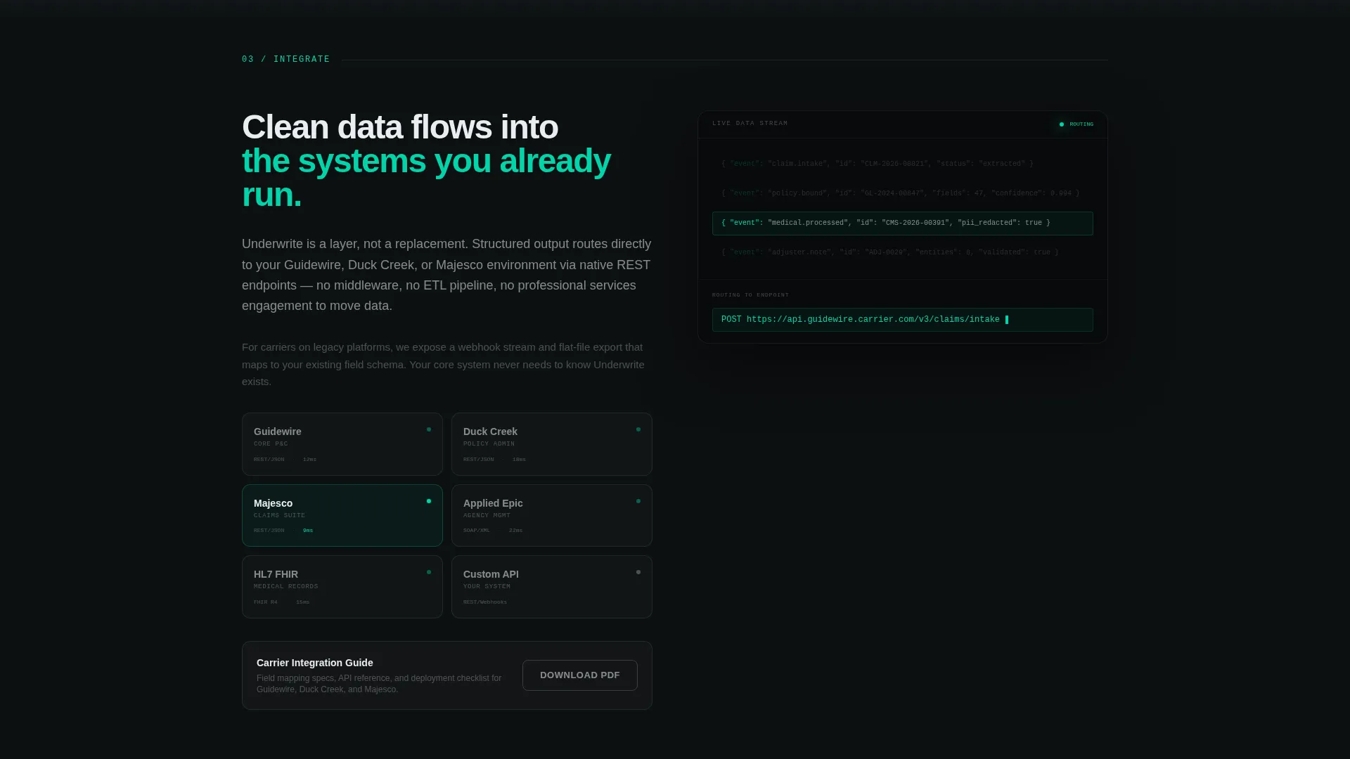
A secondary conversion path offers a downloadable carrier integration guide PDF. This captures leads who are not ready for a trial but want deeper technical information. It creates a lower-commitment entry point alongside the primary call to action.
Problem Visualization Spoke
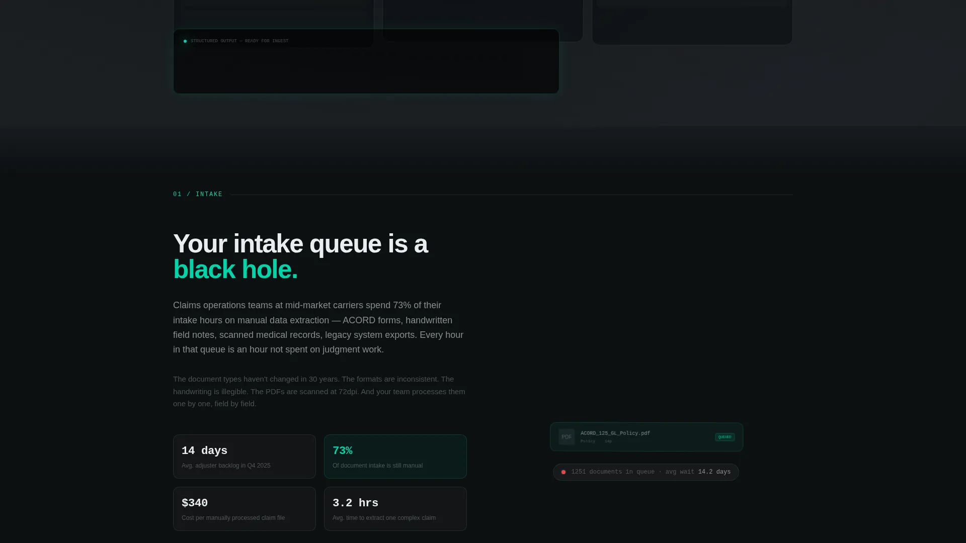
The first spoke (Intake) shows a visual representation of the manual intake bottleneck. Documents are depicted piling and blurring to communicate the real cost of the current state. This grounds the visitor in their pain before the solution is introduced.
Page sections overview
| Section | Purpose |
|---|---|
| Header with panels | Introduce AI capability visually |
| Anchor nav bar | Enable direct spoke navigation |
| Intake spoke | Visualize the manual bottleneck |
| Extract spoke | Demonstrate AI processing steps |
| Integrate spoke | Show clean data output flow |
| Deploy spoke | Present a weeks-based timeline |
| Hub call to action block | Repeat primary lead form |
| Secondary download | Capture lower-commitment leads |
Design & branding system
The visual identity uses a Tech Glass theme built on a Monochrome Steel color system. Every design decision reinforces the idea of complexity being consumed cleanly and quietly behind a controlled surface.
- Deep gunmetal (#1B1F23) for the primary background, brushed chrome (#A8B2BD) for secondary surfaces and divider lines, and cold white (#EAEDF0) for body text
- Electric teal (#00D4AA) reserved exclusively for interactive states, progress indicators, and the primary call-to-action element
- Section transitions use subtle glass-blur overlays that layer content behind translucent panels rather than stacking it on a flat surface
Mobile & speed optimization
The layout is designed to remain clear and navigable across screen sizes. The anchor navigation and spoke structure adapt to smaller viewports without losing the visual hierarchy.
- The fixed anchor nav remains accessible on mobile, keeping each spoke reachable without full-page scrolling
- The progressive form structure keeps the input experience simple and thumb-friendly on smaller screens
How this template helps you convert
This template is built around a principle of earning the click before asking for it. The animated sequences and panel visualizations demonstrate capability so directly that the call to action feels like a logical next step rather than a cold request.
- The animated header panels show real document types being processed in real time, establishing immediate credibility before the visitor reads a single headline
- The two-step progressive form removes phone number friction and segments leads by document type and volume, making follow-up more relevant for both parties
Other information about this template
This template is well-suited for insurance technology vendors whose buyers operate within established insurance core systems. The integration spoke is designed with named endpoint contexts in mind, reflecting the systems that claims and policy teams actually use day to day.
- The Deploy spoke presents a timeline measured in weeks rather than quarters, directly addressing a common objection from CIOs evaluating modernization risk
- The template style is Hub and Spoke with Anchor Navigation, making it easy to add or reorder spokes as the platform's feature set evolves
- The creative direction follows a Problem-to-Solution Arc, which mirrors how operational buyers naturally evaluate new tools
- Systems such as Guidewire, Duck Creek, and Majesco are referenced in the integration spoke as named endpoint destinations reflecting the platforms carriers and MGAs already run
Theme
Tech Glass
Creative direction
Problem→Solution Arc
Color system
Monochrome Steel
Style
Hub & Spoke (Anchor Nav)
Direction
Lead Generation
Page Sections
Dark Glass Panel Header
Four-spoke Anchor Navigation
Animated Extraction Sequence
Progressive Two-step Lead Form
Gated Integration Guide Download
Problem Visualization Spoke
Related questions
Who is this landing page template designed for?
What conversion paths does this template include?
Can the anchor navigation spokes be customized?
Does this template use stock photography?
What makes the design feel appropriate for an AI insurance platform?



