Compliance Landing Page Template for Financial Services
This landing page template is built for financial services compliance platforms that replace manual quality reviews with automated testing pipelines. It uses a dashboard and data grid layout, a terminal-black Monochrome Steel color system, and a Problem to Solution Arc structure. The design speaks directly to QA directors, compliance officers, and operations managers who need to show control before regulators ask.
by Rocket studio
Quick summary
A single-page compliance platform template built around a dashboard and data grid layout. It opens with a live-styled code snippet, walks visitors through a regulatory findings grid, then flips the narrative to show automated coverage at scale. The dark terminal aesthetic and status-color system make the product feel credible the moment the page loads.
Who this template is for
This template is designed for teams selling automated compliance and quality management software into regulated financial services markets. It speaks the language of people who have sat through regulatory examinations and know what a consent order costs.
- QA directors at regional banks managing Office of the Comptroller of the Currency (OCC) findings and audit backlogs
- Compliance vice presidents at fintech companies scaling operations faster than their internal controls can keep up
- Operations managers at insurance carriers where a single misclassified loan file can trigger enforcement action
What problem this template solves
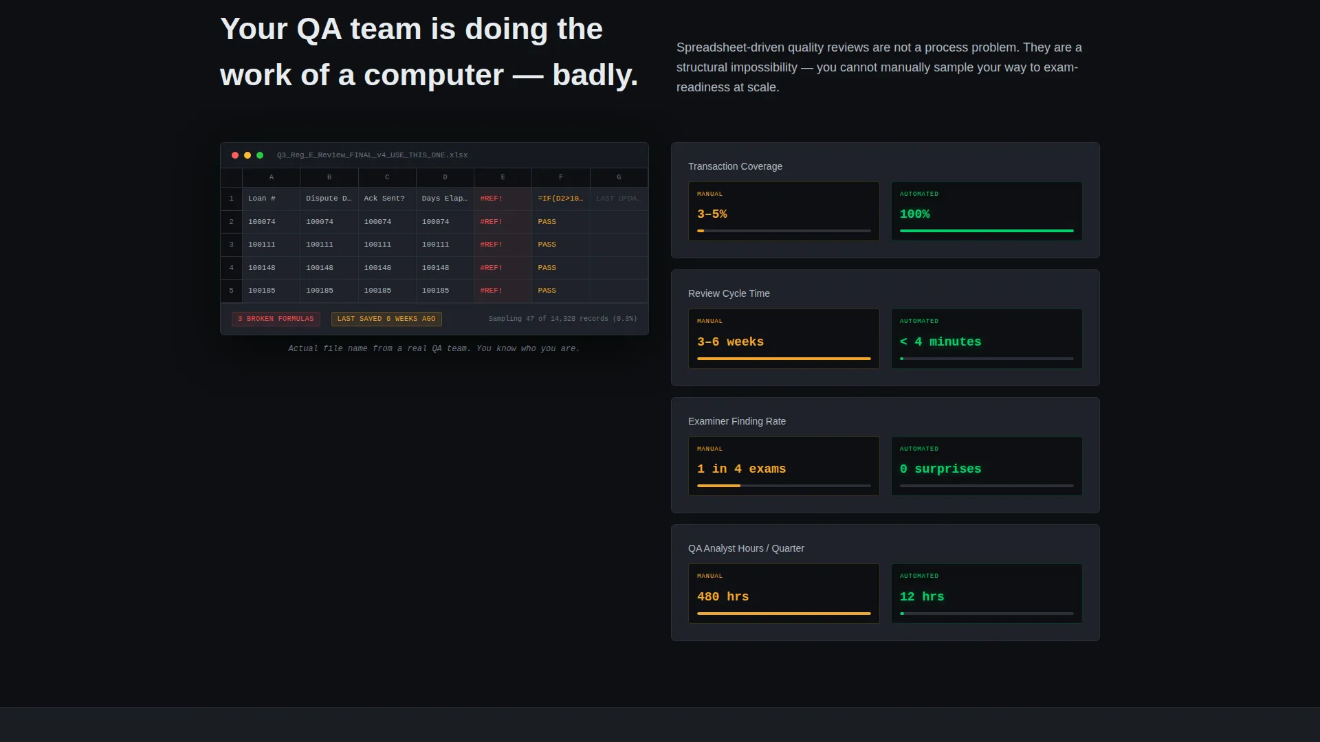
Manual compliance review is a slow, incomplete process. Spreadsheet-driven quality checks typically sample only 3 to 5 percent of transactions, leaving enormous gaps that regulators will eventually find. Weeks-long review cycles and broken Excel trackers are not a defensible audit posture.
- Visitors arrive with anxiety about exam readiness and no fast way to demonstrate coverage
- Existing tools create the illusion of control without delivering full transaction-level testing
- The page must quickly establish credibility with a technically sophisticated audience that will not respond to vague product promises
What you get with this template
You get a fully structured, single-page lead generation layout purpose-built for a financial services quality management platform. Every section is a working interface concept, not a stock-photo placeholder.
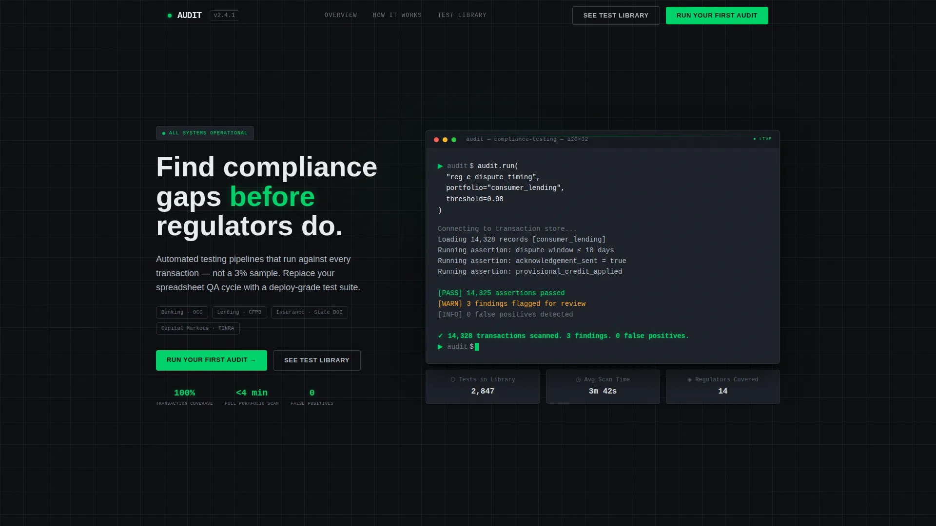
- A header code snippet block showing a syntactically plausible audit command with streaming output and a final transaction count result
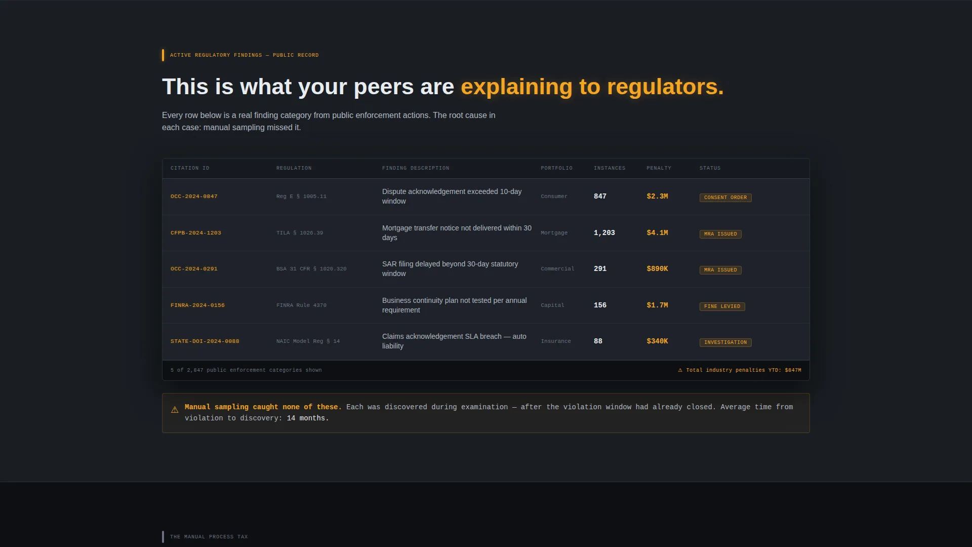
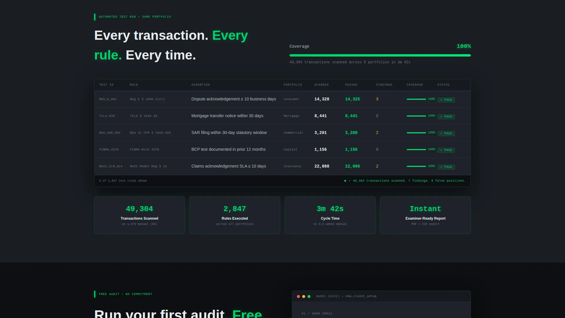
- A dual-state data grid that first shows the problem as a regulatory findings table, then transforms into an automated results view with full coverage and pass-green checkmarks
- A lead capture form with three deliberate fields: work email, sector dropdown, and an open-ended exam anxiety question that qualifies intent
Feature list
This template delivers six core layout and design features grounded in the source brief.
Live Terminal Code Snippet Header
The header section renders a dark terminal card with a monospaced code block. It shows a realistic audit command, line-by-line streaming output, a blinking cursor, and a final result line confirming transactions scanned, findings count, and zero false positives. No stock photography appears anywhere on the page.
Dual-State Regulatory Data Grid
Two versions of the same data grid anchor the Problem to Solution Arc. The first version displays a sortable table of regulatory findings with citation, penalty amount, and root cause columns, all rendered in alert amber and brushed chromium. The second version repopulates the same grid with automated results, 100 percent coverage, collapsed cycle times, and pass-green status tags.
Lead Generation Form with Qualification Logic
The primary call to action, labeled "Run Your First Audit," triggers a three-field form. Fields are ordered deliberately: work email first to qualify institutional domains, a sector dropdown covering banking, lending, insurance, and capital markets, then a free-text field that asks what keeps the visitor up before an exam.
Anchored Navigation Call to Action
The primary call to action button is pinned in the navigation bar and repeated after the solution reveal section. This placement ensures the conversion path is always one click away regardless of where the visitor is in the scroll.
Secondary Gated Content Path
A "See the Test Library" secondary link offers access to a compliance-rule catalog. It gates the catalog behind the same email capture as the primary form, giving visitors a lower-commitment entry point while still qualifying them.
Status-Color Pass and Fail System
Color is used exclusively for status states, not decoration. Pass states render in status-pass green (#00D26A). Warning and failure states use alert amber (#F5A623). All other typography stays in brushed chromium (#B0B8C1) against terminal-black backgrounds, creating a visual language that institutional finance professionals immediately recognize.
Page sections overview
| Section | Purpose |
|---|---|
| Header Code Snippet | Opens with a live-styled audit command block and streaming result output to establish product credibility instantly |
| Regulatory Findings Grid | Presents the problem as a familiar sortable data table of citations, penalties, and root causes in amber and chromium |
| Manual Process Friction | Surfaces the cost of spreadsheet reviews: 3 to 5 percent sampling rates, weeks-long cycles, and broken trackers |
| Automated Results Grid | Mirrors the findings grid with automated output showing 100 percent coverage, pass-green tags, and collapsed timelines |
| Primary Lead Form | Captures work email, sector, and exam anxiety input under the "Run Your First Audit" call to action |
| Test Library Gate | Offers a secondary conversion path to a gated compliance-rule catalog via the same email capture |
Design & branding system
The visual identity channels Startup Velocity through a Monochrome Steel palette. The aesthetic is institutional finance density reimagined by a modern software team: all the seriousness, none of the beige.
- Backgrounds range from terminal black (#0D0F12) to dark charcoal (#1A1D23), with data surfaces floating on #1E222A cards bordered by single-pixel #2A2F38 lines
- Typography renders in brushed chromium (#B0B8C1) throughout, with status-pass green (#00D26A) reserved for passing states and alert amber (#F5A623) reserved exclusively for warning and failure states
- Monospaced type in the code snippet header glows faintly like phosphor on a dark screen, reinforcing the terminal aesthetic without relying on illustration or photography
Mobile & speed optimization
The dashboard and data grid layout is structured for readability at any viewport width. The terminal card, data grids, and form stack cleanly on smaller screens without losing the density that makes the design credible.
- Data grid columns are designed to collapse gracefully on narrow screens so key status information stays visible
- The lead capture form uses a simple three-field structure that is easy to complete on a mobile device without friction
How this template helps you convert
Every scroll interaction is designed to move a skeptical compliance professional from problem recognition to form submission. The page earns trust before it asks for anything.
- The code snippet header immediately signals product sophistication by showing a realistic audit command and specific numeric output, so technical visitors recognize the product speaks their language within seconds of landing.
- The dual-state data grid creates a before-and-after moment that is visceral for anyone who has managed regulatory findings, replacing anxiety with the quiet confidence that full transaction coverage delivers.
- The three-field form design reduces friction while increasing lead quality, with the open-ended exam anxiety question serving both as an emotional release valve and a qualification signal for the sales team.
Other information about this template
This template is part of a broader financial services software category and fits naturally into a technology platform marketplace. It is designed as a single-page lead generation layout, not a multi-page site.
- The template style is Dashboard and Data Grid, making it well suited to compliance, audit, risk, and quality management platforms in regulated industries
- The Startup Velocity theme paired with the Monochrome Steel color system is intentionally positioned between institutional finance tools and modern developer-facing software products
- The Problem to Solution Arc creative direction is structured so that each scroll section trades visitor anxiety for product confidence, ending at the conversion form when trust is highest
- The header concept is a Code Snippet, which aligns with the technical literacy of the target audience and avoids generic hero imagery that would undercut credibility with this demographic
Theme
Startup Velocity
Creative direction
Problem→Solution Arc
Color system
Monochrome Steel
Style
Dashboard/Data Grid
Direction
Lead Generation
Page Sections
Terminal Code Snippet Header Block
Dual-state Regulatory Data Grid
Three-field Lead Capture Form
Anchored Navigation and Repeated Call to Action
Secondary Gated Test Library Path
Status-only Color Language
Related questions
Who is this landing page template designed for?
What sections are included in this template?
Does this template rely on stock photography or illustrations?
Can the sector dropdown and form fields be updated?
Is this a single-page template or a multi-page site?



