Certified Dental Software Comparison Website Template
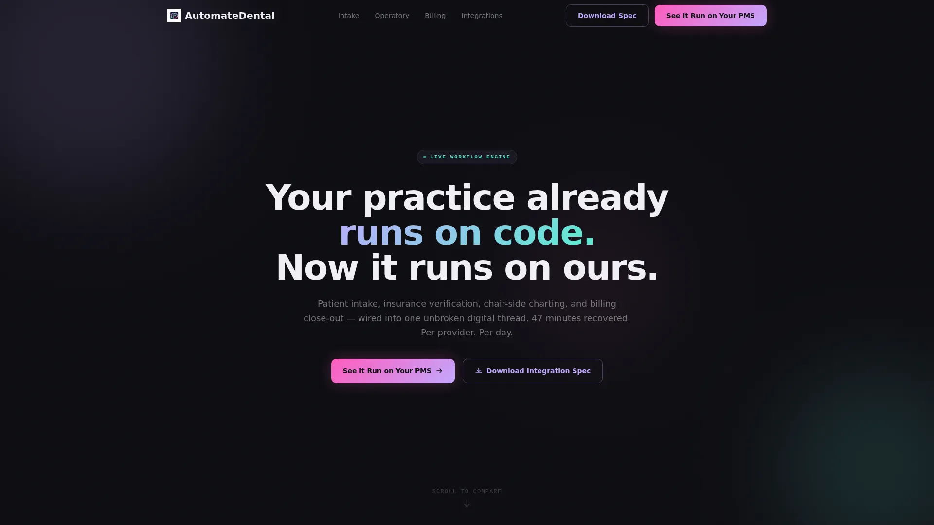
Automate is a comparison table landing page template built for dental workflow automation platforms. It pairs a live code snippet header with frosted-glass spec tables that stack through every stage of a practice day, from patient intake to billing close-out. The result is a precise, visually striking page that turns workflow metrics into a compelling case for switching.
by Rocket studio
Quick summary
Automate is a single-page template designed to sell dental workflow automation with hard numbers and sharp visuals. A scrolling terminal header transitions into stacked comparison tables that walk visitors through intake, operatory handoff, and billing. Every claim is a specific metric. Every section earns the next click.
Who this template is for
This template is built for dental technology companies and platform teams that need to convert high-intent clinical buyers. It works especially well when your audience already understands the pain and needs proof, not persuasion.
- Multi-location dental service organizations (DSOs) evaluating a unified practice management integration
- Solo practitioners and office managers who currently toggle between multiple disconnected systems to complete a single workflow
- IT directors and technical buyers at DSOs who want to review integration specifications before committing to a demo
What problem this template solves
Dental practices lose an average of forty-seven minutes per provider per day to manual clipboard workflows, repeated data entry, and tab-switching across unconnected systems. A product page full of general claims does not fix that frustration. Buyers need to see their specific pain reflected in real numbers before they trust a new platform.
- Fragmented patient intake, insurance verification, and chair-side charting each live in separate tools, creating handoff errors and billing delays
- Claim rejection rates averaging twenty-two percent and pre-arrival form completion sitting at thirty-four percent are workflow failures, not just statistics
- A generic product page cannot communicate the precision of an automated pipeline; only specific before-and-after data can
What you get with this template
You get a fully structured, single-page layout that guides visitors from curiosity to demo request through a deliberate sequence of proof. Every section is ready to populate with your platform's real workflow metrics.
- A live-rendered code snippet header block that transitions into the main headline, setting a technical and credible tone from the first second
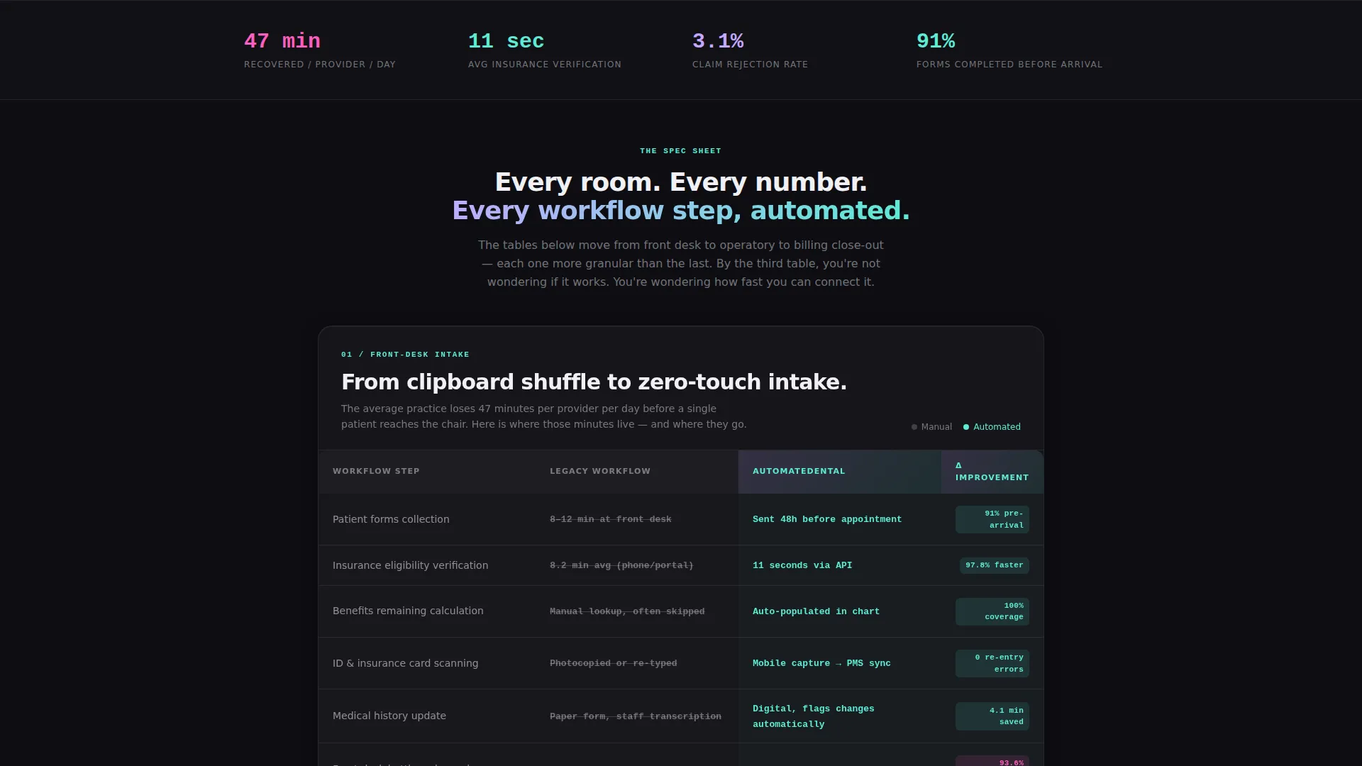
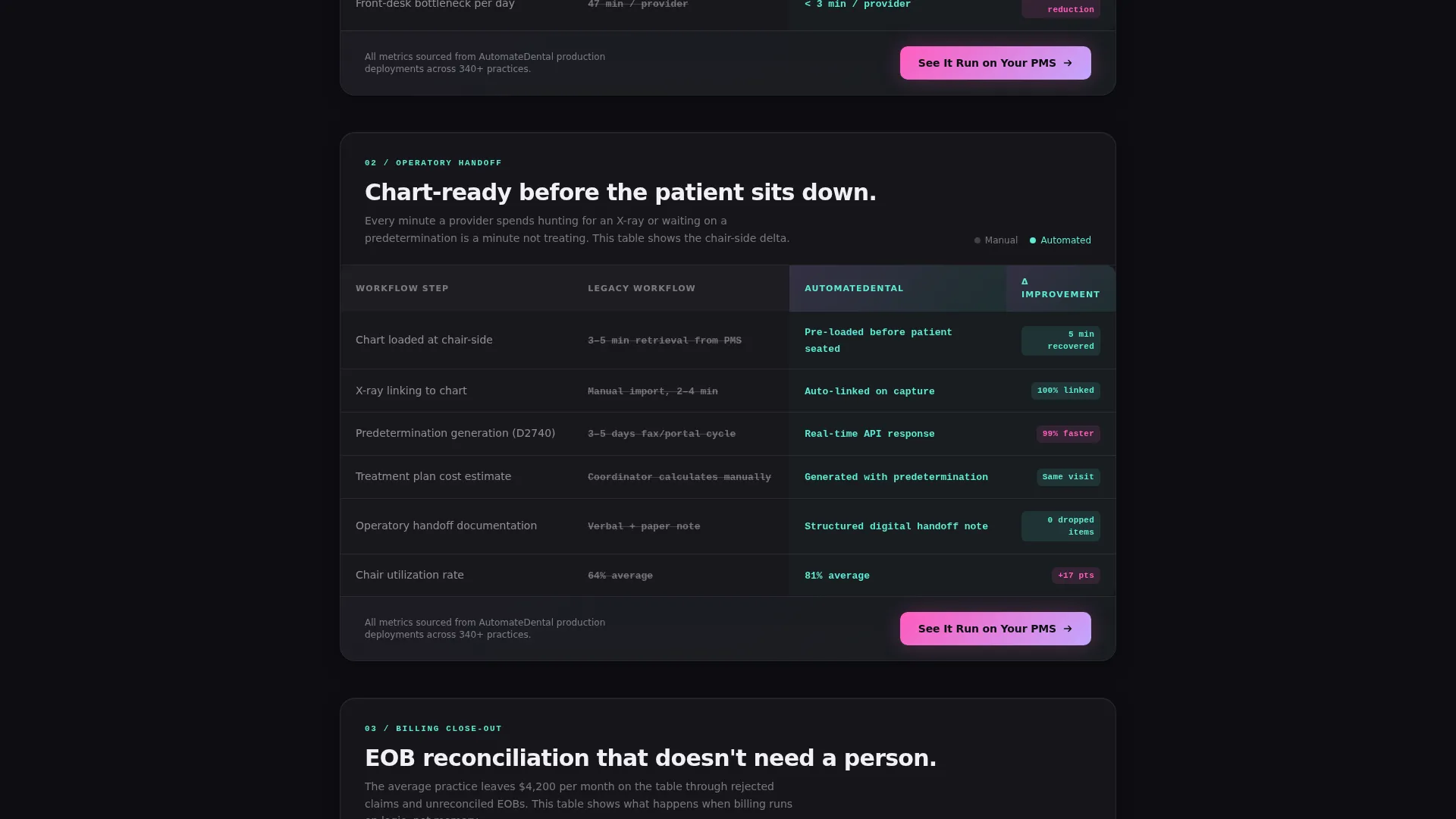
- A series of frosted-glass comparison table sections covering front-desk intake, operatory handoff, and billing close-out, each stacking and slightly overlapping as visitors scroll
- Two conversion paths: a primary call to action pinned beneath every table and a secondary floating call to action targeting high-intent technical buyers
Feature list
This template includes structured design and layout components grounded in the source brief. Each feature below corresponds to a defined element of the page.
Live Code Snippet Header
The page opens with a glassy terminal window displaying gently scrolling pseudo-API code. Each line annotates a real workflow step, such as insurance verification, chair routing, and predetermination generation. The terminal dissolves into the headline once the final line executes, creating a seamless, cinematic entry.
Stacked Comparison Table Sections
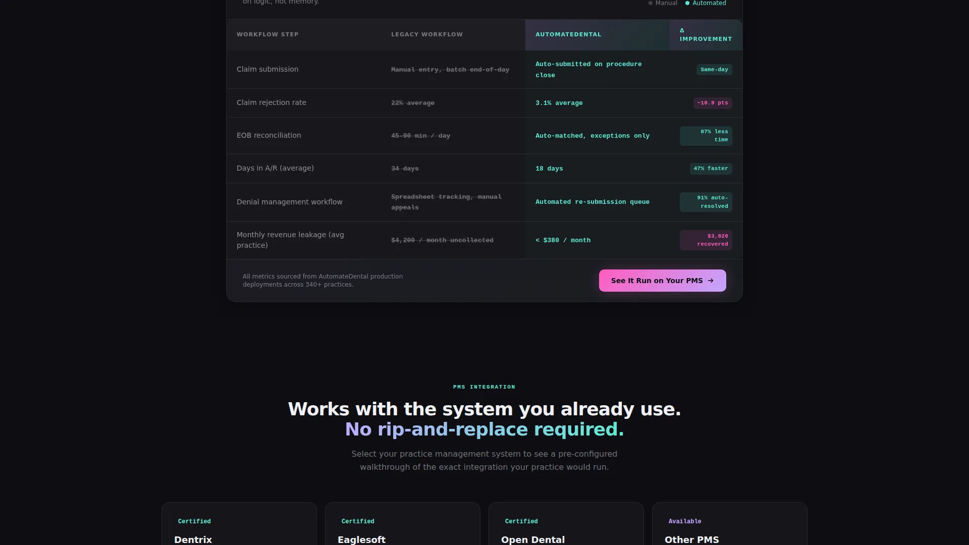
Three core comparison tables pit old manual workflows against the automated pipeline. Each table is a frosted-glass card that stacks with slight overlap on scroll. Specific metrics populate every cell, moving from front-desk intake through operatory handoff to billing close-out.
Pinned Primary call to action Block
The call to action labeled "See It Run on Your PMS" is anchored below every comparison table. It routes visitors to a demo environment selector where they choose their current practice management system before entering a pre-configured interactive walkthrough.
Floating Secondary call to action
A secondary call to action labeled "Download the Integration Spec" floats persistently on the page. It targets technical buyers who need API documentation before scheduling a meeting, capturing high-intent leads who are not yet ready for a live demo.
Syntax-Highlighted Terminal Display
The code snippet uses syntax highlighting in holographic lilac and spectral teal against an obsidian background. The color treatment reinforces technical credibility while keeping the visual consistent with the broader iridescent design system.
Metric-Driven Cell Content
Every table cell contains a specific, workflow-tied number. Verification time drops from 8.2 minutes to 11 seconds. Claim rejection falls from 22 percent to 3.1 percent. Pre-arrival form completion rises from 34 percent to 91 percent. These figures do the selling without requiring supporting paragraphs.
Page sections overview
| Section | Purpose |
|---|---|
| Terminal Code Header | Opens with scrolling pseudo-API code that dissolves into the main headline |
| Headline Block | Delivers the core value proposition after the terminal animation completes |
| Front-Desk Intake Table | Compares manual patient intake steps against the automated intake pipeline |
| Operatory Handoff Table | Shows time and error metrics for chair routing and chair-side charting handoff |
| Billing Close-Out Table | Highlights claim rejection rate and EOB reconciliation improvements |
| Primary call to action Strip | Pinned below each table with the "See It Run on Your PMS" action |
| Floating Secondary call to action | Persistent "Download the Integration Spec" button for technical buyers |
Design & branding system
The visual identity follows a Tech Glass theme powered by an AI Iridescent color system. The palette feels precise and clinical but alive with shifting light, making complex workflow data feel modern rather than dense.
- Deep obsidian (#0D0D12) forms the primary background; holographic lilac (#C4A7FF) and spectral teal (#5EEAD4) appear as gradient accents across table headers and hover states
- Clinical white (#F0F0F5) is used for cell text and data to maintain legibility against dark surfaces
- Activation pink (#FF5CBE) is reserved exclusively for call to action buttons to create an unmistakable focal point at every conversion moment
Mobile & speed optimization
The template is structured to present comparison tables clearly on smaller screens without losing the data density that makes the page persuasive. Frosted-glass cards are designed to stack vertically, keeping the scroll experience coherent on any device.
- Table sections are built as individual card components that reflow naturally on narrow viewports
- The floating secondary call to action remains accessible on mobile without obscuring primary table content
- The terminal header animation is contained within a defined block, preventing layout shift as the headline transition completes
How this template helps you convert
Every design decision on this page is aimed at reducing doubt and increasing specificity. By the time a visitor reaches the third comparison table, the question is no longer whether the platform works but how quickly they can connect it to their existing setup.
- The code snippet header establishes technical credibility immediately, signaling to clinical IT buyers that this platform speaks their language before a single marketing claim appears
- Stacked comparison tables build a cumulative case by moving room by room through the practice day, making it easy for office managers and DSO administrators to see their exact workflow reflected in the data
- The two-call to action architecture separates demo-ready buyers from spec-gathering researchers, letting both audiences convert at their own pace without friction
Other information about this template
This template fits naturally into a dental software marketing stack where the sales cycle involves both clinical decision-makers and technical evaluators. It is well suited to platforms that currently face evaluation against established practice management systems.
- The demo selector on the primary call to action destination is pre-configured for four system options: Dentrix, Eaglesoft, Open Dental, and Other, covering the most common practice management environments in the market
- The template style is Comparison Table, which performs well when a platform's differentiator is measurable efficiency gain rather than brand storytelling
- The Spec Sheet creative direction means each scroll step is a systematic teardown of the old workflow, giving IT directors and DSO administrators the structured evidence they need for internal sign-off
- This template is categorized under Technology and Dental Software, making it a strong fit for platforms positioning against legacy systems in multi-location group practice environments
Theme
Tech Glass
Creative direction
Spec Sheet
Color system
AI Iridescent
Style
Comparison Table
Direction
Click-Through
Page Sections
Live Code Snippet Header Block
Stacked Frosted-glass Comparison Tables
Pinned Primary Call to Action with PMS Selector
Floating Secondary Call to Action for Technical Buyers
Metric-driven Table Cell Content
AI Iridescent Syntax Highlighting
Related questions
Can I replace the default workflow metrics with my own data?
Who is this landing page template designed for?
How many comparison table sections does the template include?
What are the two conversion paths built into this template?
Do I need a developer to update the code snippet header?



