Transparent Nonprofit Landing Page Template
Beacon is a hub-and-spoke nonprofit landing page template built around radical transparency. A live-counting stats wall opens the page with impact metrics, then an anchor navigation guides visitors through four program categories, Water, Education, Health, and Emergency Response, each with a problem-to-solution arc, field stories, and side-by-side comparison panels that show outcomes before and after intervention.
by Rocket studio
Quick summary
Beacon is a single-page nonprofit landing page template designed to turn raw impact data into donor trust. A glassmorphic stats header leads into four anchor-navigated program spokes, each following a problem-to-solution arc and closing with a side-by-side outcome comparison. The layout earns credibility through transparency before it ever asks for a donation.
Who this template is for
Beacon is built for organizations that measure their work in real outcomes, meals, wells, classrooms, and lives. It speaks directly to the people who need proof before they commit funding or renew support.
- Program officers at foundations evaluating where to route their next grant cycle
- Monthly donors and board members who need verified outcome data alongside the human story
- Nonprofit communications teams ready to lead with numbers instead of emotional appeals
What problem this template solves
Most nonprofit pages rely on photography and vague mission statements to inspire giving. That approach no longer satisfies grant evaluators or data-literate donors who want to see overhead ratios, field reach, and before-and-after outcome comparisons before they click anything.
- Visitors leave because there is no clear proof of impact on the first screen
- Foundation officers cannot find the overhead and efficiency data they need to justify a grant recommendation
- Donors have no way to see how their specific contribution is allocated to a program area
What you get with this template
Beacon delivers a fully structured single-page layout with every section mapped to a clear donor or evaluator need. From the animated stats header to the program-specific comparison cards, every component is designed to build the case for trust incrementally.
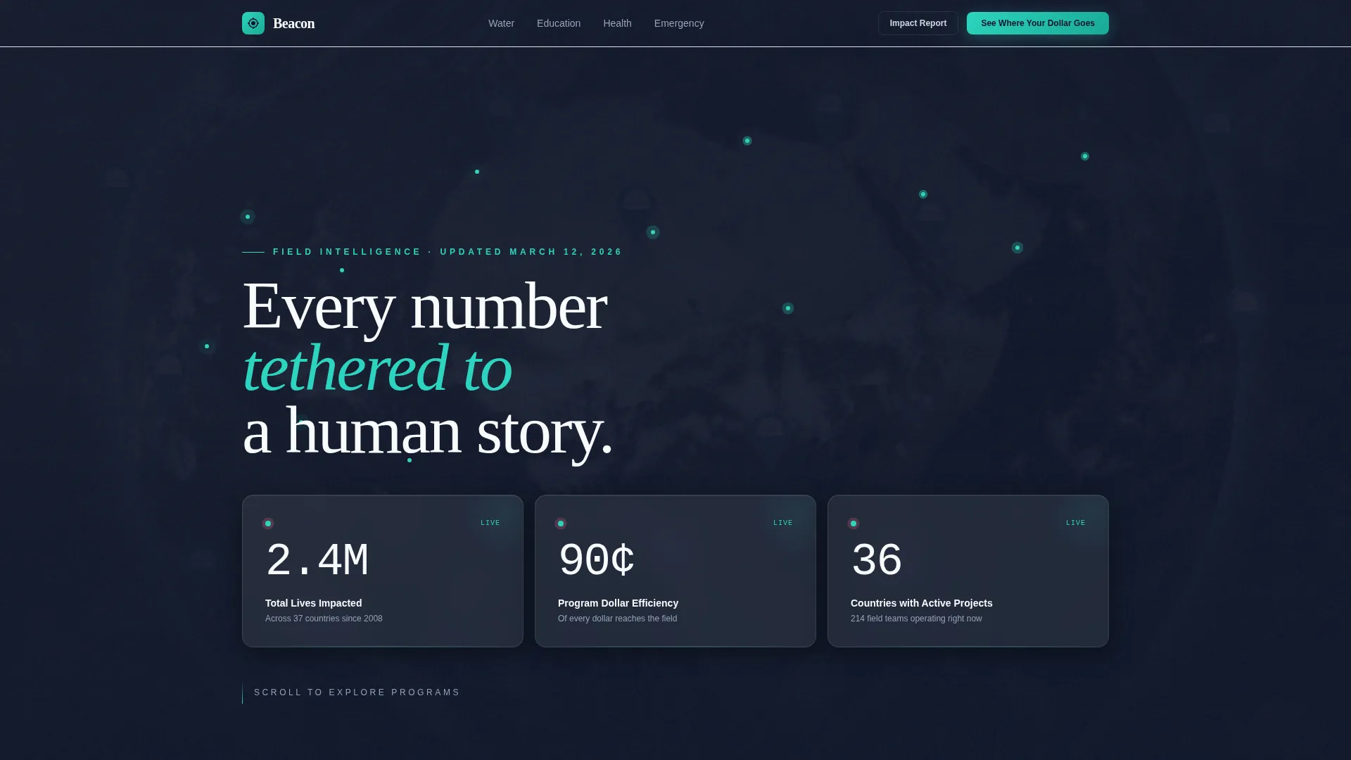
- A living metrics header with three animated counter cards showing total lives impacted, program dollar efficiency, and active field projects across countries
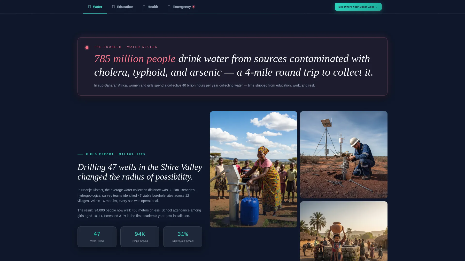
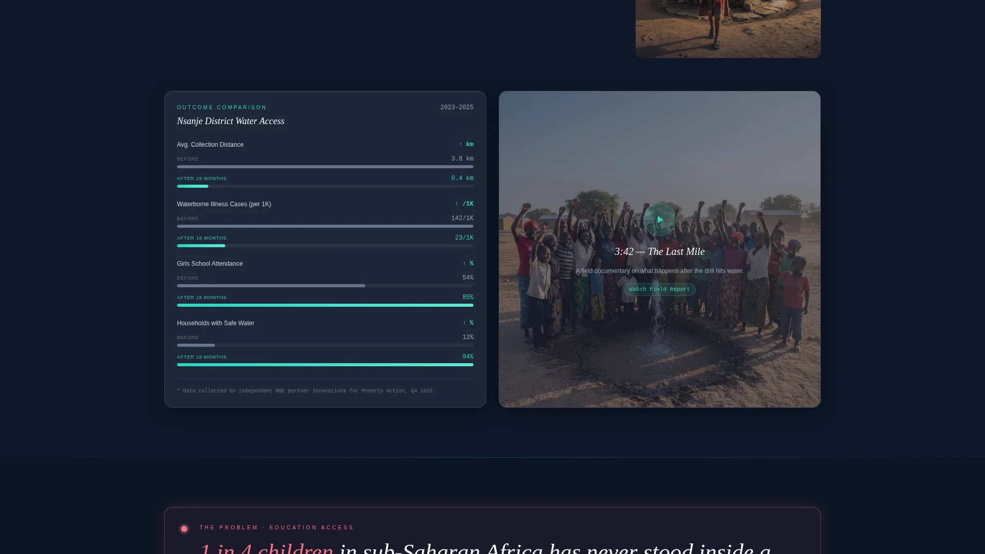
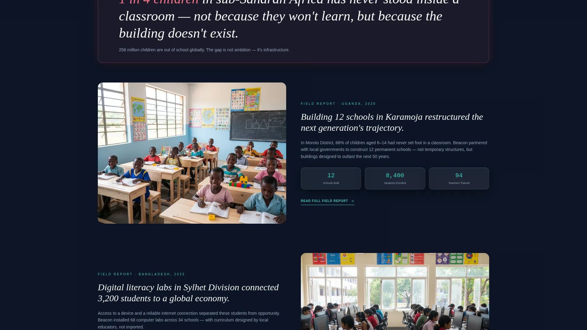
- Four anchor-navigated program spokes (Water, Education, Health, Emergency Response), each containing a problem stat, solution narrative, photo grid, embedded video slot, and a before-and-after comparison panel
- A sticky frosted-glass navigation rail with a fixed "See Where Your Dollar Goes" call-to-action button and a secondary "Download the Impact Report" email capture path
Feature list
Beacon's structure is built around a set of purpose-driven components. Each one is described below.
Animated Impact Metrics Header
Three oversized glassmorphic counter cards open the page, animating figures such as total lives impacted, program dollar efficiency, and active field project count. A subtle satellite-style map drifts behind the cards with teal pinpoints marking active project locations. The data is the first thing visitors see, establishing credibility before any narrative begins.
Hub-and-Spoke Anchor Navigation
A sticky frosted-glass navigation rail lists each program category as a spoke. Clicking any spoke scrolls the visitor to the corresponding section without a page reload. This keeps orientation clear and lets grant evaluators jump directly to the program area most relevant to their funding priorities.
Problem-to-Solution Arc per Spoke
Each program spoke opens with a stark problem statistic rendered in signal coral on a dark card. The layout then transitions into the solution narrative, field stories, a photo grid, and an embedded short-form video slot. The arc closes with a comparative outcome panel, building a complete case within each section.
Before-and-After Comparison Panels
Inside every spoke, a split glassmorphic card displays "Before Our Intervention" versus "After 18 Months" with parallel metrics such as mortality rates, literacy percentages, and water access radius. The numbers animate as the visitor scrolls into view, making the improvement tangible rather than abstract.
Industry Benchmark Comparison Cards
Each spoke ends with a translucent card comparing the organization's overhead ratio, field presence, and outcome data against published industry averages. All figures are sourced and footnoted directly on the card, so evaluators can verify claims without leaving the page.
Donation Modal with Program Allocation
A fixed call-to-action button on the navigation rail opens a slim modal containing a donation amount field, an email input, and a program allocation selector. Visitors can direct their contribution to Water, Education, Health, or "Where Most Needed," connecting the act of giving to a specific outcome they have already read about.
Page sections overview
| Section | Purpose |
|---|---|
| Metrics Stats Header | Opens the page with three animated counter cards and a drifting satellite map |
| Sticky Nav Rail | Provides anchor links to each program spoke and hosts the fixed donation call to action |
| Water Spoke | Presents the water access problem, field solution narrative, and before-after comparison |
| Education Spoke | Covers classroom access data, field stories, and literacy outcome comparison |
| Health Spoke | Addresses mortality and health access gaps with solution narrative and metrics |
| Emergency Response Spoke | Shows rapid-response scope, field presence, and post-intervention outcome data |
| Donation Modal | Captures donation amount, email, and program allocation preference |
| Impact Report Capture | Secondary email capture path for the downloadable impact report |
Design & branding system
Beacon uses a Dashboard Pro theme expressed through a glassmorphic color system. Every surface feels layered and luminous, with frosted panels floating above a deep background rather than sitting flat on it.
- Core palette: deep mission-night background (#0F172A), frosted translucent white (#FFFFFFB3) panels, philanthropic teal (#2DD4BF) for active states and progress indicators, muted humanitarian gray (#94A3B8) for secondary text, and signal coral (#FB7185) reserved for alerts, urgent campaign figures, and comparison differentials
- Typography uses thin monospaced numerals at architectural scale for the metrics header, keeping the data visually dominant
- Panel styling uses blurred backdrops, thin 1-pixel borders that catch light, and subtle hover depth to reinforce the glass-wall command-room aesthetic
Mobile & speed optimization
Beacon is designed so that the glassmorphic layering and animated counters remain legible and usable at smaller screen sizes. The layout prioritizes content hierarchy so key metrics and navigation remain accessible without horizontal scrolling.
- The sticky navigation rail adapts to smaller viewports, keeping the "See Where Your Dollar Goes" button reachable at all times
- Comparison panels and photo grids reflow into single-column stacks on narrow screens so the before-and-after data stays readable
How this template helps you convert
Beacon builds the case for a donation or grant recommendation incrementally, so that by the time the primary call to action appears, the visitor has already seen sufficient evidence to act.
- The animated metrics header delivers immediate credibility on the first screen, removing the need for a visitor to scroll before trusting the organization's scale and efficiency
- The problem-to-solution arc in each spoke keeps visitors engaged through a structured narrative that ends with sourced comparison data, addressing the specific objections that program officers and major donors typically raise before committing funds
Other information about this template
Beacon is a strong fit for organizations that publish regular field updates and need a single page that serves multiple audience types simultaneously. The hub-and-spoke structure means one URL can answer the questions of a first-time $25 donor and a foundation program officer in the same session.
- The template is built as a single landing page with anchor navigation, so no multi-page routing or content management setup is required to launch
- The "Download the Impact Report" path functions as a secondary conversion for visitors who are not ready to donate but are willing to engage with a longer nurture sequence
- Signal coral is used deliberately and sparingly, reserved only for problem statistics, urgent campaign figures, and comparison differentials, so it retains attention value every time it appears
- The satellite map background in the header is decorative and ambient, providing geographic context without requiring a live data feed to function
Theme
Dashboard Pro
Creative direction
Problem→Solution Arc
Color system
Glassmorphic
Style
Hub & Spoke (Anchor Nav)
Direction
Comparison/Versus
Page Sections
Animated Impact Metrics Header
Hub-and-spoke Anchor Navigation
Problem-to-solution Arc Per Spoke
Before-and-after Comparison Panels
Industry Benchmark Comparison Cards
Donation Modal with Program Allocation
Related questions
Who is the primary audience for the Beacon template?
Can I customize the four program spokes for different focus areas?
How does the donation modal work?
Does the template require live data or a backend connection to display the metrics?
Is this template suitable for a small nonprofit with limited content?



