Complete Restaurant Software Cost Estimator Website Template
Ticket is a restaurant learning management system landing page template built for multi-unit operators and franchise training teams. It leads with a live ROI calculator, walks visitors through a detailed spec-sheet comparison table, and drives them toward a free pilot signup, all without a single on-page form slowing things down.
by Rocket studio
Quick summary
Ticket is a single-page, click-through landing page template designed for a restaurant learning management system. It opens with an interactive ROI calculator, then guides visitors through exhaustive comparison tables that pit the platform against generic alternatives. The Void & Violet visual system keeps every screen feeling precise and urgent. One call to action, one destination, zero friction.
Who this template is for
This template is purpose-built for restaurant technology brands selling training software to operators who manage people at scale. It speaks directly to the people who own the onboarding problem.
- Multi-unit restaurant operators and franchise directors managing training across many locations
- Regional training managers trying to reduce health code violations and close costly skill gaps
- Restaurant software teams who need a landing page that earns trust through data, not marketing language
What problem this template solves
Restaurant training is notoriously fragile. Knowledge lives in laminated sheets, in one veteran employee's memory, and in shadow shifts that never get documented. When staff turn over at 120% annually, every gap becomes a liability. This template gives a restaurant learning management system a page that communicates the full value of replacing that chaos with tracked, certified, repeatable knowledge.
- Generic landing page templates do not speak to back-of-house workflows, compliance modules, or multilingual staff realities
- Operators compare software the way they compare commercial kitchen equipment, they want a spec sheet, not a sales pitch
- Without a personalized savings number, the value proposition stays abstract and easy to dismiss
What you get with this template
You get a fully structured, single-page click-through landing page built around two conversion mechanics: a live ROI calculator and a detailed comparison table. Every section is designed to answer the exact question a training manager would ask before booking a demo.
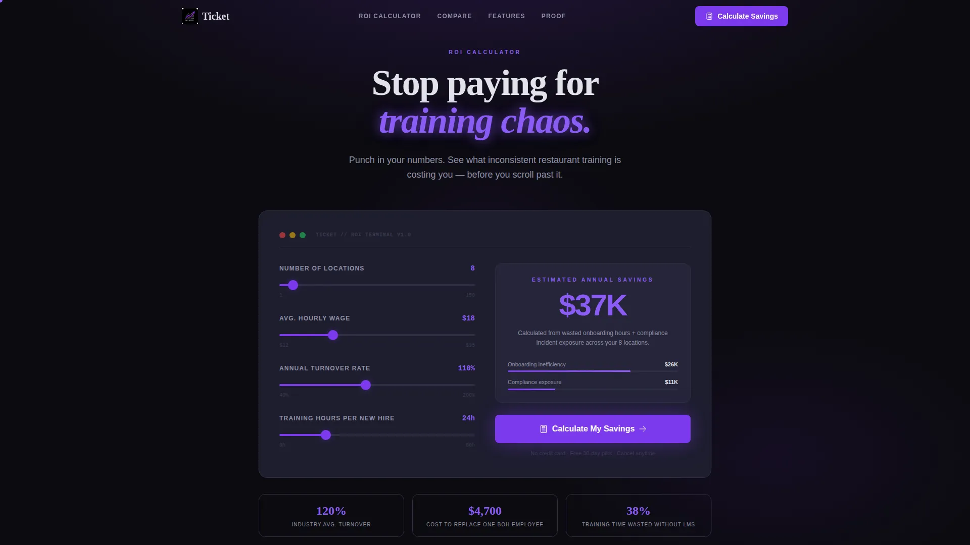
- A header-level ROI estimator with inputs for locations, hourly wage, turnover rate, and training hours per new hire
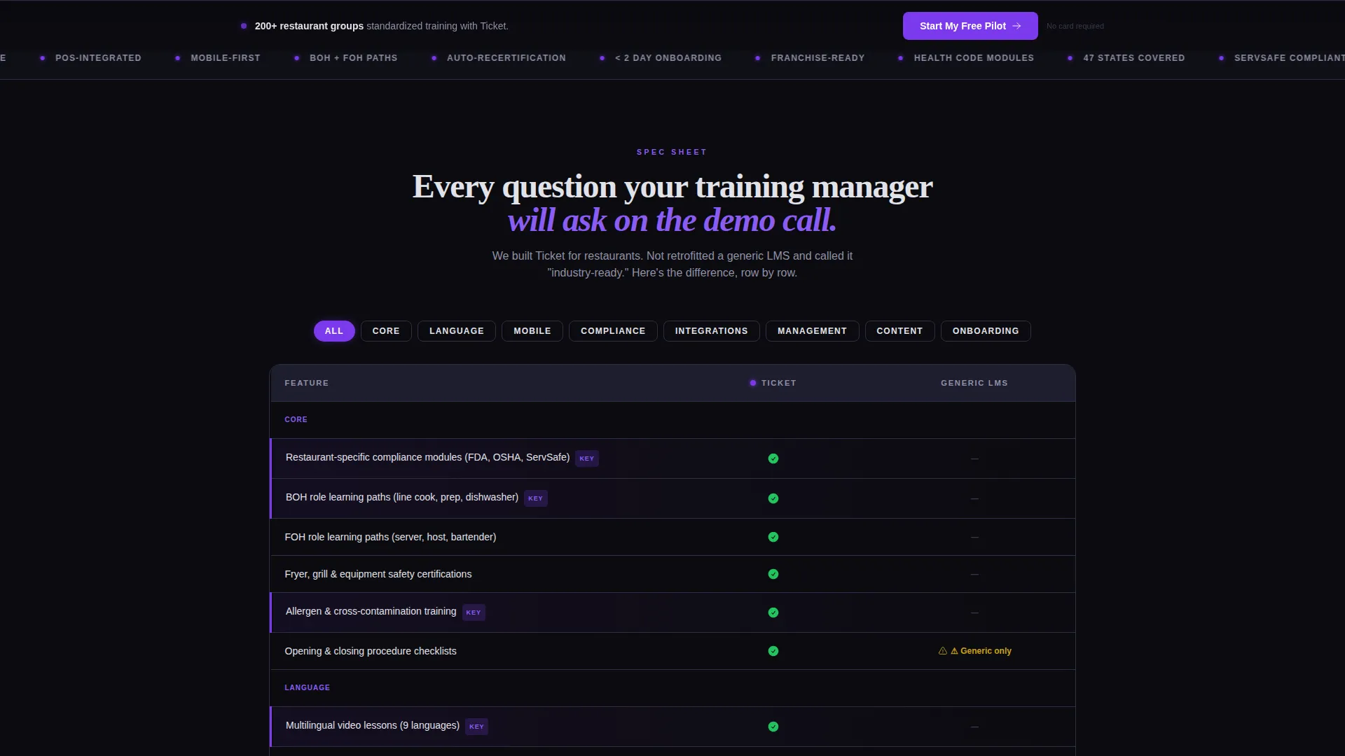
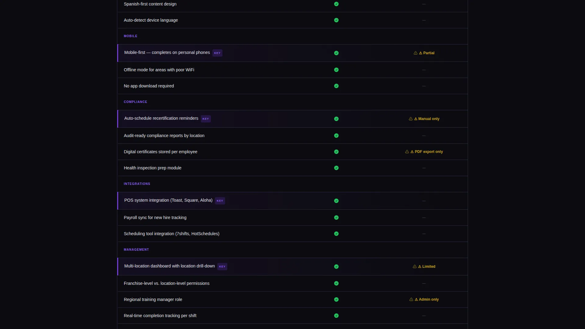
- A scrollable spec-sheet comparison table covering restaurant-specific compliance modules, multilingual video lessons, role paths, mobile completion, and recertification scheduling
- A persistent bottom-bar call to action that transitions from "Calculate My Savings" to "Start My Free Pilot" after the first scroll
Feature list
This section covers the core built-in components and design behaviors included in the Ticket template.
Live ROI Calculator Header
The page opens with a calculator styled like a point-of-sale terminal. Visitors enter their number of locations, average hourly wage, annual turnover rate, and current training hours per new hire. The output is an animated dollar figure showing estimated annual savings. The violet digits tick upward as sliders are adjusted, making the value proposition immediate and personal before the visitor scrolls a single pixel.
Spec-Sheet Comparison Table
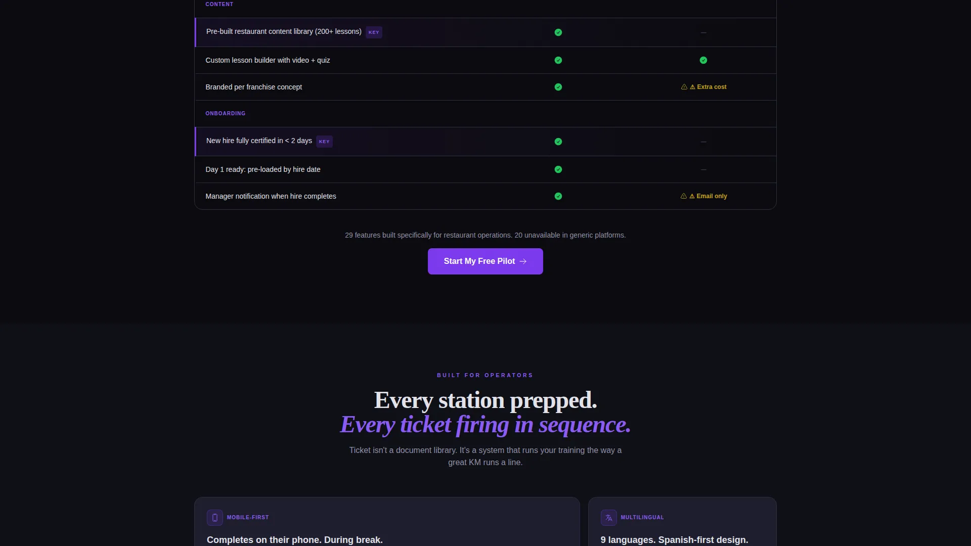
The primary content block is a structured comparison table following a product data sheet format. Each row covers one capability: restaurant-specific compliance modules, multilingual video lessons, back-of-house and front-of-house role paths, point-of-sale integration, auto-scheduling of recertification, and mobile-first completion on personal phones. Ticket's column uses violet checkmarks; competitor columns show muted gray dashes. The layout earns trust through exhaustive transparency.
Persistent Bottom-Bar Call to Action
After the visitor scrolls past the calculator, a persistent bar anchors to the bottom of the viewport. The primary call to action shifts from "Calculate My Savings" to "Start My Free Pilot." There is no form on the page. The bar stays visible throughout the entire scroll, maintaining conversion pressure without interrupting the reading experience.
Dashboard Pro Visual Theme
The template uses the Dashboard Pro theme with a Void & Violet color system. Deep void black forms the base. Electric violet highlights calls to action, progress indicators, and active table rows. Muted graphite panels stack like kitchen display tickets, clean-edged and information-dense. Cool platinum handles all text and data labels for strong contrast against dark surfaces.
POS-Styled Input Fields
The calculator inputs are designed to feel like a point-of-sale terminal interface. Fields are large, tap-friendly, and carry violet focus rings on activation. The tactile quality of the inputs reinforces the platform's restaurant-native identity and signals that this tool was built for operators, not generic business users.
Click-Through Page Architecture
This is a zero-form, click-through landing page. Every comparison row, every calculator output, and every design decision points toward one action: clicking through to a free trial signup on the next page. No inline forms, no multi-step modals. The architecture removes every friction point so the visitor arrives at the next page already convinced.
Page sections overview
| Section | Purpose |
|---|---|
| ROI Calculator Header | Personalizes savings before the visitor scrolls |
| Comparison Table Block | Spec-sheet rows comparing Ticket to generic platforms |
| Compliance Module Row | Highlights restaurant-specific regulatory coverage |
| Multilingual Lessons Row | Shows support for diverse kitchen staff language needs |
| Role Path Row | Distinguishes back-of-house and front-of-house training tracks |
| Mobile Completion Row | Confirms staff can complete training on personal phones |
| Recertification Scheduling Row | Demonstrates automated re-certification triggers |
| Persistent call to action Bar | Anchors "Start My Free Pilot" throughout the scroll |
Design & branding system
The Void & Violet color system makes this template feel like a purpose-built operator tool, not a generic software page. Every color choice reinforces urgency, precision, and trust.
- Base palette: deep void black (#0B0B0F) for backgrounds, muted graphite (#1E1E2E) for card and panel surfaces, and cool platinum (#E2E2EA) for body text and data labels
- Accent system: electric violet (#7C3AED) drives calls to action, progress bars, active table row highlights, and focus rings, precise and always visible against dark surfaces
- Visual language: graphite panels stack like kitchen display tickets, each one clean-edged and information-dense, while violet glows with the quiet urgency of a point-of-sale screen in a dim manager's office
Mobile & speed optimization
The template is designed with mobile-first completion in mind, reflecting the real-world behavior of restaurant staff who access training on personal phones during breaks. Every input and interaction is sized for touch.
- Calculator fields are large and tap-friendly, with violet focus rings that activate clearly on mobile screens
- Comparison table rows are structured for vertical scrolling on small screens without requiring horizontal swipe
- The persistent bottom-bar call to action stays anchored and readable on all viewport sizes, keeping the conversion path open throughout the entire mobile scroll
How this template helps you convert
Every structural decision in this template is pointed at one outcome: getting the visitor to click through to a free trial signup.
- The ROI calculator makes the value personal before any marketing copy appears. A visitor who sees their own dollar figure is far more motivated to keep reading than one who reads a generic claim about saving time.
- The comparison table does the objection handling that would otherwise happen on a demo call. By the time a training manager reaches the bottom of the spec sheet, their key questions are already answered in writing.
- The persistent bottom-bar call to action removes the need to scroll back up or hunt for a button. The path from convinced to clicked is always one tap away.
Other information about this template
This template sits at the intersection of restaurant software, workforce training technology, and high-intent operator audiences. It is built for teams who sell to buyers that evaluate platforms the way they evaluate commercial kitchen equipment.
- The template is categorized under Technology, specifically the Restaurant Software subcategory and the Restaurant Learning Management niche
- The creative direction is Spec Sheet, which means the scroll experience reads like a product data sheet rather than a lifestyle marketing page
- The header concept is a Calculator/Estimator, a conversion mechanic that personalizes the pitch before any feature copy appears
- The landing page direction is Click-Through, meaning the page itself carries no inline signup form, it moves visitors to the next page to complete registration
- The template style is a Comparison Table, the most trusted format for software buyers who want to evaluate options side by side
- The Dashboard Pro theme and Void & Violet palette are shared across the matched intersection context, making this template a strong fit for restaurant technology brands building a cohesive product presence
Theme
Dashboard Pro
Creative direction
Spec Sheet
Color system
Void & Violet
Style
Comparison Table
Direction
Click-Through
Page Sections
Live ROI Calculator with Animated Output
Spec-sheet Comparison Table
Persistent Bottom-bar Call to Action
Pos-terminal Input Styling
Click-through Zero-form Architecture
Dashboard Pro Void & Violet Visual System
Related questions
Does this template include a signup form?
Can I customize the ROI calculator inputs?
How many comparison rows are included?
Who is this template best suited for?
Can I update the color system to match my brand?



