Architecture Firm Order Management Landing Page
Blueprint is a dark-themed, single-page comparison landing page built for architecture firm order management platforms. It uses a Midnight Blue color system and a Spec Sheet layout to pit spreadsheets and generic tools against a modern solution. The result is a confident, data-driven page that earns conversions by letting visitors audit the difference themselves.
by Rocket studio
Quick summary
Blueprint is a Comparison Table landing page template designed for architecture firm order management software. It uses a Tech Glass visual identity, a Midnight Blue palette, and a Spec Sheet layout to walk visitors through a structured, row-by-row comparison. Every section builds a case quietly and methodically, turning curiosity into a demo request before the page ends.
Who this template is for
This template is built for software teams and marketers promoting order management platforms to architecture and construction firms. It speaks directly to buyers who are already using a competing tool and need a clear reason to switch.
- Project managers overseeing multiple subcontractors and shifting delivery timelines
- Office managers reconciling purchase orders against invoices across active projects
- Principals who need real-time budget burn visibility without scheduling a meeting
What problem this template solves
Architecture firms often rely on disconnected tools to manage orders, track deliveries, and log change requests. That fragmentation creates gaps: lost request for information (RFI) documents, mismatched invoices, and no single view of where a project stands financially. This template gives the platform a structured stage to expose those gaps and show a better path.
- Visitors using spreadsheets or generic project tools have no immediate frame of reference for switching
- A comparison-led layout removes the need for long sales copy by letting the spec sheet speak
- The page captures intent at multiple points, from demo requests to gated spec sheet downloads
What you get with this template
This template delivers a complete single-page layout designed around the comparison journey. Every section is purposefully sequenced to build momentum from the first scroll to the final call to action.
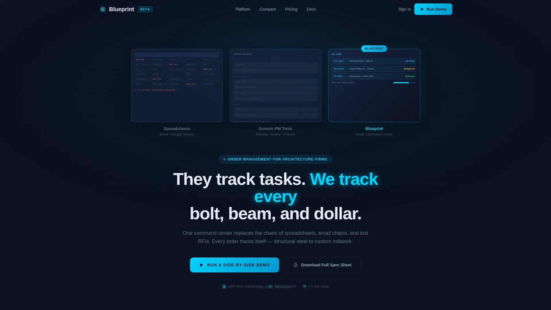
- A Dark Glass Panels header with three floating translucent rectangles representing competing approaches and the platform itself
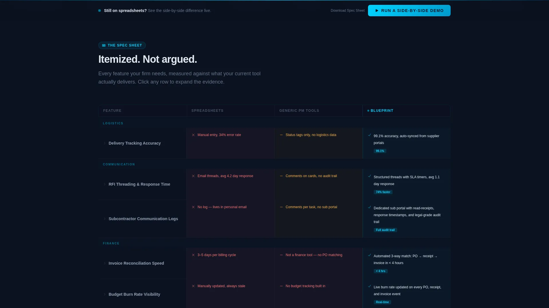
- A full Spec Sheet comparison section with expanding rows, muted competitor text, and cyan-highlighted platform metrics
- Two conversion paths: a primary demo request form and a secondary gated PDF download option
Feature list
This template ships with a set of purpose-built sections and interactive design patterns. Each feature below is drawn directly from the design brief.
Dark Glass Panel Header
Three translucent panel rectangles float against a void-navy background, each representing a different tool approach. Faint data fragments are visible inside each panel, and a subtle parallax depth effect activates on scroll. The headline renders in cold white between the panels.
Spec Sheet Comparison Rows
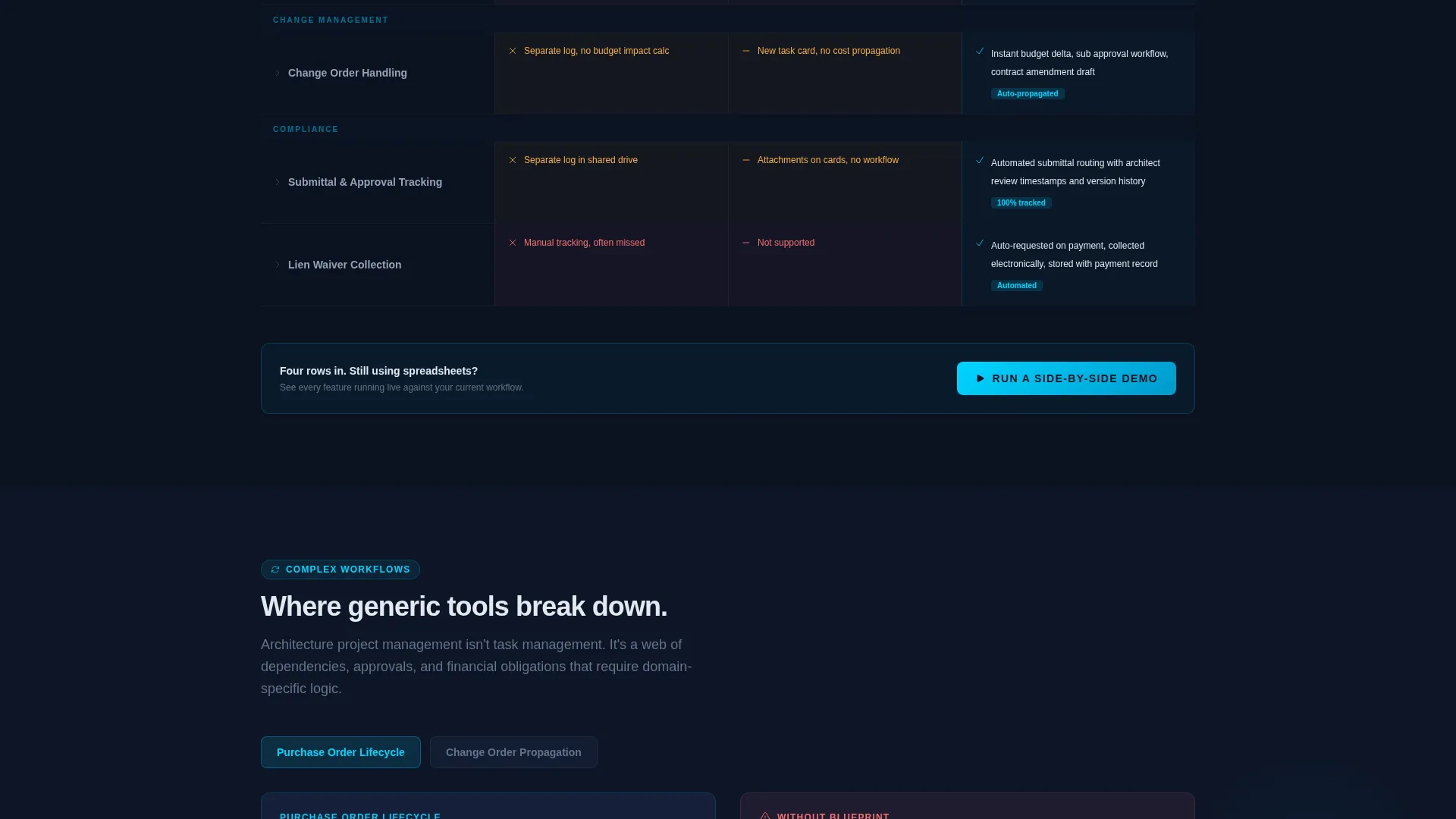
Each comparison row expands to show delivery tracking accuracy, change order handling, invoice reconciliation speed, and subcontractor communication logs. Competitor columns display limitations in muted gray text, while the platform column illuminates in electric cyan with specific metrics.
Micro-Animations on Feature Rows
Each expanding row includes a micro-animation that previews the feature in action. Animations are tied to scroll progression, so the visual complexity of the comparison builds as the visitor moves down the page.
Sticky Call-to-Action Bar
A sticky bar appears after the third comparison row and repeats the primary call to action. This keeps the conversion prompt visible throughout the comparison without interrupting the reading flow above it.
Dual Conversion Forms
The primary form captures current tool selection via a dropdown (with options for Excel, Procore, Monday, Asana, and Other), firm size by active project count, and work email. A secondary path offers a gated PDF spec sheet download, capturing email and role for visitors not yet ready to book a demo.
Glassmorphism Card Surfaces
Card and panel surfaces use translucent panel blue to create a frosted glass appearance floating against the dark background. Electric cyan traces interactive borders and hover states, reinforcing the cockpit instrument aesthetic throughout the page.
Page sections overview
| Section | Purpose |
|---|---|
| Dark Glass Header | Introduce three competing approaches side by side |
| Parallax Panel Area | Create depth and visual contrast between tools |
| Headline Block | Anchor the core positioning statement |
| Spec Sheet Rows | Compare features row by row with expanding detail |
| Sticky call to action Bar | Maintain demo conversion visibility on scroll |
| Primary Demo Form | Capture qualified leads ready to book |
| Secondary PDF Gate | Capture emails from visitors in research mode |
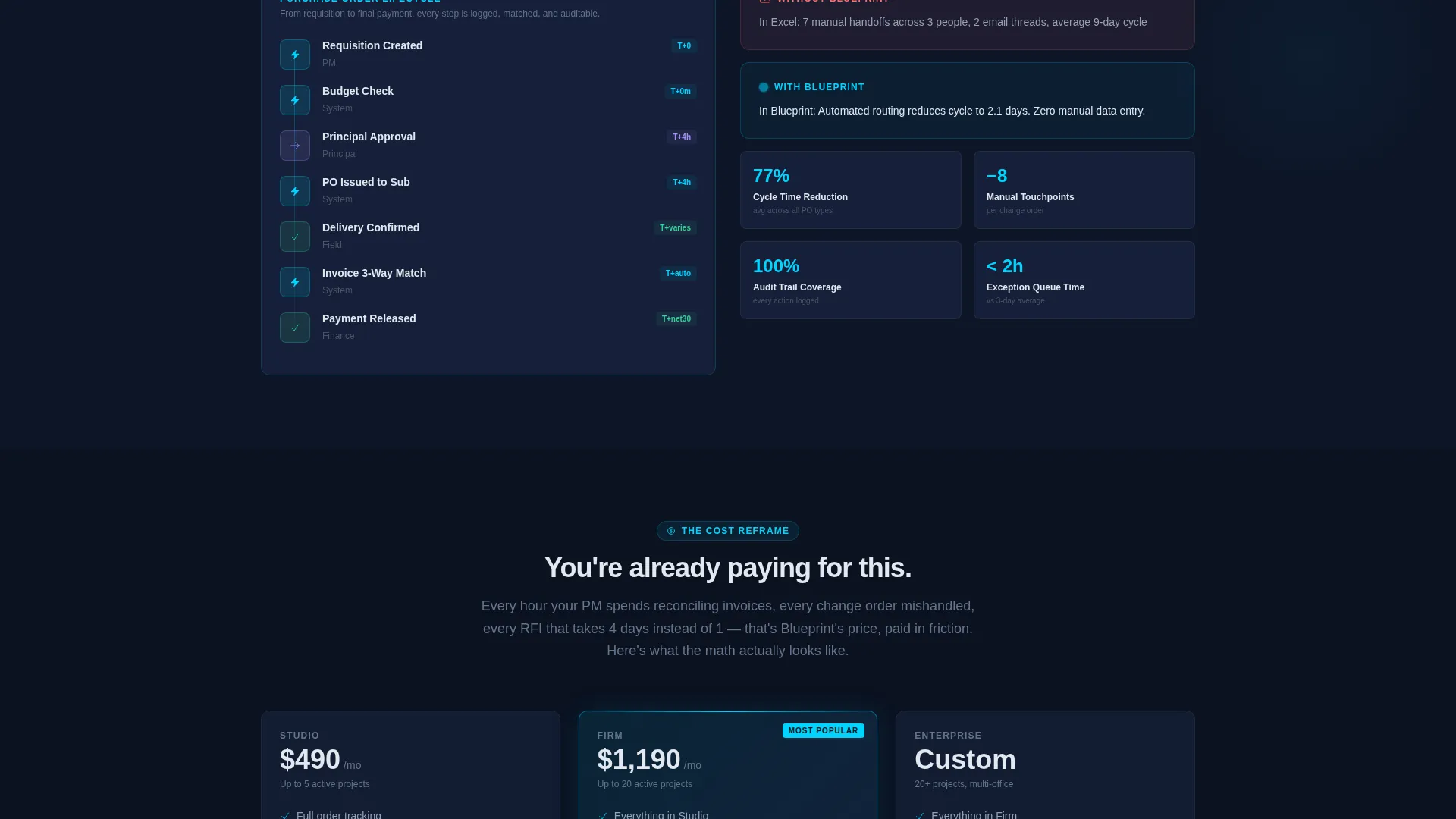
| Pricing Comparison Row | Reframe feature value as measurable cost savings |
Design & branding system
The template uses a Tech Glass theme built entirely on the Midnight Blue color system. Every visual decision reinforces a cockpit instrument aesthetic where only the most relevant data demands attention.
- Void-deep navy (#0B1120) as the primary background, translucent panel blue (#1A2744) for card surfaces, and cold interface white (#E2E8F0) for all body typography
- Electric cyan (#00D4FF) as the sole accent color, used for interactive borders, hover states, active comparison highlights, and live data pulse effects
- Glass reflections on panel surfaces catch light on scroll, adding physical depth to an otherwise flat dark layout
Mobile & speed optimization
The template is structured to remain legible and navigable on smaller screens. The comparison table layout and sticky bar are both built with responsive behavior in mind.
- Comparison rows are designed to reflow cleanly so expanding sections remain readable at mobile viewport widths
- The sticky call-to-action bar is sized and positioned to stay functional without blocking comparison content on narrow screens
- Panel depth effects and micro-animations are scoped to preserve a smooth experience across device sizes
How this template helps you convert
The page converts by making the visitor's current workflow feel visibly limited before the first call to action appears. The structure is deliberate, not decorative.
- The header immediately frames the comparison, so visitors self-identify with one of the three panels and feel curious about the third before reading a single feature row
- The Spec Sheet rows build from simple features to complex workflows to integrations and finally to the pricing row, so each section adds more justification to switch
- The dual conversion paths mean visitors who are not ready to demo still leave a contact, giving the platform two distinct lead types from a single page visit
Other information about this template
This template is built for a single-page, section-led flow and is categorized under Technology and Architecture Firm Software. It is specifically designed for the Architecture Firm Order Management niche.
- The comparison structure follows a Comparison/Versus landing page direction, making it suitable for campaigns targeting users actively evaluating order management tools
- The Spec Sheet creative direction is intentionally document-like, which aligns well with architecture and construction buyers who are accustomed to reading procurement materials
- The header concept, Dark Glass Panels, is a distinct visual device that immediately communicates the three-way comparison without requiring introductory copy
- This template can support campaign pages for architecture firm software platforms looking to differentiate from generic project management tools and spreadsheet workflows
Theme
Tech Glass
Creative direction
Spec Sheet
Color system
Midnight Blue
Style
Comparison Table
Direction
Comparison/Versus
Page Sections
Dark Glass Panel Header with Parallax Depth
Expanding Spec Sheet Comparison Rows
Scroll-triggered Micro-animations
Sticky Conversion Bar After Row Three
Dual-path Lead Capture Forms
Glassmorphism Card and Panel Surfaces
Related questions
Who is this landing page template designed for?
Can I customize the comparison rows for my own features?
What are the two conversion paths on this page?
How does the sticky call-to-action bar work?
Is this template suitable for paid advertising campaigns?



