Salon & Spa Social Media App Landing Page Template
Bookings is a split-screen landing page template built for salon and spa social media management apps. It pairs a glassmorphic Data Command visual system with an Industry Report scroll strategy, moving visitors from striking engagement stats to a confident app download. Tab-switching headers, frosted metric cards, and a sticky download bar make the value case fast and clear.
by Rocket studio
Quick summary
Bookings is a single-page template designed for beauty-industry social media tools. It opens with a three-tab Feature Tab Switcher, escalates through data-backed industry insight sections, and closes with a sticky app download bar. The glassmorphic visual system keeps every screen feeling polished, urgent, and on-brand for salon and spa audiences.
Who this template is for
This template was built for founders and teams launching or marketing a social media management app aimed at the beauty industry. It speaks directly to the people who will use that app every day.
- Salon owners who personally manage their shop's social media between client appointments
- Spa managers running seasonal promotions across multiple platforms at once
- Independent estheticians who want clearer analytics without a steep learning curve
What problem this template solves
Beauty professionals are skilled at their craft but often struggle to turn social media activity into real bookings. Generic app landing pages do not speak their language, and vague feature lists rarely earn a download.
- Visitors leave before converting because the value is described instead of shown
- Salon and spa audiences need industry-specific proof, not broad software promises
- The gap between "follower" and "booked appointment" feels invisible without a clear funnel visual
What you get with this template
You get a fully structured, single-page layout that builds a persuasive case from the first scroll to the final tap. Every section is paired and purposeful.
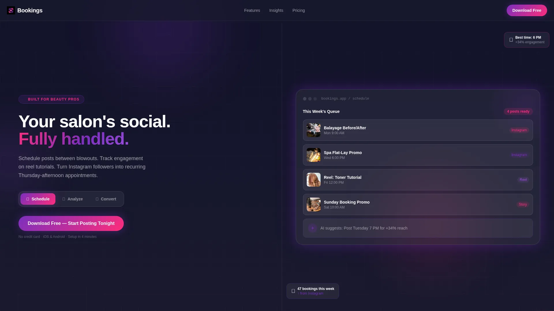
- A split-screen 50/50 layout with a three-tab interactive header showing Schedule, Analyze, and Convert states
- Frosted glassmorphic user interface panels, metric cards, a DM-to-booking funnel visual, and a sticky app download bar
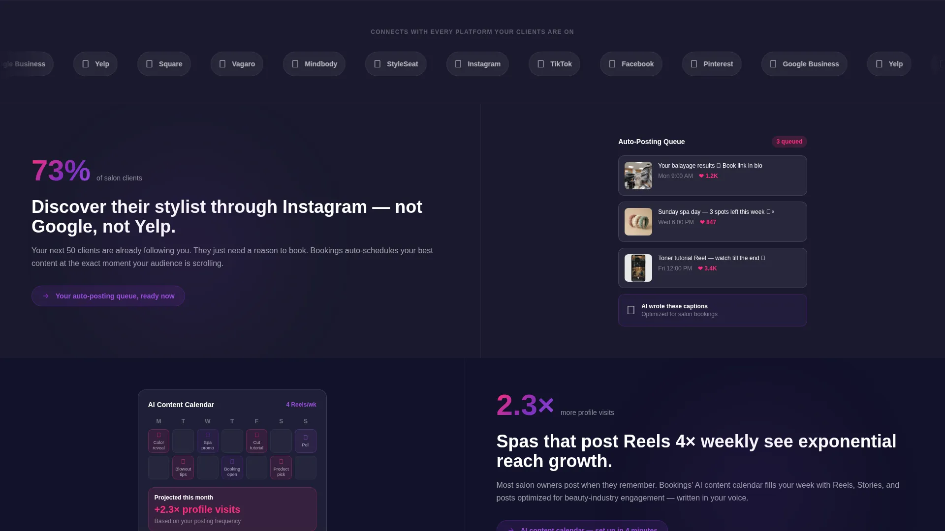
- Industry Report scroll sections pairing beauty-specific statistics with corresponding app feature visuals
Feature list
This template ships with a set of purpose-built components that work together to move beauty-industry visitors toward downloading the app.
Three-Tab Feature Switcher Header
The header splits the screen into two equal halves. The left side holds three clickable tabs labeled Schedule, Analyze, and Convert. Each tab swaps the right panel's content using a soft blur-to-focus animation, showing a glass-panel weekly calendar, frosted engagement metric cards, or a DM-to-booking funnel visualization respectively.
Industry Report Scroll Sections
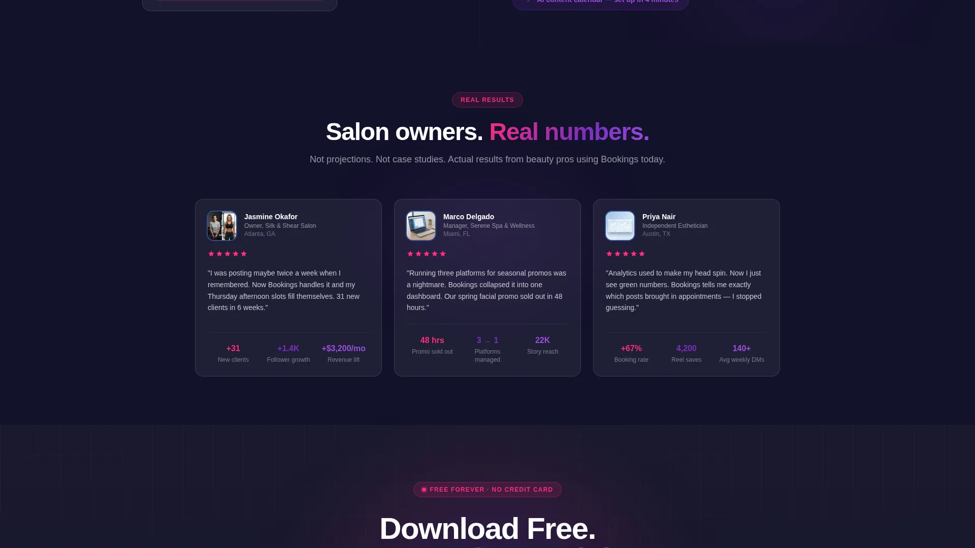
Each scroll section leads with a real beauty-industry data point, then pairs it with the app feature that solves the underlying problem. The progression moves from awareness metrics to revenue metrics, building a compounding argument as visitors scroll deeper.
Glassmorphic Data Visualization Panels
Frosted translucent panels display engagement rates, follower growth curves, and best-posting-time heatmaps. Violet gradients pulse beneath the translucent surfaces, and electric rose accents highlight data spikes and interactive elements.
Sticky App Download Bar
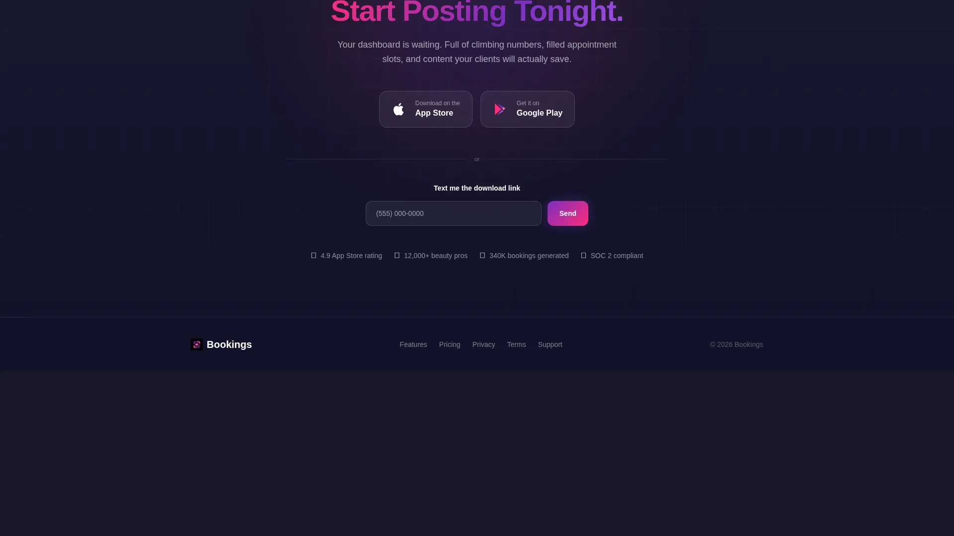
After the second section, a glassmorphic bar follows the visitor down the page. It holds the primary call to action, "Download Free - Start Posting Tonight," alongside paired App Store and Google Play buttons, keeping the conversion path always visible.
SMS Link Delivery Field
A secondary conversion path sits alongside the primary download bar. Visitors enter a single phone number to receive the app download link by text, reducing friction for users who are browsing on a desktop device.
DM-to-Booking Funnel Visual
The Convert tab displays a step-by-step visualization of a follower's journey from a story reply to a confirmed appointment. It makes the app's core value proposition tangible before a single word of feature copy is read.
Page sections overview
| Section | Purpose |
|---|---|
| Tab Switcher Header | Introduces Schedule, Analyze, Convert features interactively |
| Schedule Tab Panel | Shows queued salon posts on a glass weekly calendar |
| Analyze Tab Panel | Displays frosted metric cards and posting-time heatmaps |
| Convert Tab Panel | Visualizes DM-to-booking follower journey funnel |
| Industry Insight Row 1 | Pairs Instagram discovery stat with auto-posting queue feature |
| Industry Insight Row 2 | Pairs Reels frequency stat with content calendar feature |
| Revenue Metrics Section | Escalates proof from awareness data to booking revenue |
| Sticky Download Bar | Persists app download call to action after second section |
| SMS Delivery Field | Offers text-link option for desktop visitors |
Design & branding system
The visual identity follows a Data Command theme expressed through a glassmorphic color system. Every element is designed to feel like a live analytics dashboard viewed through a frosted screen.
- Core palette: deep charcoal substrate (#1A1A2E), frosted translucent white (#FFFFFF at 12% opacity), soft violet glow (#7B2FBE), and electric rose (#FF2D7B) on interactive accents
- Glass panels use translucency and violet gradient underlays to give depth to metric cards and calendar views
- Electric rose marks every interactive accent and data spike, ensuring calls to action and key numbers stand out immediately
Mobile & speed optimization
The template layout is structured with mobile visitors in mind. Salon owners checking a landing page between appointments are often on a phone, and the design accounts for that context.
- The 50/50 split-screen stacks cleanly on smaller viewports, keeping both content sides readable without horizontal scrolling
- The sticky download bar is sized for thumb-friendly tapping and remains accessible throughout the scroll journey
- Tab transitions use a single soft animation per swap, keeping interactions feeling snappy rather than heavy
How this template helps you convert
The page earns the download before it asks for it. Every design and content decision is pointed toward one outcome: a visitor tapping the download button with confidence.
- Front-loaded proof strategy: industry statistics appear in the first two scroll sections, so visitors see evidence before they encounter any feature list or pricing context
- Persistent call to action bar: the sticky glassmorphic download bar keeps the action step visible at all times without interrupting the reading experience
- Dual conversion paths: the primary App Store and Google Play buttons are complemented by the SMS link field, giving every visitor a frictionless way to act regardless of their current device
Other information about this template
This template is well-suited for product launches, beta campaign pages, and app store pre-registration drives within the salon and spa software space.
- The Industry Report creative direction makes the template adaptable for any social media management tool targeting a specific vertical, not only beauty
- Template style is Split Screen 50/50, which naturally accommodates before-and-after comparisons, feature walkthroughs, and side-by-side data storytelling
- The header concept, the Feature Tab Switcher, reduces page length by consolidating three distinct feature views into one interactive module rather than three separate scroll sections
Theme
Data Command
Creative direction
Industry Report
Color system
Glassmorphic
Style
Split Screen (50/50)
Direction
App Download
Page Sections
Three-tab Interactive Header
Industry Report Scroll Strategy
Glassmorphic Metric Cards
Sticky App Download Bar
Dm-to-booking Funnel Visual
SMS Link Delivery Field
Related questions
Can I customize the tab labels and panel content?
Is this template suitable for a product that is not yet launched?
How many sections does this landing page include?
Does the glassmorphic style work with different brand colors?



