Broadcast - Powerful Education Landing Page Template
Broadcast is a bold, brutalist-style education email marketing landing page built for enrollment teams who think in open rates and yield percentages. A full-viewport stats wall opens with five live-counter metrics, then a pinned anchor nav drives visitors through dense feature matrix sections covering drip sequences, segmentation, analytics, integrations, and compliance. Every section ends with a violet call to action pushing toward a free trial signup.
by Rocket studio
Quick summary
Broadcast is a single-page hub-and-spoke landing page template built for an education email marketing platform. It opens with an oversized metrics wall and uses a pinned anchor nav to guide visitors through five feature matrix spokes. The design is Bold Brutalist with a Void and Violet color system. Every section builds toward one click-through goal: a self-serve free trial signup.
Who this template is for
This template is built for enrollment-focused marketing teams who need to prove technical capability before earning a signup. It speaks the language of open rates, yield lifts, and application-stage conversions.
- Enrollment marketing directors at mid-size universities
- Admissions teams at private K-12 schools
- Education technology growth leads who measure success in click-to-apply conversions and yield percentages
What problem this template solves
Most email marketing landing pages lead with storytelling and soft visuals. That approach does not land with analytical buyers who need to evaluate a platform against real benchmarks before committing to a trial.
- Generic templates bury performance data instead of leading with it
- Enrollment teams need to see proof of education-specific capabilities like FERPA-compliant data handling and student information system sync
- Standard hero layouts waste the attention of buyers who respond to density, not decoration
What you get with this template
You get a complete hub-and-spoke landing page structured around five anchor sections, each designed to stack evidence for a highly analytical buyer. There is no form on this page. The entire structure is built to earn a click-through to the free trial signup page.
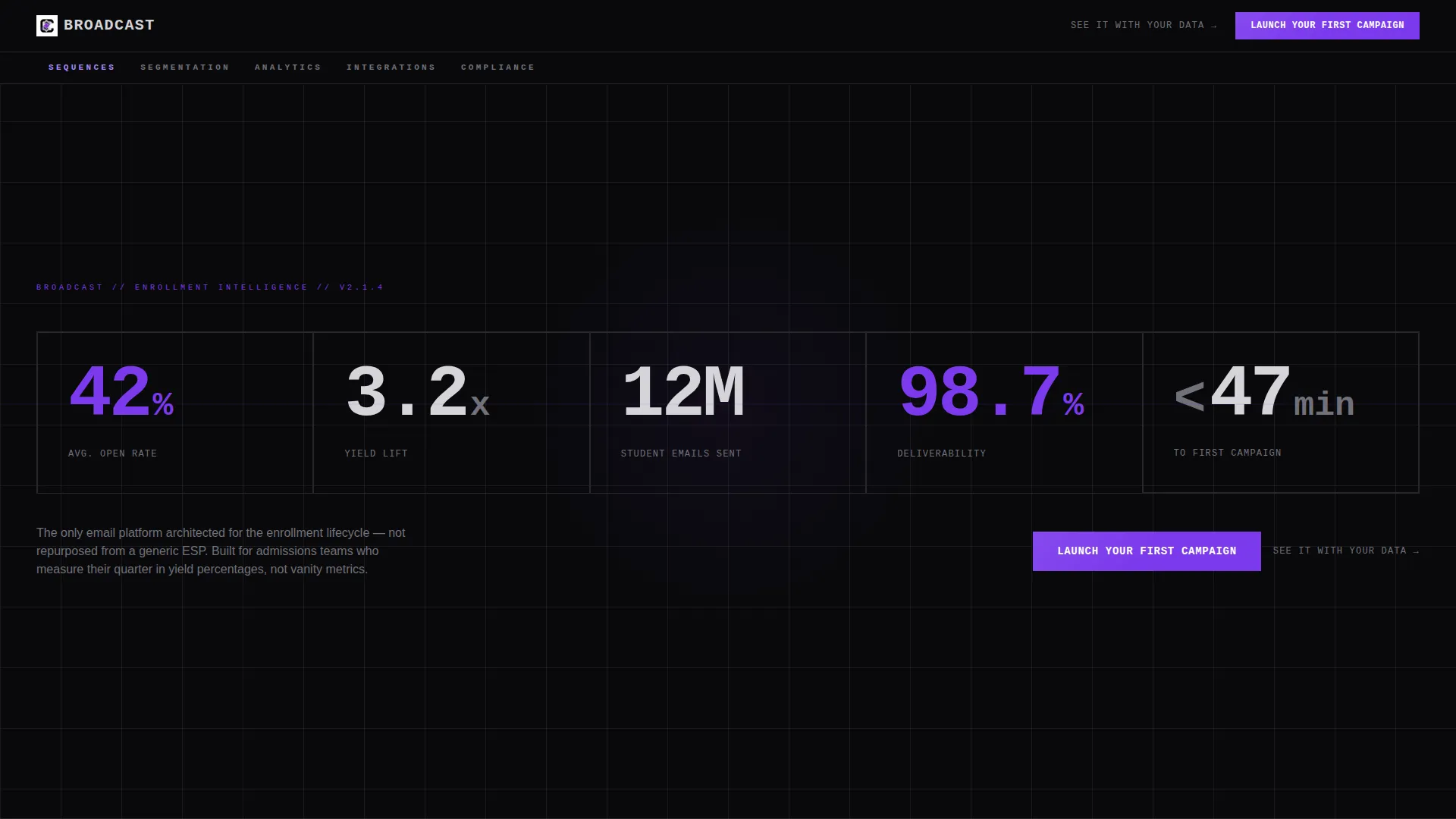
- A full-viewport stats wall header with five oversized live-counter-style metrics in monospace type
- Five anchor-nav feature matrix spokes covering sequences, segmentation, analytics, integrations, and compliance
- A persistent floating call-to-action bar that appears after the second scroll, plus a violet call to action button at the bottom of every spoke section
Feature list
This landing page template is built around components that work together to move an analytical, data-driven buyer from skepticism to signup.
Full-Viewport Stats Wall Header
Five live-counter-style numbers fill the opening screen in oversized monospace type. Metrics include average open rate, yield lift, total student emails sent, deliverability rate, and time to first campaign. Numbers animate with hard-cut brutalist transitions, no easing or fading.
Pinned Anchor Navigation Bar
A single violet-highlighted navigation bar pins to the top of the page. Five anchor links map directly to the five feature matrix sections: Sequences, Segmentation, Analytics, Integrations, and Compliance. Active nav states use electric violet to show position on scroll.
Education-Specific Feature Matrix Sections
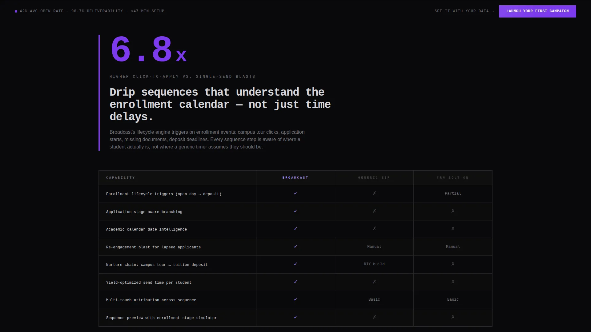
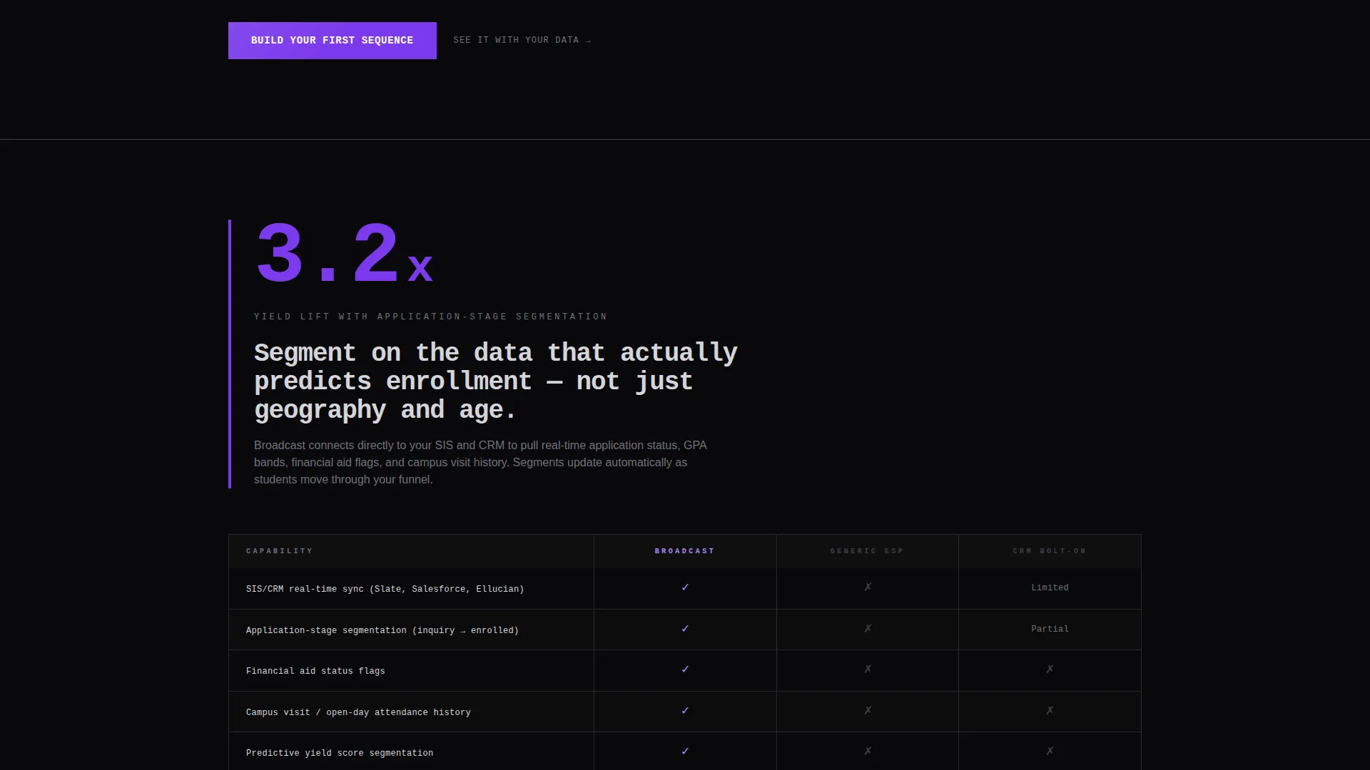
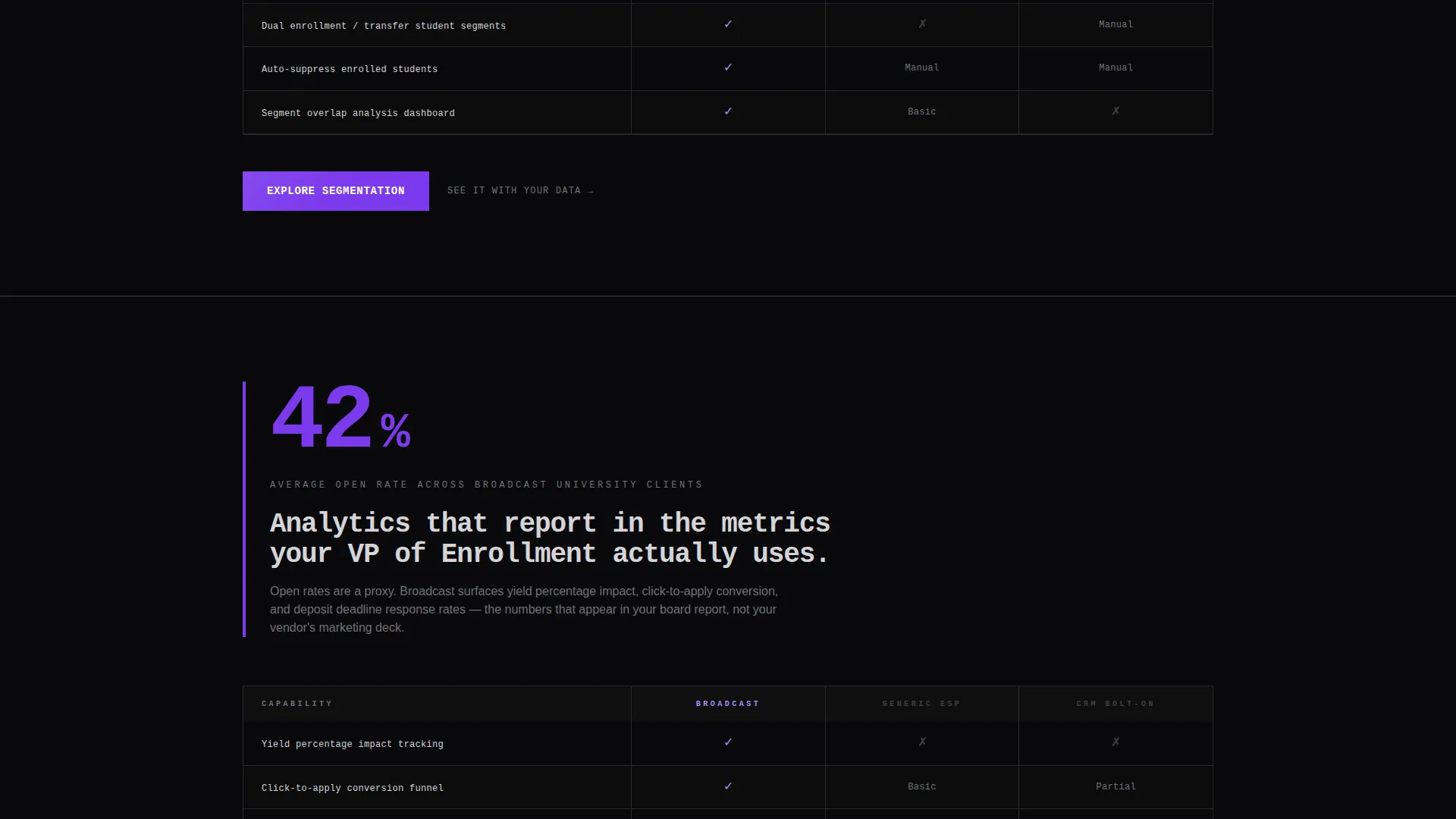
Each spoke section opens with one oversized violet metric, then drops into a dense comparison grid. Matrix rows cover education-specific capabilities such as enrollment lifecycle triggers, FERPA-compliant data handling, student information system and customer relationship management sync, and application-stage segmentation. Competitor categories compared include generic email service providers, customer relationship management tools with bolt-on email, and manual send workflows.
Persistent Floating Call-to-Action Bar
After the visitor scrolls past the second section, a floating bar locks to the bottom of the viewport. It carries the primary call-to-action: "Launch Your First Campaign." This keeps the trial signup destination visible at all times without interrupting the content scan.
Dual Call-to-Action Architecture
Every spoke section ends with a heavy violet primary button linking to the free trial signup. A secondary text link, "See it with your data," sits alongside it and routes enterprise leads to a personalized demo booking. The two-path system captures both self-serve and high-touch buyer types.
Bold Brutalist Visual Rhythm
The page uses a strict number-then-proof rhythm throughout. Each spoke section leads with a metric, follows with the matrix, and closes with the call to action. This brutalist drumbeat creates a reading pattern that rewards the analytical buyer scanning for evidence, not narrative.
Page sections overview
| Section | Purpose |
|---|---|
| Stats Wall Header | Opens with five oversized live-counter metrics to establish platform credibility immediately |
| Anchor Nav Bar | Pins to the top and links to all five feature matrix spokes for fast navigation |
| Sequences Spoke | Covers drip sequences, open-day signup flows, and re-engagement automation capabilities |
| Segmentation Spoke | Details application-stage segmentation and enrollment lifecycle trigger logic |
| Analytics Spoke | Presents open rate, click-to-apply, and yield tracking as competitive proof points |
| Integrations Spoke | Covers student information system and customer relationship management sync capabilities |
| Compliance Spoke | Addresses FERPA-compliant data handling compared against generic email service providers |
| Persistent call to action Bar | Floats after second scroll to keep trial signup visible throughout the session |
| Spoke call to action Blocks | Closes each section with primary trial button and secondary demo booking text link |
Design & branding system
The template uses a Void and Violet color system built around absolute void black, electric violet, deep ultraviolet, and exposed concrete gray. Black dominates every background. Violet appears only where the eye must go: buttons, metric highlights, and active navigation states.
- Typography is thick monospace, slammed edge-to-edge with no padding, giving headings a raw industrial weight
- Structural dividers use concrete gray to separate sections without softening the overall visual tone
- Animation style is hard-cut brutalist, no easing or fading, delivering transitions that feel like a departures board flipping
Mobile & speed optimization
The template is structured for clean rendering across screen sizes, with the hub-and-spoke layout and pinned nav designed to remain functional on smaller viewports. The brutalist grid and monospace type system are inherently lightweight because they rely on typography and color rather than images or illustrations.
- No hero images or illustrations in the template means fewer heavy asset loads on mobile
- The floating call to action bar is designed to stay visible and accessible across viewport heights
- Dense matrix sections are structured as grids that can reflow for narrower screens without losing readability
How this template helps you convert
This template is purpose-built for a single conversion goal: getting an analytical buyer to click through to a free trial signup. Every structural decision on the page supports that outcome.
- The stats wall opens with five hard numbers that immediately establish platform credibility before a single word of marketing copy appears, so the buyer enters the feature sections already leaning toward trust.
- The feature matrix spokes stack education-specific proof in a rhythm of metric, evidence, and call-to-action that keeps the analytical buyer moving forward without needing to be persuaded through storytelling.
- The dual call-to-action system captures both self-serve buyers ready to start a trial and enterprise leads who want a personalized demo, so no qualified visitor leaves without a clear next step.
Other information about this template
This template fits naturally into a broader education email marketing stack where teams evaluate platforms on deliverability, automation depth, and compliance posture before signing up. It is designed for buyers who already understand the category and need technical proof, not an introduction.
- The template style is Hub and Spoke with Anchor Navigation, making it well-suited for platforms with multiple distinct capability areas to present
- The Bold Brutalist theme and Void and Violet palette make this template visually distinctive in a category where most landing pages default to soft gradients and lifestyle photography
- The page works as a standalone pre-trial landing page and can be paired with a separate free trial signup page and a demo booking page as downstream destinations
- Teams evaluating education email marketing platforms often compare tools on FERPA compliance, student information system integrations, and enrollment lifecycle automation depth, and this template surfaces all three areas in dedicated matrix sections
Theme
Bold Brutalist
Creative direction
Feature Matrix
Color system
Void & Violet
Style
Hub & Spoke (Anchor Nav)
Direction
Click-Through
Page Sections
Full-viewport Stats Wall Header
Pinned Anchor Navigation Bar
Education-specific Feature Matrix
Persistent Floating Call to Action Bar
Dual Call-to-action Architecture
Brutalist Number-proof Rhythm
Related questions
Does this template include a signup form?
Can I customize the five metrics in the stats wall header?
Is this template suitable for a B2B education software audience?
How does the dual call-to-action system work?
What makes this template different from a general SaaS landing page template?



