Timber & Forestry Management Software Landing Page
Canopy is a split-screen landing page template built for timber and forestry management software. It pairs a dark, map-driven interactive header with a Problem-to-Solution scroll arc, guiding timberland managers, family woodland owners, and logging contractors toward a progressive lead-capture form. The Carbon Fiber color system and cruiser-orange accents give the page a tool-grade, field-ready feel.
by Rocket studio
Quick summary
Canopy is a single-page, split-screen (50/50) lead generation template designed for timber and forestry management software. It opens with an interactive map preview, walks visitors through three escalating problem-solution pairs, and closes with a progressive lead form. The dark Carbon Fiber palette and cruiser-orange accents make every call to action feel urgent and deliberate.
Who this template is for
This template is built for teams and founders marketing vertical software to forestry professionals. It matches well whether your audience is enterprise or independent.
- Timberland investment management organizations tracking portfolio parcels across multiple states
- Family woodland owners navigating cost-share and reforestation programs for the first time
- Logging contractors who need accurate timber cruise data before committing equipment to a site
What problem this template solves
Forestry software is hard to sell with a generic technology template. Buyers are practical, skeptical, and field-oriented. They need to see the product solving real problems before they hand over their contact details.
- Fragmented inventory data spread across spreadsheets and paper cruise reports loses buyer confidence fast
- Missed harvest windows and regulatory violations signal hidden revenue risk that generic templates never address
- A poorly sequenced page asks for information before earning trust, causing high drop-off rates
What you get with this template
You get a fully structured, single-page lead generation layout built around the specific workflow language of timber and forestry management. Every section is purposeful and sequenced.
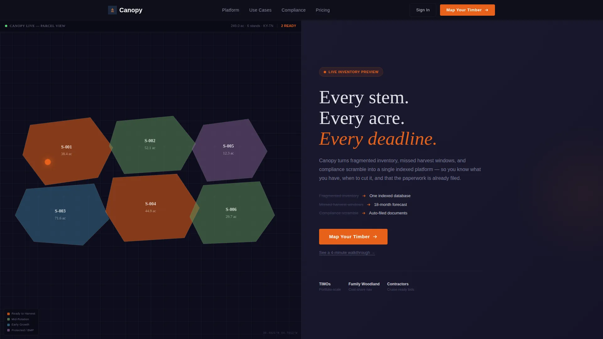
- A 50/50 split-screen header with an animated map panel and a headline-plus-call to action panel
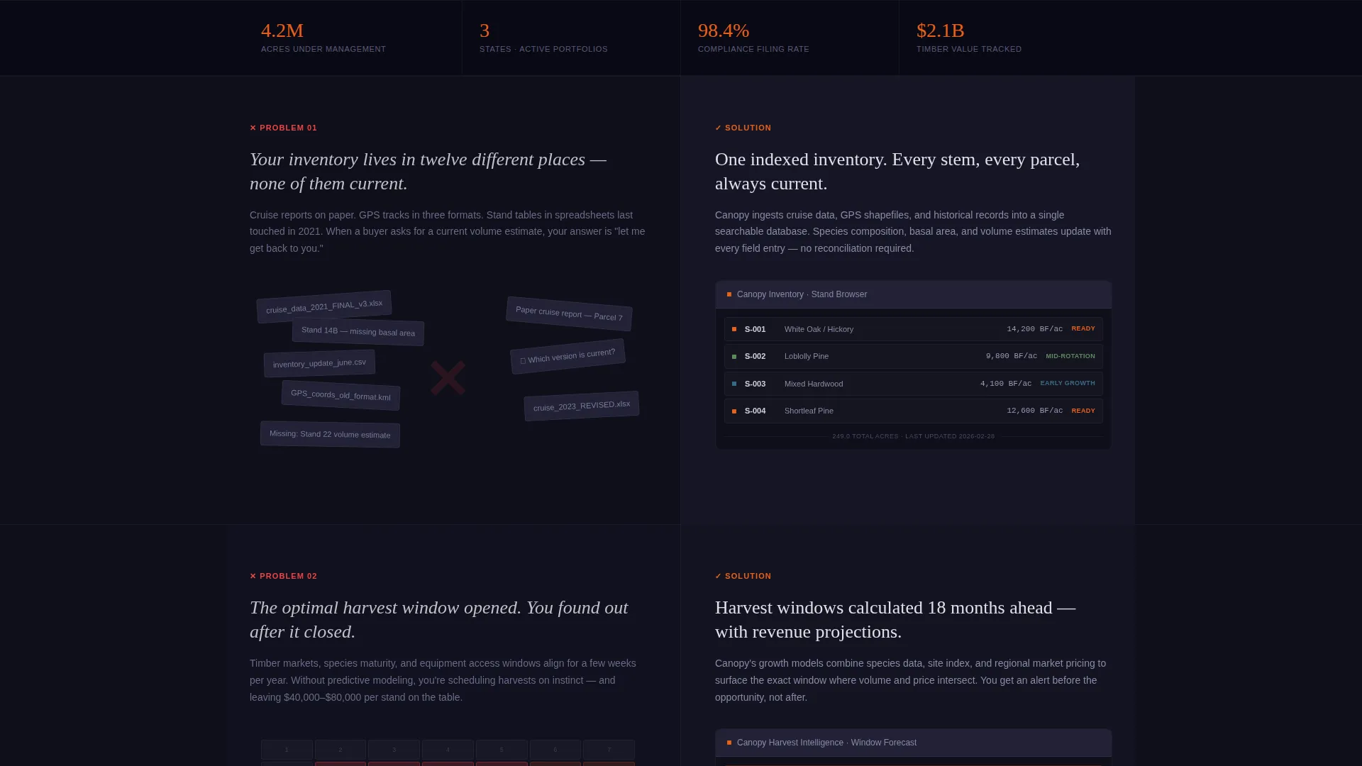
- Three Problem-to-Solution scroll sections that escalate stakes and resolve each tension with a user interface fragment
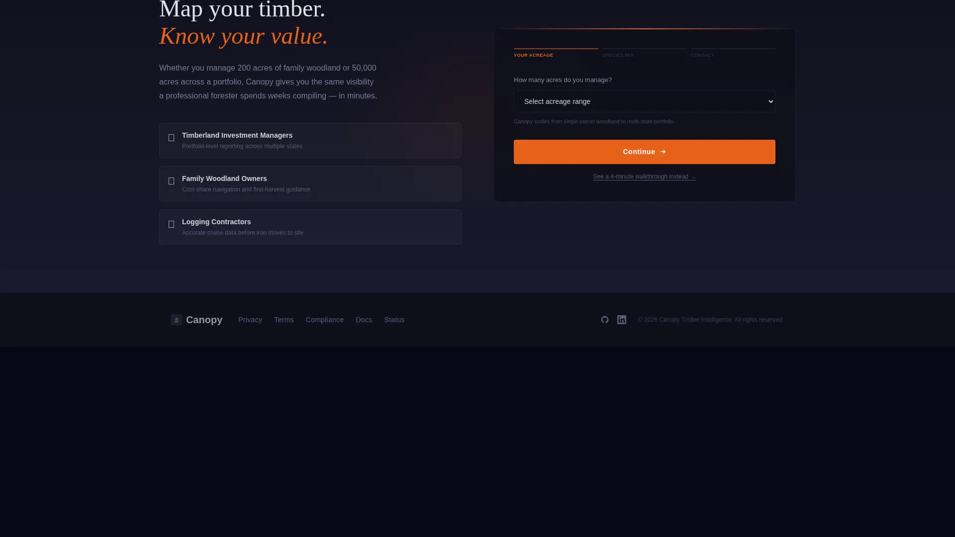
- A progressive three-field lead form anchored at the header and repeated in a full-width closing section
Feature list
This template ships with six purpose-built layout components, each grounded in the source brief.
Interactive Split-Screen Header
The header divides the viewport into two equal halves. The left side displays a dark-themed map interface showing timber stand polygons color-coded by species composition and harvest readiness. Polygon tooltips surface basal area, volume estimates, and BMP (Best Management Practice) status. The right side holds a silvered-type headline, a three-problem subline, and a glowing orange primary call to action button.
Animated Map Panel
The left map panel is not a static screenshot. Polygons pulse subtly on hover, giving the impression of a live, interactive inventory system. A slow cursor pan across parcels keeps the panel visually active without distracting from the right-side message.
Problem-to-Solution Scroll Arc
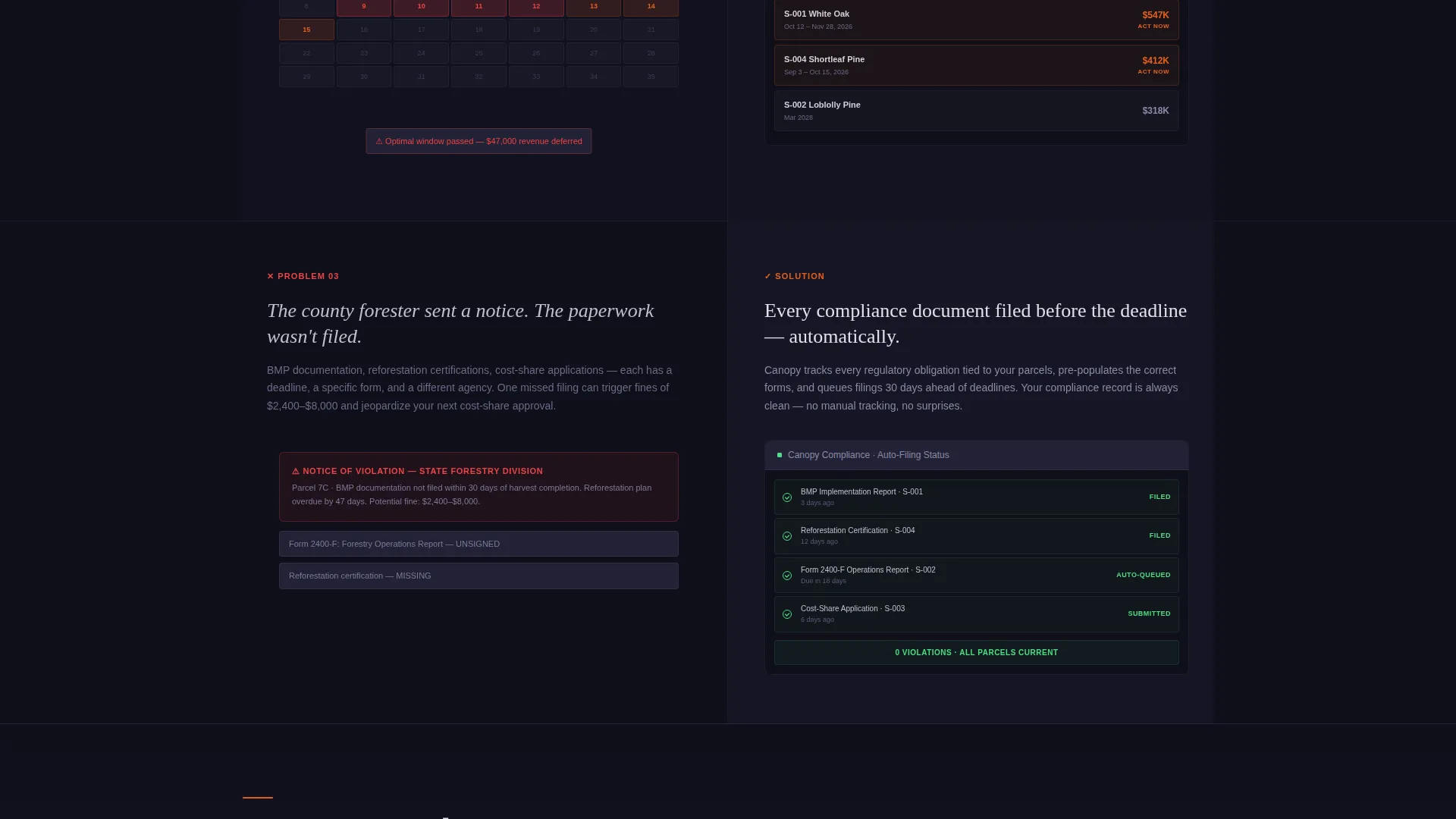
Three full-screen scroll sections follow the header. Each section places a stark problem illustration on the left (scattered spreadsheets, a missed reforestation deadline, a regulatory violation notice) and a clean product user interface fragment on the right. The rhythm is consistent: tension left, resolution right, repeated three times to build trust progressively.
Progressive Lead Capture Form
The lead form uses three sequential fields. The first field is a dropdown for total managed acres (ranging from under 500 to 50,000 and above). The second captures primary species mix (hardwood, softwood, or mixed). The third collects name and email. This staged approach lowers the perceived commitment of each step.
Dual call to action Anchoring
The primary call to action, labeled "Map Your Timber," appears at the header and again after the arc resolves in a final full-width section. A secondary text link beneath the button reads "See a 4-minute walkthrough," offering an email-gated softer conversion path for visitors not yet ready to commit.
Carbon Fiber Visual System
The color system uses a deep charcoal base, a machine-black sidebar, silvered aluminum text, and a high-visibility cruiser-orange accent. Orange fires only on interactive elements: buttons, toggles, and active-state indicators. The result is a tool-grade visual density that communicates software built for serious field operations.
Page sections overview
| Section | Purpose |
|---|---|
| Split-Screen Header | Launch map preview and primary headline with call to action |
| Problem Panel One | Show fragmented inventory data as the first pain point |
| Solution Panel One | Reveal indexed, searchable inventory user interface fragment |
| Problem Panel Two | Show revenue lost to mistimed harvest windows |
| Solution Panel Two | Display harvest window calculation feature screen |
| Problem Panel Three | Present regulatory violation notice as peak stakes |
| Solution Panel Three | Resolve with compliance document filing user interface fragment |
| Final call to action Section | Repeat "Map Your Timber" form in full-width closing block |
Design & branding system
The visual identity follows a Directory and Discovery theme executed through the Carbon Fiber color system. Every surface decision reinforces a field-tool aesthetic rather than a generic software look.
- Base palette: deep charcoal (#1A1A2E) backgrounds, machine-black (#0F0F1A) sidebar, silvered aluminum (#D0D0D8) body text
- Accent system: cruiser-orange (#E8611A) reserved exclusively for buttons, toggles, and active-state indicators to maximize call to action contrast
- Overall feel: the dashboard of a modern harvester cab at dawn, with matte dark surfaces and orange light catching only the elements that demand action
Mobile & speed optimization
The split-screen layout is designed with responsive stacking in mind. On smaller screens, the 50/50 panels reflow into single-column sections so the problem-solution arc reads naturally top to bottom.
- Map panel and headline panel stack vertically on mobile, preserving the visual hierarchy of each section
- The progressive form fields remain touch-friendly and clearly spaced across all viewport sizes
- Animated polygon pulses are scoped to the map panel only, keeping visual motion contained and purposeful
How this template helps you convert
The page earns every conversion step rather than demanding it upfront. The structure is built around progressive trust-building before any information request.
- The interactive map panel signals product credibility immediately, letting the user interface do the selling before any headline makes a claim
- Each Problem-to-Solution section resolves a specific forestry pain point with a product screen, so the visitor arrives at the form already convinced
- The two-path call to action system (primary form plus the walkthrough video link) captures both ready buyers and early-stage researchers in a single page layout
Other information about this template
This template is categorized under Technology, specifically within the Timber and Forestry Vertical SaaS subcategory. It is well-suited for any forestry software platform targeting professional land and timber management use cases.
- The template style is Split Screen (50/50), making it visually distinctive in a category where most competitors use standard single-column layouts
- The lead generation direction means no pricing is surfaced on the page; the form and the walkthrough link handle all conversion paths
- The page is built around the Directory and Discovery theme, meaning the map-as-inventory metaphor is central to the layout logic
- The Problem-to-Solution Arc creative direction means content sequence directly mirrors the buyer's mental journey from pain recognition to solution trust
Theme
Directory & Discovery
Creative direction
Problem→Solution Arc
Color system
Carbon Fiber
Style
Split Screen (50/50)
Direction
Lead Generation
Page Sections
Interactive Split-screen Header
Animated Timber Map Panel
Problem-to-solution Scroll Arc
Progressive Lead Capture Form
Dual Call to Action Path System
Carbon Fiber Color System
Related questions
Who is this landing page template designed for?
Does this template include real map data or GIS integrations?
Can I change the lead form fields to match my own qualification questions?
What makes this template different from a generic SaaS landing page?
Is the secondary walkthrough link included in the template?



