Digital Menu Platform Landing Page Template
Carte is a dark-mode dashboard landing page built for food and beverage operators who need a digital menu platform that updates in real time. It features an interactive tab switcher header, a tiered feature matrix with hover micro-animations, and a freemium signup flow. The design runs on a Void and Violet color system that feels like a lit-up cocktail bar screen.
by Rocket studio
Quick summary
Carte is a single-page dashboard landing page template built for digital menu platforms serving restaurants, bars, breweries, and multi-unit food and beverage operators. It pairs a Feature Tab Switcher header with a scrollable Feature Matrix, all rendered in a deep dark-mode aesthetic. The page is wired for freemium conversion with a low-friction signup form and a live demo path.
Who this template is for
This template is built for founders, product teams, and marketers launching or promoting a digital menu platform. It speaks directly to the operators who will use the product every day.
- Restaurant general managers who update specials from a phone before service
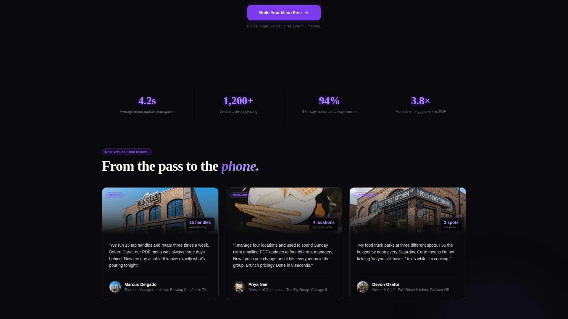
- Taproom managers rotating tap handles weekly and needing instant menu changes
- Multi-unit operators who need every location's pricing synced without manual effort
What problem this template solves
Food and beverage businesses still rely on laminated menus, outdated PDF links, and static printouts that go wrong the moment a dish sells out or a price changes. This template addresses that gap head-on.
- Visitors immediately see a live, editable menu grid instead of reading about one
- The interactive header lets people experience the platform's core features before scrolling
- The tiered feature matrix removes pricing confusion and reduces back-and-forth questions
What you get with this template
You get a fully structured landing page built around a dashboard and data grid visual style. Every section is purpose-built to convert food and beverage operators into free signups.
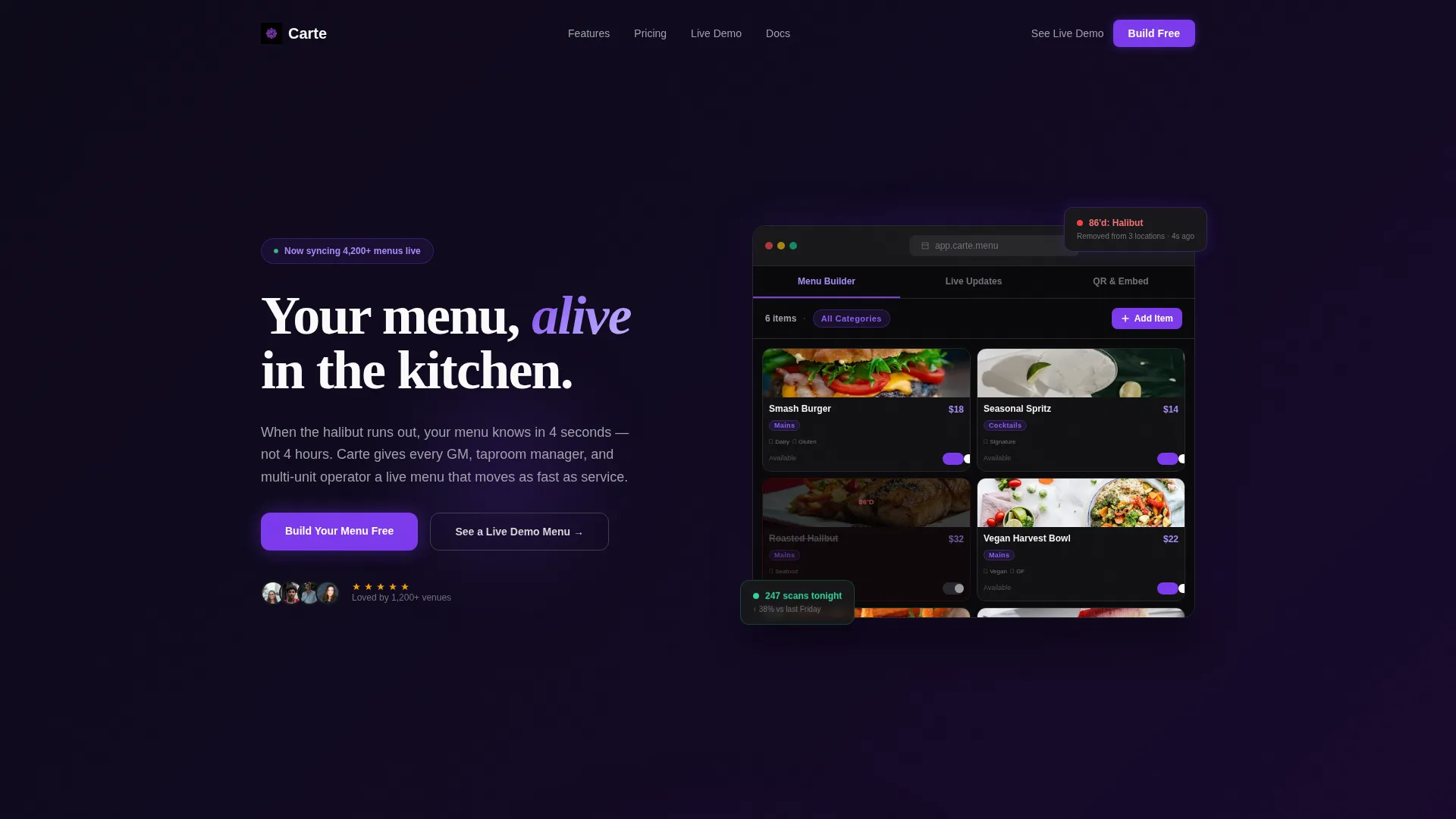
- A Feature Tab Switcher header with three tabs: Menu Builder, Live Updates, and QR and Embed
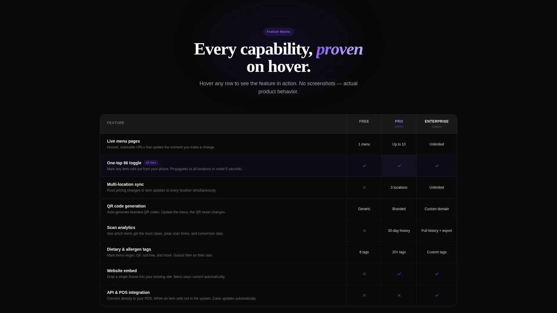
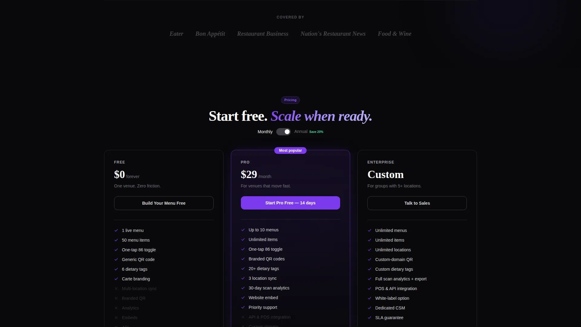
- A feature matrix grid comparing Free, Pro, and Enterprise tiers with hover micro-animations
- A two-step freemium signup form and a secondary "See a Live Demo Menu" conversion path
Feature list
This template ships with a tightly scoped set of interactive components and layout patterns, each grounded in the brief's stated functionality.
Interactive Feature Tab Switcher
The header sits inside a browser-frame mockup. Three tabs labeled Menu Builder, Live Updates, and QR and Embed are clickable. Each tab swaps the dashboard view below it instantly, showing the platform in action before the visitor reads a single sentence.
Live Menu Item Grid
The default tab state renders a dark-mode grid of menu items. A craft burger at $18, a seasonal spritz at $14, and a vegan bowl with dietary icons are displayed with violet category pills and visible drag handles. The grid makes the product feel tangible and ready to use.
Hover-Activated Feature Matrix
The feature matrix is the page's main scroll section. Each row represents a capability compared across Free, Pro, and Enterprise tiers. Hovering a row triggers a micro-animation showing the feature in action, such as the real-time 86 toggle flipping an item to sold out or a QR code generating with a branded color ring.
Two-Step Freemium Signup Form
The primary call to action is "Build Your Menu Free." The form starts with just an email address and restaurant name. After clicking, it expands to collect venue type and number of locations, keeping friction low at the first step and gathering useful data at the second.
Secondary Demo Conversion Path
A second call to action labeled "See a Live Demo Menu" links to a functioning sample menu. Skeptical visitors can experience the platform as a diner would before committing. This path runs alongside the primary signup flow without competing with it.
Pinned Navigation Call to Action
The primary "Build Your Menu Free" call to action is pinned in the header navigation bar. It stays visible as the visitor scrolls through the feature matrix, keeping the conversion moment within reach at all times.
Page sections overview
| Section | Purpose |
|---|---|
| Pinned Header Nav | Anchors primary call to action and tab switcher across scroll |
| Feature Tab Switcher | Shows Menu Builder, Live Updates, QR and Embed tabs |
| Live Menu Grid | Demonstrates real menu items in dark-mode dashboard |
| Feature Matrix Grid | Compares Free, Pro, Enterprise with hover animations |
| Freemium Signup Form | Captures email and restaurant name in two steps |
| Demo Menu call to action | Directs skeptics to a live working sample menu |
| Bottom Matrix call to action | Repeats "Build Your Menu Free" at end of scroll |
Design & branding system
The visual identity follows a Directory and Discovery theme rendered through a Void and Violet color system. The palette creates a dark-stage effect where every interactive element glows with purpose.
- Background stays in true void black (#09090B) with deep ultraviolet (#2D1B69) supporting dark surfaces
- Cards float on faint violet-edged borders, and active states use electric violet (#7C3AED) for highlights and hover pulses
- Text and card surfaces use cool zinc white (#FAFAFA), keeping content sharp and readable against the dark backdrop
Mobile & speed optimization
The template is designed with the thumb-first interactions that restaurant operators rely on during busy service. The layout adapts to smaller screens without losing the dashboard feel.
- The tab switcher and menu grid are structured for touch interaction, with elements positioned where a thumb naturally lands
- The feature matrix collapses cleanly for narrow viewports so tier comparisons remain scannable
- The pinned navigation call to action stays fixed on mobile, keeping the signup moment accessible throughout the scroll
How this template helps you convert
The page removes hesitation at every stage of the visitor's scroll. Conversion is built into the structure, not bolted on at the end.
- The interactive header lets visitors click through core features inside a browser mockup before reading any body copy, building confidence through direct experience
- The hover-animated feature matrix turns every tier comparison row into a mini product demo, making capabilities concrete rather than abstract
- The two-step signup form and the live demo path give both action-ready and research-mode visitors a clear next step that matches their mindset
Other information about this template
This template is categorized under Technology and sits at the intersection of Food and Beverage Digital Presence. It is built on a Dashboard and Data Grid template style with a Feature Matrix creative direction and a Feature Tab Switcher header concept. The freemium and trial landing page direction means the design is optimized to lower the barrier to a first signup rather than push for an immediate paid commitment. The dark-mode aesthetic is intentional and consistent throughout, borrowing visual language from modern point-of-sale terminals and cocktail bar environments to feel native to the food and beverage industry.
- The template style is Dashboard and Data Grid, matching the data-rich nature of menu management tools
- The landing page direction is Freemium and Trial, so every layout choice prioritizes low-friction first engagement
- The Directory and Discovery theme makes the feature matrix feel like a product catalogue rather than a sales pitch
Theme
Directory & Discovery
Creative direction
Feature Matrix
Color system
Void & Violet
Style
Dashboard/Data Grid
Direction
Freemium/Trial
Page Sections
Feature Tab Switcher Header
Dark-mode Live Menu Grid
Hover-animated Feature Matrix
Two-step Freemium Signup Form
Pinned Navigation Call to Action
Secondary Demo Menu Path
Related questions
Who is this landing page template designed for?
What makes the header different from a standard hero section?
Can I use this template for a freemium product launch?
How does the feature matrix section work?
What is the See a Live Demo Menu path for?



