Retail Loss Prevention Landing Page Template
Casework is a Bold Brutalist landing page template built for retail loss prevention platforms. It opens with a wall of animated stat blocks, then flows through a modular card grid that stacks industry data, product features, and proof points. The result is a high-impact single page that makes the case for your platform before visitors ever reach the call-to-action.
by Rocket studio
Quick summary
Casework is a single-page landing page template designed for retail case management platforms. It leads with five oversized animated metric counters, then builds a modular card grid that moves from industry problem data through product features to proof and conversion. The Bold Brutalist visual system makes the numbers the centerpiece, and every section pushes toward one clear action: deploy the platform.
Who this template is for
This template was built for teams selling or launching retail loss prevention software. If your platform turns shoplifting incidents, employee disputes, and inventory discrepancies into structured, trackable cases, this page speaks directly to your buyers.
- Regional loss prevention managers overseeing dozens of store locations from a single desk
- District supervisors and corporate risk directors who need documented, prosecution-ready case files
- Product and marketing teams launching a retail case management platform to an enterprise audience
What problem this template solves
Loss prevention platforms are hard to sell on a static page. The value lives in the speed of response, the volume of cases closed, and the documentation quality when a case goes to prosecution. A generic template cannot carry that weight.
- Visitors leave before understanding the platform's scale and impact without immediate, credible data
- Soft lifestyle visuals undermine trust with operational buyers who expect hard metrics and command-center clarity
- Fragmented layout makes it difficult to move a buyer from problem awareness to confident action in a single scroll
What you get with this template
You get a complete, ready-to-customize landing page built around a stats-first narrative structure. Every section is pre-wired to a specific job, from shock-value metrics at the top to dual-button conversion at the bottom.
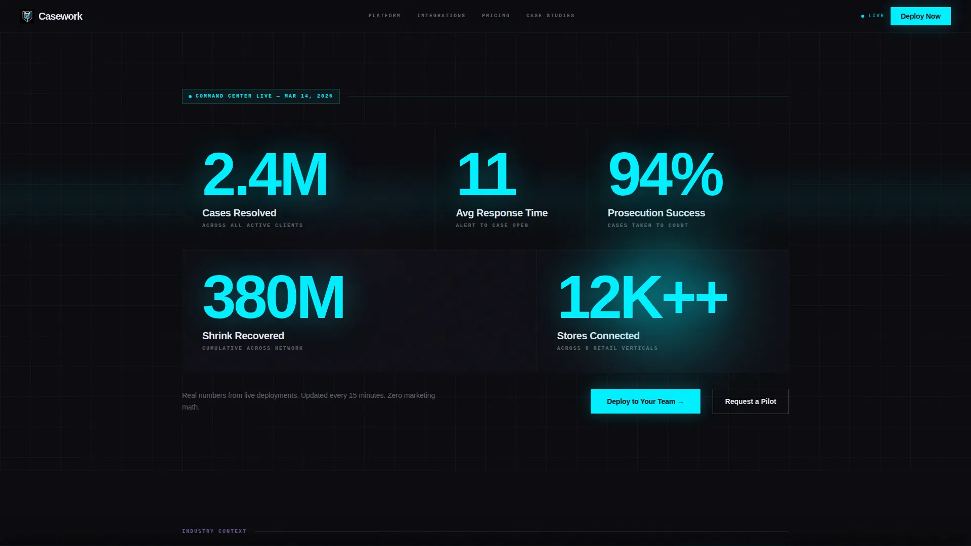
- A five-counter animated header grid with figures like "2.4M Cases Resolved" and "94% Prosecution Success Rate" set at 120-pixel-plus scale
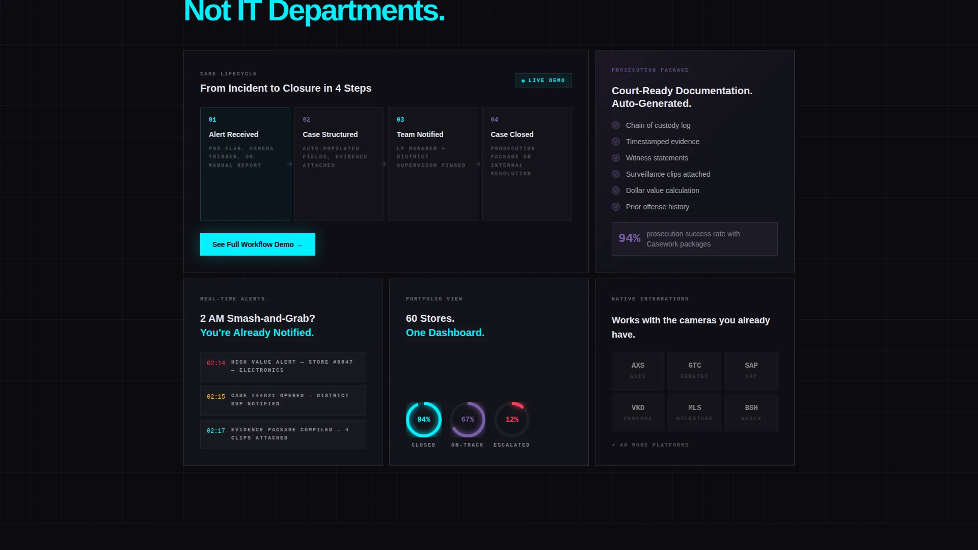
- A modular card grid with variable sizing: double-wide workflow demo cards, tall testimonial singles, and small integration logo squares
- A floating "Deploy to Your Team" call-to-action bar, inline feature card calls to action, and a full-width end block with dual App Store and Google Play buttons
Feature list
This template is built around specific structural and visual capabilities drawn directly from the design brief.
Animated Stats Header Wall
Five brutalist stat blocks sit in an asymmetric grid and animate their counters upward on page load. Numbers are set at 120 pixels or larger in electric cyan, with holographic violet unit labels beneath each figure. The composition is deliberately dense and data-forward.
Modular Card Grid Layout
Cards sit on a void black field like surveillance feeds. The grid supports variable card sizes: double-wide panels for case workflow demonstrations, tall vertical cards for director testimonials, and compact squares for integration partner logos. Each card carries an iridescent shimmer on hover.
Stats-First Content Rhythm
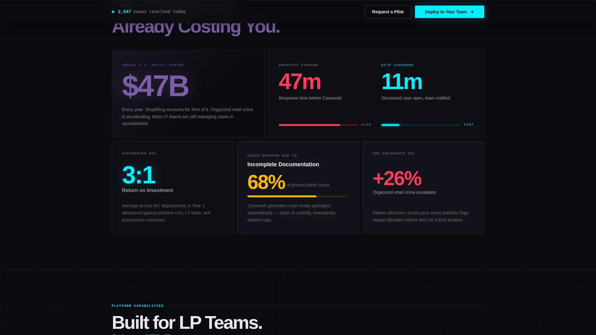
Every scroll depth opens with a metric before explaining it. A card displays "$47B" before revealing the annual retail shrink figure it represents. Another pulses "3:1 ROI" before expanding into a case study. The sequence builds like a prosecution, stacking evidence until the conclusion is inevitable.
Multi-Path Conversion System
The primary call-to-action, "Deploy to Your Team," appears in three distinct placements: a floating bottom bar after the header stats, inline inside feature cards, and as a full-width brutalist block at the page end with dual app download buttons. A secondary "Request a Pilot" path surfaces a short form for enterprise buyers requiring procurement approval.
Store-Format Dashboard Row
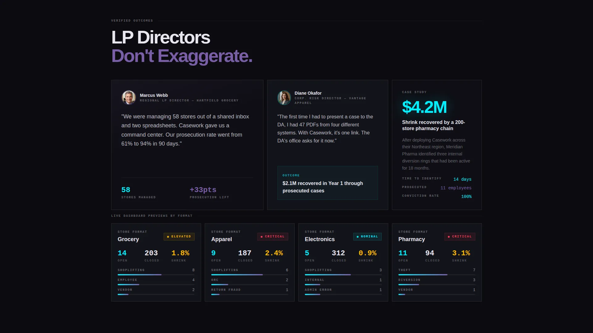
The final card row features one card per retail format, including grocery, apparel, electronics, and pharmacy. Each card displays its own live dashboard preview, grounding the platform's versatility in recognizable operational contexts.
Bold Brutalist Visual Identity
The design system uses void black as the dominant background, electric cyan for live metric counters and progress rings, holographic violet for active state cards and data highlights, and shifting pearl white for typography and card borders. The palette suggests machine intelligence running at full capacity.
Page sections overview
| Section | Purpose |
|---|---|
| Animated Stats Header | Opens with five oversized metric counters to establish immediate credibility |
| Industry Problem Cards | Frames the $47B retail shrink crisis before introducing the solution |
| Product Feature Cards | Demonstrates core platform capabilities through data-led card modules |
| ROI Proof Cards | Presents case study figures like "3:1 ROI" to validate platform value |
| Floating call to action Bar | Keeps "Deploy to Your Team" visible after the header without interrupting scroll |
| Store Format Row | Shows live dashboard previews across grocery, apparel, electronics, and pharmacy |
| Enterprise Pilot Form | Captures procurement-stage buyers with a short store count and work email form |
| Full-Width call to action Block | Closes the page with dual App Store and Google Play download buttons |
Design & branding system
The visual identity is built on a Bold Brutalist framework powered by an AI Iridescent color system. Every choice reinforces the command-center atmosphere described in the brief: synthetic, relentlessly awake, and grounded in operational urgency.
- Core palette: void black (#0B0B0F) background, electric cyan (#00F0FF) for counters and progress rings, holographic violet (#7B5EA7) for active cards and data highlights, and pearl white (#E8E6F0) for type and card borders
- Typography uses a heavy condensed typeface at headline scale, with stat figures rendered at 120 pixels or larger to make the data the dominant visual element
- Cards carry faint iridescent border shimmer on hover, blunt brutalist geometry paired with color that implies machine intelligence running underneath
Mobile & speed optimization
The modular grid adapts naturally to smaller screens because each card is a self-contained unit. The layout is designed for operational buyers who may check the page on a mobile device between store visits or during an overnight incident response.
- Variable card sizes restack cleanly on narrow viewports without losing the data-forward visual hierarchy
- The floating call to action bar remains accessible on mobile, keeping the primary conversion action within reach at all scroll depths
- Stat counters and progress rings are designed to perform visually at any screen size, maintaining impact on compact displays
How this template helps you convert
The stats-first structure is engineered to reduce buyer hesitation at every stage of the scroll. By the time a visitor reaches the final call to action block, the numbers have already made the argument.
- The animated header metrics establish credibility in the first viewport, before a visitor reads a single word of body copy, anchoring trust with figures like "$380M Shrink Recovered" and "12,000+ Stores Connected"
- The modular proof card sequence, moving from industry problem to ROI case study to store-format dashboard, mirrors the decision journey of an LP manager evaluating a platform under operational pressure
- The dual conversion paths, app download for ready buyers and pilot request for enterprise procurement, ensure no qualified visitor leaves without a clear next step
Other information about this template
This template is built specifically for the retail software category within the broader technology sector. It is designed for teams operating in the retail case management niche, where buyers respond to operational evidence over marketing language.
- The template style is a card grid with modular structure, meaning individual card blocks can be reordered, resized, or replaced to match a specific product narrative
- The creative direction is Stats-First Impact, a deliberate choice that puts quantitative proof ahead of descriptive copy throughout the entire page flow
- The header concept is a pure Stats and Metrics wall, with no hero image, no lifestyle photography, and no illustrative scenes
- The primary landing page direction targets app download conversion, with the secondary path designed for enterprise pilot requests that require internal procurement approval
- The color system is classified as AI Iridescent, a palette chosen to suggest synthetic intelligence and continuous operational awareness rather than conventional retail marketing aesthetics
Theme
Bold Brutalist
Creative direction
Stats-First Impact
Color system
AI Iridescent
Style
Card Grid (Modular)
Direction
App Download
Page Sections
Animated Stats Header Wall
Modular Card Grid Layout
Stats-first Content Rhythm
Multi-path Conversion System
Store-format Dashboard Row
Bold Brutalist Visual System
Related questions
Can I customize the stat figures and card content?
Is this template suited for a B2B software audience?
Does the page support both app download and enterprise sales paths?
How does the modular card grid work in practice?
What kind of businesses would use this landing page template?



