Food & Beverage Analytics Landing Page Template
Catalyst is a scroll-reveal landing page template built for food and beverage analytics platforms. It combines a live-feel dashboard header, interactive module reveals, and a two-step lead generation form into one high-converting page. The Tech Glass visual identity, deep black, glowing teal, and signal amber, creates an atmosphere that feels operational, precise, and unmistakably built for serious F&B operators.
by Rocket studio
Quick summary
Catalyst is a single-page, scroll-driven landing page template designed for food and beverage analytics platforms. It opens with a rendered dashboard preview, progressively reveals interactive product modules as visitors scroll, and closes with a dual-path conversion flow. The design uses a Tech Glass aesthetic to communicate operational clarity and professional-grade data tools.
Who this template is for
This template is built for teams selling data and analytics tools to food and beverage operators who live inside spreadsheets, point-of-sale systems, and supply chain reports. It speaks directly to the people managing real operational complexity, not hypothetical scale.
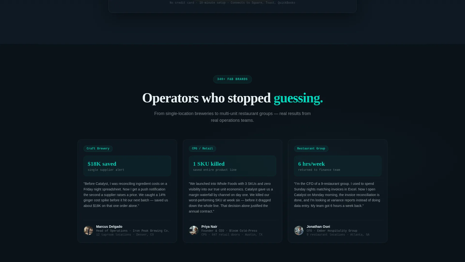
- Operations managers at multi-location craft brewery chains tracking inventory across twelve or more taprooms
- Consumer packaged goods founders monitoring margin bleed during a retail rollout at major grocery chains
- Restaurant group finance leads who still reconcile supplier invoices manually at the end of each shift
What problem this template solves
Food and beverage analytics platforms face a hard selling challenge. Buyers are skeptical, pressed for time, and already drowning in tools that promised clarity and delivered more complexity. A generic product page does nothing to break that pattern.
- Visitors cannot feel the value of a data platform by reading bullet points about it
- Decision-makers need to see their own operational pain reflected back at them before they trust a new tool
- Most landing pages for analytics software ask for commitment before proving anything
What you get with this template
You get a complete, production-ready landing page built around progressive disclosure, each scroll step earns the next. The page is structured to move a skeptical operator from curiosity to a completed lead form without friction.
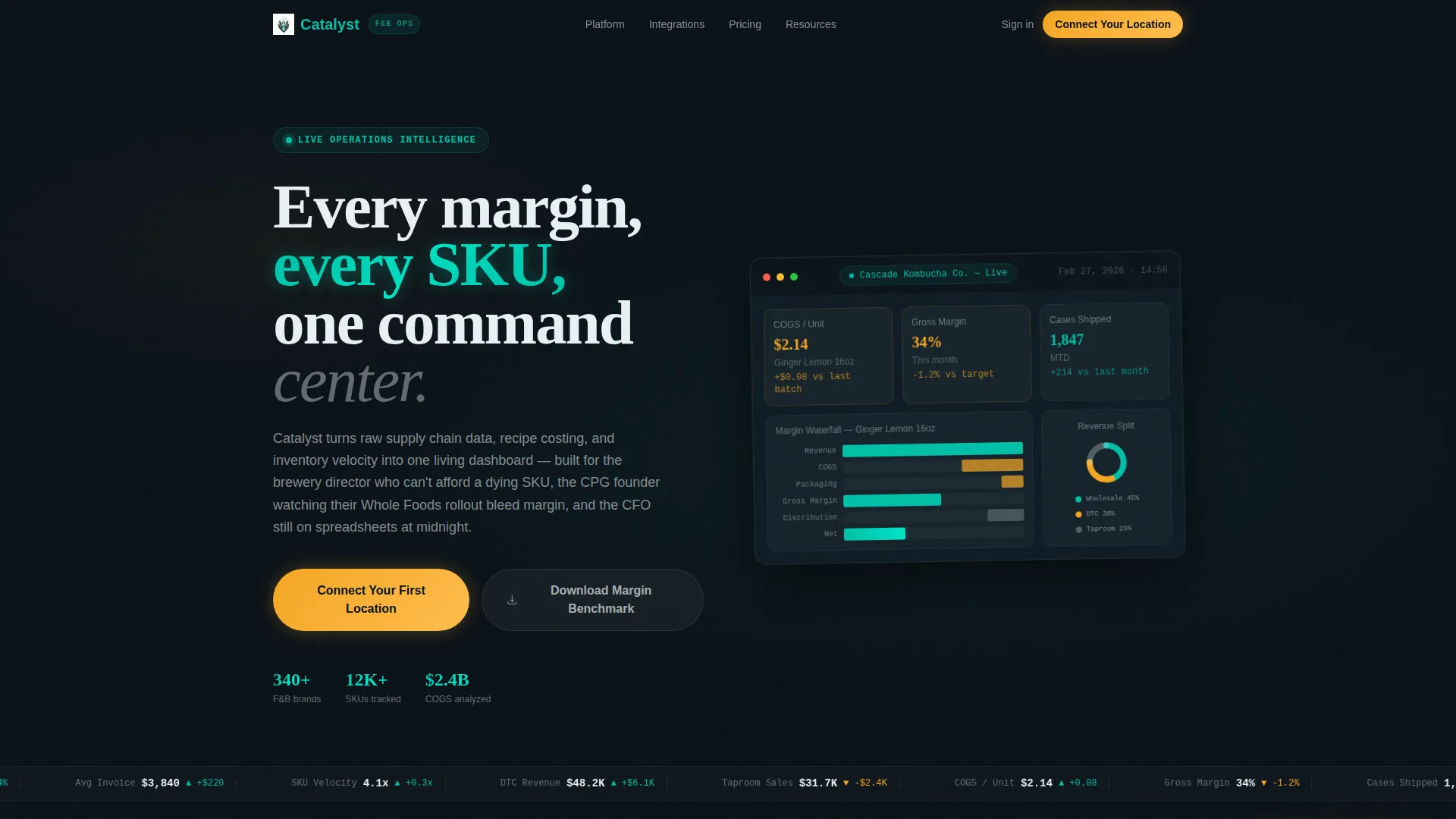
- A fully designed dashboard header with a margin waterfall chart, live ingredient cost tickers, and a revenue donut graph showing specific fictional data
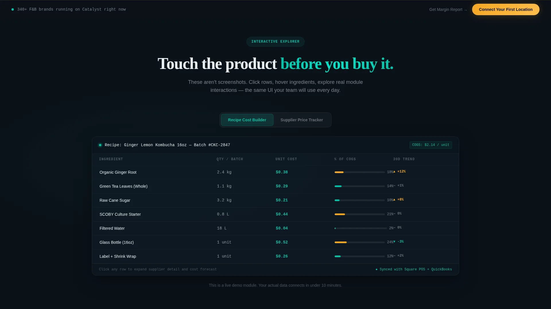
- Interactive section reveals for three product modules: recipe cost builder, supplier price tracker, and spoilage predictor
- A two-step progressive lead form and a secondary email capture path for visitors who are not yet ready to convert
Feature list
This section covers the core built-in capabilities that define what Catalyst delivers as a landing page template.
Animated Dashboard Header
The header opens with a fully rendered analytics interface floating on a dark background field. It displays a margin waterfall chart for a fictional kombucha line, live ingredient cost tickers, and a donut graph splitting revenue across wholesale, direct-to-consumer, and taproom channels. Specific numbers are embedded, $2.14 cost of goods sold per unit, 34% gross margin, 1,847 cases shipped, making the data feel real and immediately credible. A soft parallax drift gives the dashboard a physical, dimensional quality as the page loads.
Scroll Reveal Module Progression
Each scroll step progressively reveals a distinct dashboard module rather than presenting all features at once. The recipe cost builder, supplier price tracker, and spoilage predictor each appear in sequence as the visitor moves down the page. This structure escalates the narrative from "see your data" to "see what you are losing," building urgency with every new module revealed.
Interactive Module Responses
Every revealed module responds to hover and click interactions. Tooltips appear, table rows expand, and chart segments animate on engagement. Visitors experience a stripped-down version of the product's core behavior rather than reading a static description of it. This interactive exploration approach reduces cognitive distance between the page and the actual platform.
Spoilage Cost Calculator
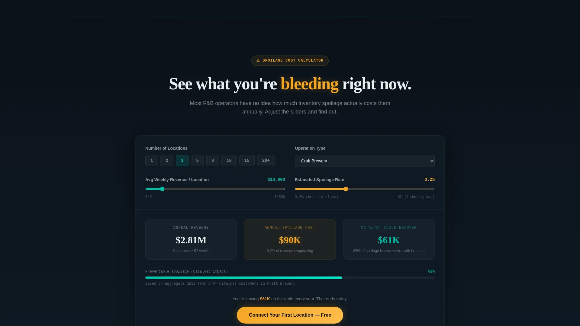
A spoilage cost calculator appears mid-page as a conversion moment. It makes invisible margin loss tangible by surfacing a number the visitor can relate to their own operation. The calculator is positioned immediately before the second primary call-to-action section, so the emotional impact of the result flows directly into the conversion prompt.
Two-Step Progressive Lead Form
The primary conversion element uses a staged form reveal. The first step asks only for company name and number of locations. The second step, revealed inline after the first is completed, asks for the visitor's current point-of-sale system and their biggest operational challenge via a dropdown menu. This two-step approach reduces upfront friction while collecting meaningful qualification data.
Dual Conversion Path Design
The page carries two conversion paths simultaneously. The primary call-to-action, "Connect Your First Location", appears first as a sticky bottom bar after the second scroll reveal, then again as a full-width section after the spoilage calculator. A secondary path offers a downloadable margin benchmark report, capturing email and audience segment in a single click for visitors who are not yet ready to commit to the primary form.
Page sections overview
| Section | Purpose |
|---|---|
| Dashboard Header | Opens with animated analytics preview and parallax drift |
| Sticky call to action Bar | Appears after second scroll reveal; drives primary conversion |
| Recipe Cost Builder | Interactive module reveal; shows ingredient-level cost data |
| Supplier Price Tracker | Scroll-revealed module; tracks supplier pricing changes |
| Spoilage Predictor | Interactive module showing inventory risk and waste signals |
| Spoilage Cost Calculator | Mid-page calculator making margin loss financially concrete |
| Primary call to action Section | Full-width conversion block after the calculator lands |
| Secondary Capture Path | Report download offer for visitors not ready for primary form |
Design & branding system
The Catalyst template uses a Tech Glass visual theme built around a Teal Catalyst color system. Every design decision reinforces the feeling of a live operational environment, backlit, precise, and always on.
- Deep operational black (#0B1219) forms the background, creating a commercial kitchen after-hours atmosphere where data surfaces feel illuminated
- Primary teal (#00BFA6) handles interactive states, active indicators, and key data labels, glowing the way a status light on a brewery fermenter would
- Frosted glass panel white (#E8F0F2) surfaces card backgrounds and data panels, giving layered depth to the interface components
- Signal amber (#F5A623) is reserved exclusively for alerts and conversion elements, including both call-to-action buttons and the sticky conversion bar
Mobile & speed optimization
The template is built with a scroll-reveal structure that adapts naturally to narrower viewports. Interactive elements are designed to remain usable and legible at mobile screen sizes without losing the layered visual identity.
- Module reveal animations and parallax effects are structured to degrade gracefully on smaller screens
- The two-step progressive form collapses cleanly into a single-column layout for mobile visitors
How this template helps you convert
Catalyst is built around a conversion architecture that earns commitment incrementally rather than demanding it upfront.
- The interactive scroll progression lets visitors use stripped-down product modules before they encounter any form, so their decision to convert is informed rather than speculative.
- The spoilage cost calculator creates a financially specific moment of urgency that directly precedes the full-width primary call-to-action section, tightening the link between pain and solution.
- The secondary report download path captures emails and audience segments from visitors who are not yet ready for the primary form, ensuring that hesitant buyers stay inside the funnel.
Other information about this template
Catalyst is categorized under Technology, with a subcategory focus on Food and Beverage Digital Presence. Its niche alignment is the Food and Beverage Landing Page segment, making it a purpose-built solution for platforms selling into craft beverage, restaurant group, and consumer packaged goods operations markets.
- The template style is Scroll Reveal (Progressive), meaning section reveals are tied to scroll depth rather than tab or page navigation
- The header concept is Dashboard Preview, designed to establish product credibility in the first viewport without requiring any visitor interaction
- The creative direction is Interactive Explorer, where engagement with the product interface is the primary mechanism for communicating value
- The landing page direction is Lead Generation, with every structural decision oriented toward capturing qualified operator contacts
Theme
Tech Glass
Creative direction
Interactive Explorer
Color system
Teal Catalyst
Style
Scroll Reveal (Progressive)
Direction
Lead Generation
Page Sections
Animated Dashboard Header with Live-feel Data
Progressive Scroll Reveal Architecture
Interactive Hover and Click Module Behavior
Mid-page Spoilage Cost Calculator
Two-step Progressive Lead Capture Form
Dual Conversion Path Layout
Related questions
Can I change the fictional data shown in the dashboard header?
Is the spoilage cost calculator functional out of the box?
Where does the primary call-to-action appear on the page?
Who is this landing page template designed for?
Does the template include the secondary report download conversion path?



