DevSecOps Training & Certification Landing Page
Certify is a scroll reveal landing page template built for DevSecOps training and certification platforms. It opens with a Feature Tab Switcher showing real lab workflows, then drives visitors toward a free first lab using a persistent call-to-action bar. The dark terminal aesthetic, teal interaction cues, and stats-first content rhythm make technical audiences trust the platform before they read a single headline.
by Rocket studio
Quick summary
Certify is a single-page landing page template for DevSecOps training and certification platforms. It combines a Feature Tab Switcher header, progressive scroll reveals, and a freemium call-to-action strategy. The design uses a deep terminal color palette to speak directly to engineers, AppSec leads, and security-conscious technical leaders.
Who this template is for
This template is built for teams and founders launching developer security training products. It speaks the language of people who live inside terminals and code reviews, not marketing decks.
- Mid-level engineers looking to move beyond passive compliance training and build real security skills through hands-on labs.
- Application security leads who need to build and demonstrate team-wide competency in a structured, evidence-backed way.
- Chief Technology Officers and technical founders launching or promoting a DevSecOps training or certification platform.
What problem this template solves
Generic course landing pages fail technical audiences. Engineers spot vague claims immediately and leave. This template solves the credibility gap by leading with hard evidence and showing the product in action before asking for a sign-up.
- Traditional training page layouts bury proof behind marketing copy, losing skeptical engineers before they reach the value proposition.
- Most landing pages offer a single conversion path, missing visitors who are browsing rather than ready to commit.
- Dark-mode and terminal-style interfaces are standard in developer tooling, but most education templates look like consumer apps, creating an instant trust mismatch.
What you get with this template
You get a fully structured, single-page layout designed specifically for a DevSecOps training and certification platform. Every section is sequenced to build trust progressively as the visitor scrolls.
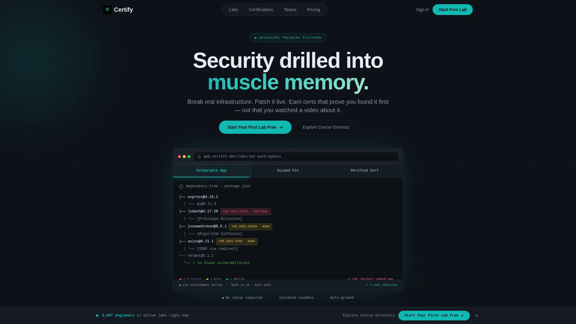
- A Feature Tab Switcher header with three interactive tabs showing a vulnerable dependency tree, a live code patch editor, and a shareable credential badge with a verification hash.
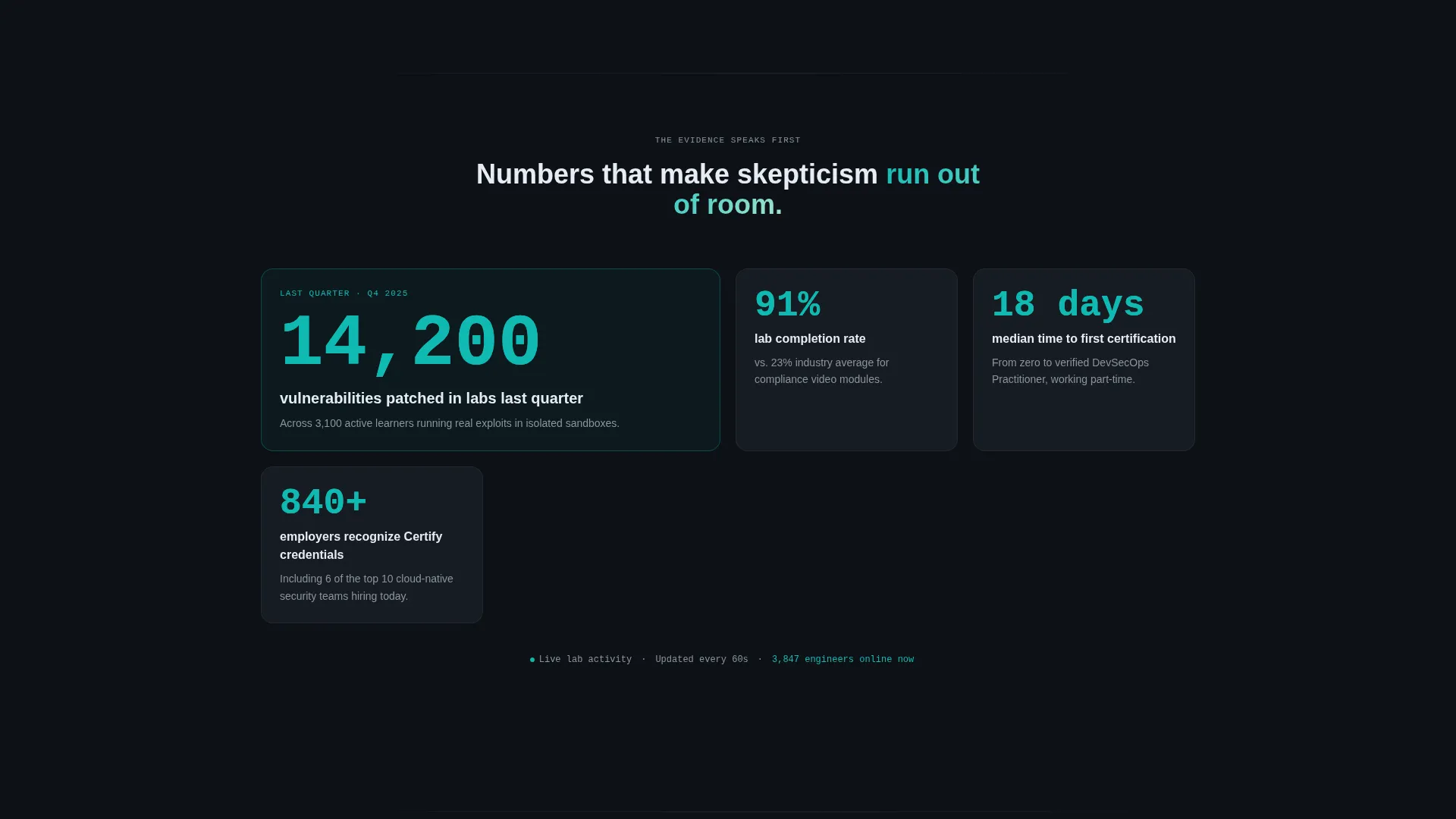
- A Stats-First Impact scroll sequence where a single hard number appears first, then context and story build around it to escalate credibility through each revealed section.
- A dual conversion funnel with a primary "Start Your First Lab Free" call-to-action and a secondary "Explore the Course Directory" path for visitors not yet ready to sign up.
Feature list
This template packages several purpose-built components. Each one addresses a specific moment in the DevSecOps buyer journey.
Feature Tab Switcher Header
Three clickable tabs sit above a simulated browser frame. Each tab reveals a different workflow screen: a dependency tree with red CVE (Common Vulnerability and Exposure) flags, an inline code editor showing a teal-highlighted patch in progress, and a shareable credential badge displaying a blockchain verification hash. The active tab glows teal. No stock photography is used anywhere.
Stats-First Scroll Reveals
Each progressive scroll section opens with a single, specific number before any explanation appears. Stats such as vulnerabilities patched in labs, median time-to-certification, completion rates, and employer adoption counts are revealed first. The supporting story fades in around each stat, building evidence until visitor skepticism has no foothold.
Persistent Freemium Call-to-Action Bar
A sticky bottom bar appears after the visitor passes the second scroll reveal. It carries the primary "Start Your First Lab Free" prompt. This keeps the conversion path visible without interrupting the reading experience.
Minimal Sign-Up Form
The sign-up form asks only for a work email and a preferred programming language. Supported language options include Python, Go, Java, and Node. This low-friction entry personalizes the first lab experience without asking for excessive information.
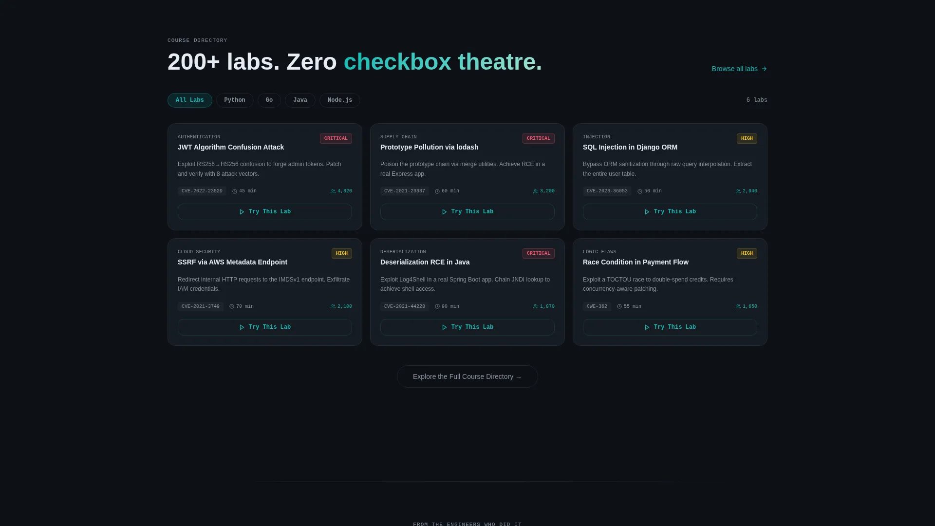
Course Directory with Micro-calls to action
Every course card inside the discovery section carries its own "Try This Lab" micro-call-to-action. This funnels browsers who are not ready to commit directly into a hands-on experience, keeping them engaged rather than bouncing.
Teal Catalyst Interaction System
Teal owns every active interaction point: buttons, progress bars, completion badges, and active tab indicators. Slate handles secondary labels and dividers. The result is a visual hierarchy that guides the eye without competing with the content.
Page sections overview
| Section | Purpose |
|---|---|
| Tab Switcher Header | Showcase three core lab workflow states |
| Stats Impact Reveal | Lead with specific proof numbers first |
| Context Story Build | Add narrative around each key stat |
| Completion Rate Stats | Show certification and retention evidence |
| Employer Adoption Proof | Demonstrate real-world hiring relevance |
| Freemium Sign-Up Form | Capture work email and language preference |
| Course Directory | Let browsers explore and try individual labs |
| Persistent call to action Bar | Keep primary conversion path always visible |
Design & branding system
The visual identity follows a Directory and Discovery theme using the Teal Catalyst color system. Every color decision serves the terminal aesthetic and the technical audience.
- Deep terminal black (#0D1117) bleeds edge to edge, making each revealed section feel like a new pane opening in a terminal multiplexer.
- Active teal (#0FBAB2) owns all interaction points including buttons, progress bars, completion badges, and active tab glows, pulsing like a heartbeat monitor confirming the system is alive.
- Muted slate (#8B949E) handles secondary labels and divider lines, while alert white (#E6EDF3) is reserved for primary body text to ensure strong contrast against the dark background.
Mobile & speed optimization
The scroll reveal structure is designed to work cleanly on smaller screens. Each section is sequenced so that progressive reveals remain legible and impactful on mobile viewports.
- The Feature Tab Switcher adapts to touch interaction, keeping the three-tab workflow accessible on phones and tablets.
- The persistent bottom call-to-action bar is sized and positioned for thumb-reach comfort on mobile screens.
- Each stats-first reveal is structured as a single focal point per scroll step, reducing visual noise and keeping mobile reading flow intact.
How this template helps you convert
The template is built around two complementary conversion paths rather than a single gate. This structure increases the chance that both ready buyers and casual browsers take a meaningful action.
- The primary funnel captures high-intent visitors through the "Start Your First Lab Free" call-to-action, which appears in the header tab area and again in the persistent bottom bar, keeping it visible across the entire scroll journey.
- The secondary funnel routes browsers into the course directory, where every card carries a "Try This Lab" micro-call-to-action. This turns passive exploration into active engagement without forcing a sign-up decision upfront.
Other information about this template
This template is part of the Certify platform design system and is released as a standalone landing page starter. It is well-suited for teams building out a DevSecOps training and certification product or relaunching an existing one with a more technically credible presence.
- The template style is Scroll Reveal (Progressive), meaning content sections animate into view as the visitor scrolls, creating a paced, deliberate reading experience.
- The theme follows a Directory and Discovery pattern, allowing the course catalog section to function both as social proof and as a secondary entry point into the product.
- The template is designed without stock photography. Every visual element, from the simulated browser frame to the credential badge, is built to resemble a real developer tool.
- The color system is labeled Teal Catalyst and is pre-configured with the four core values: #0D1117, #0FBAB2, #8B949E, and #E6EDF3, making brand customization straightforward.
Theme
Directory & Discovery
Creative direction
Stats-First Impact
Color system
Teal Catalyst
Style
Scroll Reveal (Progressive)
Direction
Freemium/Trial
Page Sections
Feature Tab Switcher Header
Stats-first Scroll Reveal System
Persistent Freemium Call to Action Bar
Low-friction Sign-up Form
Course Directory with Micro-ctas
Teal Catalyst Interaction System
Related questions
Who is this landing page template designed for?
Can I customize the tab content in the header switcher?
Does the template include a working sign-up form?
What makes this template different from a standard course landing page?
Is the dark terminal color scheme easy to adapt to another brand?



