AI Government Lead Scoring Landing Page Template
Clearance is a split-screen landing page template built for AI-powered government contract lead scoring platforms. It opens with a live, functional scoring calculator in the header, letting visitors interact with real output before any signup prompt. The Midnight Blue visual system and progressive-reveal scroll structure build trust through demonstrated intelligence, then guide visitors toward a focused two-field signup.
by Rocket studio
Quick summary
Clearance is a single-page, split-screen landing page template designed for government AI lead scoring platforms. The header drops visitors straight into a working calculator. Every scroll section peels back a new analytical layer. The Midnight Blue color system, signal-amber accents, and dossier-style layout build quiet urgency, converting skeptical capture managers into active trial users.
Who this template is for
This template is built for teams marketing AI tools to the federal contracting community. It speaks the language of the people who live inside procurement cycles and pipeline reviews.
- Capture managers at mid-tier defense contractors who need to qualify leads faster
- Business development directors at 8(a) firms who spend early mornings refreshing procurement databases
- Proposal coordinators deciding whether an RFI (Request for Information) is worth the compliance effort
What problem this template solves
Federal business development teams waste hours evaluating contract opportunities that were never a real fit. A generic software landing page cannot convey the analytical depth these buyers demand before they trust a new tool.
- Visitors need to see the product think before they commit to a signup
- Procurement professionals distrust vague claims and respond only to demonstrated precision
- Traditional lead generation pages fail to communicate scoring logic, set-aside alignment, or competitive context
What you get with this template
You get a fully structured, click-through landing page that puts the product experience front and center. The layout is designed for a single conversion goal: a free scoring session signup.
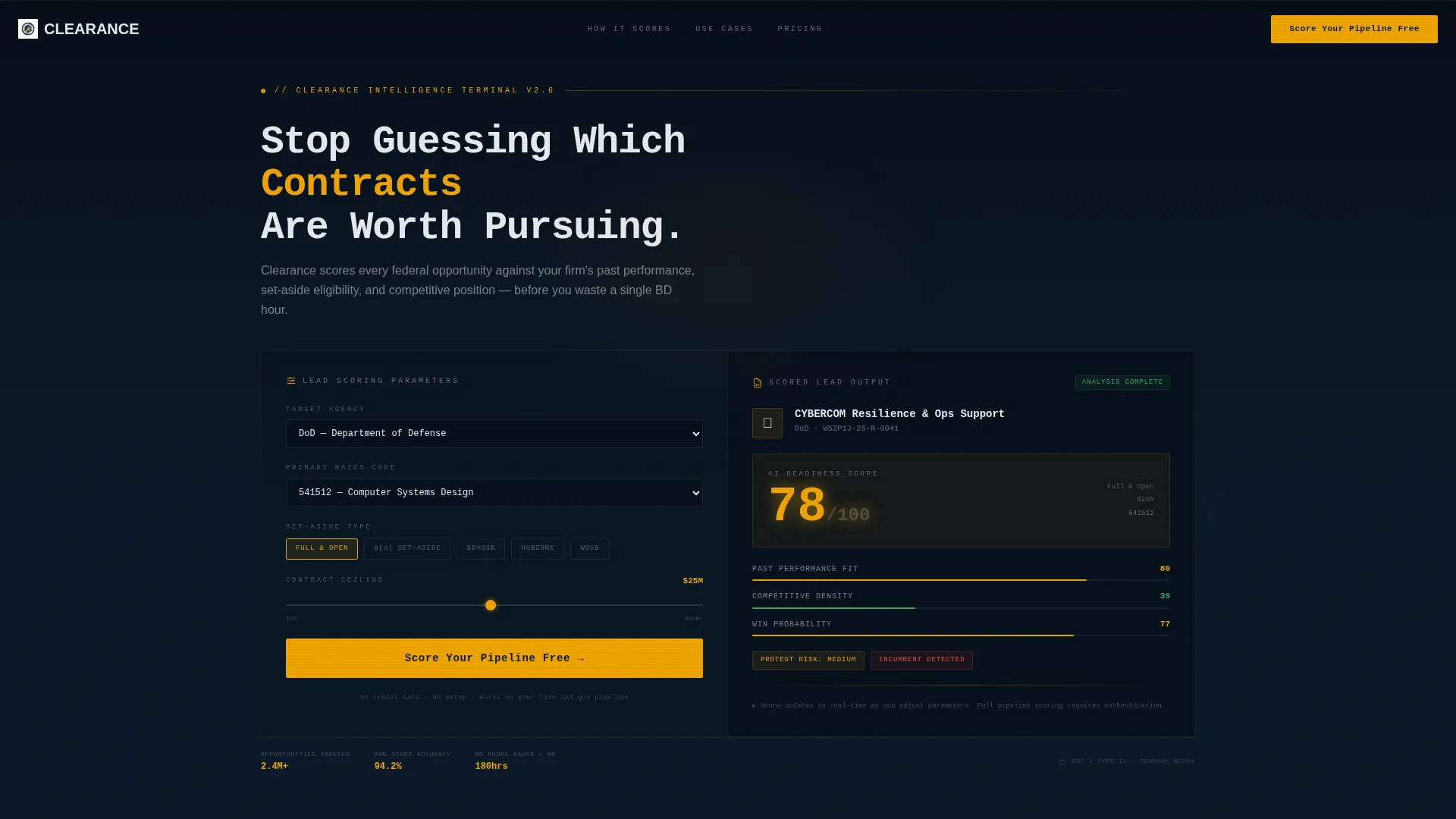
- A live, interactive lead-scoring calculator in the header with agency dropdown, NAICS code input, set-aside toggle, and contract ceiling slider
- A progressive-reveal scroll flow that layers teaming gap analysis, incumbent history, and protest risk flags across split-screen section pairs
- A fixed slim top bar carrying the primary call to action throughout the entire scroll journey
Feature list
This section covers the core functional and visual capabilities built into the Clearance template as described in the source brief.
Live Header Calculator
The header is not a static hero. The left panel holds a functional scoring tool where visitors choose an agency from a dropdown (DoD, Department of Defense; DHS, Department of Homeland Security; VA, Department of Veterans Affairs; HHS, Department of Health and Human Services), enter a NAICS (North American Industry Classification System) code, toggle a set-aside type, and adjust a contract ceiling range. Real output appears within four seconds of landing.
Scored Lead Card Output
The right panel of the header instantly renders a mock scored-lead card. It shows an opportunity name, the relevant agency seal, an AI confidence score in large amber numerals, and a three-bar breakdown covering Past Performance Fit, Competitive Density, and Win Probability. Visitors see what the platform produces before they read a single line of marketing copy.
Split-Screen Scroll Sections
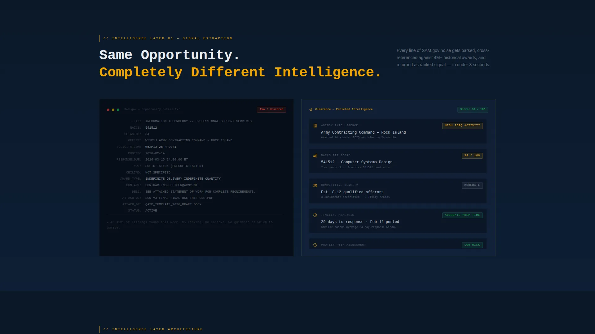
Below the header, every scroll section maintains the 50/50 left-right layout. The left side shows a raw procurement listing in its native formatting. The right side shows the same opportunity parsed, enriched, and scored. This pairing makes the platform's value visible at a glance.
Progressive Analytical Layers
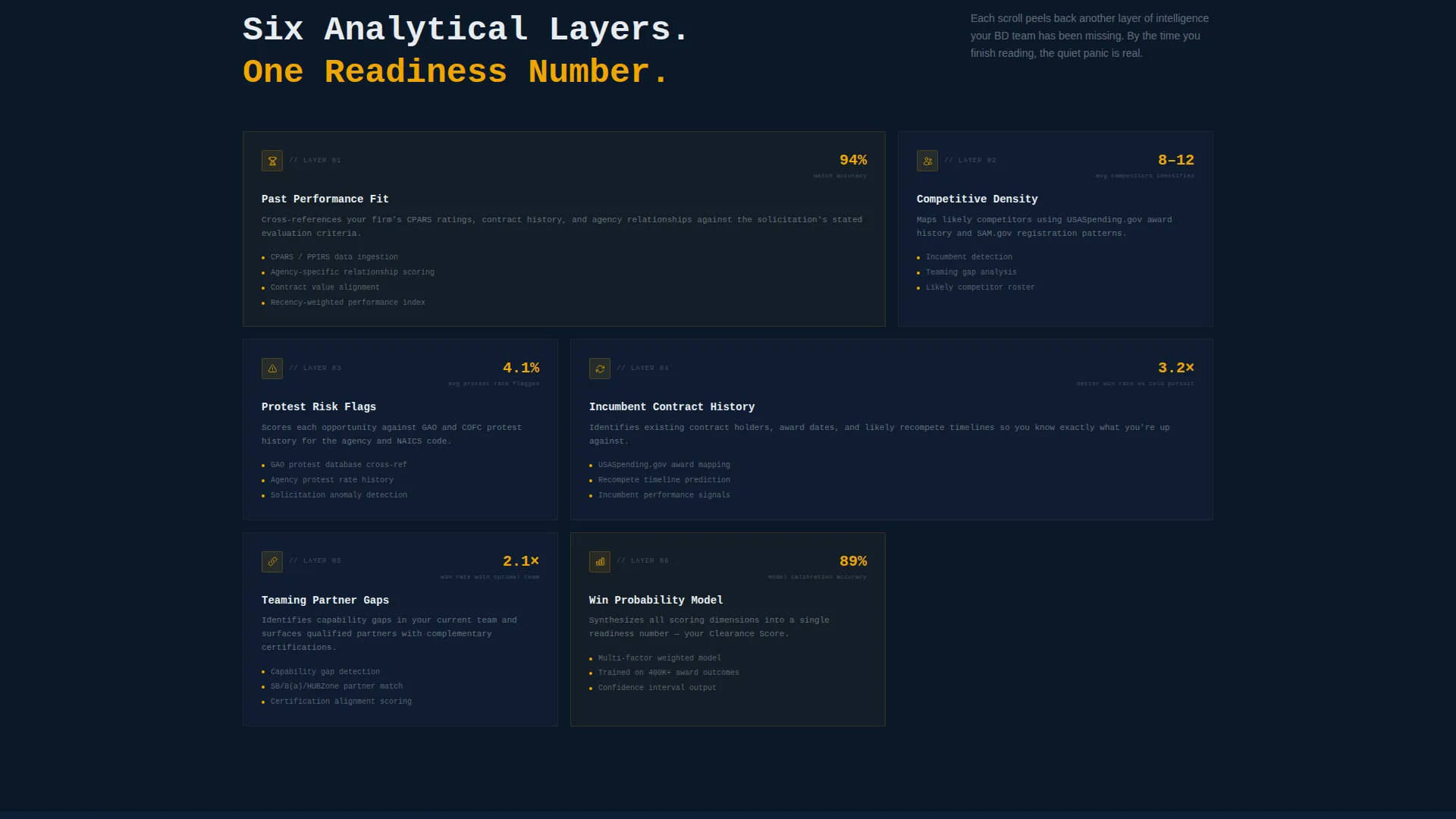
Each scroll section introduces a new scoring dimension. Teaming partner gap analysis, incumbent contract history, and protest risk flags appear in sequence. The structure builds a growing sense of urgency, helping visitors recognize how much useful signal they have been missing.
Fixed Conversion Bar
A slim top bar locks onto the screen as the visitor scrolls. It carries the primary call to action throughout the page, ensuring the next step is always visible without disrupting the content experience below.
Focused Two-Field Signup Flow
The click-through destination is a minimal signup page requesting only a work email address and a SAM.gov UEI (Unique Entity Identifier) number. Nothing else. The narrow ask matches the trust already built by the interactive demo.
Page sections overview
| Section | Purpose |
|---|---|
| Header Calculator Panel | Live scoring tool with agency, NAICS, set-aside, and ceiling inputs |
| Scored Lead Card | Instant right-panel output showing AI confidence score and three-bar breakdown |
| Raw versus. Scored Comparison | Left shows native listing, right shows parsed and enriched result |
| Teaming Gap Analysis | Scroll section revealing partner fit against opportunity requirements |
| Incumbent History Layer | Contextual display of existing contract holders and re-compete risk |
| Protest Risk Flags | Scoring dimension highlighting competitive protest vulnerability |
| Fixed call to action Bar | Persistent top bar with primary conversion action across full scroll |
| Signup Page | Two-field form collecting work email and SAM.gov UEI number |
Design & branding system
The visual identity follows a Directory and Discovery theme built entirely around the Midnight Blue color system. The palette evokes a secure operations terminal, where light appears only where it carries meaning.
- Core colors: deep SCIF-dark navy (#0B1929) for backgrounds, tactical slate (#1B2A4A) for panels, and cleared-white (#E8ECF1) for readable body text
- Signal-amber (#F0A500) is used exclusively for AI confidence scores, alerts, and interactive hotspots, ensuring every amber element demands immediate attention
- The overall aesthetic resembles a classified dossier coming into focus, with redactions lifting as the visitor scrolls deeper into the page
Mobile & speed optimization
The Clearance template is structured to load the interactive header calculator quickly and keep the split-screen layout readable across screen sizes. The lean two-field signup destination supports fast completion on any device.
- The 50/50 split-screen layout is designed to reflow cleanly for smaller viewports without losing the raw-versus-scored visual pairing
- The fixed call to action bar remains accessible throughout the scroll on both desktop and mobile, keeping the conversion path short regardless of device
How this template helps you convert
The entire page is built around a single, measurable conversion goal: getting a qualified federal BD professional into a free scoring session. The strategy is demonstration before persuasion.
- The header calculator delivers real output within four seconds, replacing doubt with direct experience before any trust is asked for
- Each progressive scroll section adds a new analytical layer, building the quiet recognition that the visitor has been leaving valuable contract signal on the table
- The fixed top bar and two-field signup page remove every friction point between interest and action, making the final click feel like finishing what the demo already started
Other information about this template
The Clearance template is a strong fit for any team marketing AI-powered tools to federal acquisition professionals. A few additional points worth noting for teams evaluating this template:
- The template name "Clearance" and the dossier visual metaphor are directly calibrated to resonate with professionals familiar with the federal procurement environment
- The SAM.gov UEI field on the signup page signals institutional credibility to visitors who expect precise, domain-fluent onboarding
- The template style is a single landing page, not a multi-page website, making it straightforward to deploy as a focused campaign asset
- The signal-amber color convention is strictly reserved for scores and alerts, so visitors learn the visual language of the product before they even sign up
Theme
Directory & Discovery
Creative direction
Calculator/Tool First
Color system
Midnight Blue
Style
Split Screen (50/50)
Direction
Click-Through
Page Sections
Live Lead-scoring Calculator
Instant Scored Lead Card Output
Raw Versus. Scored Split-screen Sections
Progressive Scoring Dimension Reveal
Persistent Fixed Conversion Bar
Focused Two-field Signup Page
Related questions
Who is the Clearance template designed for?
Does the header calculator work before a visitor signs up?
What does the two-field signup page ask for?
Can the split-screen layout support additional scroll sections?
What is the primary call to action on this landing page?



