Trusted Plumbing Services Landing Page Template
Valve is a modular card grid landing page built for a plumbing membership platform. It opens with a terminal-styled pipe calculator widget, then fans out into a grid of member resource cards covering supplier directories, permit libraries, diagnostic forums, and more. The Void and Violet color system gives it a bold, tool-first visual identity built to earn the app install.
by Rocket studio
Quick summary
Valve is a single-page membership hub template for plumbing professionals. The header puts a live pipe flow calculator front and center, earning visitor trust before asking for anything. Below it, frosted-glass cards reveal the platform's resources one by one. The page closes with a sticky install call to action, converting visitors who have already used the tool.
Who this template is for
This template is built for teams and founders launching a digital membership platform aimed at plumbing professionals. It fits operators who want to show the value of their platform before asking for a sign-up or install.
- Solo plumbers running one-van operations who need quick access to supplier and permit resources
- Mid-size shop owners managing multiple crews and looking for a centralized professional hub
- Platform builders or membership site founders targeting the skilled trades audience
What problem this template solves
Generic membership landing pages ask visitors to imagine value. Valve shows it immediately. The calculator widget at the top lets visitors interact with a real tool before any sign-up prompt appears, building trust through utility rather than copy.
- Visitors leave when a page explains features instead of demonstrating them
- Plumbing professionals need proof that a platform understands their daily workflow
- A standard hero image and headline do not communicate specialized trade value
What you get with this template
You get a fully structured single-page layout that leads with an interactive calculator block and flows into a modular card grid previewing every membership resource. The design system is production-ready with a defined color palette, hover states, and sticky call-to-action placement.
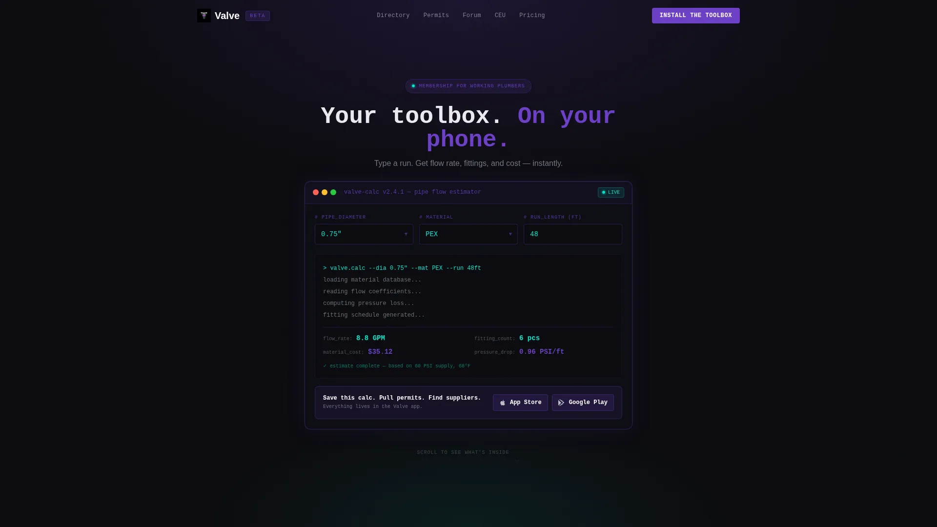
- A terminal-styled pipe calculator widget in the header that returns flow rate, fitting count, and estimated material cost
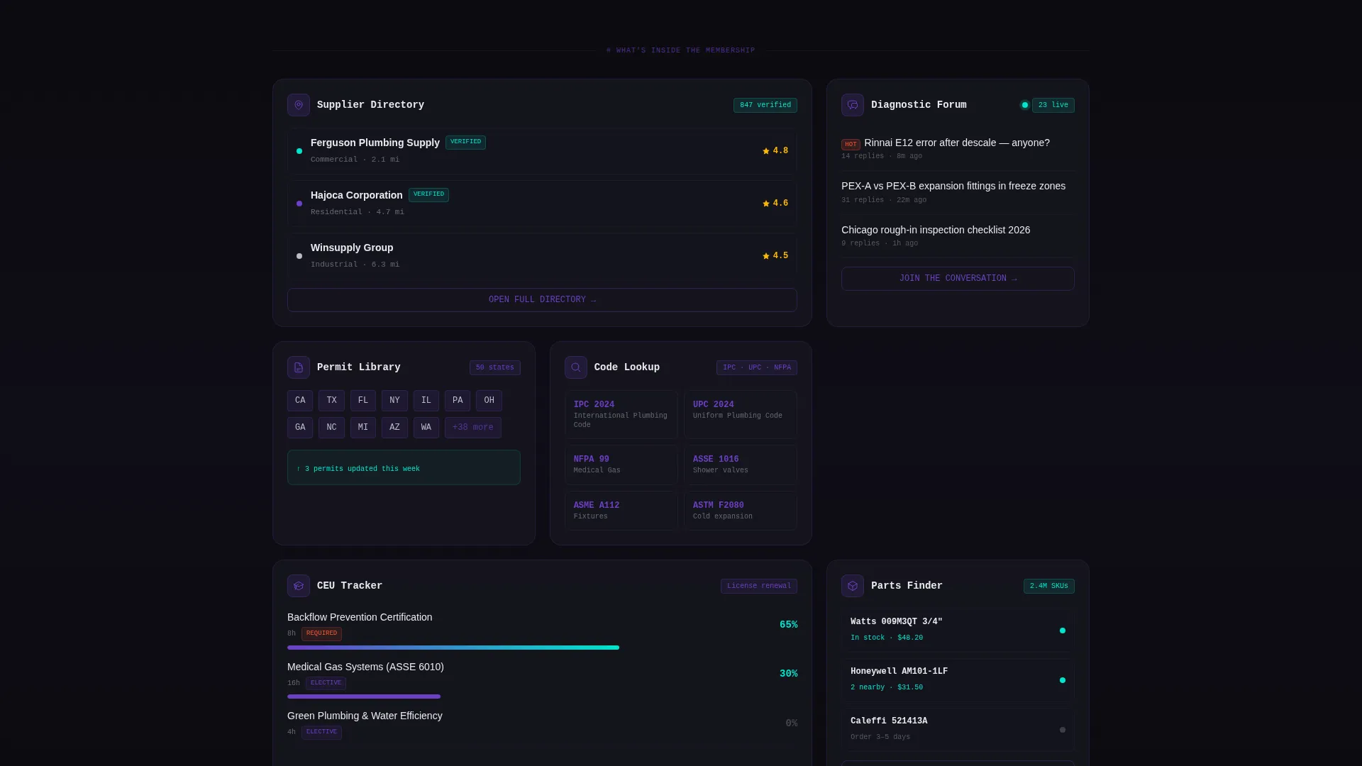
- A responsive card grid featuring supplier directory, permit library, diagnostic forum, code lookup, and CEU tracker cards
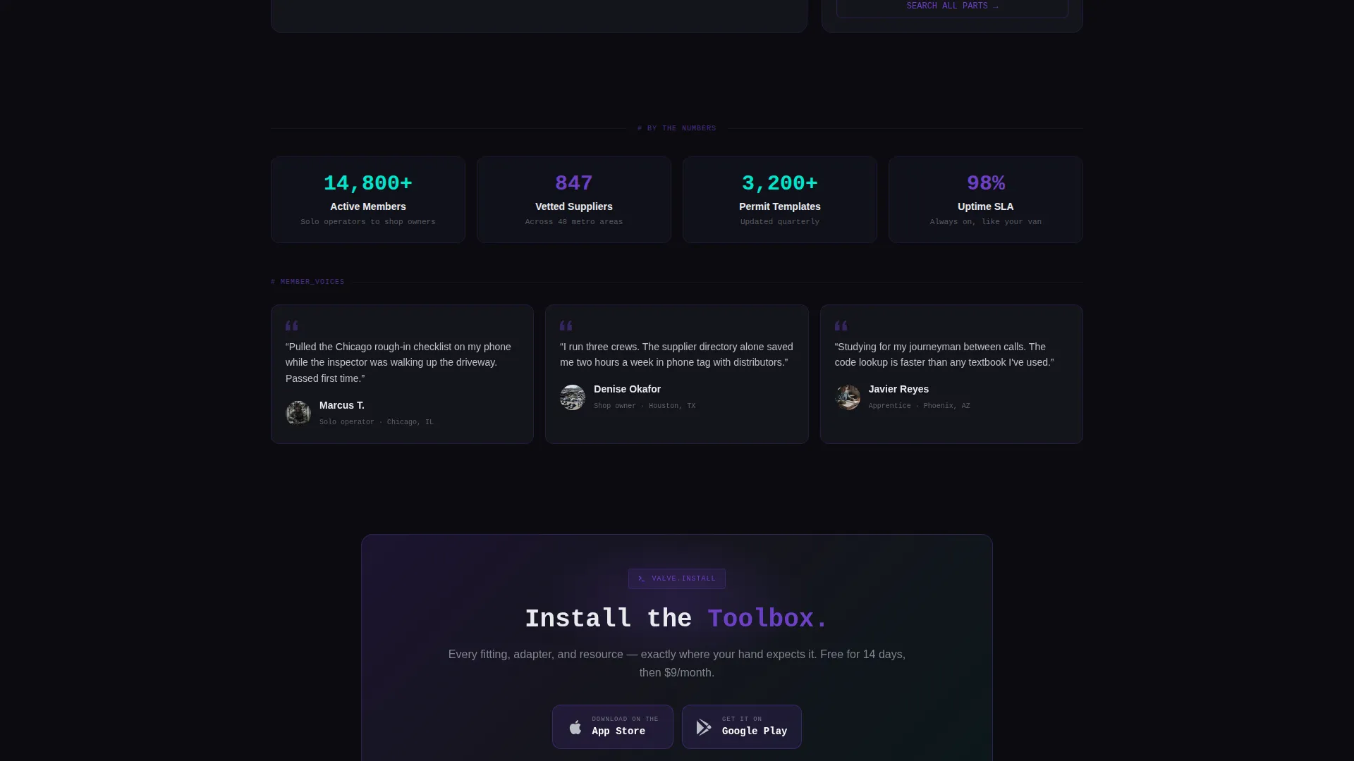
- Dual call-to-action placement with App Store and Google Play badge blocks, plus a secondary email-capture path for desktop visitors
Feature list
This template ships with a focused set of purpose-built components. Each one is designed around how a working plumber actually uses a digital tool between jobs.
Terminal-Style Calculator Header
The header widget renders like a diagnostic terminal block. Visitors enter pipe diameter, material type (PEX, copper, or CPVC), and run length. The tool instantly returns flow rate, estimated fitting count, and material cost. Monospaced type and a blinking cursor make it feel like a tool already on the job site.
Modular Membership Card Grid
Cards fan out in a responsive grid below the calculator. Each card previews a specific platform resource: a supplier directory with map pins and ratings, a permit library with state icons, a diagnostic forum card, a code lookup card, and a CEU tracker. Frosted-glass surfaces sit over the void background for a layered depth effect.
Hover and Live-State Accents
Cards gain a violet edge glow on hover. The cyan accent color marks any card content flagged as live or recently updated. This visual language trains visitors to scan for active content at a glance, without needing labels or tooltips.
Sticky Install Call to Action
After three rows of cards, a sticky bottom bar appears with the primary "Install the Toolbox" call to action. App Store and Google Play badges render in violet-on-black to match the palette. This placement catches visitors who have scrolled through the full resource preview.
Secondary Desktop Email Capture
Visitors browsing on desktop see a secondary path labeled "Try the Calculator on Desktop." Entering an email sends the app download link, capturing intent from visitors not ready to install directly. This keeps the conversion path open for a second touchpoint.
Void and Violet Design System
The full color system is pre-applied across every component. Absolute void black, deep pipe violet, brushed chrome, and leak-alert cyan are consistently used for backgrounds, borders, interactive states, and notification accents. No additional theming is needed to launch.
Page sections overview
| Section | Purpose |
|---|---|
| Calculator Header Block | Leads with the interactive pipe flow widget as the primary hook |
| First Install call to action | Converts engaged visitors immediately after the calculator result |
| Supplier Directory Card | Previews the vetted supplier finder with map pins and ratings |
| Permit Library Card | Shows state-by-state permit template access with icon layout |
| Diagnostic Forum Card | Previews an active member thread to signal community activity |
| Code Lookup Card | Indicates trade code reference access within the membership |
| CEU Tracker Card | Highlights continuing education unit tracking for journeyman prep |
| Sticky Bottom Bar | Persistent app install prompt that appears after card grid scroll |
| Desktop Email Capture | Secondary conversion path for non-mobile visitors |
Design & branding system
The Void and Violet palette is fully applied across every section of this template. The visual tone echoes a diagnostic screen inside a dark mechanical room, where content feels illuminated rather than placed on a background.
- Absolute void black (#0B0B0F) as the base, deep pipe violet (#6C3FC5) for structural accents, brushed chrome (#B8BEC4) for secondary text and surfaces, and leak-alert cyan (#00E5CC) for interactive states and live content signals
- Frosted-glass card surfaces create layered depth over the dark background without relying on imagery
- Monospaced typography in the calculator block reinforces the terminal aesthetic throughout the header zone
Mobile & speed optimization
The layout is built with mobile-first install conversion in mind. The sticky bottom bar and primary call-to-action placement are structured to work within mobile screen constraints, where the app store badges are immediately tappable.
- The card grid uses a modular layout that adapts column count for smaller screens without breaking the frosted-glass surface treatment
- The calculator widget is the first interactive element a mobile visitor encounters, keeping engagement high before any scroll is required
- The sticky bar appears after a defined scroll depth, avoiding early interruption while staying visible when intent is highest
How this template helps you convert
This template is structured around the principle that a visitor who uses the product will install it. Every layout decision supports that conversion path.
- The calculator widget delivers immediate, tangible value in the header, giving visitors a reason to stay and a reason to trust the platform before reading a single benefit statement.
- The card grid previews every membership resource as a visual screen, letting visitors picture themselves using the platform rather than reading a features list.
- The dual call-to-action structure, first docked beneath the calculator and then again in the sticky bar, catches visitors at two high-intent moments without interrupting the browsing experience between them.
Other information about this template
Valve is designed specifically for the plumbing trades niche within the broader skilled trades digital market. It is a strong fit for founders building a plumbing membership site or a directory-style resource platform targeting independent contractors and small shop operators.
- The Directory and Discovery theme makes this template adaptable for other trade verticals that follow a similar hub-and-resource structure
- The Calculator/Tool First creative direction is a deliberate choice for audiences who respond to proof over persuasion
- Template style is Card Grid (Modular), making individual resource sections easy to add, remove, or reorder without restructuring the full layout
- The App Download landing page direction is supported by dual badge placement and the secondary email-capture flow for desktop users
- The Code Snippet header concept is visually unique in the plumbing space, distinguishing a platform built on this template from standard directory or SaaS landing pages

Theme
Directory & Discovery
Creative direction
Calculator/Tool First
Color system
Void & Violet
Style
Card Grid (Modular)
Direction
App Download
Page Sections
Terminal-style Pipe Calculator Widget
Modular Membership Card Grid
Hover and Live Content States
Dual App Install Call to Action
Desktop Email Capture Path
Void and Violet Design System
Related questions
Can I change the pipe materials listed in the calculator widget?
Do I need to replace the card content with my own platform resources?
Is the sticky bottom bar always visible on mobile?
Can the secondary email-capture section be removed if I only need the app install flow?
Can this template support a web sign-up flow instead of an app install?



