Precision eCommerce Thank You Email Landing Page
Confirm is a precision-built bento grid landing page template for post-purchase email platforms. It uses a Tech Glass aesthetic with a Carbon Fiber color system to present transactional email capabilities as a spec sheet. Designed for DTC retention marketers and Shopify Plus operators, it turns order confirmation flows into a compelling, metrics-driven revenue argument.
by Rocket studio
Quick summary
Confirm is a single-page bento grid landing page template built for post-purchase email platforms. It presents order confirmation capabilities through a Tech Glass design system and a Spec Sheet creative direction. Every cell in the grid isolates a single feature or metric, making the case for your platform through accumulated, verifiable evidence rather than marketing claims.
Who this template is for
This template is built for teams that treat the post-purchase moment as a revenue channel, not an administrative checkbox. It speaks the language of operators who measure everything and trust data over copy.
- Shopify Plus operators running seven-figure monthly revenue who need a landing page that matches their platform's precision
- Direct-to-consumer brand managers focused on post-purchase lifetime value and retention metrics
- Retention marketers who want a comparison-led pitch that positions their tool against broader email platforms
What problem this template solves
Most transactional email tools are sold with generic SaaS landing pages. The platform's actual differentiation, open rates, revenue-per-send figures, and template engine depth, gets buried in walls of text. Visitors leave before they see what matters.
- Post-purchase platforms lose credibility when their own marketing page looks like a plain-text afterthought
- Comparison-hungry buyers need a clear, visual breakdown against competing tools before they commit to a free trial
- Metrics-driven operators want proof, not promises, and generic layouts cannot deliver that weight
What you get with this template
You get a fully structured bento grid landing page that presents post-purchase email capabilities as a precision instrument spec sheet. The layout is designed to build evidence progressively as the visitor scrolls.
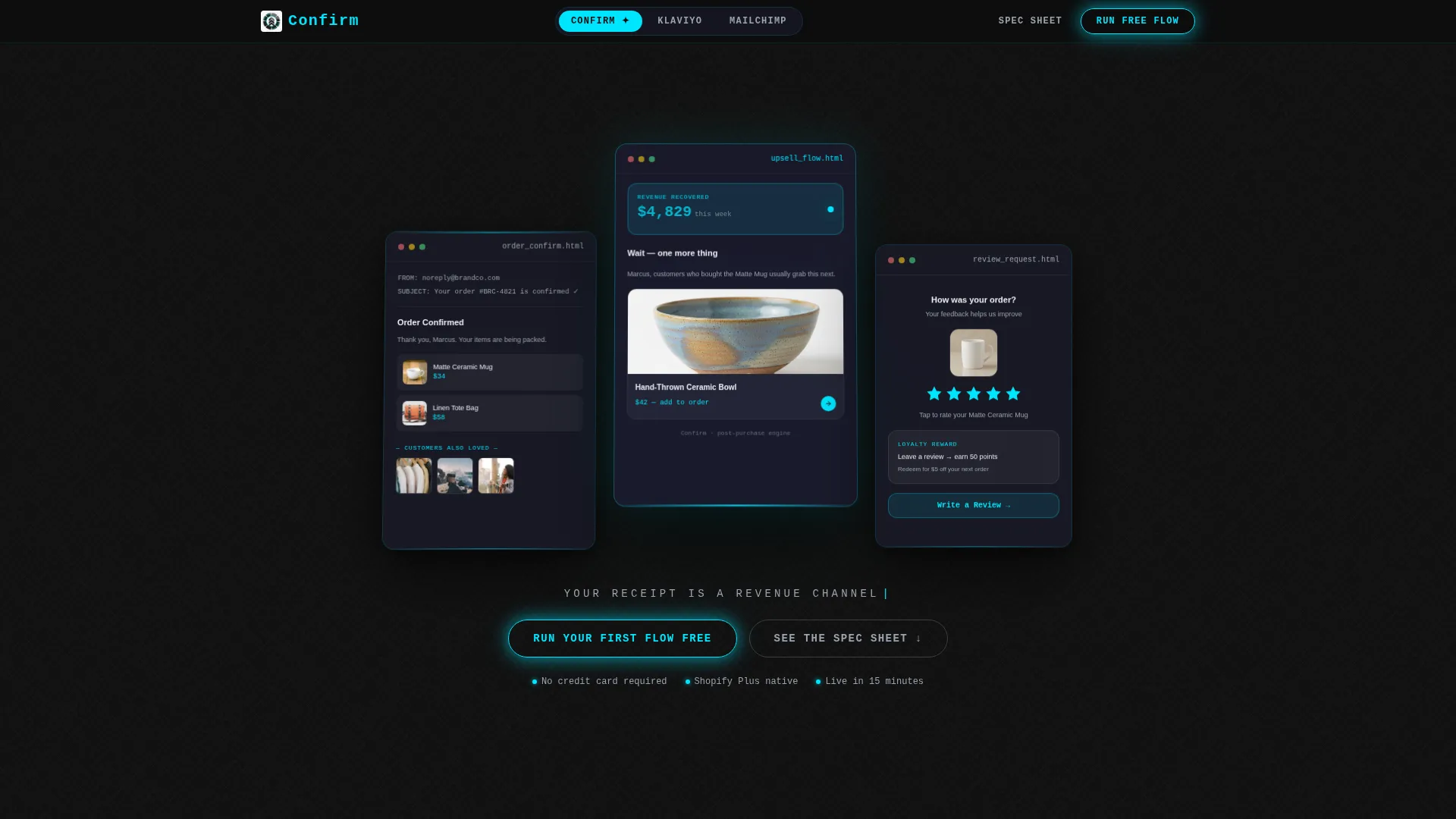
- A Dark Glass Panels header with three frosted translucent rectangles showing live email variants, including an order confirmation, a post-purchase upsell with a revenue ticker, and a review-request animation
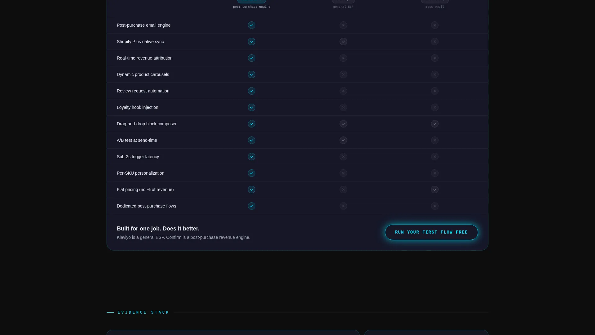
- A Comparison/Versus section with a frosted-glass table, cyan checkmarks, and a primary call-to-action cell dedicated to converting evaluation-stage visitors
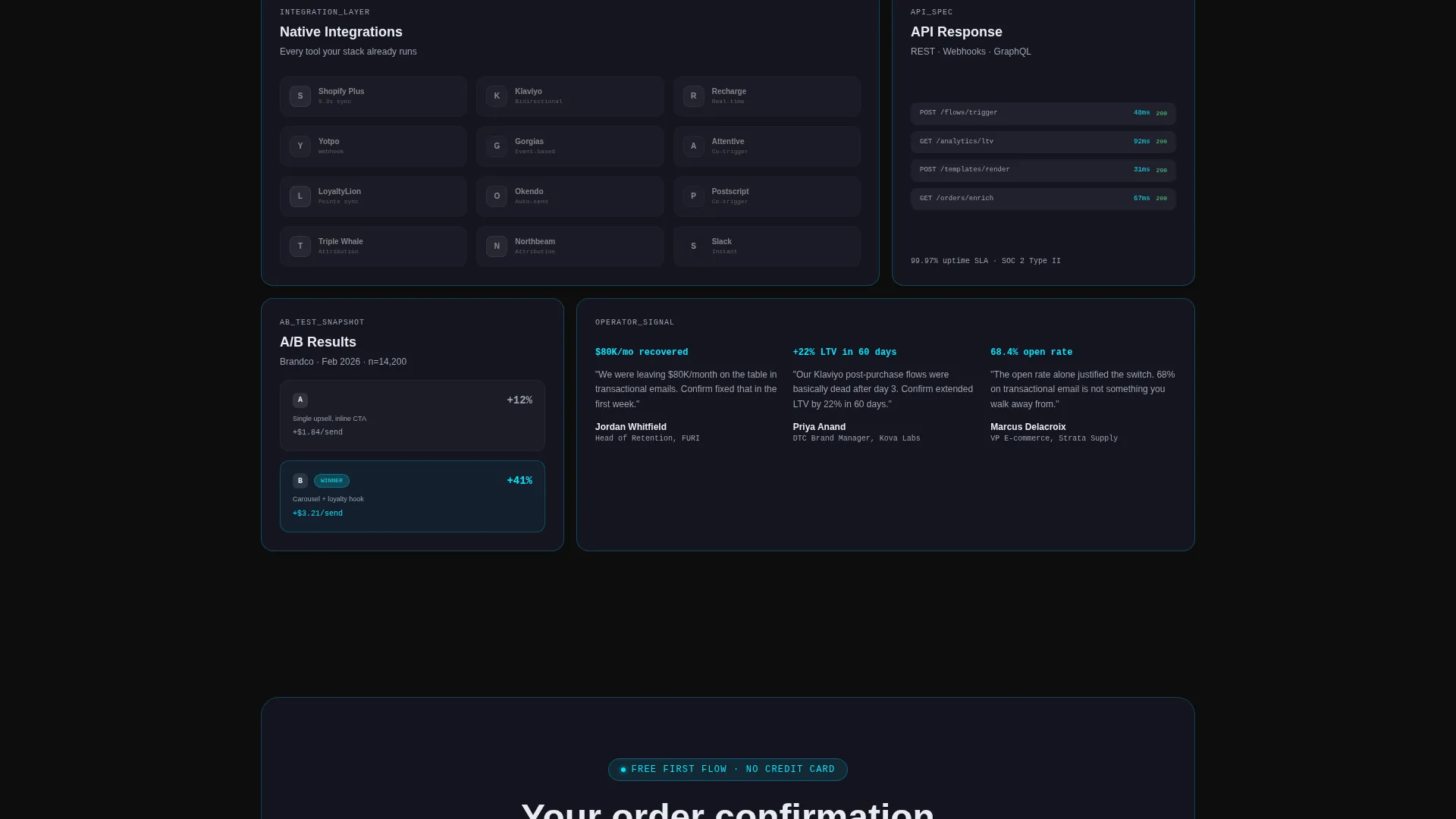
- A full bento feature grid with self-contained cells for open rate gauges, revenue-per-send figures, template engine micro-animations, integration logos, and A/B test result snapshots
Feature list
This template organizes its capabilities into discrete, scannable components. Each one is designed to communicate a specific proof point without requiring the visitor to read long paragraphs.
Dark Glass Panel Header
Three translucent, frosted-glass rectangles float over a deep carbon background. The left panel shows a minimalist order confirmation with an embedded product carousel. The center panel, pulled forward with parallax depth, displays a post-purchase upsell email with a live revenue ticker. The right panel shows a review-request email with a five-star animation mid-tap.
Bento Grid Spec Sheet Layout
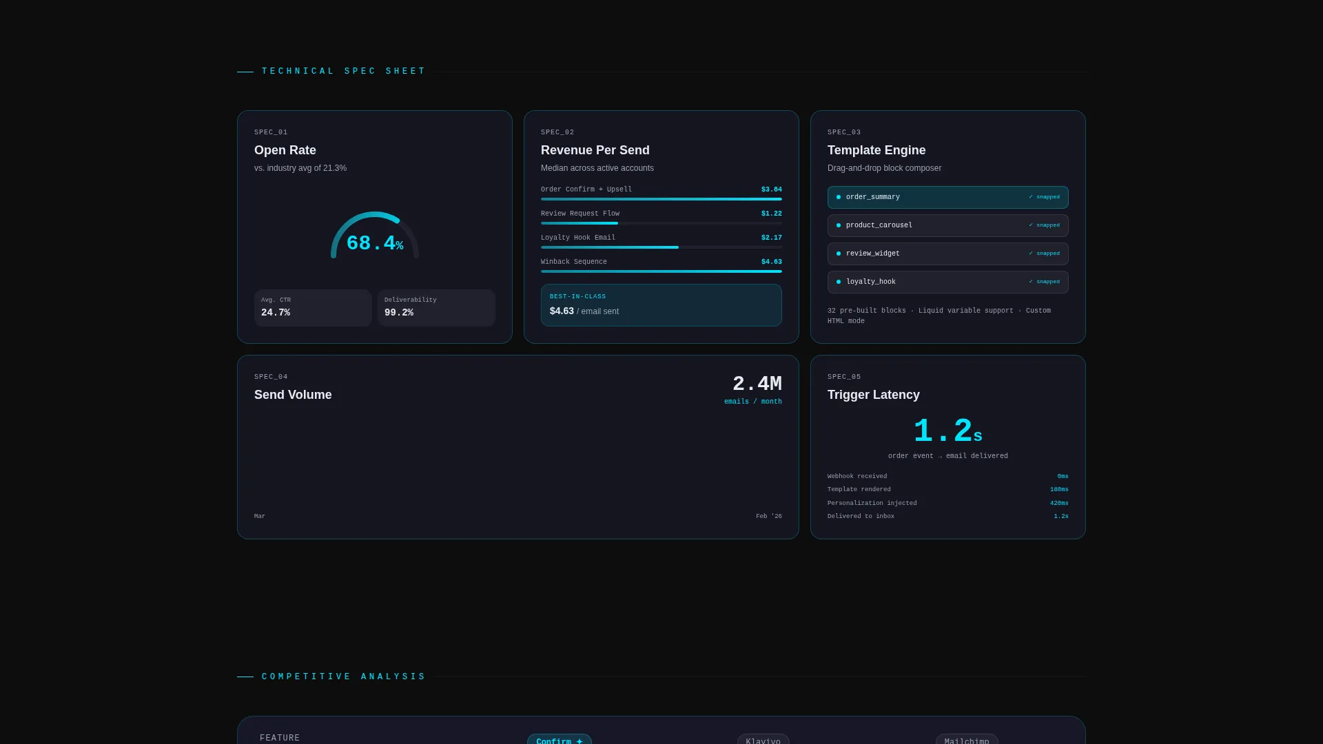
The page body is structured as a tight bento grid where each cell isolates a single capability. Cells display an open rate gauge at 68.4 percent, a real-time revenue-per-send figure, and a template engine with a drag-and-drop block animation. The grid becomes denser as the visitor scrolls, layering in integration logos, API response times, and A/B test snapshots.
Comparison Table Cell
An oversized bento cell contains a frosted-glass comparison table with cyan checkmarks indicating supported features and dimmed entries marking competitor gaps. The primary call-to-action button, "Run Your First Flow Free," appears inside this cell to capture visitors at peak intent.
Sticky Comparison Navigation Bar
A persistent sticky bar at the top of the page anchors the Comparison/Versus positioning throughout the scroll journey. It keeps the competitive framing visible at all times without interrupting the content flow below.
Dual Call-to-Action Architecture
The primary call-to-action appears twice: once beneath the header panels and once inside the comparison cell. On first click, it opens a single-field email capture with the microcopy "Enter your Shopify store email." A secondary path, "See the Spec Sheet," anchors visitors still in evaluation mode directly to the feature grid.
Tagline and Conversion Microcopy
The tagline "Your receipt is a revenue channel" fades in beneath the header panels. This single line frames the entire page argument without a traditional hero headline. Microcopy throughout the grid reinforces precision and specificity at every interaction point.
Page sections overview
| Section | Purpose |
|---|---|
| Dark Glass Header | Showcases three live email variant panels with embedded metrics and animations |
| Sticky Comparison Bar | Keeps the competitive positioning anchored throughout the full scroll |
| Tagline Reveal | Fades in the core value statement beneath the header panels |
| Open Rate Cell | Displays a glass-panel gauge reading 68.4 percent as a standalone proof point |
| Revenue Per Send | Shows a real-time dollar figure metric inside a self-contained bento cell |
| Template Engine Cell | Demonstrates drag-and-drop block assembly with a micro-animation |
| Comparison Table Cell | Presents a frosted-glass feature table with cyan checkmarks and competitor gaps |
| Integration Grid | Layers in platform logos and API response data as accumulated evidence |
| A/B Test Snapshot | Shows test result data inside a dense bento cell for credibility |
| Primary call to action Cell | Hosts "Run Your First Flow Free" with single-field email capture |
| Secondary call to action Anchor | Links evaluation-stage visitors to the full feature grid |
Design & branding system
The visual identity follows a Tech Glass theme built on a Carbon Fiber color system. The palette is designed to feel tactile and precise, like a high-end device rather than a typical SaaS page.
- Core background colors sit in the deep carbon black (#0D0D0D) to woven graphite (#1A1A2E) range, with text rendered in frosted glass white (#E8ECF1)
- Electric cyan (#00E5FF) is reserved exclusively for interactive states, hover glows, data accents, and the cyan borders that catch light at bento cell edges
- The overall aesthetic follows a Spec Sheet creative direction, where each element is presented like a component in a technical data sheet rather than a marketing layout
Mobile & speed optimization
The bento grid structure is inherently well-suited to responsive scaling. Cells reflow naturally for narrower viewports without losing the density and precision the design depends on.
- Bento cells are self-contained units that can stack vertically on mobile while preserving individual metric legibility
- The Dark Glass Panels header is designed for depth and layering, which translates to a stacked single-column view on smaller screens
- Micro-animations and hover states adapt gracefully so the interactive cyan accents remain meaningful on touch devices
How this template helps you convert
The page is engineered to build a purchase case through progressive evidence accumulation rather than a single persuasive moment. Conversion pressure is distributed across the entire scroll rather than concentrated at one hero call-to-action.
- The header panels do the selling before a single word is read. Visitors see real email variants, live metrics, and a revenue ticker, which establishes credibility immediately and reduces skepticism before the tagline even appears.
- The bento grid layers verifiable proof points cell by cell. Each metric, gauge, and animation adds weight to the argument so that by the time the visitor reaches the comparison table, the call-to-action feels like a logical conclusion rather than a request.
Other information about this template
This template is built for a niche intersection of technology and e-commerce email, specifically the post-purchase thank you email use case. It is designed for platforms that compete in the same space as broader tools and need to carve out a differentiated position through precision and specificity.
- The template style is Bento Grid, making it well-suited for platforms that want to present multiple capability proof points without a long-scroll narrative format
- The Comparison/Versus landing page direction is ideal for buyers already evaluating tools like Klaviyo or Mailchimp and needing a clear side-by-side argument
- The Tech Glass theme and Carbon Fiber color system give the page a premium, device-like feel that matches the expectations of Shopify Plus operators and technical DTC audiences
- The template fits naturally within the E-Commerce Email Templates subcategory and supports use cases centered on order confirmation, post-purchase upsell, and review request flows
Theme
Tech Glass
Creative direction
Spec Sheet
Color system
Carbon Fiber
Style
Bento Grid
Direction
Comparison/Versus
Page Sections
Dark Glass Panel Header
Bento Grid Spec Sheet
Frosted Glass Comparison Table
Sticky Competitive Navigation Bar
Dual Call to Action Architecture
Metric and Animation Cells
Related questions
What kind of platform is this landing page template designed for?
Can I use this template to position against other email marketing tools?
What does the bento grid layout mean for how content is organized?
How does the call-to-action flow work on this template?



