Reinforcement Learning Consulting Landing Page
Converge is a hub-and-spoke reinforcement learning consulting landing page built for firms that train autonomous agents to make high-stakes decisions at machine speed. It combines a live WebGL reward-curve header, animated cost counters, side-by-side simulation comparisons, and a pulsing interactive comparison table to move engineering leaders from skepticism to a feasibility diagnostic request.
by Rocket studio
Quick summary
Converge is a single-page, anchor-navigated landing page template designed for a reinforcement learning consulting firm. It opens with a live reward-curve simulation, guides visitors through the cost of static systems, explains how reinforcement learning outperforms alternatives, and closes with an interactive comparison table and a dual conversion path.
Who this template is for
This template is built for technically credentialed consulting firms that need to convince a skeptical, highly informed audience. The buyer is not a generalist; they already know what rule-based systems cost them.
- Engineering VPs at logistics companies running brittle, rule-based routing systems
- Machine learning leads at robotics startups hitting the simulation-to-real transfer gap
- Chief Technology Officers at energy firms whose heuristic models are losing margin every quarter
What problem this template solves
Most consulting pages describe services in abstract terms. This template solves the credibility gap. Reinforcement learning is a hard sell because the audience has already been burned by overpromised artificial intelligence projects.
- Static pages cannot show a live training run, so skeptical engineers dismiss the pitch before reading
- No visual contrast between rule-based systems and reinforcement learning means prospects cannot self-identify the gap
- Leads who are not ready to book a call leave with nothing, removing any chance of follow-up
What you get with this template
You get a fully structured, high-density landing page that builds technical trust section by section. Every element serves the argument that autonomous, adaptive systems outperform static ones.
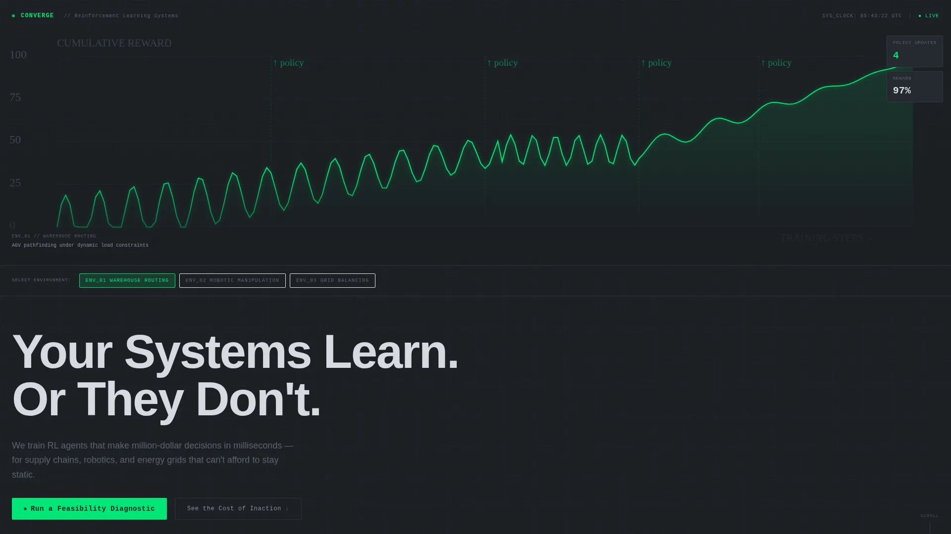
- A WebGL reward-curve header with three toggleable environments: warehouse routing, robotic manipulation, and grid balancing
- Four anchor-navigated spoke sections that escalate in visual density and data granularity toward a conversion decision
- Two conversion paths: a feasibility diagnostic form and an email-capture lead magnet for the benchmark report
Feature list
This template is built around five core capabilities drawn directly from the brief. Each one serves a specific function in the conversion sequence.
Live Reward-Curve Header
The header renders a working reinforcement learning training simulation in WebGL. Visitors watch an agent's cumulative reward line climb, plateau, and break through as policy updates tick upward. The headline "Your Systems Learn. Or They Don't." types itself letter by letter only after the reward curve inflects upward, making the first impression feel earned rather than given.
Three-Environment Toggle
The header simulation lets visitors switch between warehouse routing, robotic manipulation, and grid balancing environments. Each toggle changes the agent's observed behavior in real time. This gives each target audience segment a direct, personalized entry point into the narrative.
Animated Cost Counter Spoke
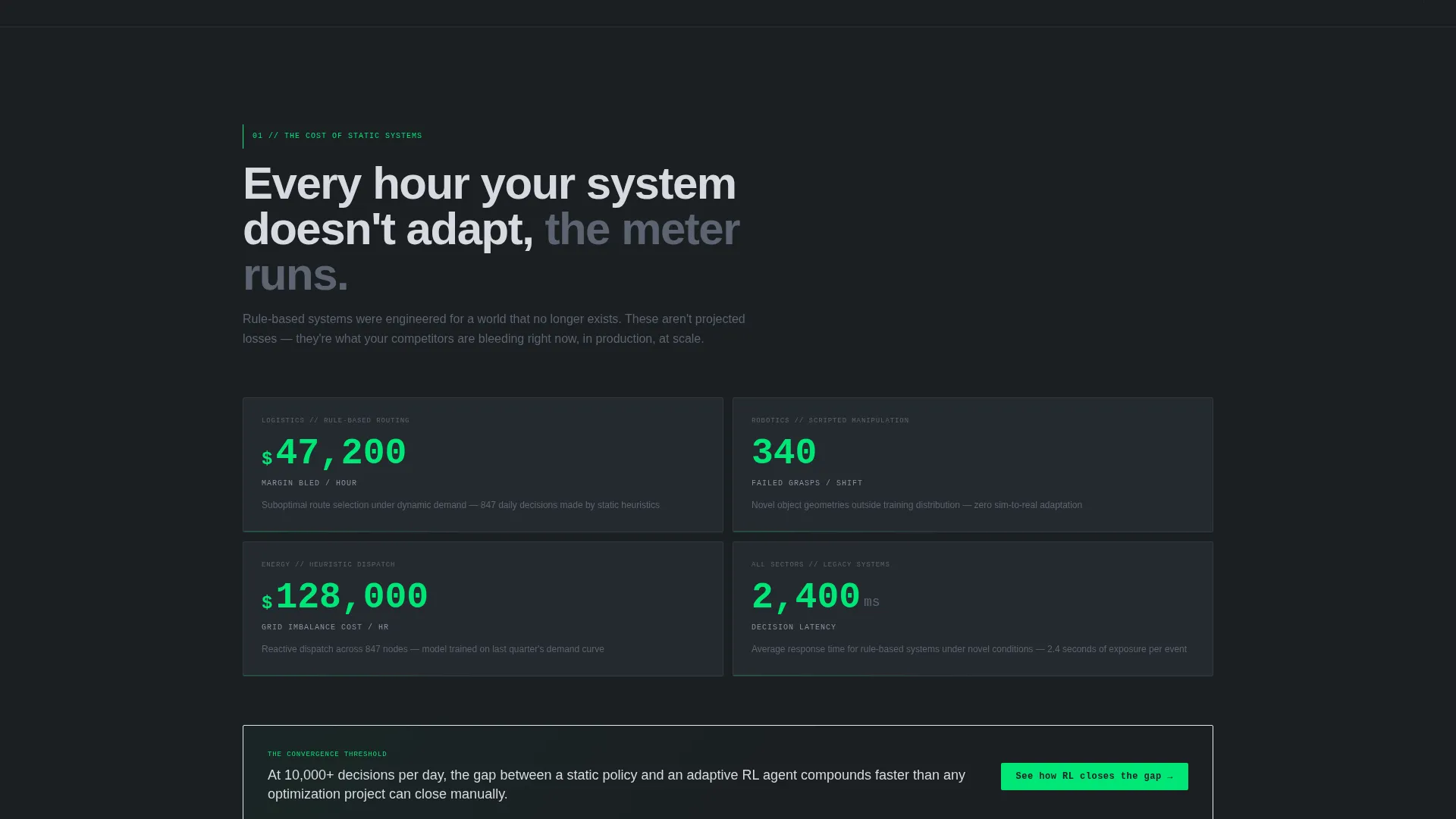
The first spoke section uses animated counters to quantify the margin loss that static systems generate per hour. Numbers move in real time, creating urgency without relying on testimonial copy. The effect grounds the pitch in the visitor's financial reality before the solution is introduced.
Side-by-Side Simulation Comparison
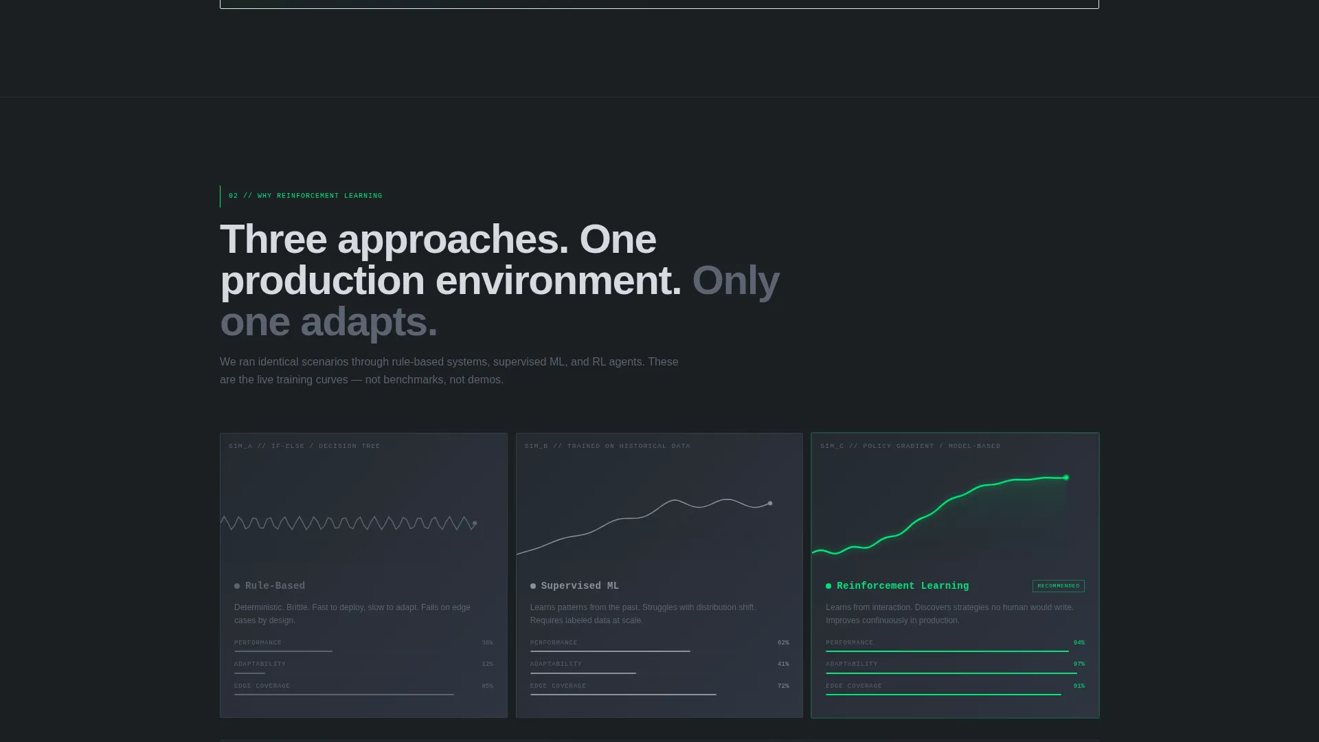
The second spoke runs three parallel simulations simultaneously: a rule-based system, a supervised machine learning model, and a reinforcement learning agent. Visitors see performance differences play out at the same moment, across the same task. This removes the need for abstract explanation by making the contrast visible.
Interactive Comparison Table with Signal-Green Pulse
The final spoke anchors a persistent interactive table comparing rule-based systems, supervised learning, and reinforcement learning across latency, adaptability, edge-case handling, and long-term cost. Reinforcement learning cells pulse in signal-green. The table stays anchored so visitors can reference it while deciding whether to submit the diagnostic form.
Dual Conversion Path
The primary call to action, "Run a Feasibility Diagnostic," appears at the comparison table and as a sticky navigation element that activates after 40 percent scroll depth. A secondary path, "Download the RL versus. Rules Benchmark Report," captures email for leads not ready to engage, ensuring the page's argument travels with them after they leave.
Page sections overview
| Section | Purpose |
|---|---|
| WebGL Reward Header | Opens with a live agent training simulation and a self-typing headline |
| Environment Toggle Bar | Lets visitors switch between three domain-specific agent scenarios |
| Cost of Static Systems | Animated counters show real-time margin loss from rule-based approaches |
| RL versus. ML Comparison | Three parallel simulations contrast performance across decision methods |
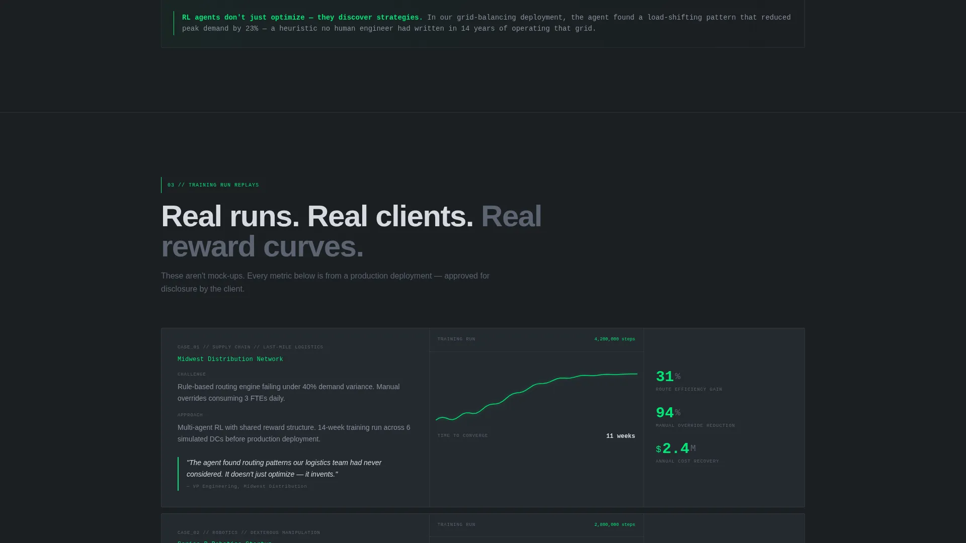
| Case Study Replays | Replays real training runs with client-approved metrics |
| Interactive Comparison Table | Persistent table contrasts three system types across four performance dimensions |
| Feasibility Diagnostic Form | Primary conversion form with system type, approach, and decisions-per-second fields |
| Benchmark Report Capture | Secondary email capture tied to the downloadable PDF lead magnet |
| Sticky Navigation Bar | Anchor nav activates at 40 percent scroll; call to action persists throughout |
Design & branding system
The visual identity follows a Data Command theme rendered through a Monochrome Steel color system. The palette is deliberately industrial, referencing the thermal aesthetic of server hardware rather than the polished softness of typical software-as-a-service design.
- Core palette: deep gunmetal (#1B1F23) for backgrounds, brushed steel mid-tone (#5C6370) for secondary text and inactive states, and light alloy (#D7DAE0) for primary readable text
- Signal-green (#00E676) is reserved exclusively for interactive states, live data pulses, and calls to action, earning its presence by meaning something is active or requires attention
- No stock imagery, no illustration; every visual element is either a rendered simulation, a live data readout, or a typographic element, keeping the page feeling like an operational environment rather than a marketing surface
Mobile & speed optimization
The template is structured so that its most data-intensive elements, particularly the WebGL header and animated counters, are positioned to load progressively. The layout adapts the dense desktop simulation views into readable, sequential mobile blocks without losing the escalating narrative.
- The three-environment toggle and parallel simulation panels reflow into stacked, individually scrollable panels on smaller viewports
- The sticky navigation anchor bar and persistent comparison table remain functional on mobile, keeping the conversion path accessible at every scroll position
- The signal-green accent remains the sole color marker for interactive elements on all screen sizes, preserving the visual language across devices
How this template helps you convert
The page is engineered as a Comparison/Versus conversion sequence. Every section raises the stakes before presenting the next proof point, so by the time the visitor reaches the comparison table, the argument has already been built.
- The live reward-curve header creates immediate proof of capability before a single word of body copy is read, reducing the skepticism that kills most consulting page conversions.
- The escalating spoke structure moves visitors from cost awareness through conceptual contrast to replayed case study evidence, so the comparison table lands as confirmation rather than a first claim.
- The dual call-to-action system captures both ready buyers through the diagnostic form and research-stage leads through the benchmark report, preventing high-intent traffic from leaving empty-handed.
Other information about this template
This template is built as a hub-and-spoke layout with full anchor navigation, meaning every section is reachable from the persistent top bar. The spoke structure is ordered deliberately: cost first, contrast second, evidence third, decision last. The Launch Energy creative direction means the page is designed to feel like it is accelerating as the visitor scrolls, with signal-green appearing more frequently in later sections to signal proximity to a decision point.
- The template style is Hub and Spoke with Anchor Navigation, suitable for long-form, high-density consulting or technology service pages
- The header concept is an Interactive Preview, distinguishing the page from static hero sections common in the consulting category
- The conversion direction is Comparison/Versus, making it well-suited for any service where the core argument is "our approach outperforms existing alternatives"
- The Data Command theme and Monochrome Steel palette are designed specifically for audiences who respond to precision, density, and industrial credibility over lifestyle-oriented design
Theme
Data Command
Creative direction
Launch Energy
Color system
Monochrome Steel
Style
Hub & Spoke (Anchor Nav)
Direction
Comparison/Versus
Page Sections
Live Webgl Reward-curve Header
Three-environment Toggle
Animated Margin-loss Counters
Side-by-side Simulation Comparison
Pulsing Interactive Comparison Table
Dual Conversion Path System
Related questions
Can I change the three environments in the header simulation?
How does the sticky navigation bar work?
What fields does the feasibility diagnostic form collect?
Is there a secondary path for leads not ready to book a call?
Who is this landing page template best suited for?



