Robust DevOps Landing Page Template
Pipeline is a dark-themed, card grid landing page template built for DevOps consulting practices. It combines a monospaced terminal aesthetic with a modular service spec layout, a tool logo ribbon, and a freemium audit conversion flow. The design feels like a live infrastructure dashboard, precise, scannable, and immediately credible to engineering-minded buyers.
by Rocket studio
Quick summary
Pipeline is a single-page DevOps consulting landing page template built around a card grid layout. It uses a deep terminal color system, a scrolling tool logo ribbon, and a modular service spec structure so technical buyers can evaluate offerings the way engineers evaluate tools, by scanning specs, not reading narratives. The free infrastructure audit form drives conversion without requiring commitment.
Who this template is for
This template is purpose-built for DevOps consultancies and independent platform engineers who serve technical decision-makers. It speaks directly to buyers who think in pipelines, not paragraphs.
- DevOps consultancies offering services such as continuous integration and delivery pipeline design, infrastructure as code audits, and incident response planning
- Platform engineering teams and solo consultants targeting chief technology officers at growth-stage startups or engineering managers at mid-market software-as-a-service companies
- Consulting practices that need to establish technical credibility fast, before a prospect ever books a call
What problem this template solves
Most consulting landing pages feel like brochures. Technical buyers skim past generic value propositions and look for proof of competence. This template solves the credibility gap by presenting services as structured spec cards rather than marketing copy.
- Ops teams drowning in Terraform sprawl or config drift need to see that you understand their exact problem, not a sanitized version of it
- Engineering managers facing an audit deadline want a clear deliverables list, not a paragraph about your philosophy
- The freemium audit flow removes the friction of a sales call by delivering value first, earning trust before a contract is discussed
What you get with this template
The template packages a complete single-page layout designed around the way DevOps buyers actually evaluate vendors. Every section has a defined job, and none of them waste the reader's time.
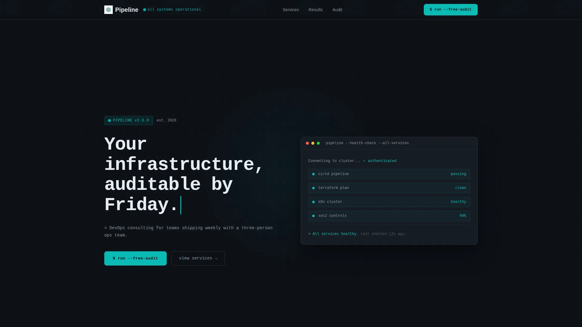
- A scrolling logo ribbon header, a typewriter-style monospaced headline, and a dotted topology background that establish technical authority without a hero image
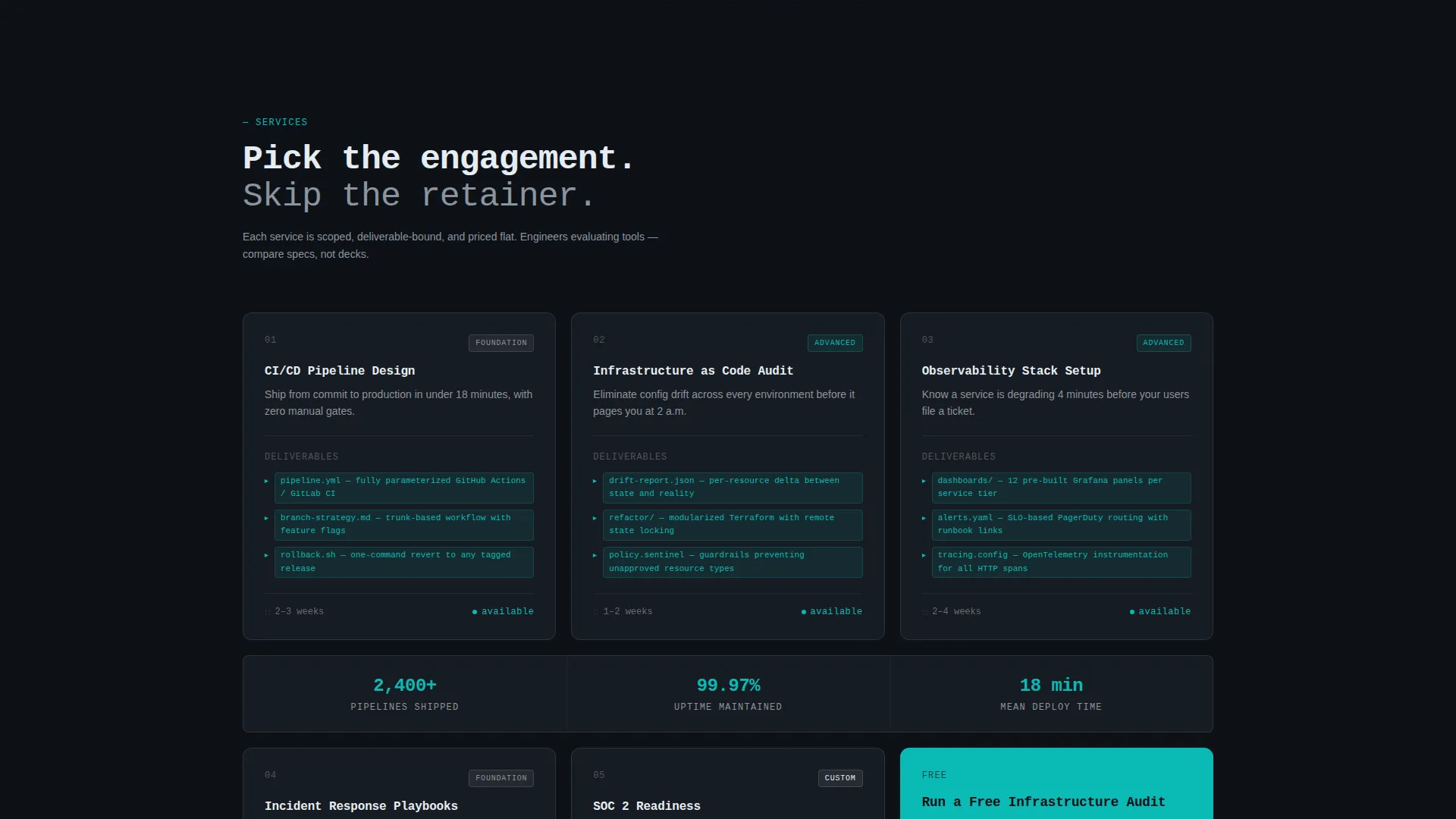
- A modular service card grid where each card shows a service name, a one-line outcome, three deliverables in inline code formatting, an estimated engagement length, and a complexity badge
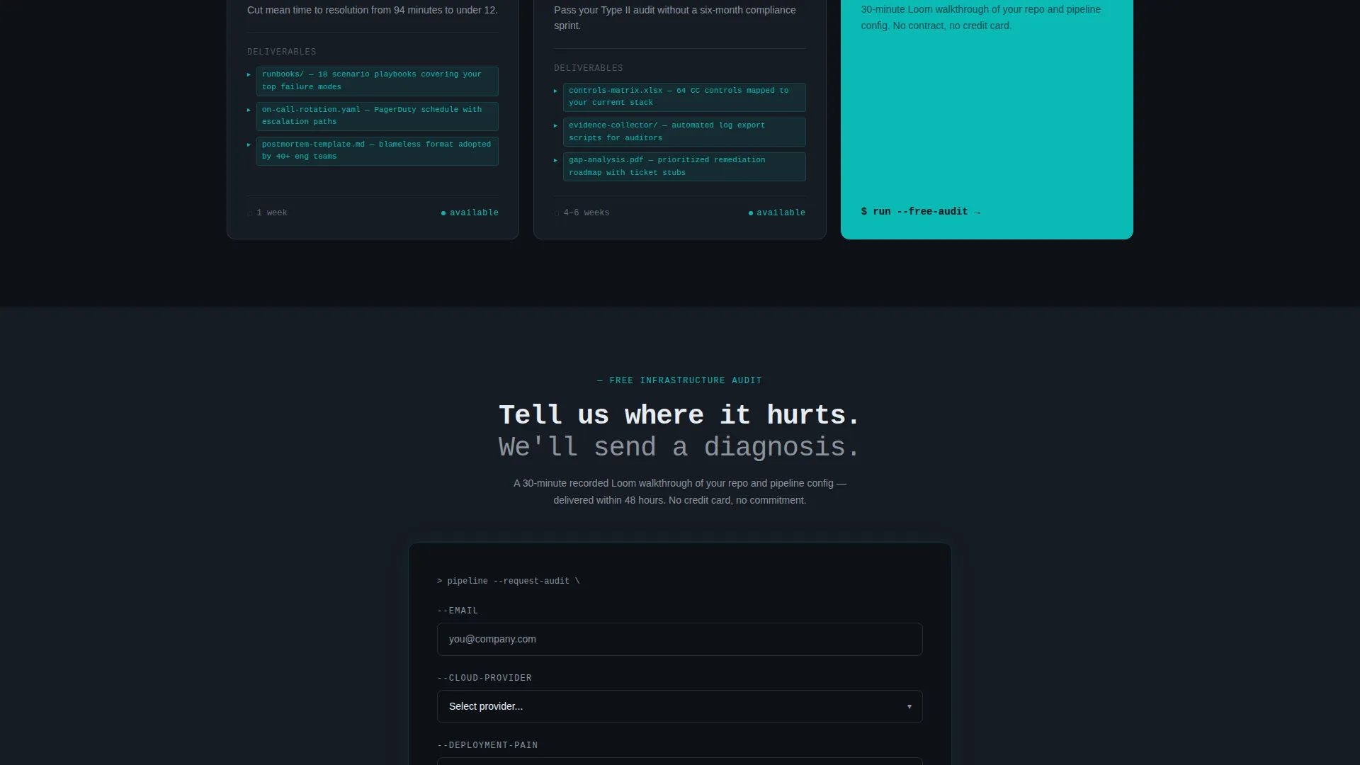
- A three-field freemium audit form with a secondary calendar booking path, plus a sticky top bar and a closing grid card that both carry the primary call to action
Feature list
The section below details what each major component of this template delivers and how it contributes to the overall page experience.
Scrolling Tool Logo Ribbon
A horizontal header ribbon displays recognized infrastructure and platform tool logos at a slow, mechanical scroll speed. It communicates tooling fluency before a single line of copy is read, establishing immediate context for technical visitors.
Typewriter Monospaced Headline
The hero headline renders character by character in a monospaced font against a pure terminal black background. The restrained, no-image approach signals confidence. The result reads like live terminal output rather than a marketing tagline.
Modular Service Spec Card Grid
Each service is presented as a self-contained card following identical anatomy: service name, outcome statement, three deliverables in inline code style, estimated engagement length, and a complexity badge labeled Foundation, Advanced, or Custom. The grid lets visitors compare services the way they compare tools.
Inline Metric Bar
Between card rows, a single-line metric bar displays aggregate proof points. Social proof is delivered at the exact moment a visitor is evaluating individual services, reinforcing confidence mid-scroll without interrupting the grid rhythm.
Freemium Audit Conversion Form
The primary conversion path is a three-field form collecting a work email, a cloud provider selection, and a one-sentence description of the visitor's biggest deployment problem. The offer is a recorded infrastructure walkthrough, providing real value before any sales conversation begins.
Sticky Call-to-Action Bar
The primary call to action appears in a sticky top navigation bar and again as the final card in the service grid. This dual placement ensures the conversion prompt is always visible without interrupting the scanning experience.
Page sections overview
| Section | Purpose |
|---|---|
| Logo ribbon header | Establish tooling credibility visually |
| Typewriter hero headline | Set the consultancy's positioning statement |
| Service card grid | Present discrete offerings as scannable specs |
| Aggregate metric bar | Reinforce trust with proof points mid-scroll |
| Freemium audit form | Capture leads with a value-first offer |
| Secondary booking path | Offer a direct call option for warmer prospects |
Design & branding system
The visual system is built around a dark terminal aesthetic that feels familiar to the engineers and technical leaders this template targets. Every color choice has a functional purpose, not just a decorative one.
- The primary background is deep terminal black (#0D1117), with cards sitting on a barely-lighter surface (#161B22) to create subtle elevation and a monitoring-wall feel
- Active teal (#0ABAB5) marks status indicators, interactive accents, and the primary call-to-action button, while muted slate (#8B949E) handles secondary text, card borders, and supporting labels
- Signal white (#E6EDF3) is reserved for headlines and primary copy, and a faint dotted grid overlay on the background suggests an infrastructure topology map
Mobile & speed optimization
The card grid layout is built to reflow cleanly across screen sizes, maintaining the spec-card scanning experience on smaller viewports. The restrained visual approach, with no large hero images, supports a lightweight page structure.
- The sticky call-to-action bar remains accessible on mobile, keeping the primary conversion path reachable at any scroll depth
- The scrolling logo ribbon and typewriter headline are designed to work as visual anchors on both desktop and mobile without requiring heavy media assets
How this template helps you convert
The conversion strategy is built around a freemium model that removes the biggest obstacle in technical sales: the ask for commitment before proof of competence. Every design and layout decision supports this flow.
- The scrolling logo ribbon and typewriter headline establish credibility in the first few seconds, so technically skeptical visitors stay long enough to scan the service cards
- The modular spec card grid lets visitors self-qualify by reading deliverables, complexity levels, and engagement timelines, reducing friction before they reach the form
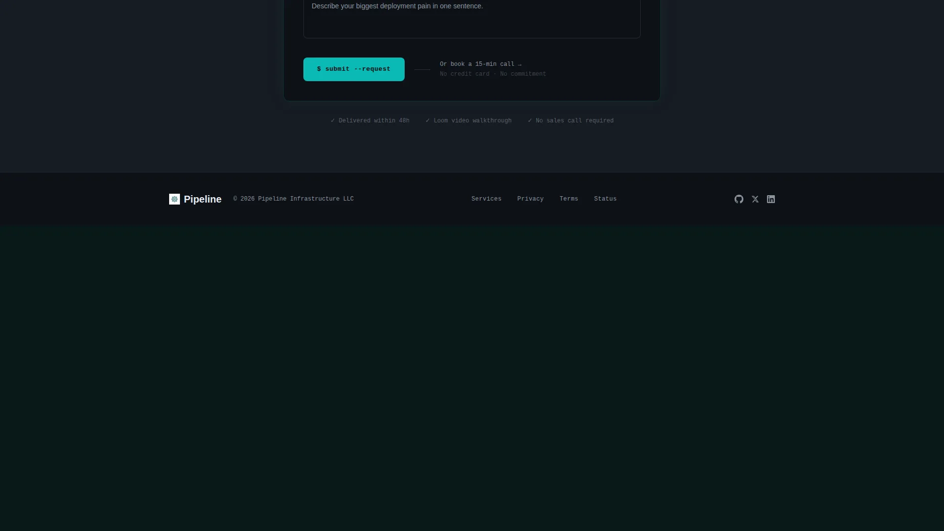
- The three-field audit form offers a concrete, low-commitment first step, and the secondary calendar booking link gives warmer prospects an immediate alternative path
Other information about this template
This template is designed specifically for the DevOps consulting niche and reflects the visual and structural language that infrastructure teams recognize. It is a strong fit for practices that use tooling such as Kubernetes, Terraform, ArgoCD, and cloud providers like AWS to deliver their work.
- The Dashboard Pro theme and Teal Catalyst color system make this template visually distinct from generic agency pages, signaling deep domain expertise to technical buyers
- Services showcased in the template include continuous integration and delivery pipeline design, infrastructure as code audits, observability stack setup, incident response playbook creation, and readiness reviews for compliance frameworks
- The Freemium/Trial conversion model and the Card Grid layout style are intentional choices aligned to how platform engineers and engineering managers evaluate vendors
Theme
Dashboard Pro
Creative direction
Spec Sheet
Color system
Teal Catalyst
Style
Card Grid (Modular)
Direction
Freemium/Trial
Page Sections
Scrolling Tool Logo Ribbon
Typewriter Monospaced Headline
Modular Service Spec Card Grid
Aggregate Metric Bar
Freemium Audit Conversion Form
Sticky Call-to-action Bar
Related questions
Can I customize the service cards for my specific DevOps offerings?
Does the freemium audit form connect to a scheduling or booking tool?
Is this template suitable for a solo consultant or only for a larger team?
What makes this layout feel credible to technical buyers like CTOs or engineering managers?
Can I add or remove cards from the service grid?



