Healthcare AI Recommendation Engine Landing Page
Diagnose is a split-screen healthcare AI landing page template built for clinical decision support tools. It combines a live product screenshot hero, a feature matrix scroll structure, and a three-step pilot conversion form. Designed with a Tech Glass visual identity in Electric Indigo, it targets hospital CMOs, IT directors, and hospitalists who need fast, evidence-ranked clinical recommendations.
by Rocket studio
Quick summary
Diagnose is a single-page landing page template purpose-built for AI-powered clinical recommendation engines. It uses a 50/50 split-screen layout, a product screenshot hero, and a feature matrix scroll to communicate clinical credibility at a glance. The Electric Indigo color system and glowing cyan accents make the interface feel sterile, alive, and trustworthy.
Who this template is for
This template speaks directly to healthcare technology buyers who need to evaluate and adopt a clinical decision support tool quickly. It is built for people who have both clinical authority and technical scrutiny.
- Hospital Chief Medical Officers evaluating clinical decision support software for their health system
- Health-system IT directors who need to assess integration readiness with existing electronic health record platforms
- Hospitalists and on-call physicians who rely on fast, evidence-backed second opinions during high-pressure shifts
What problem this template solves
Clinical AI tools often fail to earn trust because their landing pages look like generic software marketing. Diagnose solves the credibility gap. It leads with the real product, not a cartoon illustration, and lets the interface itself make the clinical case.
- Buyers cannot quickly assess whether the tool is clinically defensible without seeing its evidence-ranking logic
- IT stakeholders need a clear picture of integration scope before they will commit to a pilot conversation
- Overworked clinicians need confidence that the tool works at the speed and depth their workflow demands
What you get with this template
You get a complete, single-page landing page layout ready to represent a healthcare AI recommendation engine. Every section is structured to build clinical trust progressively as the reader scrolls.
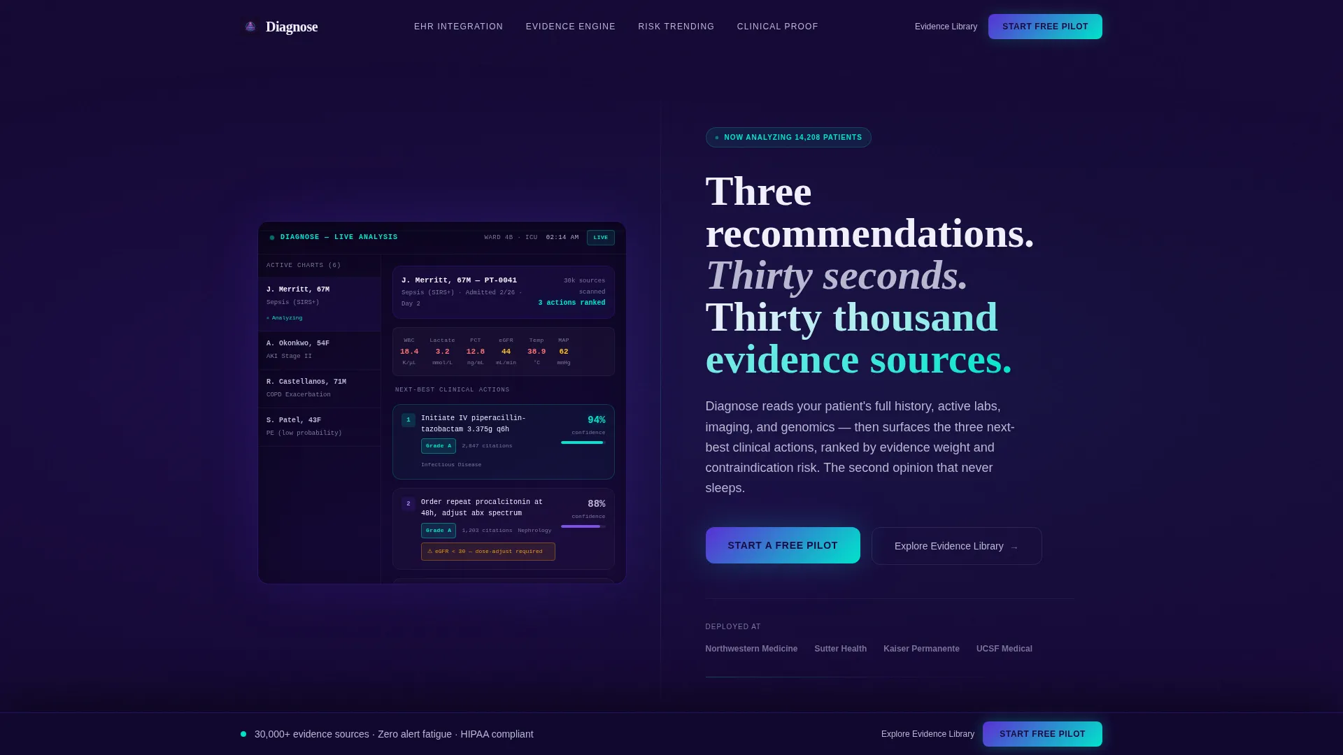
- A 50/50 split-screen hero with a product dashboard screenshot on the left and a headline-plus-call to action panel on the right
- A scrollable feature matrix pairing isolated capability descriptions with frozen product views for each feature
- A three-step progressive conversion form and a sticky bottom bar call to action, plus a secondary lead-capture path for evidence library visitors
Feature list
This template is built around components that serve the clinical buying journey from first impression to pilot booking.
Split-Screen Product Screenshot Hero
The header divides the viewport into two equal halves. The left half renders a de-identified patient panel dashboard at native resolution, showing three ranked recommendations each tagged with an evidence grade (A, B, or C), a contraindication flag in amber, and a source-journal citation count. The right half holds a single bold headline and the primary "Start a Free Pilot" call to action on a deep indigo background.
Scrollable Feature Matrix Layout
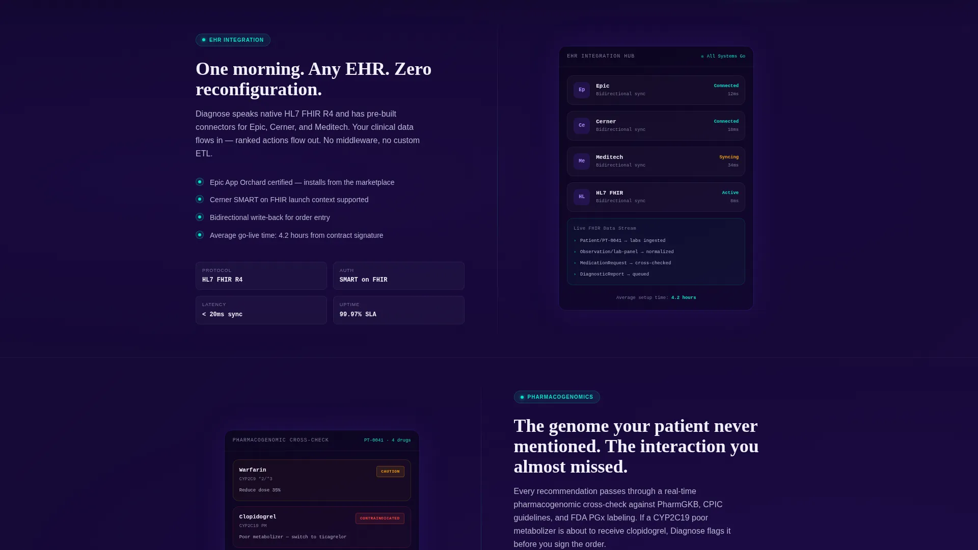
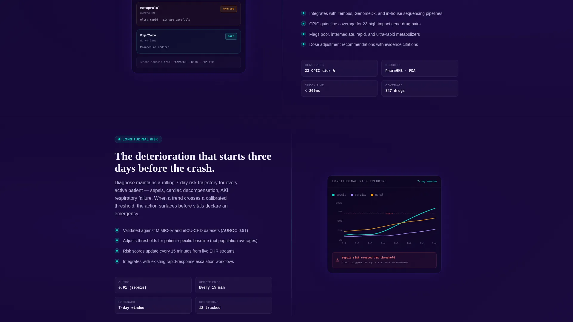
Each section below the hero isolates one product capability on the left side of the split while the right side displays the corresponding product view frozen at the exact moment that feature fires. Capabilities covered include electronic health record integration, real-time pharmacogenomic cross-check, and longitudinal risk trending. The scroll builds a living spec sheet rather than a story.
Cyan Pulse Micro-Interactions
Each feature row triggers a cyan glow animation as it enters the viewport. The pulse mimics a heart monitor cadence, so the page feels like it is breathing. Confidence score indicators throughout the layout glow in electric cyan, echoing the visual language of vital-sign monitors.
Three-Step Progressive Pilot Form
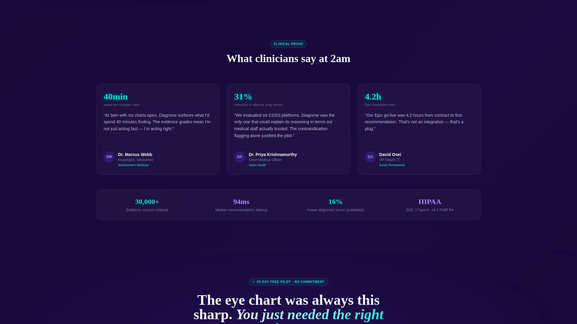
The conversion form guides prospects through three focused steps. Step one collects work email and health-system name. Step two presents a radio selector for electronic health record platform preference, covering major platforms and an open-field option. Step three embeds a calendar to book a 15-minute sandbox walkthrough.
Sticky Bottom Bar call to action
After the visitor scrolls past the third feature row, a sticky bottom bar activates and repeats the "Start a Free Pilot" call to action. This persistent nudge keeps the conversion path visible without interrupting the reading flow of the feature matrix.
Secondary Evidence Library Path
A secondary call to action, labeled "Explore the Evidence Library," links to a gated research portal. This path captures leads who want to vet clinical rigor before committing to a pilot, extending the conversion funnel without pressuring early-stage buyers.
Page sections overview
| Section | Purpose |
|---|---|
| Split-screen hero | Anchors product credibility with a live dashboard screenshot and primary call to action |
| Headline panel | Delivers the core value proposition in a single bold statement |
| EHR integration row | Demonstrates integration capability alongside a frozen product view |
| Pharmacogenomic check row | Shows real-time drug-gene cross-check feature in context |
| Risk trending row | Illustrates longitudinal patient risk analysis with a matching product screenshot |
| Sticky bottom bar | Keeps the pilot call to action visible after the third feature section activates it |
| Three-step pilot form | Converts qualified leads through a progressive email, platform, and calendar flow |
| Evidence library call to action | Captures research-focused leads via a gated secondary conversion path |
Design & branding system
The visual identity follows a Tech Glass theme built on an Electric Indigo color system. The palette is designed to feel like looking through a surgical loupe at a backlit display, sterile and luminous at the same time.
- Core colors include deep substrate indigo (#1A0A3E), glowing midfield violet (#5B2FD4), clinical-white glass (#F0F0FA), and electric accent cyan (#00E5CC) reserved for interactive states, hover glows, and confidence-score indicators
- Every surface is designed to feel faintly luminous, as though live data is running beneath the glass, reinforcing the sense that the tool is always on
- No decorative illustrations are used; the product dashboard is the visual centerpiece, and the design system frames it without competing with it
Mobile & speed optimization
The template is structured for a clean responsive experience across device sizes. The 50/50 split-screen layout adapts so clinical buyers can review the feature matrix on any screen.
- The split-screen sections reflow to single-column stacking on smaller viewports, preserving the pairing between capability text and product screenshot
- The sticky bottom bar and three-step form are designed to remain functional and readable on mobile screens throughout the scroll
- Micro-interaction timing is set to the viewport-entry trigger, so cyan pulse effects fire correctly whether the visitor is on desktop or a tablet
How this template helps you convert
The template is structured around two conversion paths and three reinforcement mechanics that work together to move buyers from skepticism to a booked pilot call.
- The hero section places the primary "Start a Free Pilot" call to action at the top of the page alongside the product screenshot, capturing high-intent visitors before they scroll.
- The feature matrix builds progressive conviction row by row, and the sticky bottom bar re-surfaces the call to action at exactly the moment a scrolling visitor has seen enough evidence to act.
- The secondary "Explore the Evidence Library" path ensures that research-oriented buyers, who are not yet ready to pilot, still enter the funnel through a gated lead-capture step.
Other information about this template
This template is designed specifically for the healthcare AI recommendation engine category, where trust and evidence credibility are the primary buying signals. A few additional details are worth noting.
- The template style is a 50/50 split screen, and the creative direction follows a feature matrix logic rather than a narrative scroll
- The header concept is a product screenshot, not an abstract illustration, which aligns with how clinical software buyers evaluate tools
- The freemium and trial conversion direction means the primary goal is a low-friction pilot signup, with the calendar embed in step three reducing scheduling friction
- The Tech Glass theme and Electric Indigo palette were selected to visually differentiate this template from generic health-tech marketing and to reinforce the precision and depth of the underlying AI tool
- This template fits naturally within a broader AI for healthcare software marketing context, where buyers expect both clinical depth and modern interface design
Theme
Tech Glass
Creative direction
Feature Matrix
Color system
Electric Indigo
Style
Split Screen (50/50)
Direction
Freemium/Trial
Page Sections
Split-screen Product Screenshot Hero
Scrollable Feature Matrix
Cyan Pulse Micro-interactions
Three-step Progressive Pilot Form
Sticky Bottom Bar Call to Action
Gated Evidence Library Path
Related questions
Who is this landing page template designed for?
What conversion paths does this template include?
Can I customize the product screenshot in the hero section?
What does the sticky bottom bar do?
Does the template support more than one call to action?



