Ride-Hailing Platform Bento Grid Landing Page Template
Dispatch is a bento grid landing page template built for ride-hailing and mobility platforms. It presents a dark, dashboard-style interface with a monochrome steel palette and electric cyan accents. Designed for operations managers, fleet coordinators, and technical evaluators, it leads with live data visuals, a capability comparison grid, and two distinct conversion paths to drive demo requests and spec downloads.
by Rocket studio
Quick summary
Dispatch is a single-page bento grid template for mobility and ride-hailing platforms. It opens with a full-bleed dark header featuring a glowing dispatch dashboard, then inventories platform capabilities as labeled data cards. A structured versus grid and dual conversion paths make it ideal for buyers evaluating dispatch technology against existing solutions.
Who this template is for
This template is built for teams that need to communicate technical power quickly and clearly to a discerning, numbers-first audience.
- Operations managers at regional ride-hailing startups who need to showcase platform control
- Fleet coordinators managing large driver pools across multiple metro areas
- CTOs and technical evaluators comparing dispatch platforms before a build-or-buy decision
What problem this template solves
Most mobility platform pages bury capability behind lifestyle imagery and vague promises. Technical buyers want proof, not polish. Dispatch solves that disconnect by leading with measurable specs and structured comparisons.
- Eliminates the gap between what a platform can do and what a prospect can immediately verify
- Replaces generic marketing copy with data cards, metrics, and a direct side-by-side comparison layout
- Gives evaluators a fast path to both a live demo and a downloadable spec document for internal review
What you get with this template
You get a fully structured, single-page bento grid layout built around a dark dashboard aesthetic and a precise conversion flow. Every section is designed to earn trust through data before asking for contact.
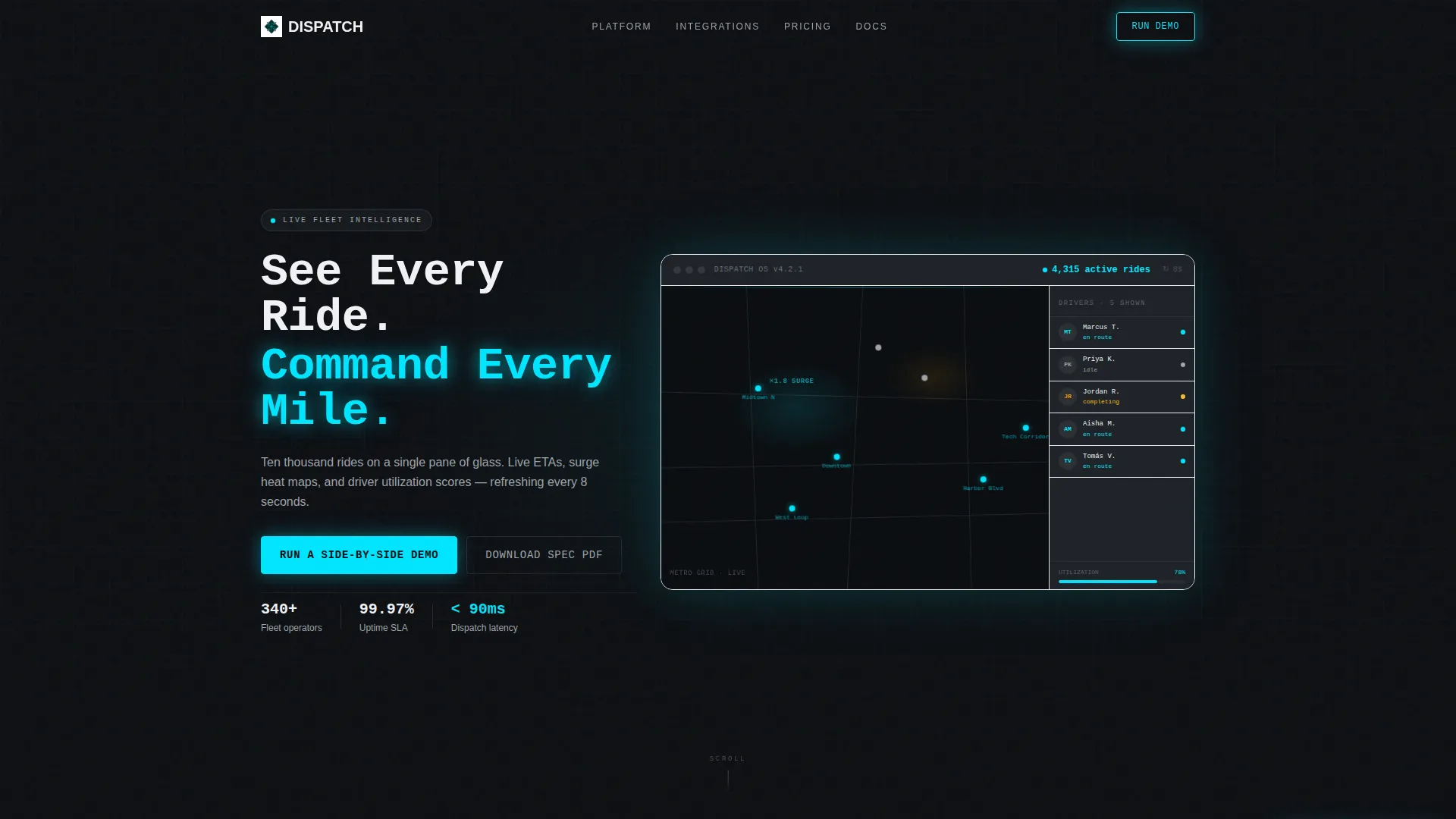
- A dark full-bleed header with a glowing ride-dispatch dashboard visualization, live-style map pins, driver status chips, and a real-time ride counter
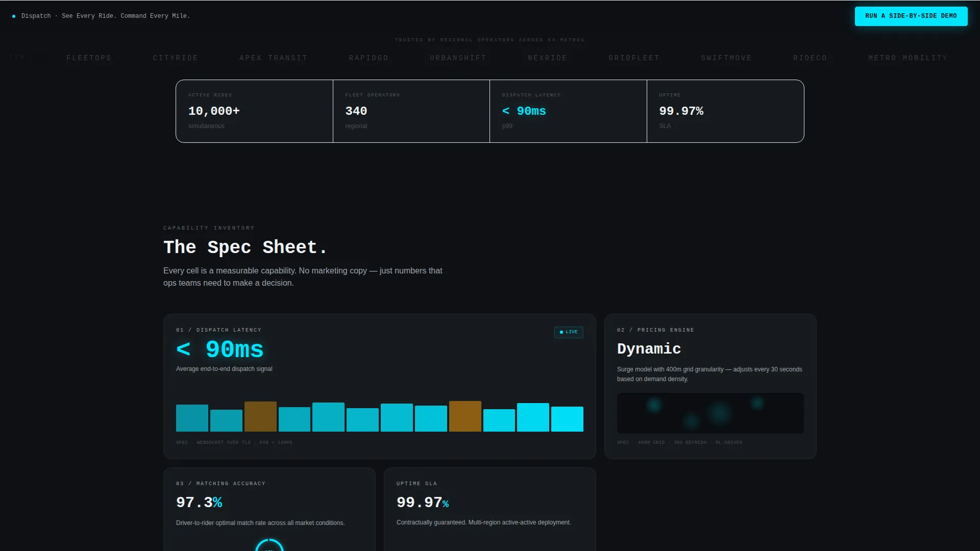
- A bento grid capability section presenting dispatch latency, dynamic pricing, driver matching, multi-city fleet switching, and analytics export as individual labeled data cards
- A versus comparison grid, dual call-to-action paths, a sticky scroll bar, and a two-field demo request form
Feature list
This template is structured around six core design and layout capabilities drawn directly from the brief.
Dark Full-Bleed Dashboard Header
The header fills the entire viewport in forge black and renders a softly glowing dispatch interface at its center. Map pins move along named streets, a sidebar shows driver avatars with status chips (en route, idle, completing), and a top bar displays an active ride count that appears to tick upward in real time. The headline is set in a monospaced typeface and reads: "See Every Ride. Command Every Mile."
Bento Grid Capability Cards
Each cell in the bento grid presents one platform capability as a labeled data card. Cards include a headline metric, a micro-animation, and a one-line technical spec. Covered capabilities include dispatch latency under 90 milliseconds, the dynamic pricing engine, driver-matching algorithm accuracy, multi-city fleet switching, and real-time analytics export.
Versus Comparison Grid
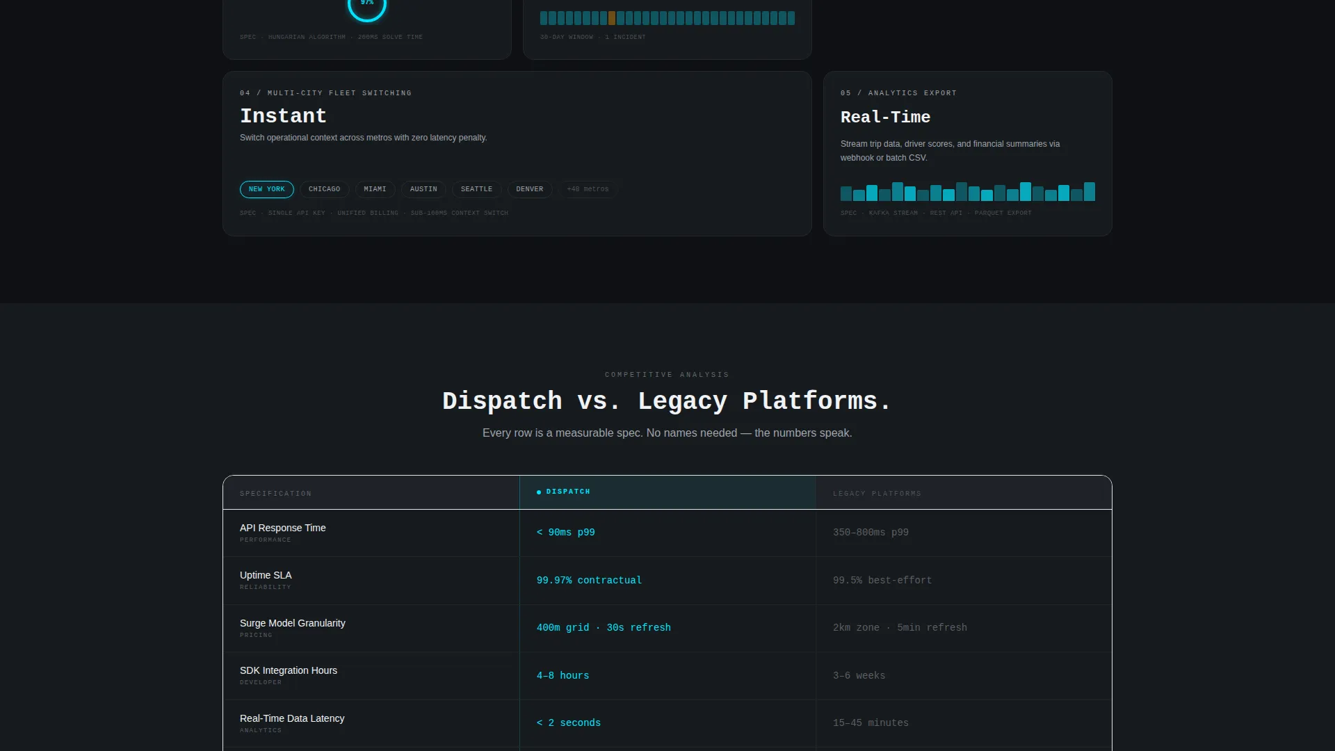
Midway through the page, the bento layout reorganizes into a structured two-column comparison table. The left column represents the platform being showcased; the right represents legacy alternatives. Every row is a measurable spec: API response time, uptime service-level agreement, surge model granularity, and SDK integration hours. The platform column glows cyan; the competitor column stays flat gray.
Dual Conversion Path Design
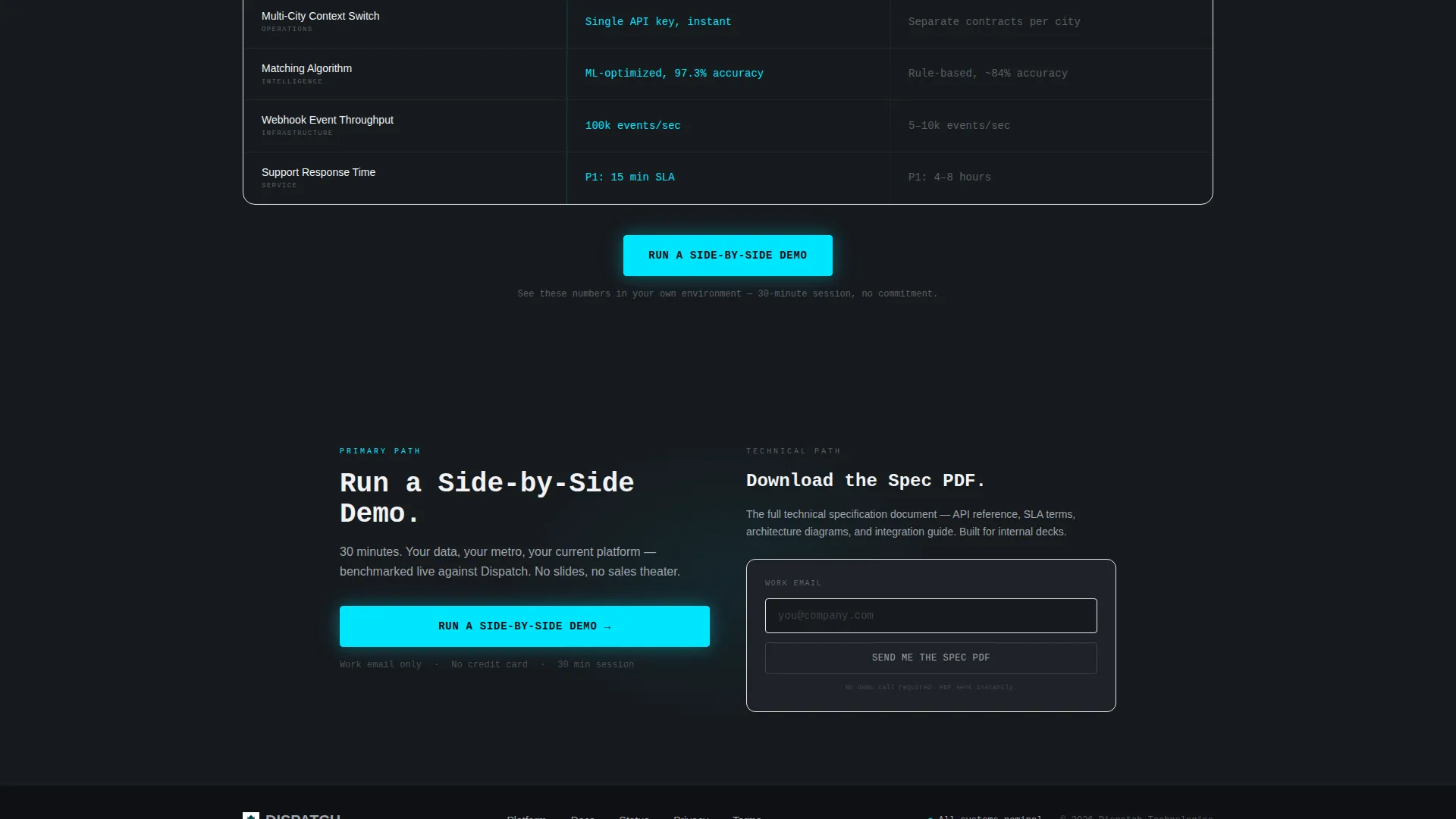
The page supports two distinct conversion paths running simultaneously. The primary path drives demo requests through a cyan-glow button and a sticky scroll bar. The secondary path captures technical evaluators via a gated spec PDF download that requires only an email address.
Two-Field Demo Request Form
Clicking the primary call-to-action opens a minimal form with two fields: work email and current platform. The current platform field is a dropdown listing available categories. This low-friction form keeps the conversion barrier as small as possible for qualified prospects.
Sticky Call-to-Action Bar
The primary call-to-action button anchors to the bottom of the versus grid and reappears as a persistent sticky bar during scroll. This keeps the conversion action visible at every point in the page without interrupting the data-first reading experience.
Page sections overview
| Section | Purpose |
|---|---|
| Full-Bleed Header | Establish dark dashboard atmosphere and introduce the platform headline |
| Active Ride Counter | Display a live-style ride count to signal real-time platform scale |
| Driver Status Sidebar | Show driver avatars with status chips to illustrate dispatch visibility |
| Bento Capability Grid | Present individual platform specs as labeled data cards with micro-animations |
| Dispatch Latency Card | Highlight sub-90-millisecond dispatch response as a lead performance metric |
| Dynamic Pricing Card | Showcase the surge pricing engine as a distinct capability cell |
| Driver Matching Card | Feature algorithm accuracy as a measurable, trust-building data point |
| Multi-City Switching Card | Communicate fleet scalability across multiple metropolitan areas |
| Analytics Export Card | Present real-time data export as a standalone operational capability |
| Versus Comparison Grid | Compare platform specs against legacy alternatives row by row |
| Primary call to action Block | Anchor the "Run a Side-by-Side Demo" button at the base of the versus section |
| Sticky call to action Bar | Keep the demo request action persistent throughout the scroll journey |
| Demo Request Form | Capture work email and current platform via a two-field inline form |
| Spec PDF Gate | Offer a downloadable specification document behind an email-only gate |
Design & branding system
The visual identity follows a Dashboard Pro theme using a Monochrome Steel color system. Every color choice is intentional and functional, with no decorative warmth or softness.
- Core palette: forge black (#0E1013) for backgrounds, brushed gunmetal (#2C2F33) for card surfaces, and instrument-cluster gray (#9EA3AB) for secondary labels and inactive states
- Electric cyan (#00E5FF) is reserved exclusively for live data points, active toggle states, and call-to-action pulse effects, making every interactive element instantly recognizable
- Typography uses a monospaced typeface for headlines to reinforce the spec-sheet and instrument-cluster aesthetic throughout the page
Mobile & speed optimization
The bento grid layout is structured to adapt cleanly across screen sizes, keeping the data-card format readable on smaller viewports without losing the dashboard character.
- Bento grid cells are designed to reflow into a single-column stack on mobile, preserving the labeled data card format at reduced widths
- The sticky call-to-action bar remains anchored at the bottom of the viewport on mobile, keeping the primary conversion action accessible at all times during scroll
How this template helps you convert
The entire page is structured around a single principle: prove superiority through numbers before ever asking for contact. Every layout decision reinforces that conversion logic.
- The bento capability grid establishes credibility with measurable specs and micro-animated data cards before the visitor reaches any form or call-to-action element
- The versus comparison grid reframes the decision as a direct, spec-level evaluation, positioning the platform favorably on every row without requiring the visitor to do their own research
- Two parallel conversion paths capture both action-ready prospects (demo form) and research-stage evaluators (spec PDF download), reducing drop-off across different buyer readiness levels
Other information about this template
This template is part of a broader template library designed for technology and mobile app niches, with particular depth in the ride-hailing and mobility platform category.
- The template style is Bento Grid, the theme is Dashboard Pro, and the creative direction is Spec Sheet, making it well-suited to technical SaaS and platform products beyond mobility
- The header concept is Dark Full-Bleed with a glow effect, and the landing page direction is Comparison/Versus, a pattern proven effective for buyers actively evaluating competing solutions
- The color system, Monochrome Steel, can be adopted as-is for any dark-mode platform product that prioritizes precision and operational credibility over consumer warmth
Theme
Dashboard Pro
Creative direction
Spec Sheet
Color system
Monochrome Steel
Style
Bento Grid
Direction
Comparison/Versus
Page Sections
Dark Full-bleed Dashboard Header
Bento Grid Capability Cards
Versus Comparison Grid
Dual Conversion Path Design
Sticky Call-to-action Bar
Two-field Demo Request Form
Related questions
Who is the Dispatch template designed for?
Can I use this template for a product outside the ride-hailing industry?
How does the dual conversion path work?
Does the versus grid name specific competitor platforms?
What form fields does the demo request capture?



