Retail Document Management Landing Page Template
Docflow is a retail document management landing page template built on a bento grid layout with a Feature Tab Switcher header. It showcases a platform that digitizes purchase orders, vendor contracts, compliance certificates, and planograms. Designed for ops managers, compliance officers, and warehouse teams, the page uses a Void and Violet color system to guide visitors toward a guided product demo.
by Rocket studio
Quick summary
Docflow is a single-page bento grid landing page template for a retail document management platform. It turns a chaotic paper-heavy operation into a searchable, auditable digital workflow. The layout opens with a live product demonstration, guides visitors through five capability tabs, and closes every section with a persistent call to action routed to a guided demo.
Who this template is for
This template is built for retail technology companies and software founders who need to communicate a complex document workflow platform quickly and credibly. It speaks directly to the buyers who feel the pain of paper overload every single day.
- Regional retail chain operations managers buried in filing cabinets and manual processes
- Franchise compliance officers chasing expired permits across dozens of locations
- Warehouse receiving teams still printing packing slips in triplicate
What problem this template solves
Retail operations generate enormous volumes of paper: purchase orders, vendor contracts, compliance certificates, and planograms. Communicating the value of a platform that resolves all of that is genuinely hard. A generic product page does not earn trust fast enough.
- Visitors leave before understanding what the platform actually does
- Abstract feature lists fail to show how real retail workflows get resolved
- No single page moment connects the visitor's daily chaos to a clear solution
What you get with this template
You get a fully structured, scroll-driven landing page that demonstrates the platform in motion from the very first second. The template is built around five workflow tabs that each expand into their own deep-dive bento grid section as the visitor scrolls.
- A Feature Tab Switcher header with five tabs: Capture, Classify, Route, Store, and Audit
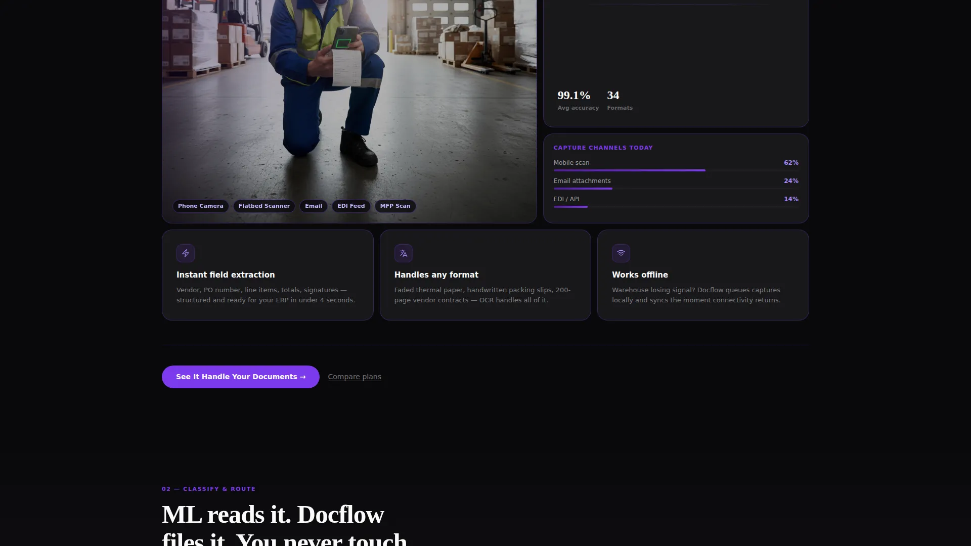
- Bento grid sections that escalate in complexity, from scanning a receipt to multi-location compliance dashboards
- A persistent call-to-action button and a secondary comparison text link built into every section
Feature list
This template includes a carefully structured set of components, each designed to demonstrate a specific stage of the retail document workflow.
Feature Tab Switcher Header
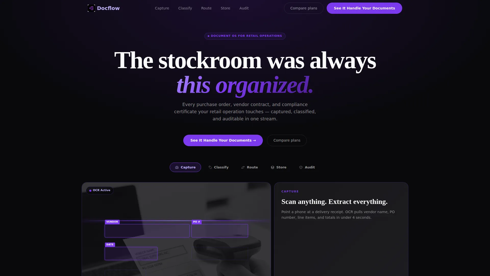
Five labeled tabs sit across the top of the viewport. Each tab triggers a different bento card arrangement below with a snappy rearrangement animation. The default tab opens on the Capture view, showing a phone camera scanning a delivery receipt with optical character recognition extracting line items in real time.
Live OCR Capture Mockup
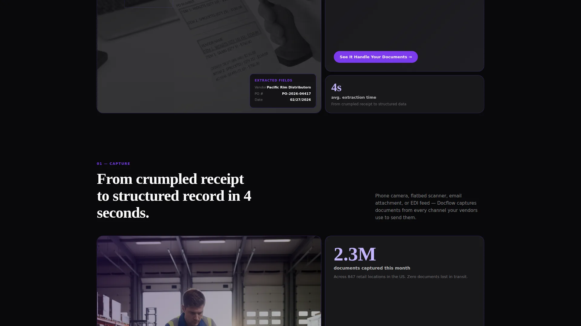
The Capture tab includes a phone camera mockup with violet highlight boxes pulsing around detected fields. This puts the product in front of the visitor within three seconds, replacing a static hero image with a working demonstration of the core feature.
Escalating Bento Grid Sections
Each of the five workflow tabs expands into its own full bento grid section as the visitor scrolls. Sections grow in complexity from a simple receipt scan at Capture to multi-location compliance dashboards, automated expiration alerts, and regulatory report generation at Audit.
Persistent Click-Through call to action
The primary call-to-action button, labeled "See It Handle Your Documents," appears in the top navigation and repeats at the close of every bento section. A secondary text link reading "Compare plans" sits beneath each button for visitors already past the discovery stage.
Void and Violet Bento Grid Layout
Cards float on near-black backgrounds with hairline violet borders that brighten on hover. The grid feels interactive and alive rather than decorative, using electric violet buttons, deep ultraviolet section dividers, and phosphor white typography throughout.
Micro-Animation and Metric Callouts
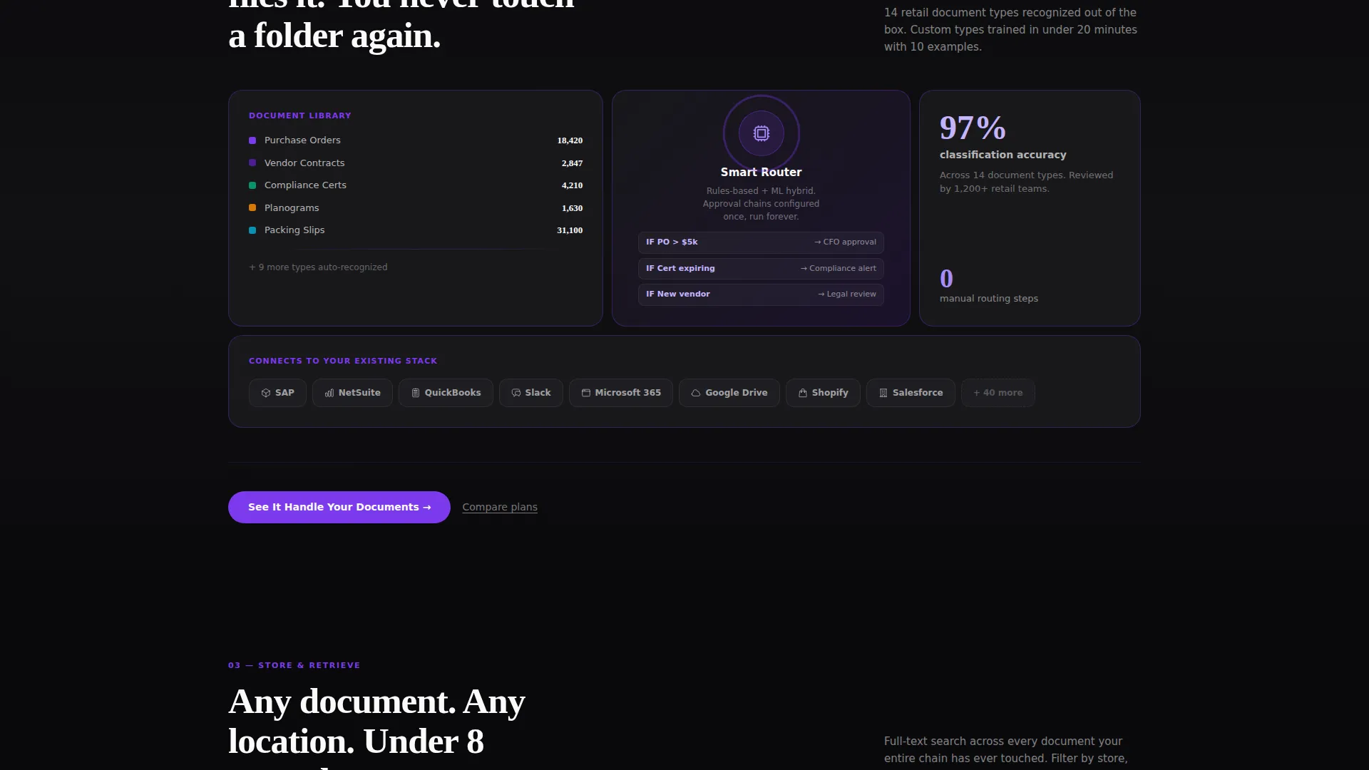
Each bento section includes integration logos, metric callouts, and micro-animations that reinforce the capability being demonstrated. The animations are purposeful, not decorative, each one tied to a specific retail document workflow step.
Page sections overview
| Section | Purpose |
|---|---|
| Tab Switcher Header | Introduces five workflow tabs and triggers animated bento card rearrangements |
| Capture Bento Grid | Shows OCR scanning of delivery receipts with real-time field detection |
| Classify Bento Grid | Demonstrates automatic document sorting and categorization logic |
| Route Bento Grid | Illustrates how documents move through approval and distribution flows |
| Store Bento Grid | Covers searchable, auditable digital document storage capabilities |
| Audit Bento Grid | Displays multi-location compliance dashboards and expiration alert systems |
| Persistent call to action Row | Repeats the primary demo button and secondary compare-plans link per section |
Design & branding system
The template uses a Void and Violet color system designed to feel like a focused terminal screen during a late-night product sprint. Every color decision reinforces urgency, clarity, and forward motion.
- Absolute void black (#09090B) dominates backgrounds and card gutters; phosphor white (#FAFAFA) keeps typography razor-sharp
- Electric violet (#7C3AED) drives buttons, hover states, and progress indicators; deep ultraviolet (#4C1D95) anchors section dividers
- Hairline violet borders on bento tiles brighten on hover, making the grid feel interactive rather than static
Mobile & speed optimization
The bento grid layout is structured to adapt across screen sizes without losing the tab-switcher interaction or the escalating section hierarchy. Every layout decision was made with scroll-driven engagement in mind.
- Bento card arrangements reflow cleanly so the tab preview and deep-dive sections remain readable on smaller viewports
- The persistent top-navigation call to action button stays accessible regardless of scroll position
- Micro-animations and hover states are tied to interaction rather than autoplay, keeping the experience focused on user intent
How this template helps you convert
This template earns the click by showing the product working, not by describing it. Every scroll step moves the visitor closer to understanding the full platform, so the decision to click the demo button feels obvious by the bottom of the page.
- The live OCR capture mockup in the first viewport replaces guesswork with proof, removing the biggest early objection before it forms
- The escalating bento grid sections build a complete mental model of the platform, from a single scanned receipt to a full compliance audit dashboard, so the visitor arrives at the call to action already sold on the scope
- The secondary "Compare plans" text link catches visitors who are ready to evaluate pricing, converting a second audience segment without cluttering the primary click-through flow
Other information about this template
This template is part of the Startup Velocity theme family and pairs its dark, high-contrast aesthetic with a Feature Matrix creative direction. The combination is well suited for retail software products that need to communicate operational depth without overwhelming the visitor.
- The template style is bento grid, a layout format that groups related capabilities into modular, hoverable cards
- The landing page direction is Click-Through, meaning no contact form appears on the page; all conversion paths route to a demo environment
- The Void and Violet color system and the Feature Tab Switcher header concept are locked intersection attributes, meaning they define the template's identity at the category and niche level
Theme
Startup Velocity
Creative direction
Feature Matrix
Color system
Void & Violet
Style
Bento Grid
Direction
Click-Through
Page Sections
Feature Tab Switcher Header
Live OCR Capture Mockup
Escalating Bento Grid Sections
Persistent Click-through Call to Action
Void and Violet Bento Grid Design
Micro-animations and Metric Callouts
Related questions
Does this template include a contact form?
Can I rename the five workflow tabs to match my product?
What animations are included in this template?
Is this template suited for a single product or a multi-product platform?
How does the Void and Violet color system apply across the page?



