Data & Analytics Reviews & Social Proof Website Template
Embed is a scroll-reveal landing page template built for embedded analytics platforms. It showcases live dashboards injected into host software, a Tech Glass visual identity, and a comparison-first conversion flow. The layout gives product managers, engineering leads, and CTOs the competitive evidence they need to make a confident build-versus-buy decision fast.
by Rocket studio
Quick summary
Embed is a single-page, scroll-reveal landing page template designed for embedded analytics platforms. It uses a cockpit-dark Tech Glass aesthetic, a progressive Industry Report content structure, and a comparison-driven conversion path. The template gives B2B buyers the data they need to champion a purchase internally, all before they ever hit a form.
Who this template is for
This template is built for B2B software-as-a-service companies that sell or plan to sell embedded analytics as part of their product. It speaks directly to the people who feel the most pressure when "add analytics" lands on the roadmap.
- Product managers facing a hard deadline to ship analytics inside their platform
- Engineering leads tired of maintaining fragile, homegrown chart libraries that break every sprint
- Chief technology officers weighing a build-versus-buy decision while the roadmap stretches thin
What problem this template solves
Most analytics vendor pages lead with feature lists and ask visitors to book a demo before they understand the value. That approach loses the evaluator who needs to build an internal business case first. This template solves that by front-loading competitive evidence so buyers feel informed, not sold to.
- Visitors can compare total cost of ownership, time-to-first-dashboard, and feature parity before seeing a single form
- The progressive reveal structure mirrors how a real buy-versus-build analysis unfolds, making the page feel useful rather than promotional
- A sticky comparison configurator lets buyers personalize the data to their own team size and current tooling
What you get with this template
You get a fully structured scroll-reveal landing page with every section, animation trigger, and conversion element already laid out. The layout follows an Industry Report creative direction, so each scroll reveal surfaces a new competitive finding in a format buyers can actually forward to their leadership.
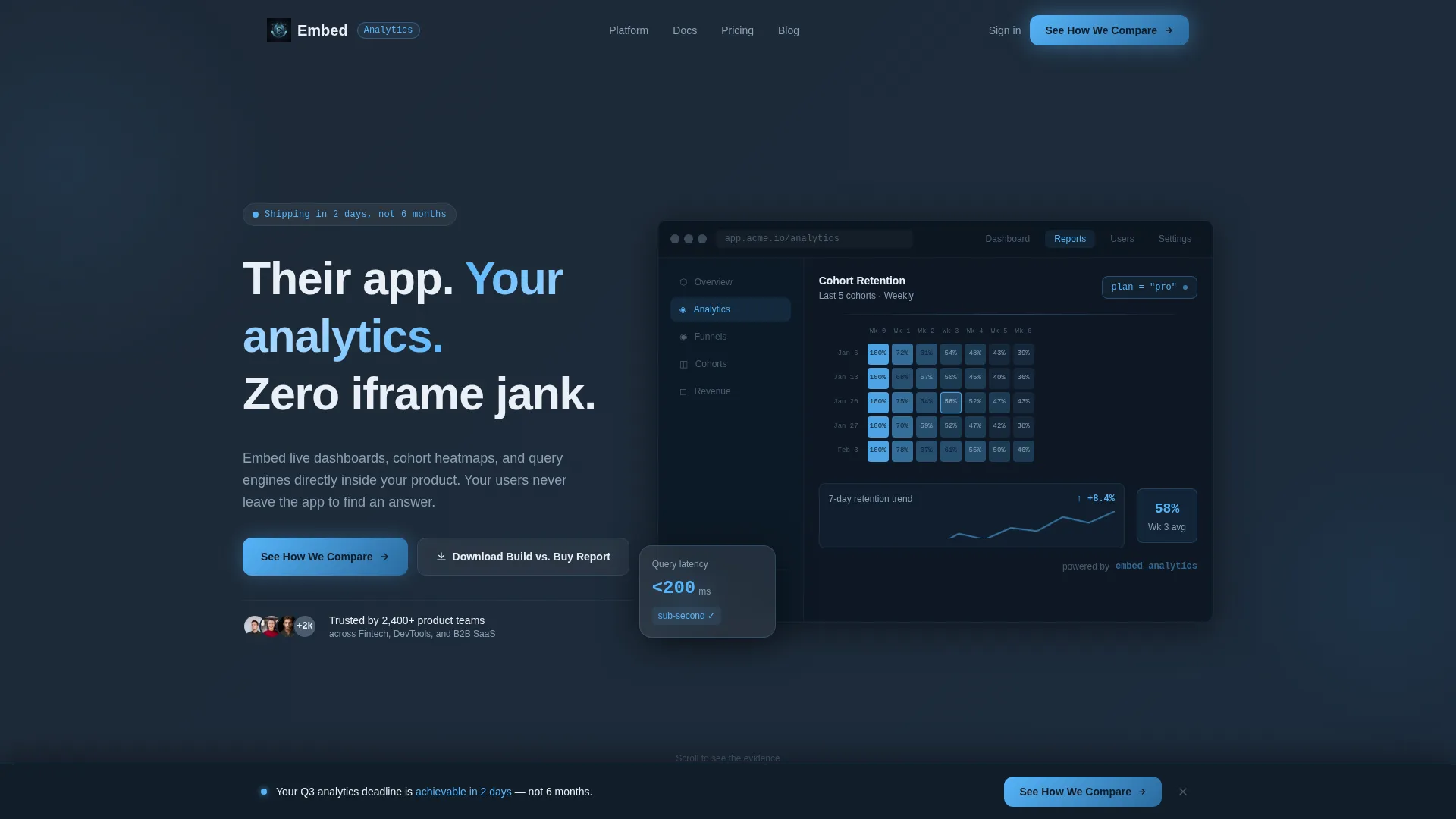
- A pixel-perfect product screenshot header showing an embedded dashboard inside a fictional host application
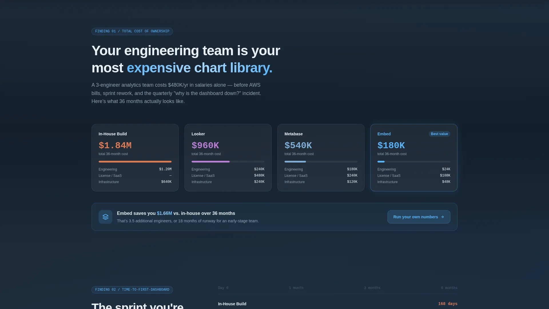
- Three progressive reveal sections: a 36-month total cost of ownership comparison, a time-to-first-dashboard race-bar chart, and a blurred-to-sharp feature matrix
- A sticky bottom bar with an inline configurator and a gated report download path
Feature list
This template is built around the features described below. Every element is grounded in the source brief.
Scroll Reveal Progressive Layout
Each section enters the viewport as a distinct reveal, structured like a research brief the visitor can use in their own decision-making. The pacing gives buyers time to absorb one competitive finding before the next appears.
Animated Cost Comparison Counters
The first reveal section displays a 36-month total cost of ownership comparison. Animated counters fill in as the section enters the viewport, contrasting the cost of an in-house build against named competitor tiers and the platform itself.
Horizontal Race-Bar Chart
The time-to-first-dashboard benchmark section renders as a horizontal bar chart that fills left to right as the visitor scrolls in. This visual format makes the speed advantage immediately legible without requiring the reader to interpret a data table.
Blurred-to-Sharp Feature Matrix
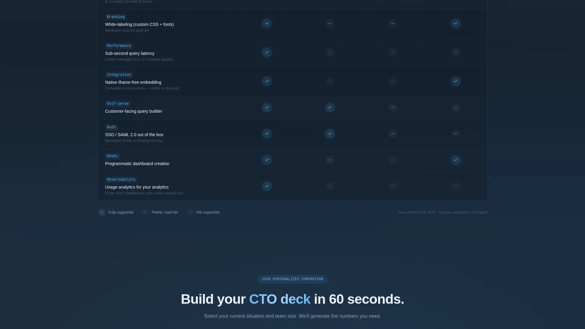
The feature matrix starts visually blurred and sharpens row by row as the section loads. Rows cover multi-tenancy, white-labeling, row-level security, and sub-second queries, with the platform column lighting up sky-blue checkmarks while competitor columns accumulate gray dashes.
Sticky Inline Comparison Configurator
A sticky bottom bar appears after the first scroll reveal. Visitors select their current solution and team size to generate a personalized cost and timeline comparison inline, without leaving the page or opening a new tab.
Gated Report Download Path
A secondary conversion path offers a downloadable build-versus-buy report and an editable spreadsheet model behind a single work-email field. The page gives away 80 percent of the comparison data ungated, so the form feels like a natural next step rather than a toll gate.
Page sections overview
| Section | Purpose |
|---|---|
| Hero Header | Display embedded dashboard screenshot with headline fade-in |
| Cost of Ownership | Animated 36-month cost counters comparing build options |
| Time to Dashboard | Horizontal race-bar chart for deployment speed benchmark |
| Feature Matrix | Row-by-row sharpening comparison of key platform capabilities |
| Sticky Comparison Bar | Persistent call to action with inline configurator and team-size selector |
| Report Download Gate | Single-field email form for gated report and spreadsheet model |
Design & branding system
The visual identity follows a Tech Glass theme built on a Slate and Sky color system. The palette is inspired by a cockpit instrument panel at cruising altitude: dark and recessed until data lights up ice-blue, with every element appearing to float on a barely-visible glass layer above the one beneath it.
- Deep graphite slate (#1E2A38) for primary backgrounds, mid-tone steel (#4A5B6E) for secondary surfaces and card borders, high-altitude sky (#56B4F9) for interactive accents and data highlights, and frosted white (#EAF0F6) for text and glass-panel overlays
- A frosted-glass bevel effect separates the embedded analytics panel from the host application chrome in the header screenshot
- Sky-blue checkmarks light up in the feature matrix to visually separate the platform column from gray competitor dashes
Mobile & speed optimization
The template is structured as a single-page scroll-reveal layout, which keeps the overall page architecture lean. Section-by-section reveal logic means content loads progressively rather than all at once, supporting a smoother experience on smaller screens.
- Scroll-triggered animations activate per section, so no single viewport is overloaded with simultaneous motion
- The sticky bottom bar is designed to remain accessible across screen sizes without obscuring primary content
- The horizontal race-bar chart and feature matrix are laid out to reflow naturally for narrower viewports
How this template helps you convert
The conversion strategy is built around giving visitors most of the value before asking for anything. This earns trust from technically skeptical buyers who normally ignore landing pages.
- The 80-percent-ungated data approach reduces friction early. Visitors absorb real comparison figures before they see any form, making them more likely to trust the remaining gated content.
- The inline configurator in the sticky bar lets visitors personalize the comparison to their own context. A buyer who sees their own team size and current tool reflected in the output has a stronger reason to take the next step.
Other information about this template
This template is purpose-built for the embedded analytics category and is a strong fit for platforms positioning against self-hosted or open-source business intelligence tools. The Industry Report creative direction is especially effective for audiences who evaluate software through competitive research rather than feature demos.
- The editable spreadsheet model included in the gated download is designed to help buyers present the case internally, extending the template's reach beyond the page itself
- The visual language of "declassifying evidence" as visitors scroll makes the page memorable without relying on generic software-landing-page conventions
- The template supports a comparison-versus positioning strategy, making it well suited for markets where buyers are actively evaluating alternatives such as Looker, Metabase, or homegrown build decisions

Theme
Tech Glass
Creative direction
Industry Report
Color system
Slate & Sky
Style
Scroll Reveal (Progressive)
Direction
Comparison/Versus
Page Sections
Scroll Reveal Progressive Layout
Animated Cost Comparison Counters
Horizontal Race-bar Chart
Blurred-to-sharp Feature Matrix
Sticky Inline Comparison Configurator
Gated Report Download Path
Related questions
Who is this landing page template designed for?
What makes the scroll reveal structure useful for technical buyers?
How does the inline comparison configurator work?
What does the gated report download include?
Can the competitor names in the feature matrix be edited?



