Enforce — Intelligent Regulatory Landing Page Template
Comply is a split-screen landing page template built for insurance compliance software. It contrasts the chaos of legacy workflows against a clean, automated alternative using a dramatic 50/50 header, animated feature comparisons, scroll-triggered speed metrics, and a live risk calculator. The design runs on a dark, terminal-inspired palette that makes every section feel urgent and credible.
by Rocket studio
Quick summary
Comply is a single-page template designed for insurance compliance software platforms. It opens with a split-screen header that puts a cluttered legacy dashboard side by side with a clean, automated interface. From there, every scroll adds urgency: a feature comparison table, a speed metric counter, a risk calculator, and a two-step lead capture form that quantifies the cost of inaction before asking for contact details.
Who this template is for
This template is built for SaaS teams and product marketers who need a high-conviction landing page for compliance automation software. It suits launches targeting regulated industries where the buyer already knows the pain and needs to be shown the gap.
- Compliance officers at mid-market insurance carriers who manage multi-state filings
- Operations VPs at managing general agencies juggling manual regulatory workflows
- In-house counsel at insurtech startups who inherited patchwork processes
What problem this template solves
Manual compliance workflows create real financial and operational risk. Spreadsheets miss deadlines. Legacy tools generate alert fatigue. The people responsible for filing accuracy are stretched thin and lack a clear way to show stakeholders the cost of the current approach. This template gives a compliance software platform a page that speaks directly to that moment of pressure.
- Visitors arrive already frustrated; the page meets them with contrast, not explanation
- The risk calculator makes the cost of inaction concrete before a single sales call happens
- The comparison table removes ambiguity about what the software actually replaces
What you get with this template
You get a fully structured, single-page layout with every section pre-built and purpose-matched to a compliance software buyer journey. The template is built around a Comparison/Versus conversion flow, moving visitors from skepticism to a scored lead in two steps.
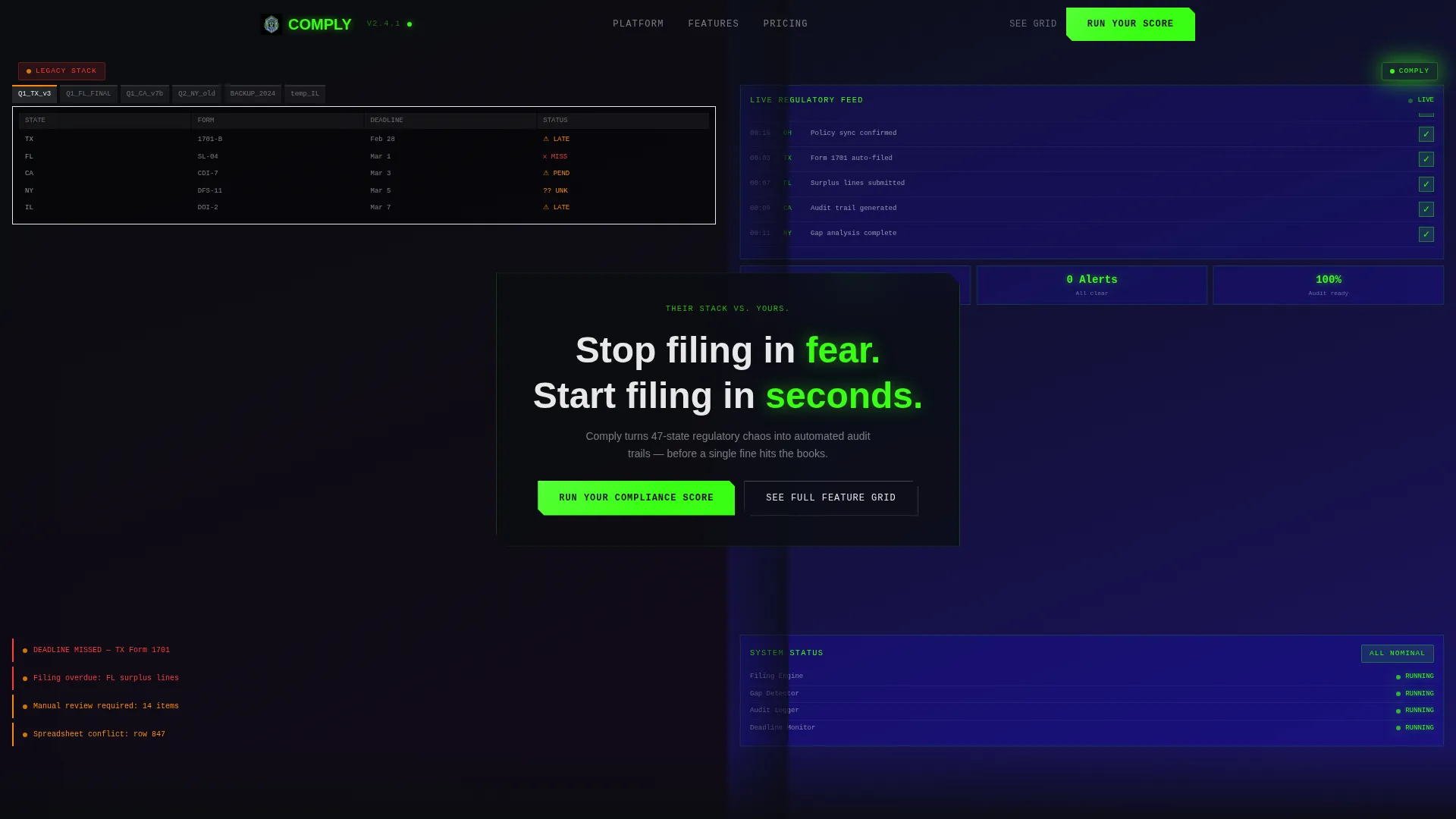
- A 50/50 split-screen header with dual Dark Glass Panels showing legacy chaos versus clean automation
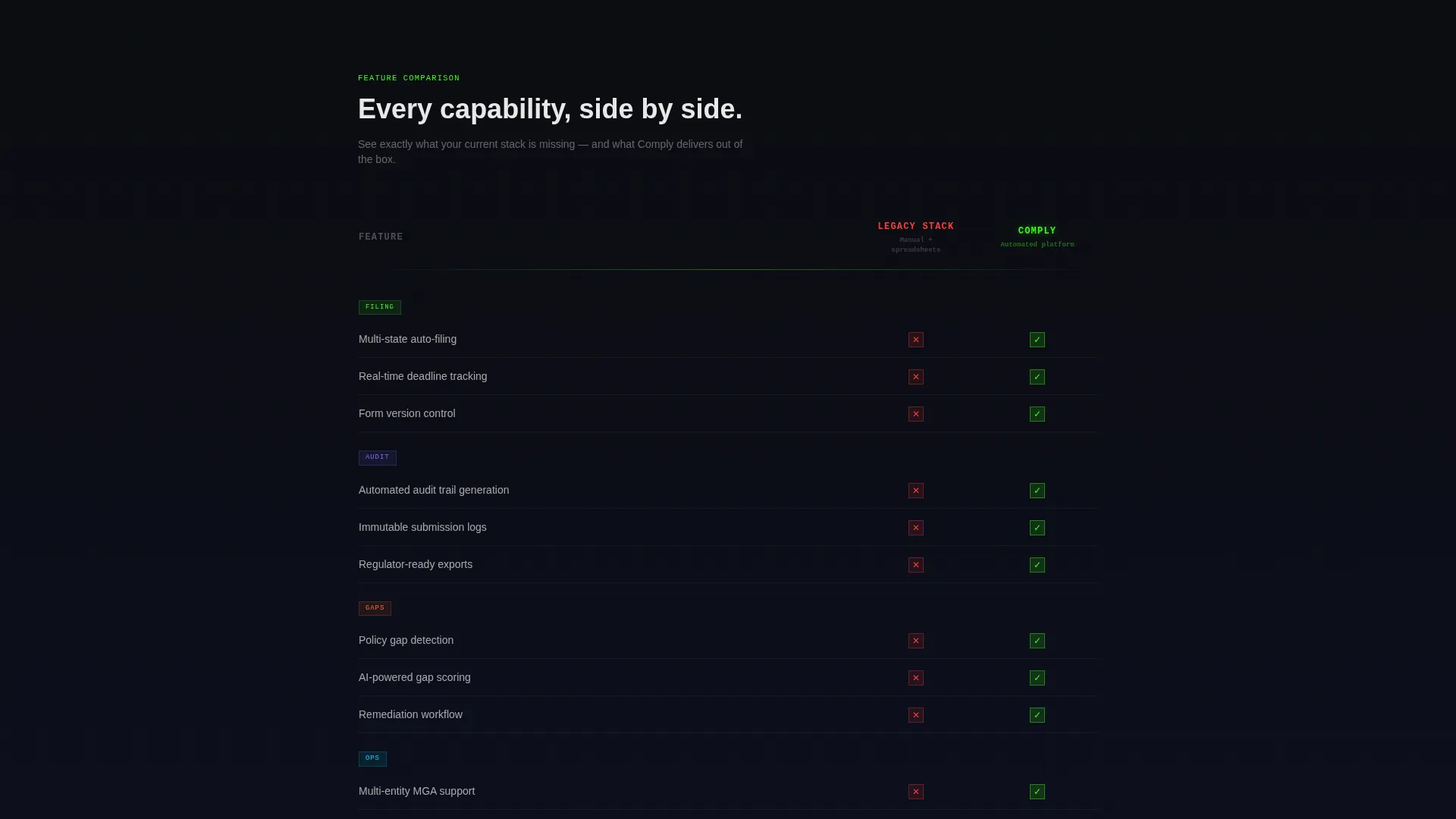
- An animated feature-by-feature comparison table with scroll-triggered phosphor green checkmarks
- A scroll-activated speed metric block, a risk calculator section, and a two-step gated lead form
Feature list
This section covers the core built-in components and interaction patterns included in the template layout.
Split-Screen Header with Dual Panel Contrast
The header divides the full viewport into two frosted glass panels. The left panel renders a cluttered legacy dashboard with overflowing spreadsheet tabs, stacked red warning icons, and a blinking amber deadline banner. The right panel shows the same workflow inside the software: clean dark interface, green status badges, and a live regulatory feed. A single bridging headline sits across both panels.
Scroll-Triggered Comparison Table
The second section of the page presents a feature-by-feature comparison table. The competitor column renders static while the software column animates in row by row. Each checkmark arrives with a micro-burst of phosphor green, building momentum as the visitor reads downward.
Animated Speed Metric Counter
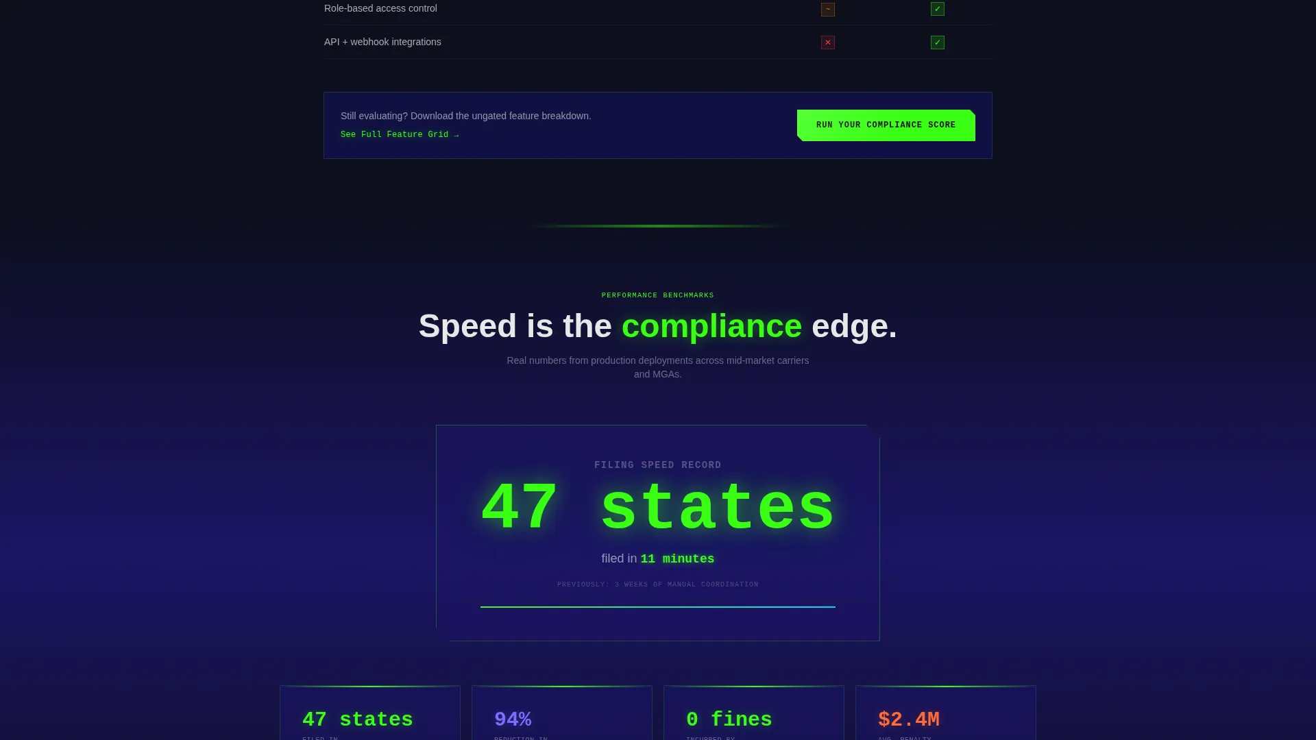
The third section displays a bold performance claim with a scroll-triggered animated counter. The number races to its final value as the visitor scrolls into view, creating a moment of visual impact tied to a real platform capability statement.
Interactive Risk Calculator
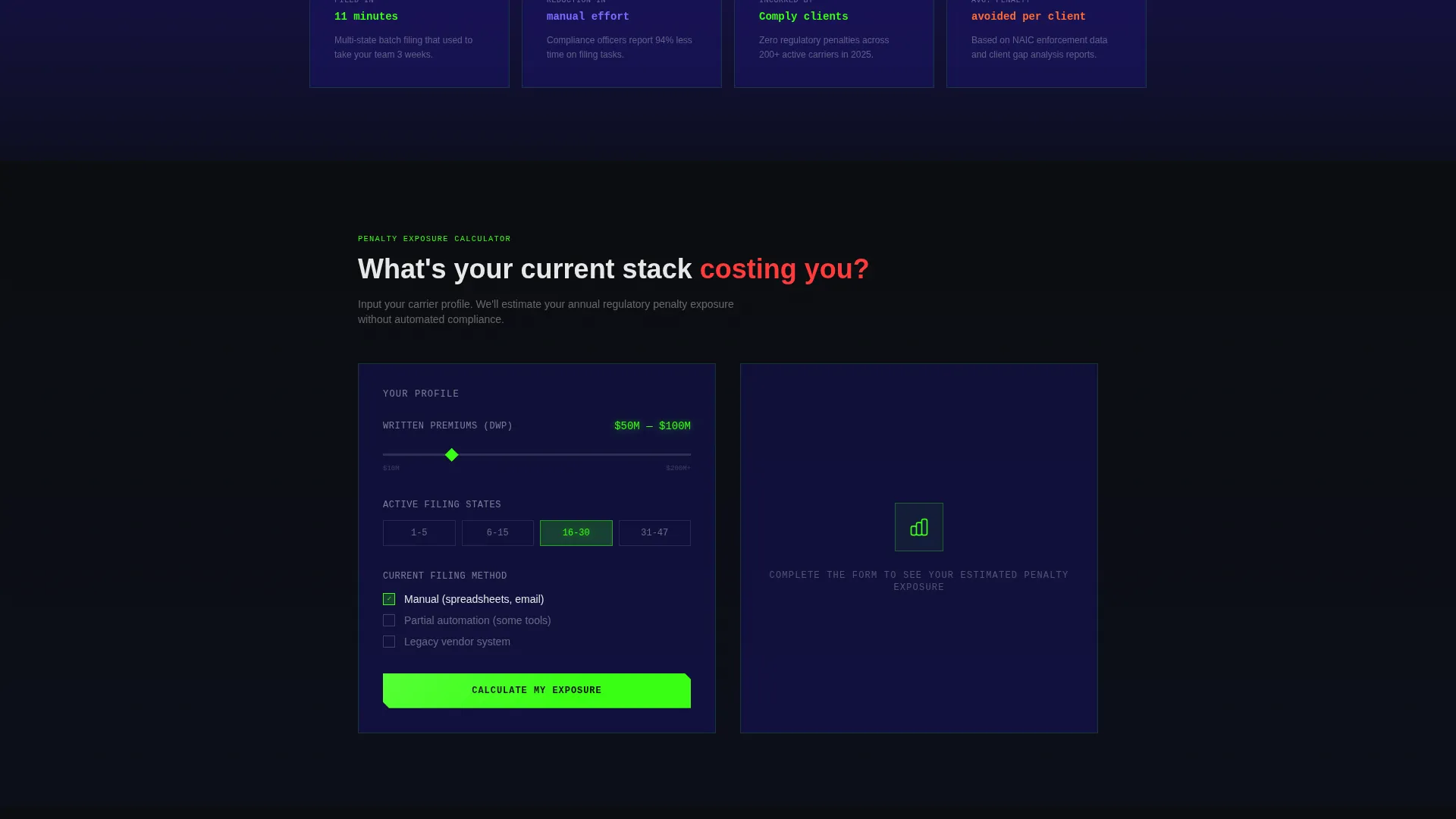
The fourth section includes an input-based risk calculator. Visitors enter their carrier size and current filing method, and the template displays an estimated penalty exposure figure. This section quantifies inaction in financial terms without requiring a sales conversation first.
Two-Step Lead Capture Form
The primary call-to-action opens a two-step form. Step one collects company name, state count, and current filing method via a dropdown. Step two shows a personalized gap analysis preview, gated behind a work email address. The form is triggered by the "Run Your Compliance Score" button placed at the header and repeated after the risk calculator.
Secondary Ungated Feature Path
A secondary call-to-action labeled "See the Full Feature Grid" anchors in the comparison table section. It links to an ungated detailed breakdown of platform capabilities. The breakdown ends with the same scoring call-to-action, creating a second conversion path for visitors still in the evaluation stage.
Page sections overview
| Section | Purpose |
|---|---|
| Split-Screen Header | Contrast legacy versus. automated compliance visually |
| Feature Comparison Table | Animate platform advantages row by row |
| Speed Metric Block | Quantify filing speed with scroll-triggered counter |
| Risk Calculator | Show penalty exposure based on visitor inputs |
| Two-Step Lead Form | Capture leads with personalized gap analysis preview |
| Ungated Feature Grid | Support longer evaluation with detailed breakdowns |
Design & branding system
The template runs on the Acid Digital color system inside a Data Command visual theme. The overall feel is nocturnal and precise, like a terminal window active at 2 a.m. with every signal confirmed green. Every color has a specific role and does not overlap with another.
- Void black (#0B0D10) covers primary backgrounds; phosphor green (#39FF14) handles active states, hover effects, and data visualizations
- Ultraviolet blue (#1B1464) anchors section backgrounds and card surfaces to create depth without competing with green
- Signal white (#E8E8E8) is reserved for body text, labels, and micro-interaction copy to stay legible at all times
Mobile & speed optimization
The template layout is structured to adapt across screen sizes without losing the core split-screen contrast effect. The Dark Glass Panel header, animated counter, and calculator input fields are all designed with a responsive layout in mind.
- The 50/50 split-screen stacks vertically on smaller screens to preserve readability of both panels
- Scroll-triggered animations are tied to viewport entry points, so they fire correctly on mobile scroll behavior
- The two-step form is kept minimal by design, reducing friction on touch devices
How this template helps you convert
The entire page is structured around a Comparison/Versus conversion strategy. Every section earns the next click by raising the stakes before asking for anything in return.
- The split-screen header creates immediate contrast and hooks visitors who already feel the pain of legacy compliance tools, setting up the rest of the page before a single word of body copy is read.
- The risk calculator makes the financial cost of inaction visible in the visitor's own terms, so the "Run Your Compliance Score" call-to-action feels like a logical next step rather than a cold ask.
Other information about this template
This template is part of a broader category of high-intent SaaS landing page designs built for regulated industry verticals. It is particularly well-suited for insurance compliance software platforms that compete against legacy vendors or manual-process incumbents.
- The Launch Energy creative direction drives scroll momentum through escalating motion and data, keeping visitors engaged through all four content folds
- The template style is classified as Split Screen (50/50), making it a strong fit for any versus-style or before-and-after product positioning
- The Comparison/Versus landing page direction is one of the highest-converting structures for compliance automation software because it mirrors how buyers already think about the decision
Theme
Data Command
Creative direction
Launch Energy
Color system
Acid Digital
Style
Split Screen (50/50)
Direction
Comparison/Versus
Page Sections
Split-screen Contrast Header
Animated Comparison Table
Scroll-triggered Speed Counter
Interactive Risk Calculator
Two-step Gated Lead Form
Secondary Ungated Feature Path
Related questions
Can I change the colors and typography in this template?
Does the risk calculator require a backend connection?
How does the two-step lead form work?
Is this template suitable for a product launch campaign?
What type of visitor does this page convert best?



