Education Client Management Landing Page Template
Enroll is a bento grid landing page template built for education client management platforms. It pairs a Stats-First Impact layout with a Void and Violet color system to show prospective users exactly what they gain by switching from spreadsheets. The comparison-driven structure, live metric displays, and dual call-to-action paths make the value gap impossible to ignore.
by Rocket studio
Quick summary
Enroll is a single-page, bento grid landing page template designed for education client management software. It opens with a dashboard screenshot and a visceral before-and-after comparison that makes the cost of staying on spreadsheets feel immediate. Every section is built to move admissions directors, bootcamp operators, and tutoring franchise owners toward booking a demo.
Who this template is for
This template is purpose-built for education software products that manage students, enrollments, and tuition at scale. If your platform replaces messy manual workflows, this landing page speaks that language directly.
- Admissions directors at private K-12 schools managing application season volume
- Bootcamp operators coordinating cohort launches across multiple time zones
- Tutoring franchise owners who need data from dozens of locations in one view
What problem this template solves
Education administrators lose hours every week switching between spreadsheets, sticky notes, and disconnected tools. Missed follow-ups and duplicated data are the default, not the exception. This template makes the pain of that status quo visible before it ever asks for a click.
- Scattered student inquiry data with no single source of truth
- Enrollment milestones and tuition payments tracked in separate, unconnected places
- No fast way to show leadership a clear picture of conversion or revenue performance
What you get with this template
You get a full bento grid landing page layout with a clear visual hierarchy and a conversion architecture built around contrast. Every section is ordered to build urgency before surfacing a call to action.
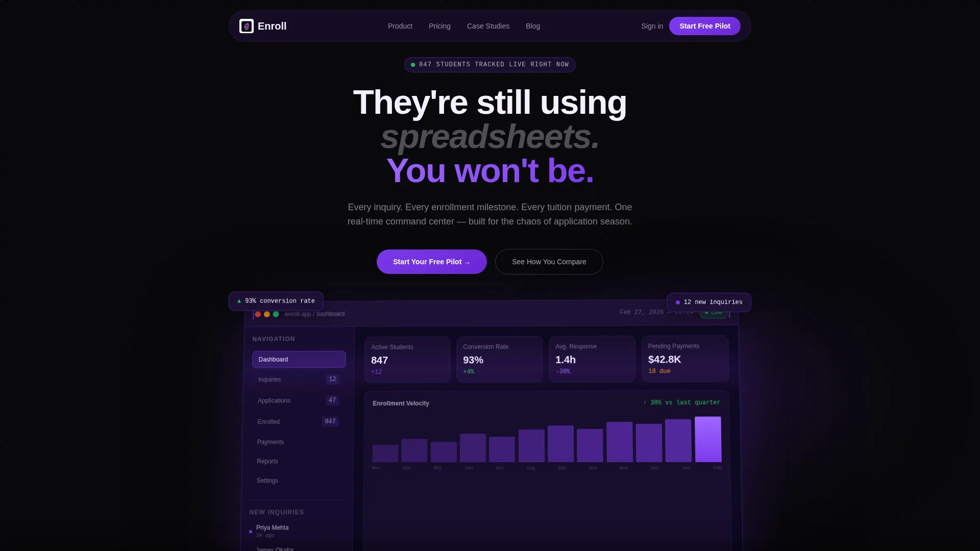
- A full-width product screenshot header with perspective tilt and violet glow effect
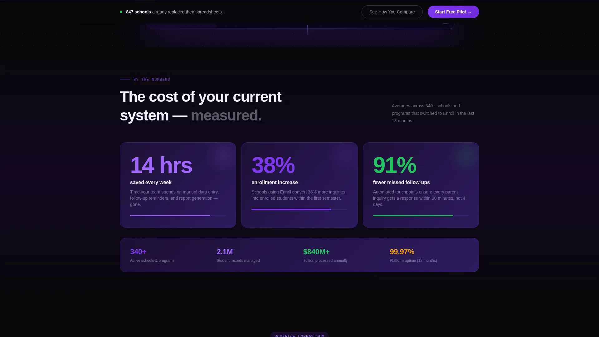
- A stats-first bento grid opening with oversized enrollment and efficiency metrics
- A before-and-after comparison grid and a scrolling live ticker bar
- A sticky bottom call-to-action bar that activates after 60 percent scroll depth
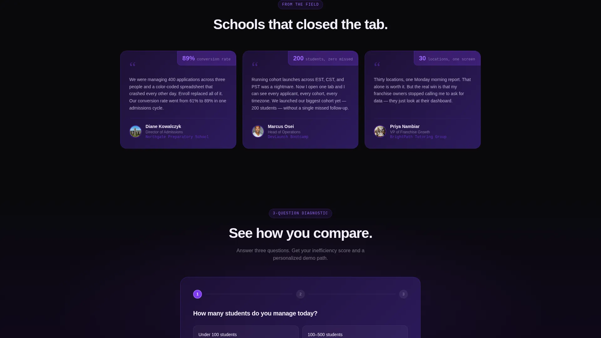
- A three-question diagnostic flow leading to a personalized inefficiency score and demo booking path
Feature list
This template packs a focused set of layout components that work together as a single persuasion system.
Stats-First Bento Grid Layout
The first content row opens with three oversized numbers: time saved per week, enrollment increase percentage, and missed-follow-up reduction. Each metric card reveals its context on scroll, so the number lands before the explanation. This sequencing keeps readers engaged without overwhelming them.
Before-and-After Comparison Grid
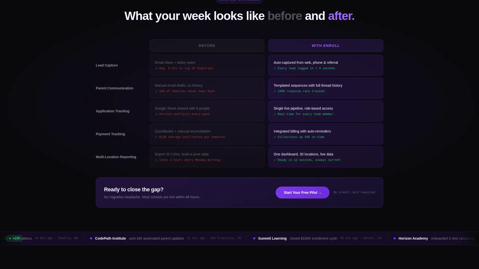
Two columns run side by side throughout the grid. The left column, labeled "Before" in muted gray, lists current workflow pain points. The right column, labeled "With Enroll" in electric violet, shows the improved state. The contrast is visual and immediate, built to do the persuading without lengthy copy.
Live Ticker Stats Bar
A scrolling bar below the comparison grid displays real anonymized statistics from active accounts. It signals that results are current and real, not hypothetical. This reinforces trust at exactly the moment a visitor is deciding whether to act.
Dual Call-to-Action Architecture
The primary call to action, "Start Your Free Pilot," appears first inside the comparison grid and then again as a sticky bottom bar after the visitor passes 60 percent scroll depth. A secondary path, "See How You Compare," leads into the three-question diagnostic flow. Both paths are designed to convert at different levels of visitor readiness.
Three-Question Diagnostic Flow
Visitors answer three quick questions about their current student count, primary tool, and biggest bottleneck. The template returns a personalized inefficiency score and drops them into a tailored demo booking flow. This secondary conversion path captures visitors who are not yet ready for a direct sign-up.
Product Screenshot Header
The header uses a pixel-accurate dashboard screenshot showing 847 active students, 93 percent enrollment conversion, twelve new inquiries in a sidebar, and a rising revenue graph. The screenshot is tilted at a subtle 2-degree perspective angle with a soft violet glow radiating behind it. A single headline in phosphor white anchors the section above it.
Page sections overview
| Section | Purpose |
|---|---|
| Full-Width Header | Anchors the page with a live-state dashboard screenshot and a single provocative headline |
| Stats Impact Row | Opens the bento grid with three oversized performance metrics |
| Comparison Grid | Contrasts old-workflow pain with platform-enabled outcomes column by column |
| Live Ticker Bar | Scrolls real anonymized stats to reinforce that results are active and current |
| Primary call to action Block | Delivers the "Start Your Free Pilot" button at peak persuasion moment |
| Diagnostic Flow | Runs a three-question quiz returning a personalized inefficiency score |
| Sticky Bottom Bar | Reactivates the primary call to action after 60 percent scroll depth |
Design & branding system
The Void and Violet color system creates a dev-console aesthetic that feels fast, modern, and data-driven. Every interactive element and data highlight uses electric violet to draw the eye without competing with content.
- Absolute void black (#09090B) as the page base, deep space indigo (#1E1035) for card backgrounds
- Electric violet (#7C3AED) on all interactive elements, hover states, metric counters, and the primary call-to-action button
- Phosphor white (#F4F0FF) for all body text and card surfaces, creating legible contrast against the dark layers
Mobile & speed optimization
The bento grid structure is designed to reflow cleanly across screen sizes, keeping the comparison layout readable on smaller viewports. The sticky bottom bar is especially useful on mobile, where it stays accessible without disrupting the scroll flow.
- Bento grid cards restack vertically on smaller screens, preserving metric readability
- The sticky call-to-action bar remains visible throughout the mobile scroll journey
How this template helps you convert
Conversion is built into the page structure, not bolted on at the end. The layout earns the click by making the cost of the current approach feel concrete before a single feature is mentioned.
- The before-and-after comparison grid creates a visceral gap between the visitor's current reality and what the platform delivers, motivating action before the call to action appears.
- The dual call-to-action system captures visitors at two different levels of intent: those ready to start a pilot and those who want a personalized diagnostic before committing.
Other information about this template
This template is categorized under Technology, specifically the Education Software and Software as a Service subcategory, with a niche focus on education client management. It is built on the Startup Velocity theme and uses the Bento Grid template style with a Stats-First Impact creative direction. The header concept is a Product Screenshot and the landing-page direction is Comparison and Versus architecture.
- Template style: Bento Grid with a Startup Velocity energy theme
- Creative direction: Stats-First Impact with a Comparison and Versus conversion architecture
- Color system: Void and Violet, using hex values #09090B, #1E1035, #7C3AED, and #F4F0FF
- Best suited for education software products positioning against spreadsheet-based workflows
Theme
Startup Velocity
Creative direction
Stats-First Impact
Color system
Void & Violet
Style
Bento Grid
Direction
Comparison/Versus
Page Sections
Stats-first Bento Grid Layout
Before-and-after Comparison Grid
Live Ticker Stats Bar
Dual Call-to-action Architecture
Three-question Diagnostic Flow
Product Screenshot Header
Related questions
Who is this landing page template designed for?
Can I customize the metrics and comparison content in the bento grid?
What is the three-question diagnostic flow included in this template?
Does the sticky bottom bar appear on mobile devices as well?
What makes the comparison grid effective for driving conversions?



