University CRM Comparison Landing Page Template
Enroll is a comparison-table landing page template built for university CRM platforms. It guides admissions-focused visitors through a Problem-to-Solution arc, from a vivid "before" pain section to a feature-by-feature competitor table, and closes with dual conversion paths. The Tech Glass visual identity uses a Void and Violet color system to make every winning data point impossible to ignore.
by Rocket studio
Quick summary
Enroll is a single-page comparison landing page template designed for university CRM platforms. It opens with an institutional logo bar, names the admissions stack problem directly, then walks visitors through a structured competitor comparison table. Two conversion paths capture both ready buyers and internal researchers. The Void and Violet Tech Glass design keeps every element sharp and credible.
Who this template is for
This template is built for enrollment technology teams and the people who evaluate them. It speaks directly to the frustrations of modern admissions operations.
- Enrollment VPs and admissions directors who need to justify a CRM switch to leadership
- Admissions counselors who manage recruitment cycles across too many disconnected tools
- IT directors and operations teams tasked with evaluating legacy system replacements
What problem this template solves
Admissions teams lose yield not because they lack data, but because their tools are fragmented. A disconnected stack of spreadsheets, email tools, and legacy portals makes it hard to act quickly on any single student's journey.
- Prospects fall through the cracks when inquiry touchpoints live in separate systems
- Counselors waste time toggling between tabs instead of engaging students
- Decision-makers struggle to build an internal case for switching without clear side-by-side evidence
What you get with this template
You get a fully structured, conversion-ready landing page that takes the visitor from recognizing the problem to requesting a migration plan. Every section serves a specific role in the persuasion arc.
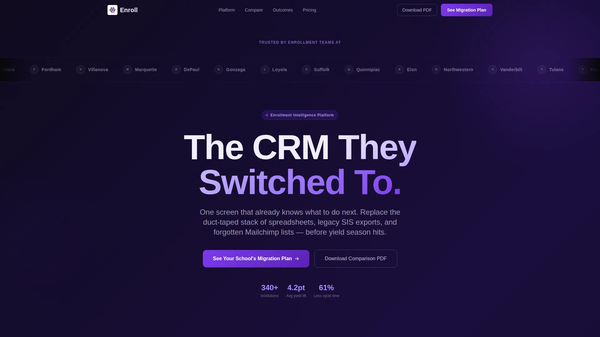
- A logo bar header with institutional crests rendered in frosted monochrome for instant peer credibility
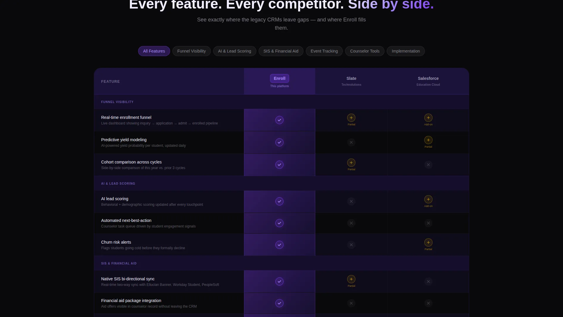
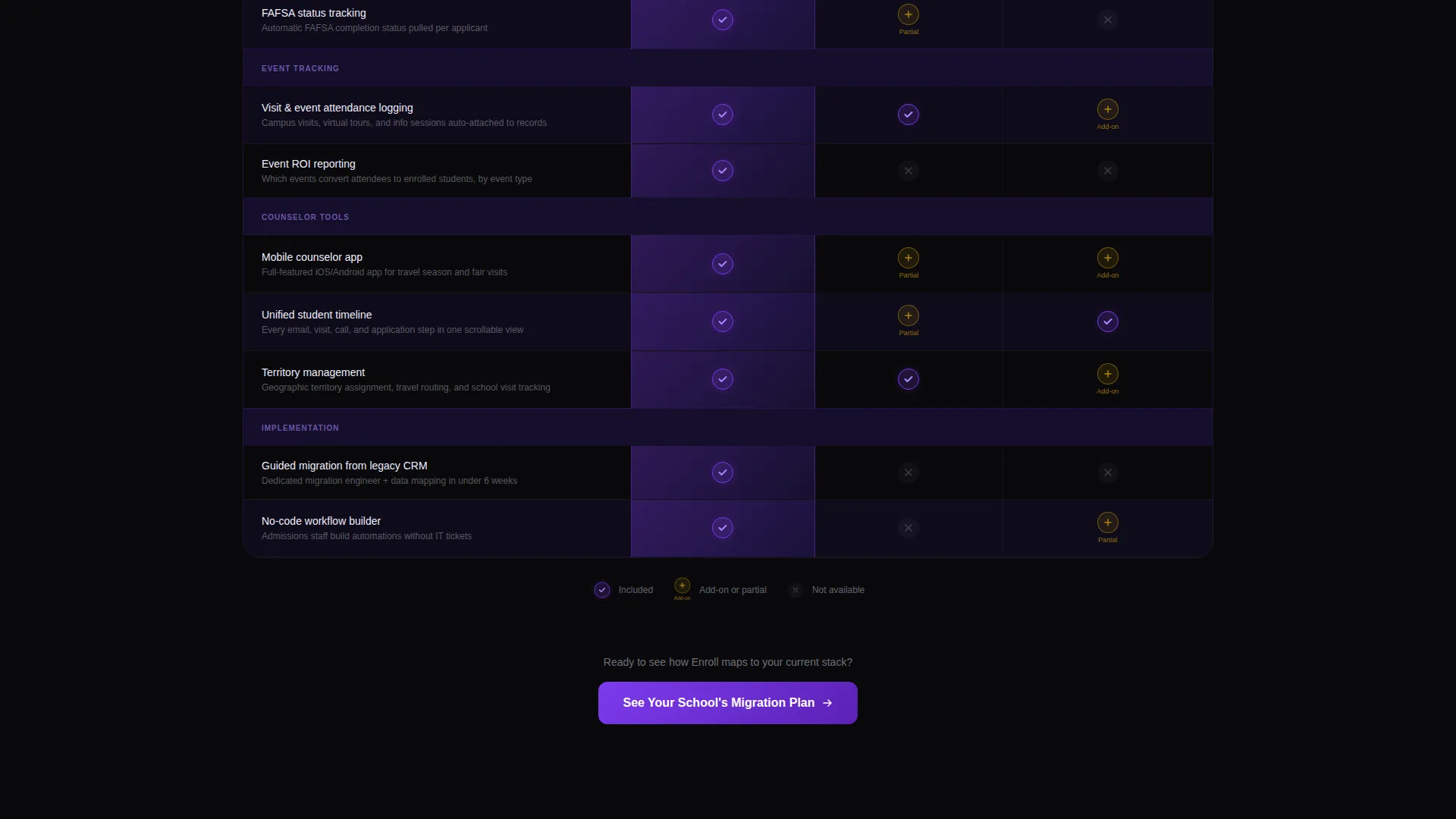
- A central comparison table with alternating glass-panel rows, violet winning-cell highlights, and feature rows covering funnel visibility, lead scoring, financial aid integration, event tracking, and mobile counselor tools
- Two distinct conversion paths: a two-step "See Your School's Migration Plan" form and a gated PDF download requiring only an institutional email address
Feature list
This template delivers a focused set of components that work together as a complete persuasion system.
Institutional Logo Bar Header
A horizontal ribbon of university crests opens the page before any hero image appears. Logos render in monochrome frosted white against void black, creating immediate social proof through institutional recognition.
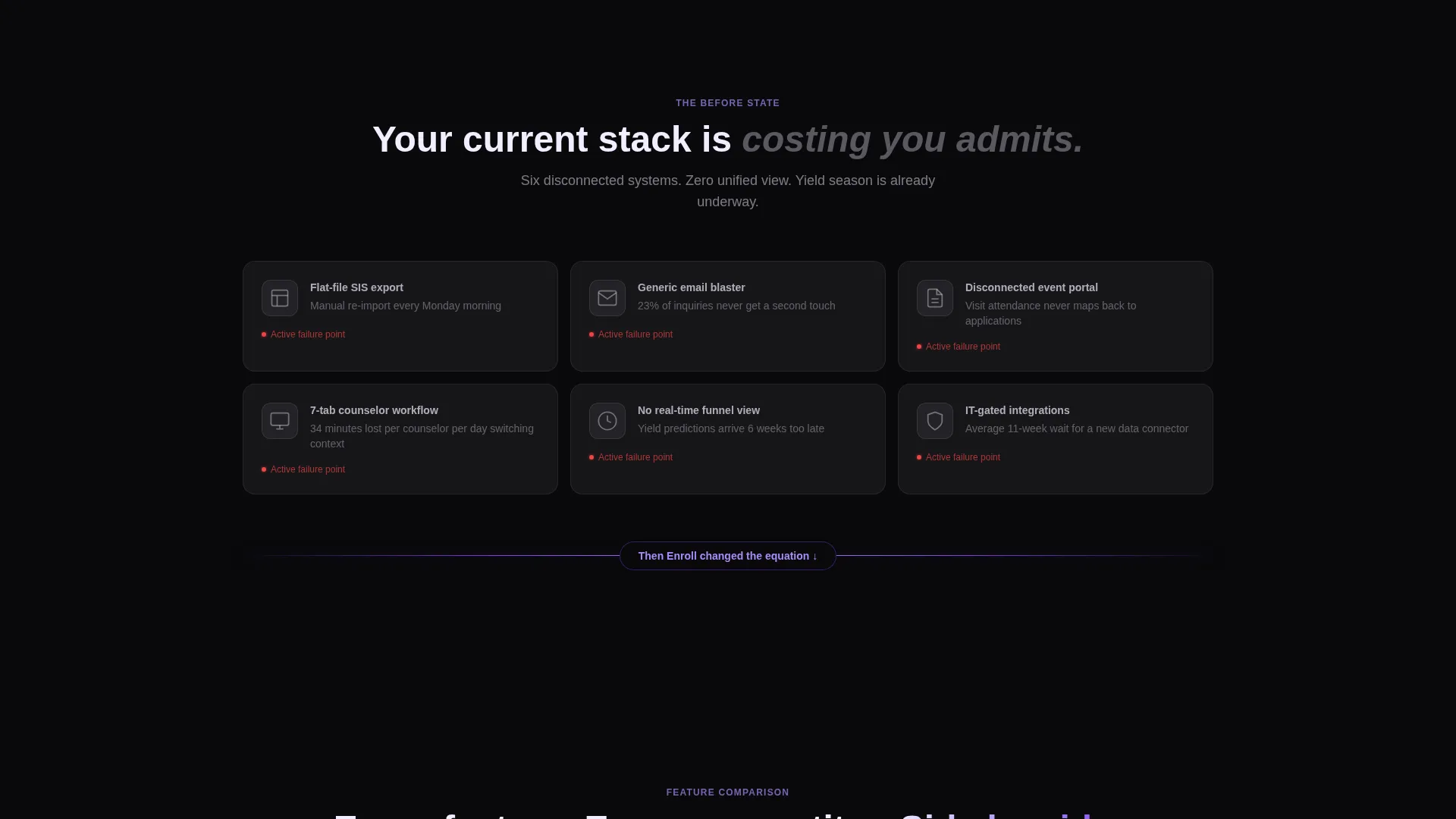
Problem Stack Visualization
A short, direct "before" section displays icons of disconnected legacy tools alongside real failure metrics. This section names the pain quickly and prepares the visitor to value the comparison that follows.
Feature-by-Feature Comparison Table
The centerpiece of the page pits the platform against known legacy CRM alternatives row by row. Winning cells glow electric violet, alternating rows use ultraviolet-tinted glass panels, and coverage spans funnel visibility, artificial intelligence lead scoring, financial aid packaging, event tracking, and mobile tools.
Dual Conversion Path System
A sticky navigation call to action and a post-table repeat both drive to the primary two-step form. A secondary download path captures researchers at earlier decision stages with only an institutional email required.
Outcome Data Section
After the comparison table, attributed yield lifts, cycle-time reductions, and counselor satisfaction scores appear alongside named institutions. This closes the persuasion arc with evidence rather than claims.
Glass Divider Transition Animation
A frosted glass divider animates across the viewport between the problem section and the comparison table. The transition signals a visual shift from pain to solution without needing additional copy.
Page sections overview
| Section | Purpose |
|---|---|
| Logo Bar Header | Establishes peer credibility through recognizable institutional logos |
| Pain Stack Section | Names the fragmented-tool problem with icons and failure metrics |
| Glass Divider Transition | Signals the visual shift from problem to solution |
| Comparison Table | Compares platform features against legacy CRMs row by row |
| Outcome Data Section | Closes the arc with attributed yield and satisfaction results |
| Primary call to action Block | Drives visitors to the two-step migration plan form |
| PDF Download Gate | Captures researchers via institutional email for the comparison PDF |
Design & branding system
The template uses a Tech Glass visual identity built around the Void and Violet color system. Every design decision reinforces the sense of clarity, precision, and forward motion that admissions leaders are looking for.
- Color palette: absolute void black (#09090B) for backgrounds, deep ultraviolet (#2D1B69) for row fills, electric violet (#7C3AED) for interactive states and winning cells, and frosted glass white (#F0EEFF) for card surfaces and body text
- Typography uses oversized variable-weight type for the headline, creating immediate contrast against the dark background
- Interactive states including toggle switches, winning checkmarks, and hover highlights all pulse in electric violet to guide attention naturally through the table
Mobile & speed optimization
The layout is structured to remain scannable and functional across screen sizes. Admissions counselors frequently work on the go, so the template accounts for mobile viewing without sacrificing the comparison table's clarity.
- The sticky navigation call to action remains accessible at all scroll depths on both desktop and mobile viewports
- The comparison table structure is designed to be readable on smaller screens without losing the visual hierarchy of winning versus non-winning cells
How this template helps you convert
The template is designed around a single core idea: let the comparison do the selling. Every structural choice reduces friction and builds belief before the visitor reaches a form.
- The logo bar creates institutional peer pressure in the first two seconds of the visit, making the visitor feel they are looking at a validated platform rather than an unknown product
- The comparison table converts passive readers into active evaluators by letting them check winning cells against their current tool, building micro-commitments before the primary call to action appears
- The two-path conversion system captures both high-intent prospects ready to talk and early-stage researchers who need internal ammunition, so no qualified visitor leaves empty-handed
Other information about this template
This template is categorized under Technology, specifically the University Vertical SaaS niche, and is purpose-built for university CRM platform positioning pages. It is a strong fit for teams running competitive displacement campaigns during active recruitment cycles.
- The template style is a Comparison Table layout, meaning the comparison grid is the structural centerpiece rather than a supporting element
- The creative direction follows a Problem-to-Solution Arc, which earns each scroll section by resolving a clearly stated admissions pain point
- The header concept is a Logo Bar, which replaces a traditional hero image with institutional trust signals
- The landing page direction is Comparison and Versus, making it well suited for campaigns targeting teams already using a competing platform
- This template works well alongside direct outreach campaigns where admissions prospects have already been warmed up and need a structured reason to act
Theme
Tech Glass
Creative direction
Problem→Solution Arc
Color system
Void & Violet
Style
Comparison Table
Direction
Comparison/Versus
Page Sections
Institutional Logo Bar Header
Problem Stack Visualization
Feature-by-feature Comparison Table
Dual Conversion Path System
Outcome Data Section
Glass Divider Transition Animation
Related questions
Who is the primary audience for this landing page template?
Can I use this template to compare my platform against multiple competitors?
What are the two conversion paths included in this template?
Does this template include outcome data content or just the layout?
Is this template suitable for paid advertising campaigns?



