Evaluate — Expert Claims Processing Landing Page Template
Adjuster is a split-screen landing page template built for insurance claims management platforms. It pairs a live-feel claims dashboard preview with a spec-driven scroll experience, guiding property and casualty carriers, independent adjusting firms, and third-party administrators toward a free trial sign-up. The design uses a high-contrast Acid Digital palette that communicates precision and operational urgency.
by Rocket studio
Quick summary
Adjuster is a single-page, split-screen landing page template for insurance claims management platforms. It combines an interactive header preview with a specification-led scroll, converting skeptical adjusters and operations managers into trial sign-ups. The Acid Digital color system and Directory and Discovery theme make the product feel like a purpose-built claims tool rather than generic software.
Who this template is for
This template is designed for teams selling or building software in the insurance claims space. It speaks directly to operational buyers who evaluate tools by capability, not by aesthetics.
- Mid-size property and casualty carriers managing high claim volumes across spreadsheets and email threads
- Independent adjusting firms handling dozens of catastrophe files simultaneously
- Third-party administrators whose account managers spend hours each day tracking down status updates
What problem this template solves
Claims operations are fragmented. Photos, adjuster notes, policyholder calls, and reserve estimates live in separate places, and critical details get buried or lost. This template gives a platform the right landing page to communicate exactly how it solves that chaos.
- Visitors arrive with a specific pain point and need immediate proof that the product handles real claims complexity
- Generic software landing pages fail to earn trust with adjusters who read coverage forms for detail and specificity
- The freemium sign-up path needs to feel low-friction without sacrificing credibility
What you get with this template
The template delivers a complete, production-ready landing page layout with every section purpose-built for the claims software audience. Each visual and structural choice reinforces the platform's core value.
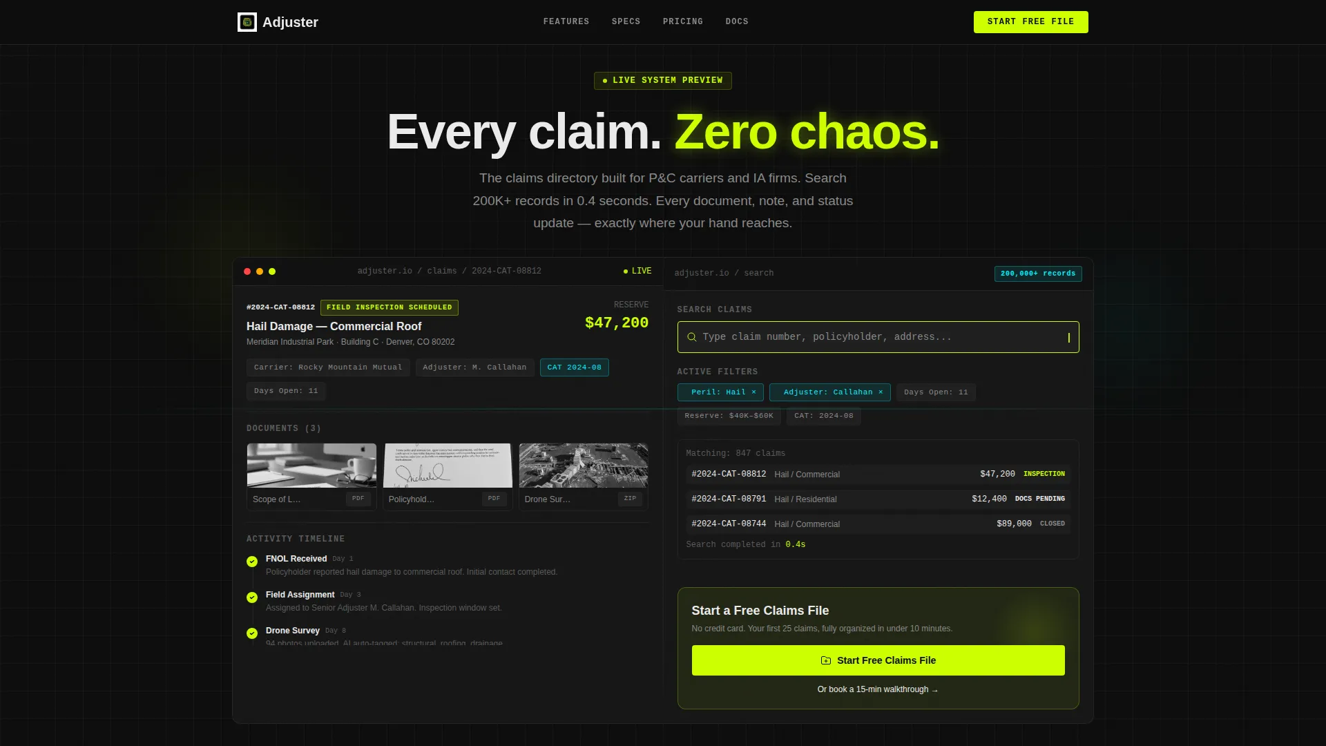
- A 50/50 split-screen header with a simulated live claims dashboard on the left and an interactive search preview on the right
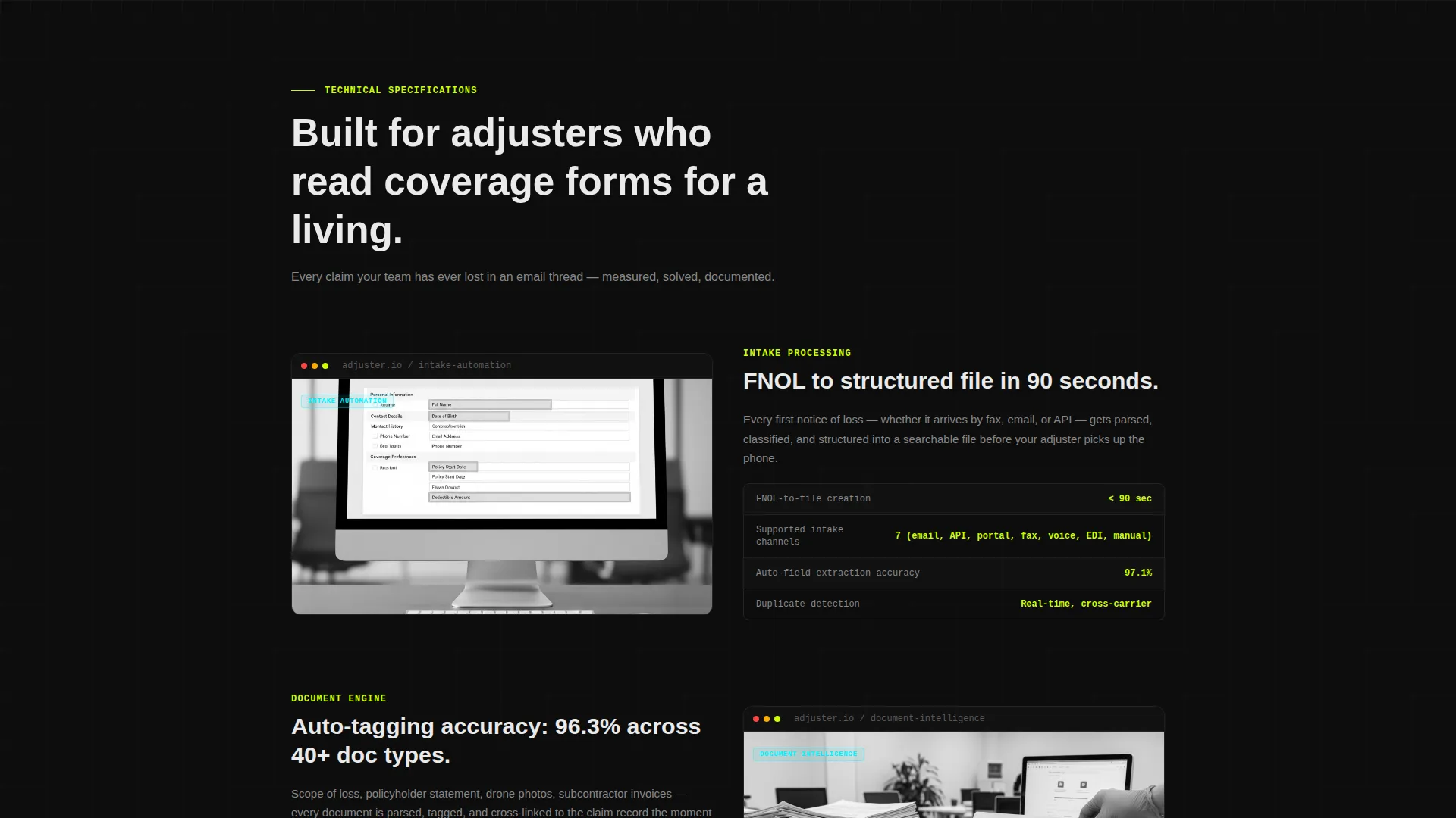
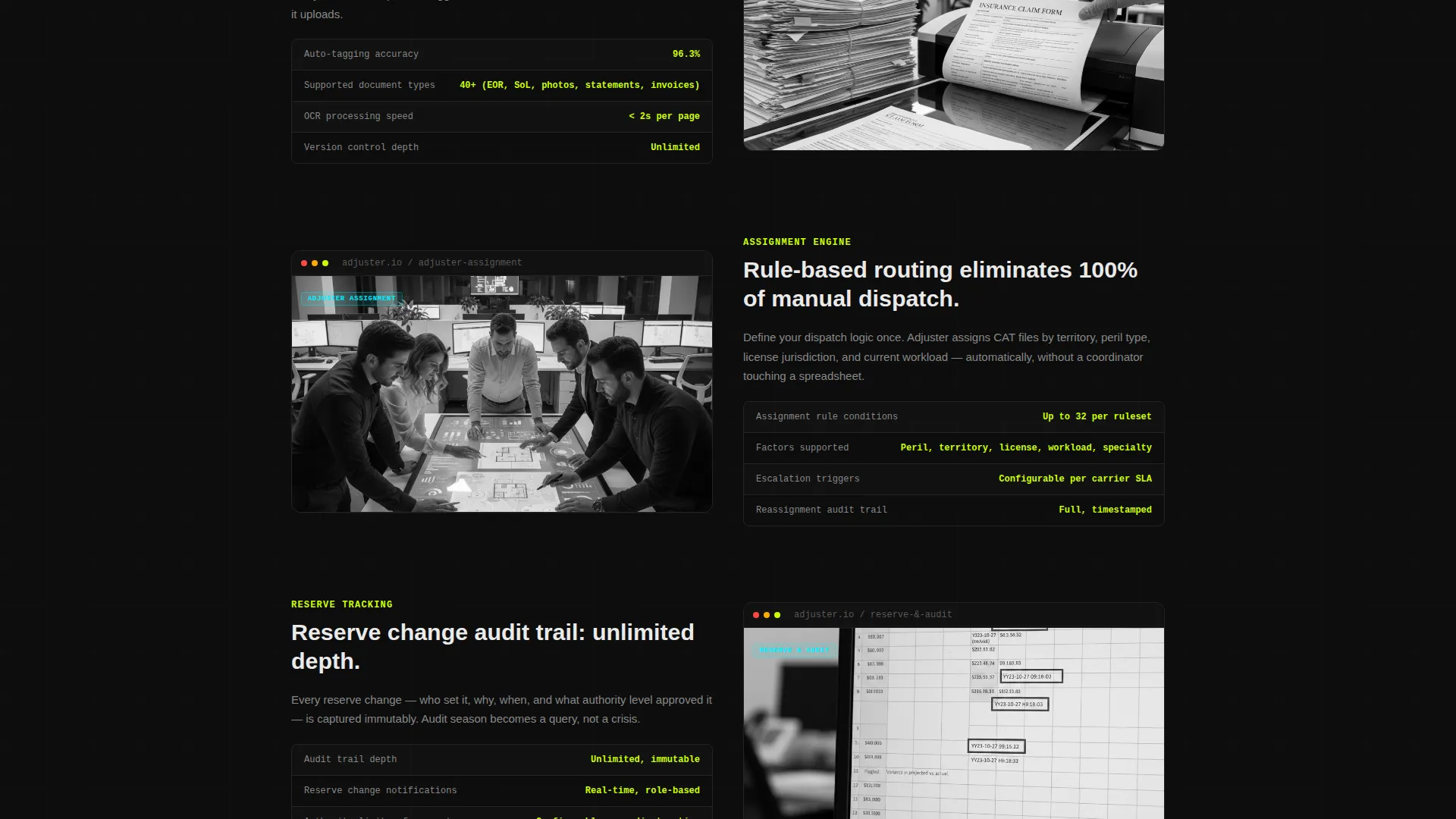
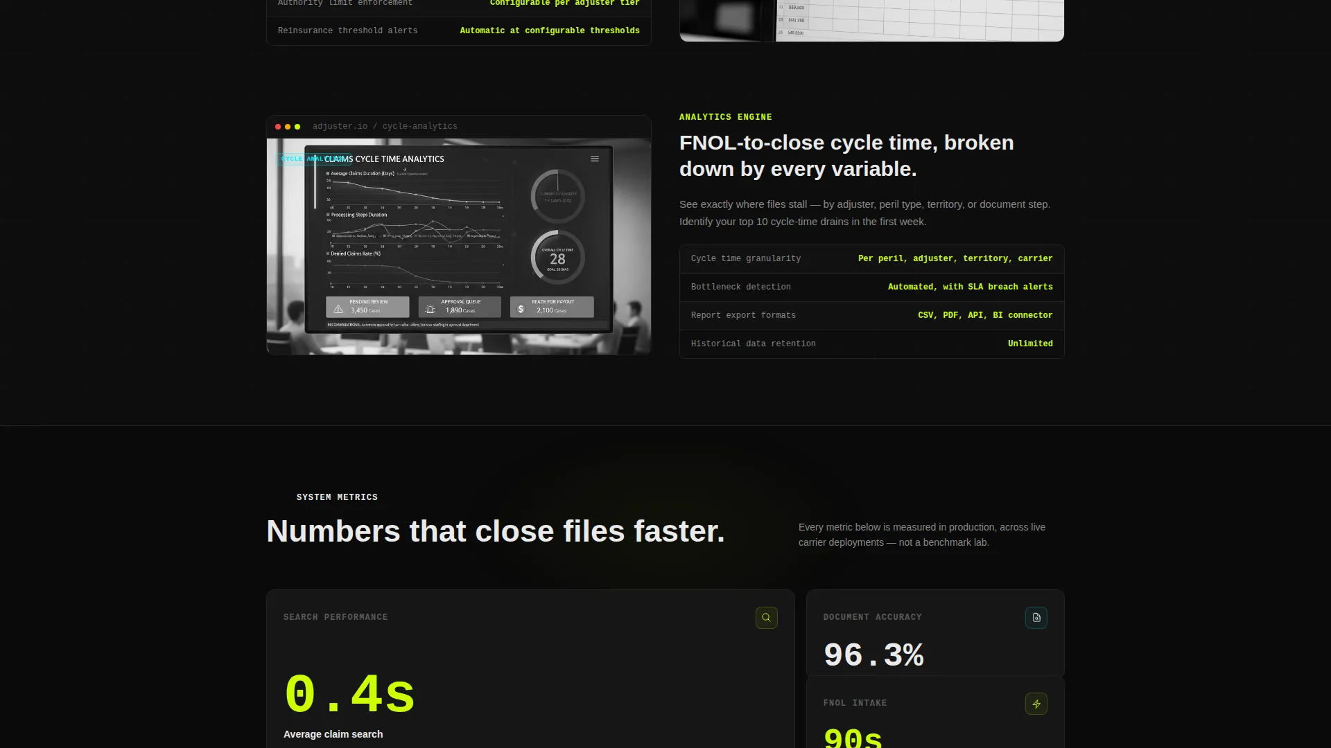
- A specification-sheet scroll section that presents platform capabilities as measurable, verifiable data points
- A two-path conversion section with a primary free trial form and a secondary demo booking option
Feature list
This template ships with a focused set of layout and interaction features drawn directly from the design brief.
Simulated Claims Dashboard Header
The left side of the header renders a realistic claims dashboard with sample data including a claim number, peril type, reserve amount, status badge, document thumbnails, and an eleven-day touchpoint timeline. Subtle animations show a new note appearing, a status shifting, and a document uploading, making the interface feel live and operational.
Interactive Search and Filter Preview
The right side of the header features a search bar with a blinking cursor and a row of filter chips covering peril type, assigned adjuster, days open, and reserve range. This layout invites visitors to mentally place their own workflow into the product before scrolling further.
Spec Sheet Scroll Layout
Each scroll section presents a platform feature as a formal specification, pairing an interface screenshot or micro-interaction on the left with a precise data point or capability statement on the right. The format mirrors a coverage endorsement, building evidence with every section.
Dual-Path Conversion Section
The final section anchors a free trial form asking for work email, company name, and current open claims volume via a dropdown. A secondary call-to-action below the form offers a 15-minute guided walkthrough for prospects who want a demo before committing.
Floating Primary Call to Action
A "Start a Free Claims File" button floats on the right side of the header preview, appearing before the visitor scrolls. This placement captures high-intent visitors immediately while the dashboard visual builds context beside it.
Acid Digital Color System
The layout uses void black, electric chartreuse, scanner-line cyan, and interface white to create a high-contrast, operations-center aesthetic. Chartreuse marks live actions, cyan highlights search results and filter tags, and white text sits on dark card backgrounds to maximize legibility.
Page sections overview
| Section | Purpose |
|---|---|
| Split Screen Header | Displays live dashboard preview alongside interactive search bar |
| Animated Dashboard Panel | Shows realistic claim data with subtle live-state animations |
| Search and Filter Bar | Lets visitors mentally interact with peril and adjuster filters |
| Floating Trial call to action | Captures high-intent clicks before the visitor scrolls down |
| Spec Sheet Scroll | Presents platform features as measurable specification blocks |
| Intake and Assignment Specs | Details claim intake automation and adjuster assignment rules |
| Subrogation and Cycle Specs | Covers subrogation tracking and FNOL-to-close cycle analytics |
| Free Trial Sign-Up Form | Collects work email, company name, and open claims volume |
| Demo Booking Secondary call to action | Offers a 15-minute walkthrough for prospects needing more context |
Design & branding system
The visual identity is built on the Acid Digital color system, designed to feel like a claims dashboard running in a dark operations center. Every color choice prioritizes legibility and operational urgency over warmth or softness.
- Void black (#0D0D0D) forms the base, electric chartreuse (#CCFF00) marks live actions, scanner-line cyan (#00F0FF) highlights search and filter elements, and interface white (#EAEAEA) is used for body text and card surfaces
- The Directory and Discovery theme structures information like a well-organized filing system, with every data point tabbed and immediately locatable
- No decorative gradients or soft tones appear anywhere; the palette is deliberate, tool-grade, and built for an audience that values precision
Mobile & speed optimization
The split-screen layout is structured to adapt gracefully to narrower viewports while preserving the operational feel of the design.
- The 50/50 split stacks vertically on smaller screens so the dashboard preview and search panel each occupy full width
- Spec sheet blocks reflow to single-column layout, keeping data points readable without horizontal scrolling
- Animated elements in the header are designed to remain lightweight so the initial impression loads quickly across devices
How this template helps you convert
The template earns conversions by making the product feel already familiar before the visitor reaches the form. Every layout decision reduces resistance and builds evidence progressively.
- The animated dashboard header immerses the visitor in a realistic claims scenario immediately, so they are evaluating the product from the first second rather than reading about it
- The spec sheet scroll replaces marketing language with precise capability statements, giving operational buyers the evidence they need to justify a trial internally
- The dual-path conversion section removes friction by separating low-commitment sign-ups from higher-touch demo requests, matching each visitor to the step they are ready for
Other information about this template
This template is built specifically for the insurance claims management software category, where buyers are detail-oriented and resistant to vague promises. A few additional details worth noting:
- The template style is Split Screen (50/50), meaning the header is a permanent two-panel layout rather than a full-width hero
- The freemium and trial landing page direction is reflected throughout: no credit card required, a short form, and a secondary demo path all reduce sign-up anxiety
- The creative direction follows a Spec Sheet format, which suits platforms in the property and casualty insurance vertical where decision-makers value precision over storytelling
- The header concept is an Interactive Preview, making this template particularly effective for claims software, document management tools, and workflow platforms where showing the interface early builds immediate trust
- The Directory and Discovery theme ensures information architecture mirrors the product promise: everything organized, nothing buried
Theme
Directory & Discovery
Creative direction
Spec Sheet
Color system
Acid Digital
Style
Split Screen (50/50)
Direction
Freemium/Trial
Page Sections
Simulated Live Claims Dashboard
Interactive Search and Filter Bar
Spec Sheet Scroll Sections
Dual-path Conversion Section
Floating Trial Call to Action
Acid Digital Visual System
Related questions
Who is this landing page template designed for?
Can I edit the sample claims data shown in the header dashboard?
Does the template include both a free trial form and a demo booking option?
How does the spec sheet scroll section work?
What color system does this template use?



