Smart Field Ops Landing Page Template
Dispatch is a dashboard-style landing page template built for retail field service management platforms. It pairs a mission-control visual identity with data-forward layout patterns, live dispatch maps, KPI ribbons, vendor scorecards, and SLA heat maps. The result is a single-page experience that turns complex operational data into an instantly credible, conversion-ready product showcase.
by Rocket studio
Quick summary
Dispatch is a dark-themed, glassmorphic landing page template designed for retail field service management platforms. It presents live-style dispatch dashboards, regional SLA heat maps, and vendor scorecards inside a mission-control visual frame. The layout is built around escalating proof, industry data first, then platform capability, then a clear lead-generation call to action.
Who this template is for
This template speaks directly to operations teams managing field service at scale. If you sell or build software for facilities and vendor management in retail, this layout was designed around your buyer.
- Regional operations directors overseeing 200 or more store locations who need a single visibility layer across all active work orders
- Facilities vice presidents at big-box retailers juggling thousands of open service tickets across multiple trade categories
- Franchise operators who coordinate HVAC, refrigeration, lighting, and plumbing vendors from one centralized view
What problem this template solves
Retail field service platforms often struggle to communicate complexity with clarity. A broken freezer case can cost a grocery chain six figures in spoiled inventory, but most software landing pages fail to make that urgency visible. This template closes that gap.
- Generic SaaS layouts cannot convey the real-time, high-stakes nature of dispatch operations to a facilities buyer
- Prospects cannot self-identify their pain when the page uses abstract feature lists instead of live operational context
- Conversion rates suffer when a powerful platform is presented through a static, corporate template that feels nothing like the product
What you get with this template
You get a fully structured, single-page layout ready to represent a retail field service management platform. Every section is designed to show the product in action, not just describe it.
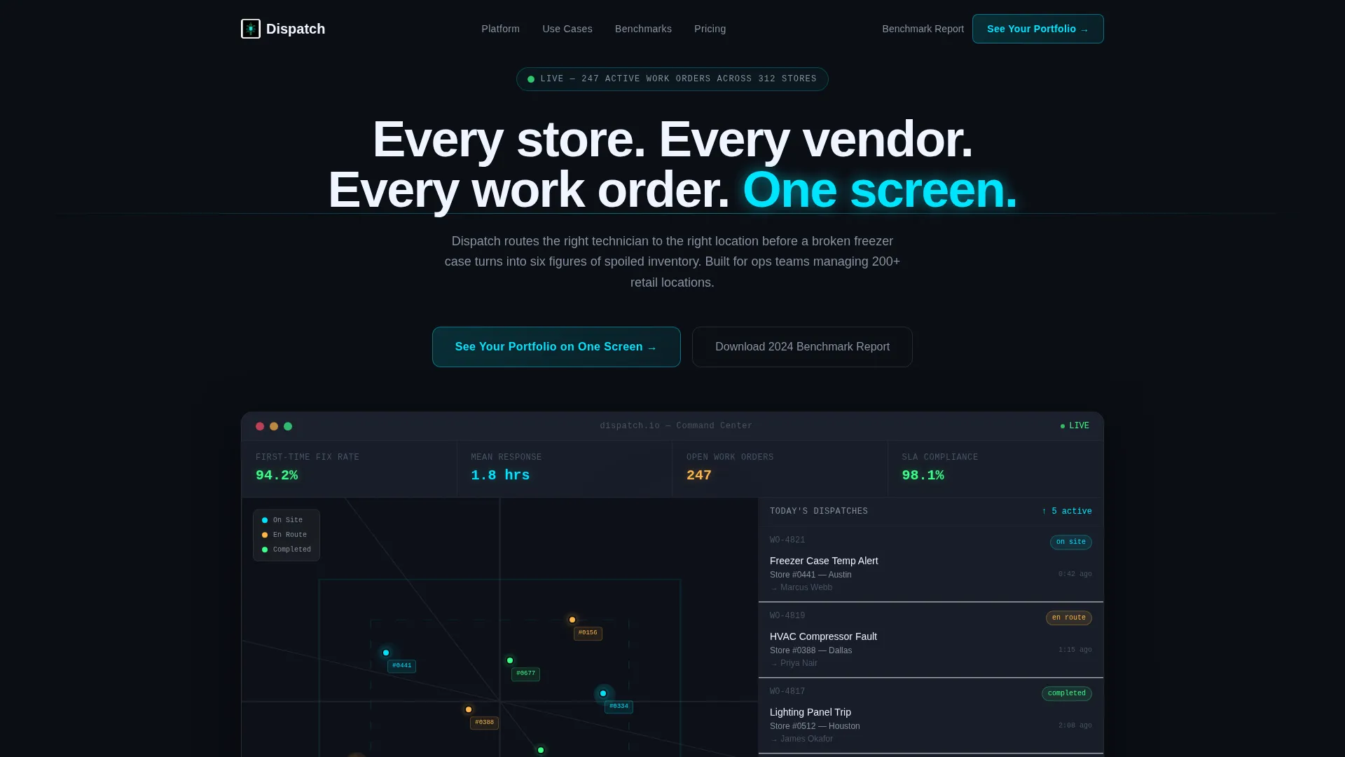
- A dark full-bleed header with a live-style dashboard mockup showing technician map pins, dispatch status chips, and a KPI ribbon with first-time fix rate and mean response time
- An industry-report scroll narrative that opens each section with a data-backed claim and immediately follows it with an interactive dashboard panel
- Two conversion paths: a primary frosted-glass modal for qualified demo requests and a secondary gated PDF download for top-of-funnel researchers
Feature list
This template includes six structured content and design components, each grounded in the source brief.
Live-Style Dashboard Hero Panel
The header section presents a mock dispatch dashboard as the hero visual. It shows a map view with pulsing technician location pins, a sidebar listing today's dispatches with status chips (en route, on site, completed), and a KPI ribbon reading real metrics like "First-Time Fix Rate: 94.2%" and "Mean Response: 1.8 hrs." No stock photography is used. The product interface itself is the hero.
Industry Report Scroll Narrative
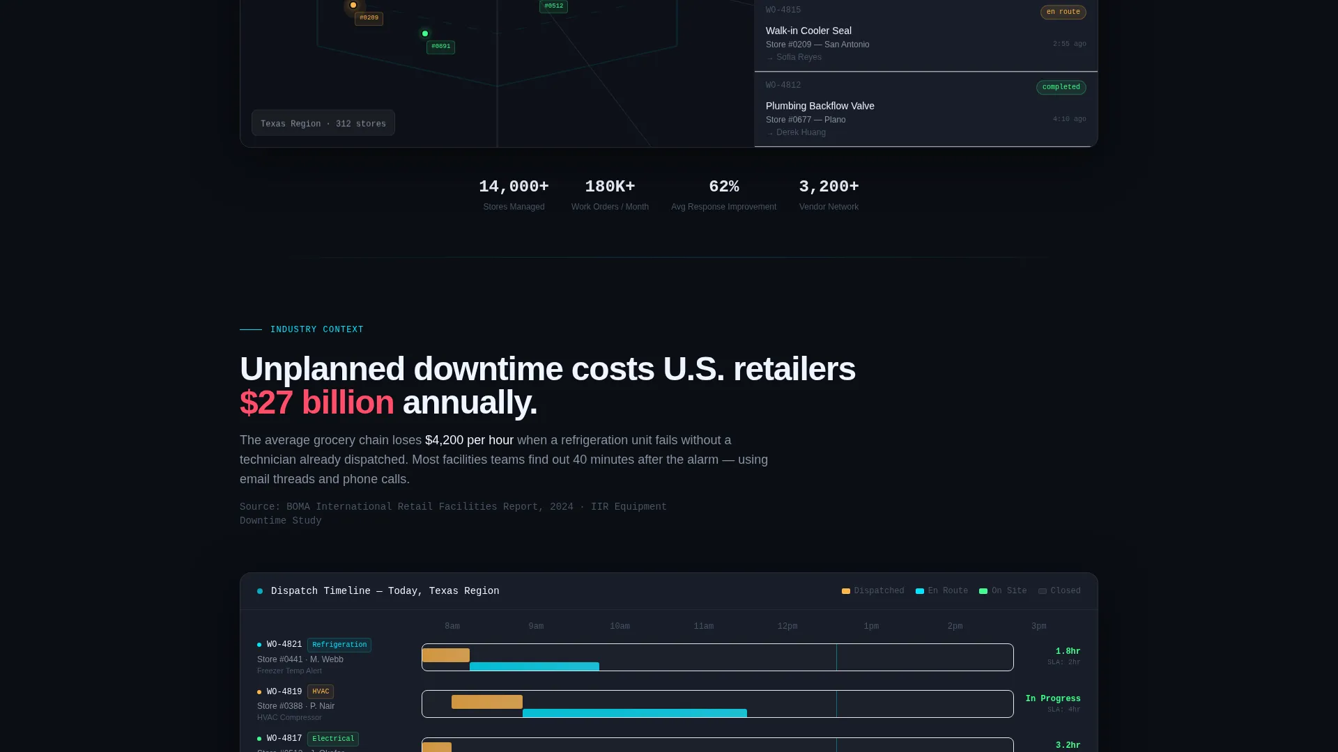
Each content section opens with a bold, research-backed claim from retail facilities management data. The page references a figure like "$27 billion in annual unplanned downtime costs for U.S. retailers" before immediately presenting the platform's answer through a dashboard panel. This structure builds escalating proof across the full page scroll.
Interactive Dashboard Panel Sections
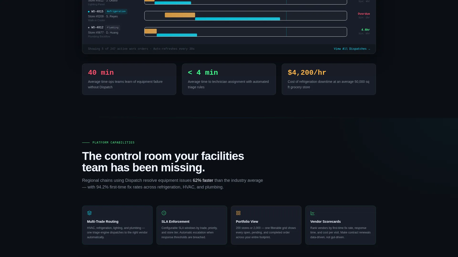
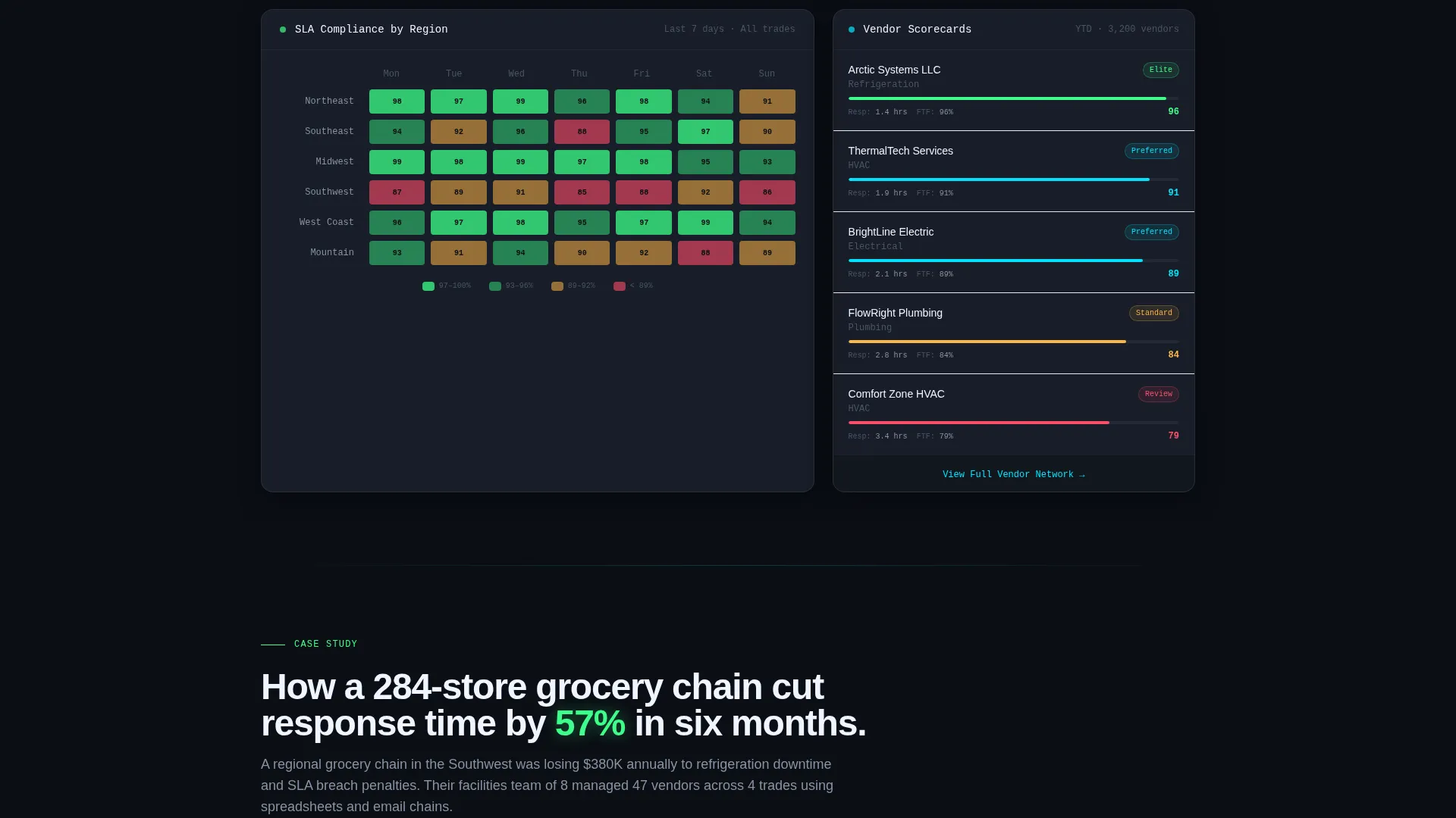
Three distinct dashboard panels are laid out across the page: a Gantt-style dispatch timeline, a regional SLA compliance heat map, and a vendor scorecard with frosted-glass cards. Each panel lets visitors interact with the data view rather than simply reading about it.
Dual Conversion Path Layout
The primary call to action is a frosted-glass modal titled "See Your Portfolio on One Screen." It collects company name, number of retail locations via dropdown, primary trade category, and work email. A secondary path offers a gated "2024 Retail Field Service Benchmark Report" PDF requiring only an email address, capturing researchers who are not yet ready for a demo.
Vendor Scorecard Component
The vendor scorecard section uses frosted-glass cards to rank vendors by response time and first-visit resolution rate. Each card displays at a glance which vendors are meeting SLA commitments and which are underperforming. This component gives prospects an immediate preview of the platform's reporting depth.
Glassmorphic Panel System
Every data section uses translucent frosted panels floating above a void black canvas. The panels use 12% white opacity, muted graphite card surfaces, electric cyan accents for live-data highlights, and signal green reserved exclusively for completion metrics and success confirmations. The result is a visual language that feels like an operational control room, not a marketing page.
Page sections overview
| Section | Purpose |
|---|---|
| Dark Header Hero | Establishes mission-control tone with live dashboard mockup and headline |
| KPI Ribbon Strip | Displays first-time fix rate and mean response time at a glance |
| Industry Problem Block | Opens with a data-backed downtime cost claim to frame the platform's value |
| Gantt Dispatch Timeline | Shows active work order scheduling across store locations |
| SLA Heat Map | Visualizes regional SLA compliance to highlight performance gaps |
| Vendor Scorecard Cards | Ranks vendors by response time and first-visit resolution |
| Named Case Study | Presents before-and-after KPIs to build credibility with ops buyers |
| Primary call to action Modal | Collects qualified demo leads via a frosted-glass form overlay |
| Benchmark Report Download | Captures top-of-funnel emails with a gated PDF offer |
Design & branding system
The visual identity follows a Dashboard Pro theme built on a glassmorphic color system. Every design decision reinforces the mission-control atmosphere described in the brief.
- Core palette: void black (#0B0E14) as the persistent background, muted graphite (#1E2330) for card surfaces, translucent frosted panels at 12% white opacity, electric cyan (#00E5FF) for live-data accents and glow states, and signal green (#3CFF8A) used exclusively for completion and success indicators
- Header treatment: a dark full-bleed viewport with a faint radial cyan glow at 6% opacity emanating from the center, creating a powering-on effect behind the floating dashboard mockup
- Typography and layout lean toward clean white headlines, high-contrast data labels, and zero decorative elements, every component either recedes into the dark canvas or pulses with operational urgency
Mobile & speed optimization
The template is designed with responsive layout patterns that translate the dashboard-heavy composition to smaller screens without losing hierarchy or readability.
- Dashboard panels and scorecards reflow to single-column stacks on mobile, keeping KPI data legible without horizontal scrolling
- The glassmorphic panel system uses CSS-level opacity and blur rather than heavy image assets, keeping the dark visual identity intact across device sizes
How this template helps you convert
This template earns each conversion by building trust incrementally through the scroll experience. By the time a visitor reaches either call to action, they have already engaged with three dashboard panels and seen their operational pain reflected in industry data.
- The industry-report scroll structure introduces a real financial problem, then immediately answers it with a platform demonstration, visitors experience proof before they see a pitch
- The dual conversion path separates high-intent demo prospects from early-stage researchers, letting each segment self-select into the right next step without friction
Other information about this template
This template is suited for technology vendors operating in the retail software space, particularly those whose platforms serve the retail field service management niche. It is built as a single-page lead-generation layout, not a multi-page site.
- The creative direction follows an Industry Report scroll pattern, making it well-suited for content-led go-to-market strategies where the platform's data story does the selling
- The Dashboard Pro theme and glassmorphic color system create a visual identity that mirrors the operational software it represents, reinforcing product credibility on first impression
- The template style is a Dashboard and Data Grid layout, which aligns directly with the visual language that operations buyers expect from dispatch and field service platforms
Theme
Dashboard Pro
Creative direction
Industry Report
Color system
Glassmorphic
Style
Dashboard/Data Grid
Direction
Lead Generation
Page Sections
Live-style Dispatch Dashboard Hero
Industry Report Scroll Structure
Three Interactive Dashboard Panels
Frosted-glass Dual Call to Action System
Vendor Scorecard with Glassmorphic Cards
Mission-control Color System
Related questions
Who is the primary buyer this template targets?
Can I replace the placeholder KPI data with my platform's real metrics?
What makes the dual conversion path useful for a field service software page?
Does this template include live dashboard software or real data connections?
Is this template suitable for an agency building a page for a field service client?



