ETL Data Pipeline Landing Page Template
Pipeline is a bold brutalist ETL and data integration landing page template built for data-focused platforms. It features an interactive feature tab switcher, a scroll-reveal comparison engine, a live cost calculator, and a 14-dimension competitor table. Designed in a carbon fiber color system, it turns a complex technical product into a compelling, self-evident business case.
by Rocket studio
Quick summary
Pipeline is a single-page, scroll-reveal landing page template for ETL and data integration platforms. It opens with an interactive three-tab product demo, then escalates through a cost calculator, a brutalist competitor comparison table, and a lightweight lead form. The visual identity is bold brutalist: matte black surfaces, graphite dividers, and signal orange reserved for every live element and call to action.
Who this template is for
This template is built for technical SaaS companies selling data pipeline or ETL products to engineering and analytics audiences. It suits teams who need to earn trust quickly and let the product speak before asking for anything in return.
- Data infrastructure platforms targeting data engineers and analytics leads
- SaaS tools competing against established pipeline and integration products
- Technical founders and growth teams who need a high-conviction, conversion-focused landing page
What problem this template solves
Technical buyers distrust polished marketing pages. They want to see the product work, understand the real cost of alternatives, and verify the claim before they click anything. A generic landing page template cannot carry that weight.
- No standard template handles the complexity of live product demos, interactive calculators, and competitor tables in one scroll flow
- Data engineering audiences skip hero sections with illustrations and need raw, functional interfaces instead
- Most templates hide the value behind a form, but this audience requires proof before they give you an email address
What you get with this template
You get a fully structured, scroll-reveal landing page that guides a skeptical technical buyer from curiosity to conviction. Every section is pre-built and sequenced to escalate evidence progressively.
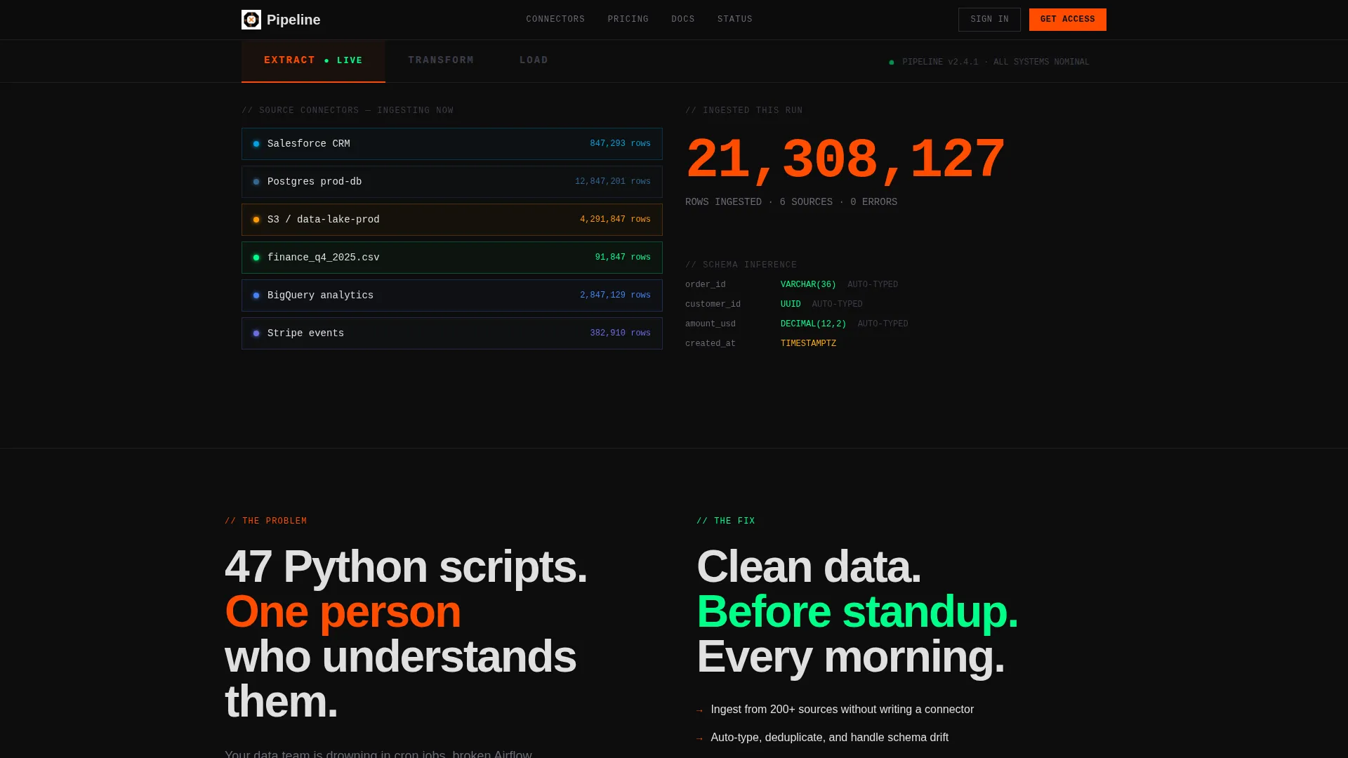
- A three-tab interactive header demo simulating Extract, Transform, and Load states with live counters and visual DAG animations
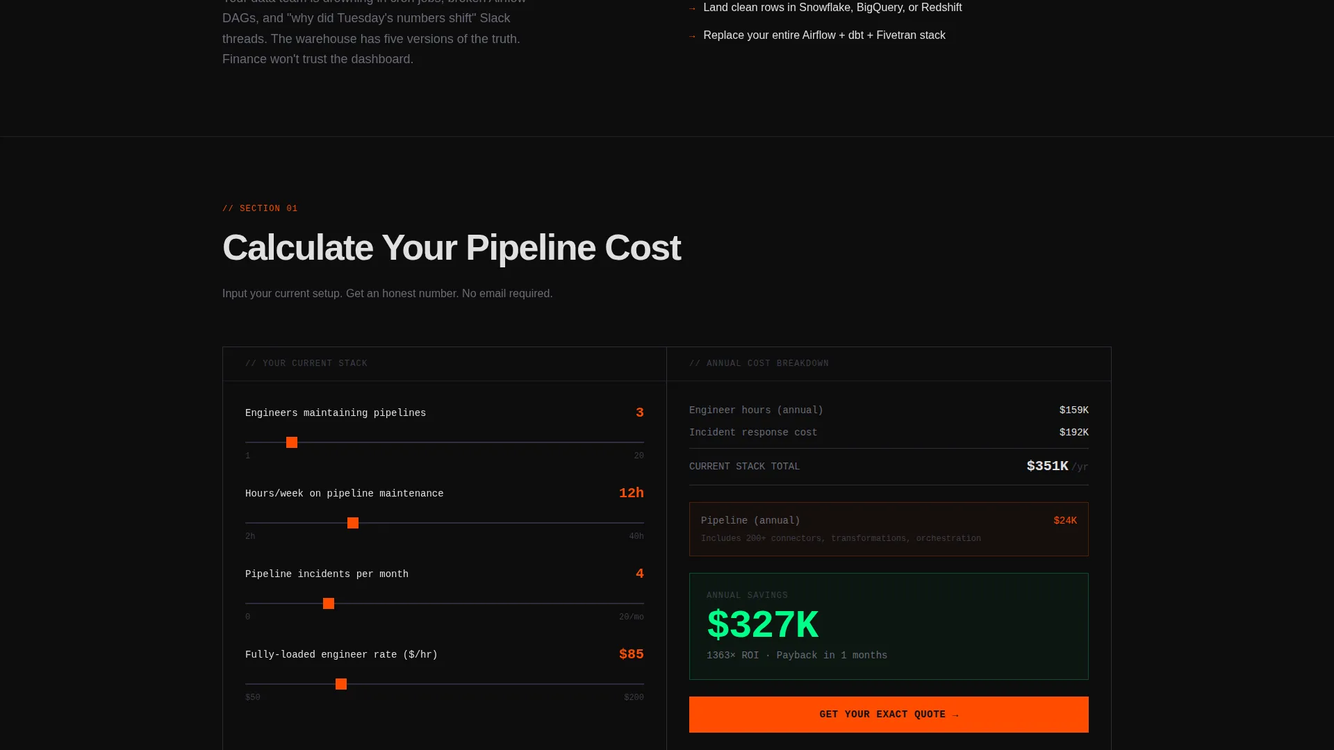
- An interactive cost calculator section that compares your visitor's current stack cost against the platform, followed immediately by the primary call to action
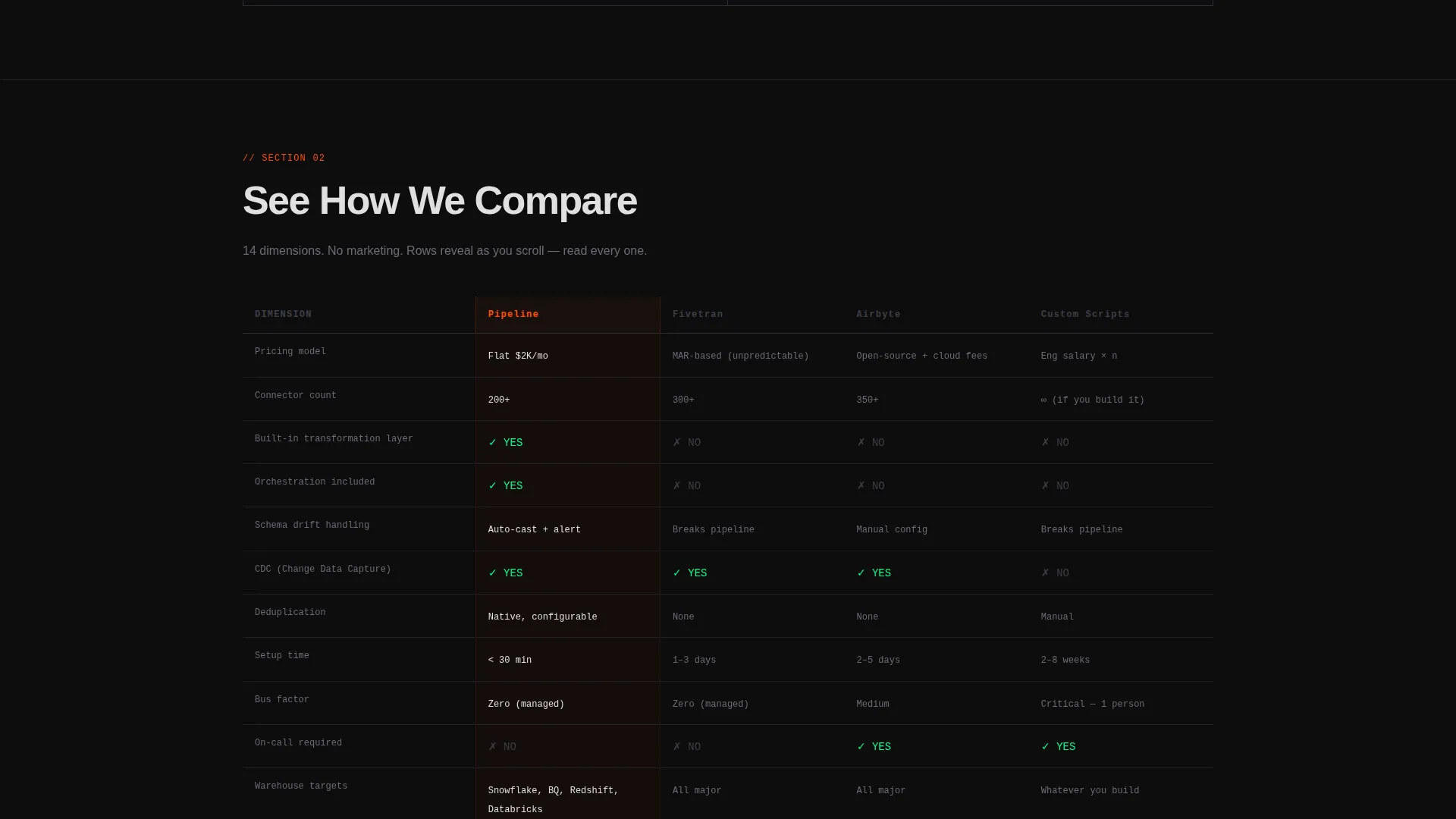
- A 14-dimension brutalist comparison table with rows that reveal one at a time on scroll, plus a three-field lead capture form at the close
Feature list
This section covers the core built-in components of the Pipeline landing page template.
Interactive Feature Tab Switcher Header
Three oversized monospaced tabs sit across the top of the viewport: EXTRACT, TRANSFORM, and LOAD. Each tab click reveals a sandboxed live-simulated interface. Extract shows source connectors lighting up with an ingested row counter. Transform displays a rearranging visual DAG with schema mappings. Load shows a warehouse table filling row by row with latency metrics in the corner.
Scroll-Reveal Progressive Layout
The page uses a progressive scroll structure that sequences evidence in deliberate order. Visitors move from interactive demo to cost calculator to competitor comparison to lead form. Each scroll layer makes the next section feel inevitable rather than promotional.
Interactive Cost Calculator
Visitors input their current pipeline hours, engineer count, and incident frequency. The calculator outputs the estimated annual cost of their existing stack alongside the platform cost. The primary call to action, "Calculate Your Pipeline Cost," appears immediately after the result renders.
14-Dimension Brutalist Comparison Table
A side-by-side table compares the platform against competing approaches across 14 dimensions. These include pricing model, connector count, transformation layer, orchestration, schema drift handling, and change data capture support. Rows land with visual weight as the visitor scrolls, with no rounded corners or soft gradients anywhere in the layout.
Architecture Diagram Section
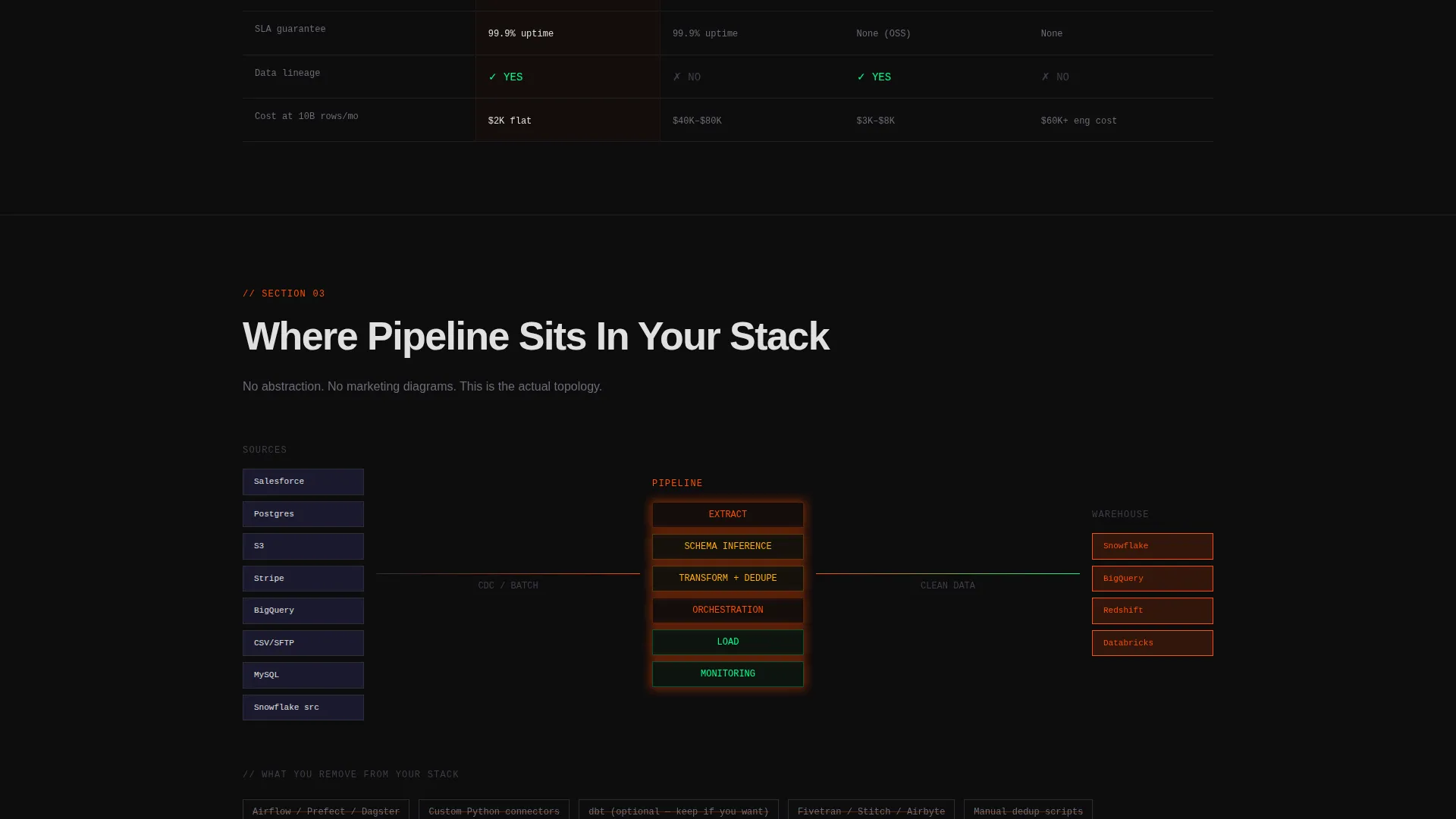
After the comparison table, stripped-down architecture diagrams show precisely where the platform sits in a real data stack. These diagrams remove marketing abstraction and replace it with honest system context that a data engineer or CTO can evaluate directly.
Lightweight Lead Capture Form
The closing form asks for three fields only: current stack selection via multi-select (covering common pipeline tools and custom scripts), monthly data volume range, and work email. No phone number field, no last name field. The form appears only after the visitor has already used the calculator and reviewed the comparison table.
Page sections overview
| Section | Purpose |
|---|---|
| Feature Tab Header | Lets visitors interact with simulated Extract, Transform, and Load interfaces before reading any copy |
| Cost Calculator | Takes visitor inputs and outputs a real cost comparison, anchoring the primary call to action |
| Competitor Comparison Table | Reveals 14 evaluation dimensions row by row on scroll to build a self-assembled business case |
| Architecture Diagrams | Shows honest system placement diagrams that replace abstraction with engineering context |
| Lead Capture Form | Closes the page with a three-field form gated only after full value has been delivered |
| Sticky Secondary call to action | A persistent signal orange button labeled "See How We Compare" that follows the scroll throughout |
Design & branding system
The template uses a carbon fiber color system built around four tones. Matte black (#0D0D0D) forms all backgrounds. Machined graphite (#1A1A2E) and woven carbon gray (#2D2D3A) layer surfaces and section dividers. Signal orange (#FF4D00) appears exclusively on interactive elements, live data counters, and calls to action.
- Typography mixes oversized heavy grotesks for headings with monospaced fonts wherever data, metrics, or terminal-style output appears
- Section dividers are single 1px graphite lines; there are no rounded corners, gradients, or illustrative imagery anywhere in the layout
- Off-white (#E0E0E0) body text reduces glare and reads like terminal output against the matte black backgrounds
Mobile & speed optimization
The scroll-reveal layout and tab-switching interactions are structured to work across viewport sizes. The brutalist grid and full-width section logic translate cleanly to narrower screens.
- Oversized monospaced type and high-contrast color ratios remain readable on mobile without requiring separate style overrides
- The calculator, comparison table, and lead form are each designed as self-contained sections that stack naturally in a single-column mobile view
How this template helps you convert
This template is designed around a specific principle: give the visitor full value before asking for anything. By the time a visitor reaches the form, they have already run their own cost calculation and reviewed a detailed product comparison.
- The interactive header demo creates immediate product credibility before the visitor reads a single line of marketing copy, reducing early bounce from skeptical technical buyers
- The cost calculator makes the business case personal and quantified, so the primary call to action feels like a logical next step rather than a cold ask
- The comparison table rows reveal progressively on scroll, maintaining engagement through the longest section and delivering a complete self-service evaluation experience before the form appears
Other information about this template
This template is categorized under Technology, within the Data and Analytics subcategory, and is purpose-built for the ETL and data integration niche. It pairs a bold brutalist visual theme with a calculator-first creative direction and a comparison-versus landing page structure.
- The template style is scroll reveal progressive, meaning sections animate into view as the visitor scrolls rather than loading all at once
- The header concept is a feature tab switcher, which is a distinct alternative to hero banners and suits products where the interface itself is the strongest sales argument
- This template is well suited for platforms whose buyers include data engineers evaluating pipeline reliability, analytics leads building internal reporting cases, and technical leaders assessing build-versus-buy decisions
Theme
Bold Brutalist
Creative direction
Calculator/Tool First
Color system
Carbon Fiber
Style
Scroll Reveal (Progressive)
Direction
Comparison/Versus
Page Sections
Interactive Feature Tab Switcher Header
Scroll-reveal Progressive Layout
Interactive Cost Calculator
Dimension Brutalist Comparison Table
Architecture Diagram Section
Lightweight Three-field Lead Form
Related questions
Can I customize the calculator inputs and comparison table dimensions?
Does this template require a form submission to use the calculator or comparison table?
Who is the target visitor for a landing page built with this template?
Is this a single-page template or a multi-page site?



