Expert Retail Software Comparison Website Template
Flow is a retail workflow automation landing page template built around a head-turning comparison table. It targets operations directors, store managers, and IT leads at mid-market retail chains. The template uses a Tech Glass visual system in Electric Indigo to show exactly how many manual steps, hours, and errors Flow eliminates before a visitor ever reaches the install prompt.
by Rocket studio
Quick summary
Flow is a single-page landing page template for a retail workflow automation platform. Its core piece is a side-by-side comparison table showing your current manual stack versus the automated alternative. A live stats header, hard-hitting interstitials, and a sticky app download bar work together to turn a complicated buying decision into a straightforward numbers comparison.
Who this template is for
This template speaks directly to the people inside mid-market retail chains who feel the daily cost of disconnected systems. If your workday involves toggling between spreadsheets, legacy point-of-sale tools, and inventory dashboards, this page was designed for your attention.
- Operations directors managing purchase order routing, shelf-price sync, and vendor compliance across multiple locations
- Store managers who run Monday morning reviews across six open browser tabs and still miss critical alerts
- IT leads responsible for connecting legacy point-of-sale systems to modern inventory platforms without causing outages
What problem this template solves
Retail operations run on dozens of invisible handoffs every day. Most of those handoffs still depend on a human doing something manually, which means every step is a chance for delay or error. This template gives a retail automation platform a credible, data-led way to show prospects the exact cost of staying manual.
- Buyers arrive skeptical and need proof, not promises, before they will commit to a new tool
- The gap between a cluttered manual process and a clean automated one is hard to visualize without concrete numbers
- Traditional product pages bury the value proposition inside feature lists that nobody reads in full
What you get with this template
The template delivers a complete, section-led landing page structure that earns visitor trust before it asks for a download. Every section is designed to build on the previous one, moving the reader from problem recognition to confident action.
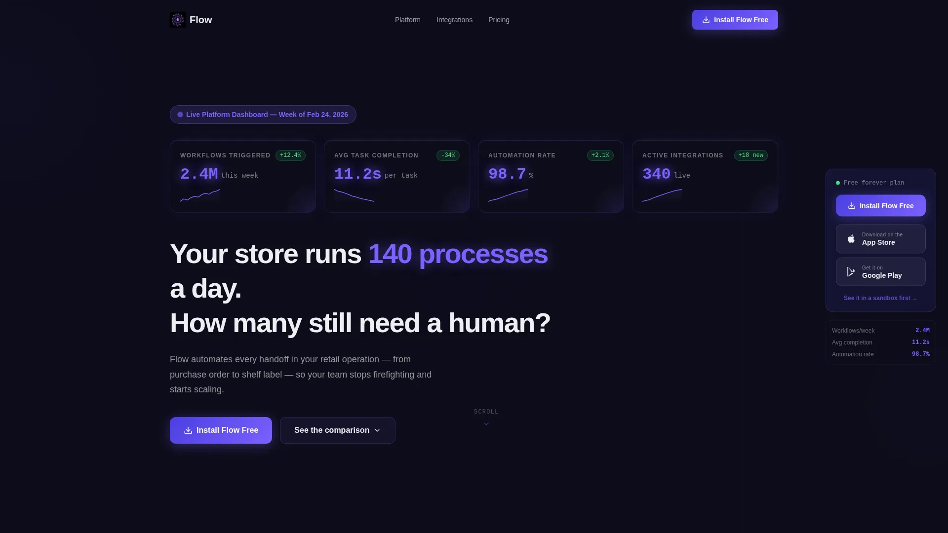
- A live stats header showing real aggregate metrics inside frosted-glass cards with micro-sparklines
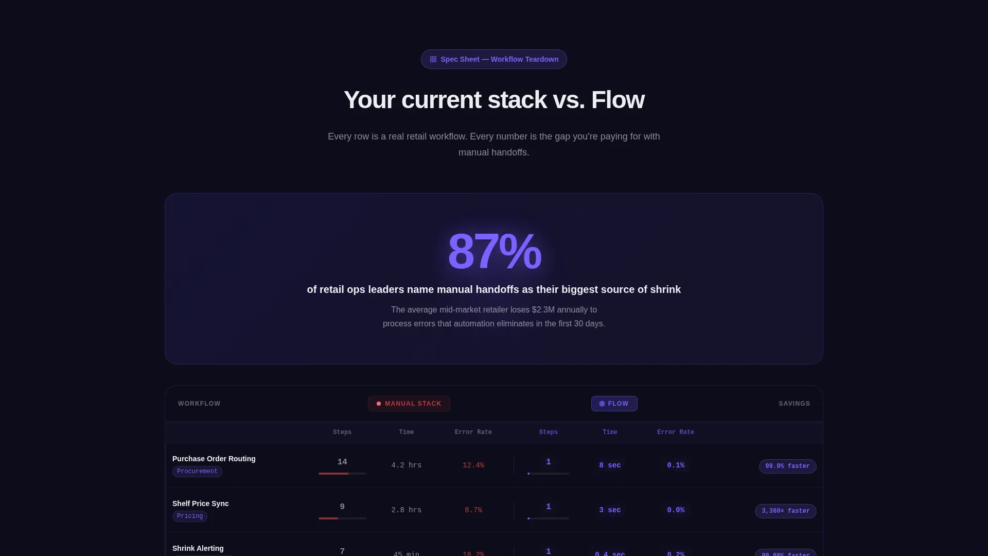
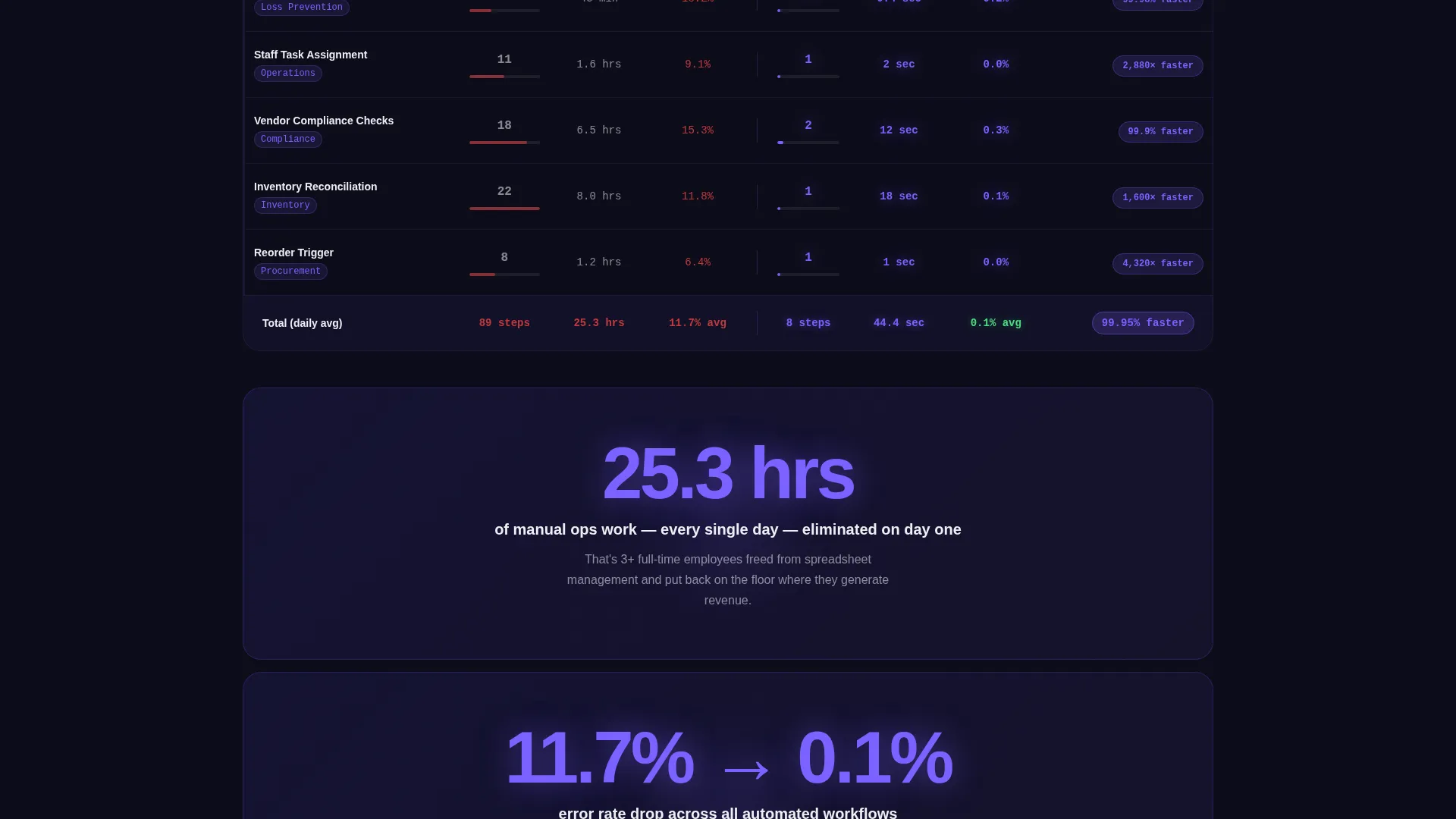
- A central comparison table that contrasts manual step-count, time-to-complete, and error rate against the automated equivalent for five specific retail workflows
- A sticky app download bar on mobile and a fixed right-column download module on desktop, each pairing the primary call to action with App Store and Google Play badges
Feature list
This template is built around a focused set of components that serve the retail automation sales story from the first scroll to the final tap.
Live Stats Metrics Header
The header opens with a dark glass panel displaying four real aggregate numbers: 2.4 million workflows triggered this week, 11.2 seconds average task completion, 98.7 percent automation rate, and 340 active integrations. Each metric sits in its own frosted-glass card with a micro-sparkline trailing behind it in signal violet. The product is the hero from the first second.
Workflow Comparison Table
The core of the page is a row-by-row teardown of five retail workflows: purchase order routing, shelf-price sync, shrink alerting, staff task assignment, and vendor compliance checks. Each row shows manual step-count, time-to-complete, and error rate alongside the automated equivalent. Numbers glow in signal violet as each row enters the viewport.
Single-Stat Interstitial Blocks
Between table sections, full-width interstitial blocks surface a single hard statistic to give the eye a visual rest. The opening interstitial reads: "87% of retail ops leaders say manual handoffs are their biggest source of shrink." These blocks break up the data density and reinforce the urgency of switching.
Sticky App Download Module
On mobile, a sticky bottom bar carries the primary call to action "Install Flow Free" alongside App Store and Google Play badges. On desktop, the same call to action lives in a fixed right-column module. No form fields anywhere, just the download button and a secondary text link that opens an interactive browser demo.
Spec Sheet Scroll Structure
The page is organized as a feature-by-feature spec sheet. The scroll sequence is deliberate: first it names the pain, then it quantifies the gap, then it proves the closure. This structure means visitors see exactly what they are eliminating before they ever reach the install prompt.
Page sections overview
| Section | Purpose |
|---|---|
| Stats Metrics Header | Opens with live aggregate numbers to establish platform credibility immediately |
| Headline Block | Delivers the core provocation: "Your store runs 140 processes a day. How many still need a human?" |
| Comparison Table | Side-by-side teardown of manual versus automated retail workflows with glowing data on scroll |
| Stat Interstitial Blocks | Single-number breaks between table sections to reinforce urgency and rest the eye |
| App Download Module | Sticky mobile bar and fixed desktop column driving "Install Flow Free" with no form friction |
Design & branding system
The template uses a Tech Glass visual theme built on the Electric Indigo color system. Every surface is designed to feel like tapping through a flagship phone at midnight, backlit from within, with glass layers floating above glass layers.
- Base palette: deep app-shell black (#0D0D1A) for backgrounds, translucent panel indigo (#4B3FE0) at 85% opacity over frosted surfaces, bright signal violet (#7B61FF) for active states and data pulses, and crisp interface white (#EDEEF2) for typography and dividers
- Visual texture: frosted-glass card panels, razor-thin edge lines, and soft light bleed between layers create depth without distracting from the data
- No lifestyle imagery or stock photography appears anywhere; the product numbers and interface panels are the only visual elements
Mobile & speed optimization
The template is structured to deliver the right experience on any screen size without asking visitors to hunt for what they need. The download path is always visible, always one tap away.
- On mobile, the sticky bottom bar keeps the "Install Flow Free" call to action fixed in place throughout the entire scroll
- The layout adapts the comparison table and stat interstitials into a single-column flow on smaller screens so the data remains readable
- The fixed right-column download module on desktop means the conversion action is always in view without interrupting the spec sheet reading experience
How this template helps you convert
The page is structured around a single insight: if you show someone the exact arithmetic of their current pain, the decision to switch becomes obvious rather than risky. Every section earns the next.
- The stats header establishes platform scale immediately, so visitors start from a position of trust rather than skepticism before they have read a single feature claim.
- The comparison table makes the value proposition concrete by turning abstract promises into specific numbers for workflows the visitor recognizes from their own workday.
- The no-form download prompt removes every remaining point of friction, so when a visitor is convinced, the path from convinced to installed is a single tap.
Other information about this template
This template is built for teams evaluating retail automation software and needing a high-conviction, data-forward landing page to support an app download funnel. It is a strong fit for platforms competing in a crowded retail software space where trust and specificity are the real differentiators.
- The template style is Comparison Table, which means the page is optimized for buyers who want to see feature parity and workflow gaps side by side rather than reading a long narrative pitch
- The creative direction follows a Spec Sheet approach, meaning the scroll is organized as a technical teardown rather than a story arc, which aligns well with operations and IT buyer personas
- The header concept is Stats and Metrics, establishing social proof through aggregate numbers rather than customer quotes or lifestyle imagery
- The landing page direction is App Download, so all conversion paths point to installation rather than a lead capture form, reducing buyer commitment at the moment of decision
- The template is category-matched to Technology and the Retail Software subcategory, with a niche focus on retail workflow automation
Theme
Tech Glass
Creative direction
Spec Sheet
Color system
Electric Indigo
Style
Comparison Table
Direction
App Download
Page Sections
Live Stats Metrics Header
Workflow Comparison Table
Single-stat Interstitial Blocks
Sticky App Download Bar
Spec Sheet Scroll Structure
Related questions
Who is this landing page template designed for?
Does this template include a lead capture form?
Can I customize the comparison table rows for my own workflows?
What does the secondary demo link do?
Is this template suitable for a non-retail software platform?



