Expert Transplant Landing Page Template
Graft is a dark-themed, card-grid landing page template built for hair transplant analytics dashboards. It presents live clinic metrics through animated data visualizations, modular glass-panel cards, and a scroll-driven Industry Report layout. Designed for FUE clinic directors, multi-location practice owners, and solo surgeons, it turns complex graft data into a compelling, conversion-ready presentation.
by Rocket studio
Quick summary
Graft is a single-page, card-grid landing page template designed for hair transplant analytics platforms. It combines a dark surgical aesthetic with animated metric visualizations to communicate clinical precision. Built around a Dashboard Pro theme, it guides hair restoration professionals from problem awareness to a personalized demo, all within a scroll-driven, modular layout.
Who this template is for
This template is built for professionals in the hair restoration space who need to present complex clinical data in a credible, visual format. It speaks directly to data-driven decision-makers who evaluate software before committing to a demo.
- FUE clinic directors comparing graft yields across technicians and sessions
- Multi-location practice owners benchmarking throughput across facilities
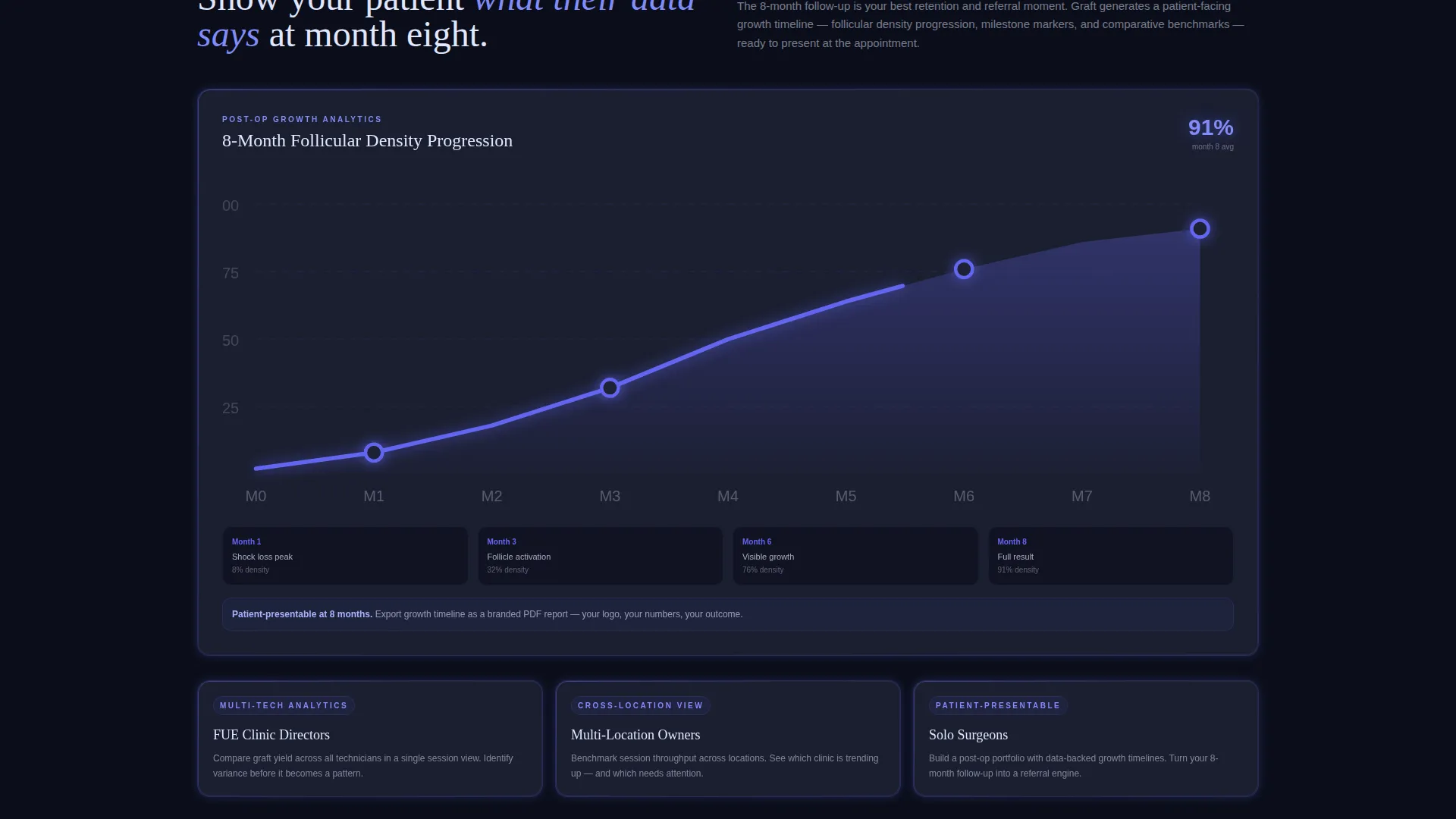
- Solo hair restoration surgeons who want post-operative growth analytics they can share with patients at follow-up appointments
What problem this template solves
Most analytics platforms struggle to communicate their value before a user logs in. A plain feature list does not convey the depth of data available. This template solves the "show, don't tell" problem by putting live-feeling metrics in front of the visitor immediately.
- Clinics lose trust during the demo request stage because visitors cannot picture the product in action
- Surgeons need benchmarking context, such as industry graft survival rates, before they commit to a new tool
- Generic SaaS landing pages fail to reflect the clinical precision that hair restoration professionals expect
What you get with this template
The template delivers a fully structured, single-page layout with modular card blocks, animated data components, and two distinct conversion paths. Every visual element is pre-designed and ready to adapt to a specific clinic analytics product.
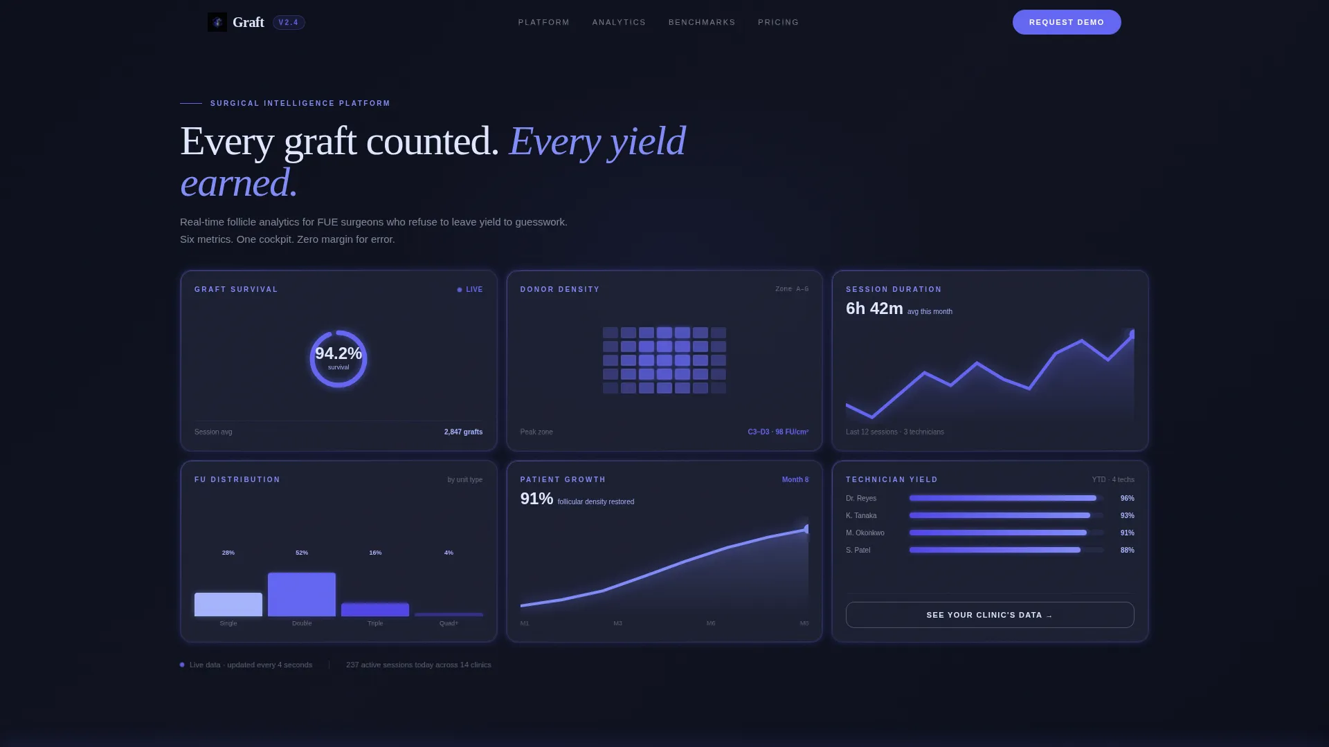
- A six-panel asymmetric header grid with live-metric cards, including a radial progress ring, donor zone heatmap, trend lines, bar charts, a growth timeline, and a technician yield comparison
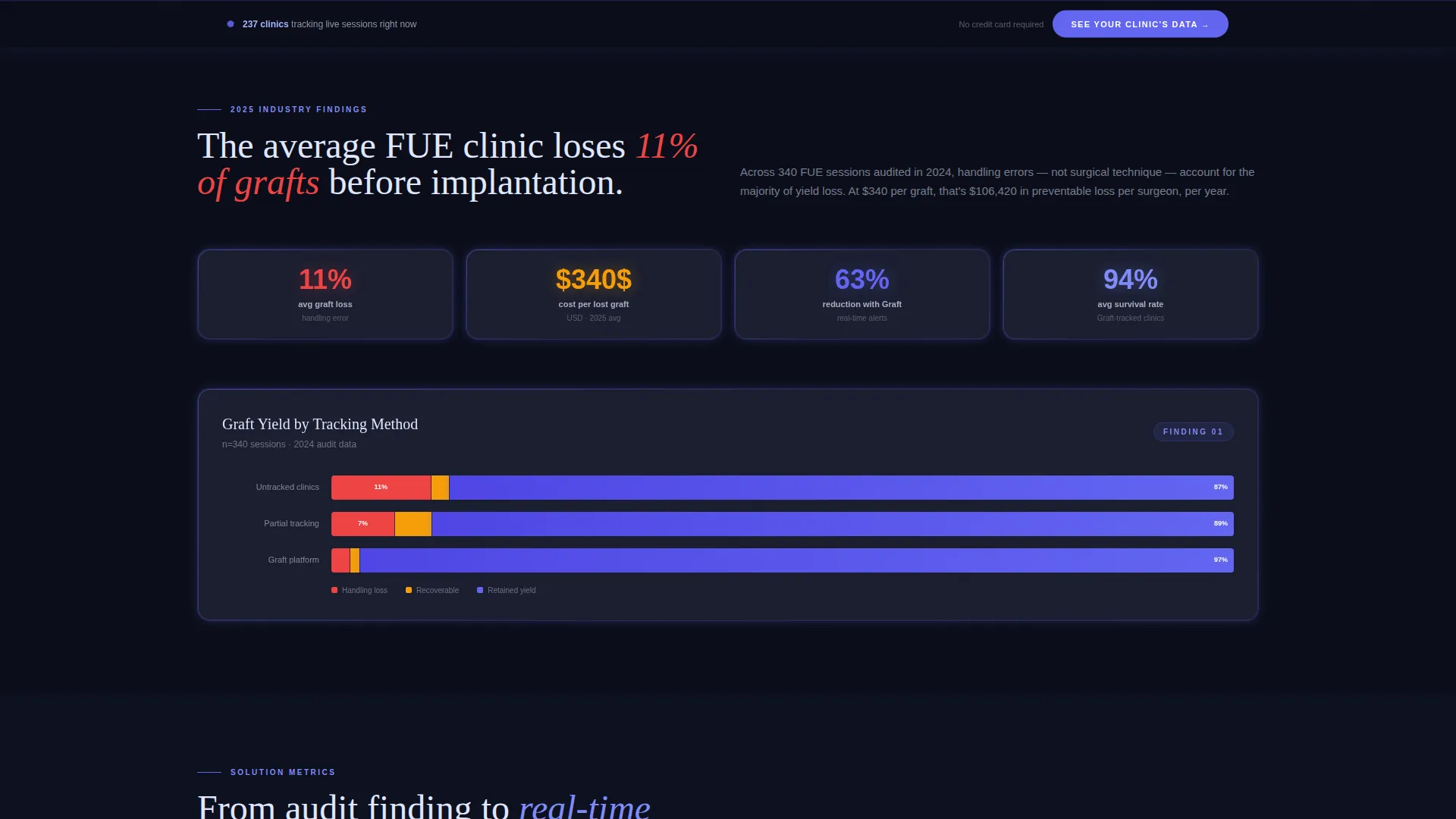
- A scroll-driven Industry Report content flow with stacked bar charts, animated progress rings, and racing comparison bars that draw as the visitor scrolls
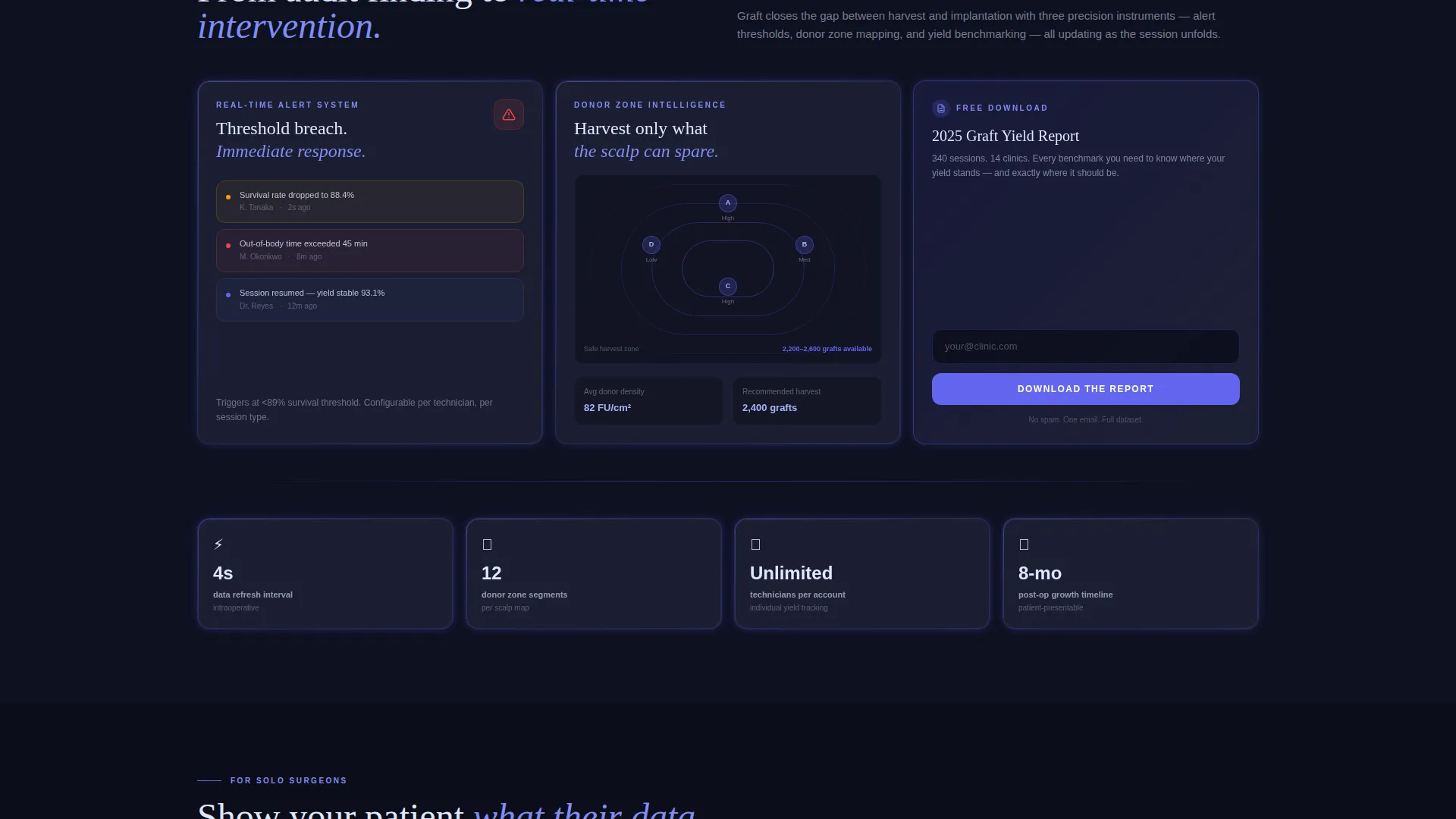
- Two call-to-action paths: a primary "See Your Clinic's Data" demo route and a secondary email-capture path for the "Download the 2025 Graft Yield Report"
Feature list
This template is built from purpose-driven components that reflect real clinical analytics workflows.
Asymmetric Dark Glass Header Grid
Six translucent panel cards are arranged in an asymmetric grid against a near-black background. Each card displays a different live metric, including graft survival percentage, donor zone density, session duration trends, follicular unit distribution, patient growth timelines, and technician yield comparisons. The cards carry faint indigo edge lighting to create a backlit glass effect.
Scroll-Triggered Data Animations
As the visitor scrolls, data visualizations animate in sequence. Progress rings fill, trend lines draw themselves, and comparison bars race across the card surface. This creates the impression of watching a clinic's numbers improve in real time, making the value proposition visceral rather than abstract.
Industry Report Content Flow
The page is structured as a scrollable findings report rather than a traditional feature list. Each section presents a clinical insight, such as the statistic that average FUE clinics lose 11 percent of grafts to handling error, then follows immediately with a solution-metric card block showing how the dashboard addresses it.
Dual Conversion Path Architecture
The primary call to action, "See Your Clinic's Data," appears first as a ghost button inside the sixth header card, then reappears as a fixed bottom bar after the third content section. The secondary path offers a downloadable graft yield report in exchange for a single email field, capturing surgeons who are not yet ready to book a demo.
Modular Card Grid Layout
Every content block is built as a self-contained card module. This makes it straightforward to reorder sections, swap data visualizations, or expand the page with additional metric categories without disrupting the overall layout structure.
Electric Indigo Interactive States
Toggle switches, progress rings, sparklines, and hover states all use the electric indigo accent color. This creates a consistent visual language across every interactive element, reinforcing the sense of a live, responsive dashboard rather than a static marketing page.
Page sections overview
| Section | Purpose |
|---|---|
| Dark Glass Header | Display six live-metric panel cards in an asymmetric grid |
| Problem Metrics Block | Present industry graft loss statistics with stacked bar charts |
| Solution Metrics Block | Show how real-time alerts reduce error rates with animated cards |
| Technician Yield Comparison | Benchmark graft output across individual technicians visually |
| Patient Growth Timeline | Visualize post-operative growth progression for patient-facing use |
| Primary call to action Bar | Fixed bottom call-to-action bar repeating the demo request prompt |
| Report Email Capture | Single-field email form for the downloadable graft yield report |
Design & branding system
The visual identity is built on a dark surgical palette that feels focused and clinical. Every color and component choice reinforces the precision of the data being displayed.
- Core palette: deep void black (#0B0E1A) for backgrounds, cool slate (#1E2235) for card surfaces, electric indigo (#6366F1) for all active and interactive elements, and clinical frost (#E0E7FF) for typography and axis labels
- The black-to-slate gradient on each card creates the illusion of floating behind anti-reflective glass, while indigo edge lighting gives the header panels a backlit, instrument-panel quality
- No hero images or stock photography are used; the data visualizations themselves serve as the visual identity
Mobile & speed optimization
The modular card grid is structured to restack cleanly at smaller screen widths, keeping metric panels readable on tablet and mobile without losing the dashboard aesthetic.
- Individual card modules scale independently, so metric panels do not overlap or truncate on narrow viewports
- Scroll-triggered animations are tied to viewport entry, ensuring each visualization activates at the right moment regardless of device scroll speed
- The fixed bottom call-to-action bar remains anchored and tappable on touch devices throughout the scroll journey
How this template helps you convert
Every design and layout decision in this template is pointed toward a single outcome: getting a qualified hair restoration professional to request a demo or download the report.
- The header loads with data already visible, so the visitor's first impression is the product itself rather than a tagline. By the time they read the first problem statistic, they are already oriented inside the dashboard experience.
- The Industry Report structure escalates from pain to proof. Each scroll reveals a new data insight, building credibility before the call to action appears. The visitor feels informed, not sold to.
- Two conversion paths reduce drop-off. Surgeons ready to act can request a personalized demo with pre-loaded sample data. Those who need more time can capture the benchmarking report with a single email entry, keeping them inside the funnel.
Other information about this template
This template is part of a broader Dashboard Pro theme family and sits within the Hair Transplant Vertical SaaS category under the Technology intersection. It is designed for the Hair Transplant Analytics Dashboard niche and carries an intersection match score of 13, indicating strong alignment between the template style and the target use case.
- Template style: Card Grid (Modular), suited for platforms that need to display multiple simultaneous data points without hierarchy confusion
- Creative direction: Industry Report, which positions the landing page as an authoritative data-led narrative rather than a promotional pitch
- Header concept: Dark Glass Panels, a design pattern that signals instrument-grade precision to a clinical professional audience
- Landing page direction: Click-Through, with every layout decision reinforcing a clear path to the demo environment or the report download
Theme
Dashboard Pro
Creative direction
Industry Report
Color system
Electric Indigo
Style
Card Grid (Modular)
Direction
Click-Through
Page Sections
Asymmetric Dark Glass Header Grid
Scroll-triggered Data Animations
Industry Report Content Flow
Dual Conversion Path Architecture
Modular Card Grid Layout
Electric Indigo Interactive States
Related questions
Who is this template designed for?
Does the template include real data or live integrations?
Can I customize the metric cards for different analytics categories?
How do the two conversion paths work?
Is this template suitable for a single-page product launch?



