Followup - Precision SaaS Landing Page Template
Followup is a bold brutalist SaaS landing page template built for a precision-timed email follow-up tool. It combines a full-viewport product screenshot header, a feature comparison data grid, and a frictionless app download flow. Designed for SDRs, RevOps managers, and solo founders, it turns a cold-pipeline problem into an undeniable visual argument for signing up.
by Rocket studio
Quick summary
Followup is a single-page SaaS landing page template with a dashboard aesthetic and a bold brutalist visual identity. It opens with a live product screenshot, scrolls through a feature comparison matrix, and closes with a zero-friction install flow. Every section builds evidence. By the end, the decision to install feels obvious.
Who this template is for
This template is built for SaaS teams selling a tool that automates sales follow-up email workflows. It speaks directly to people who lose deals because a thread went quiet, not because the lead was uninterested.
- Sales development representatives (SDRs) managing high-volume contact pipelines who cannot manually chase every thread
- Revenue operations managers connecting CRM and outreach tools and looking for a page that communicates automation depth
- Solo founders and small teams who need a conversion-ready landing page without custom design work
What problem this template solves
Sales follow-up is one of the highest-leverage activities in a pipeline, yet it is the one most likely to fall through the cracks. A generic template cannot communicate the sophistication of silence detection, AI drafting, and send-time optimization. This template is built to make that case visually before a single word is read.
- Prospects do not understand the product until they see it working, so a static hero image fails
- Feature lists without context look like every other SaaS page, so a comparison matrix is needed
- A demo booking flow adds friction that kills conversion for a tool people should just install and try
What you get with this template
You get a complete, structured SaaS landing page with every section pre-built and purpose-driven. Nothing needs to be invented from scratch. The layout, visual hierarchy, and conversion flow are already decided.
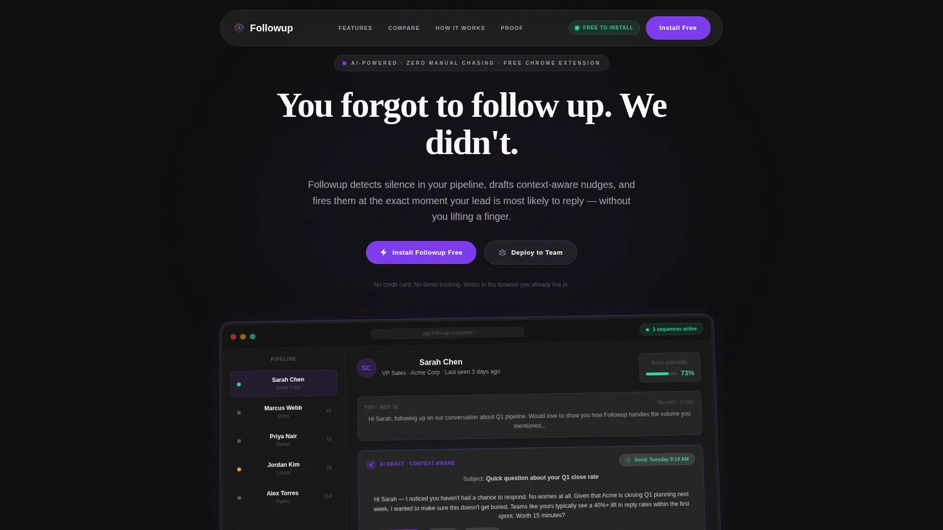
- A full-viewport product screenshot header with a frosted glass card, a 2-degree z-axis tilt, and a typewriter headline animation
- A scrollable feature comparison data grid where each row lights up in signal green or dims to zinc as the visual argument builds
- A persistent frosted-glass download bar that slides in after 40 percent scroll depth, plus two distinct install paths for individual users and teams
Feature list
This template is built around six core layout and interaction capabilities drawn directly from the product brief. Each one serves a specific conversion role.
Full-Viewport Product Screenshot Header
The header occupies the entire viewport width and shows the Followup dashboard mid-action. A contact card for "Sarah Chen" displays a 73 percent reply probability, an AI-generated follow-up draft, and a send-time suggestion of Tuesday 9:14 AM. The screenshot sits inside a frosted glass card with a 1-pixel violet border and a subtle 2-degree tilt. The headline types in letter by letter above it.
Feature Comparison Data Grid
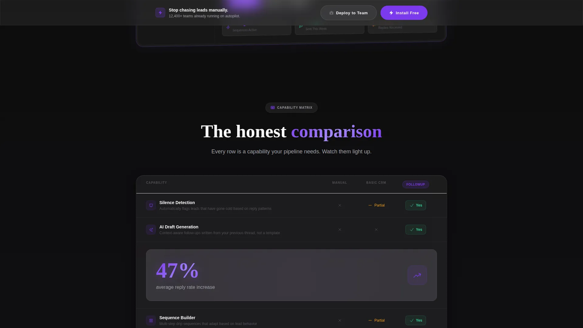
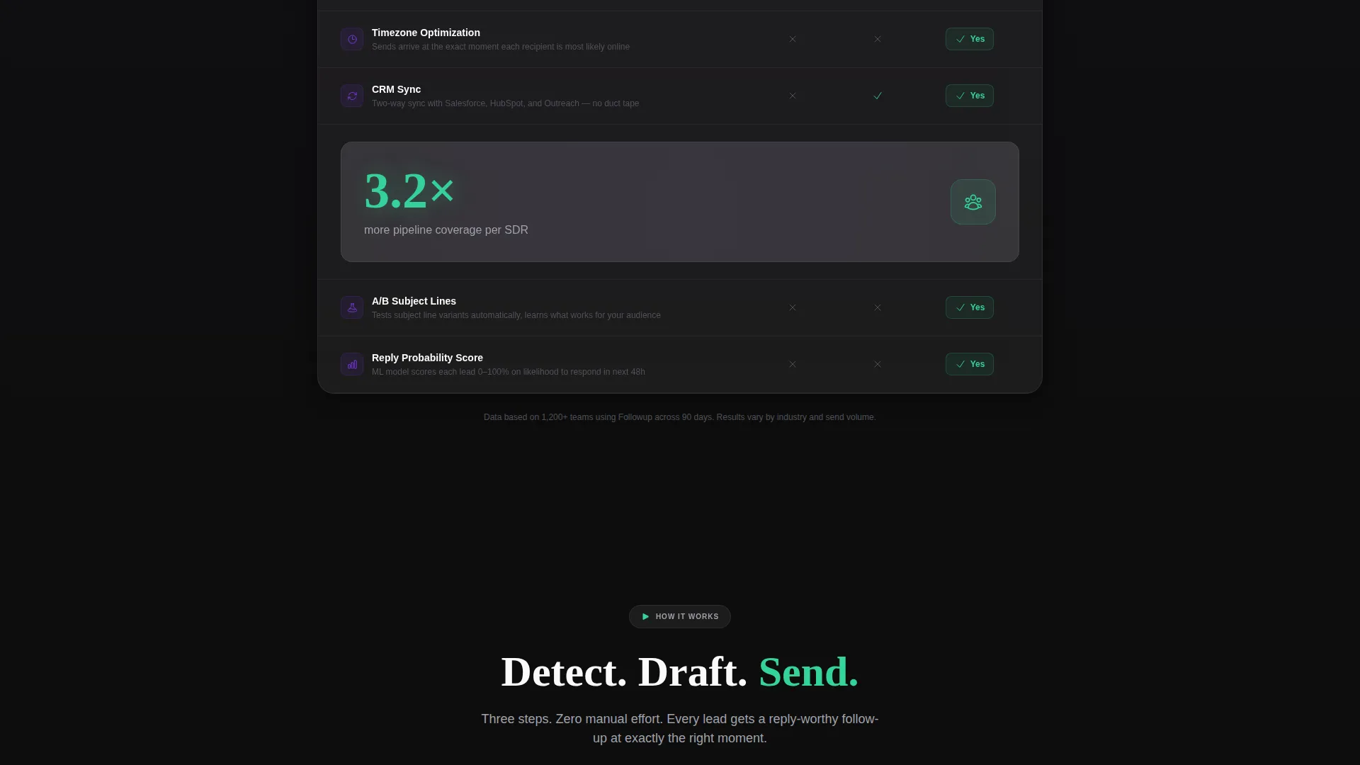
After the header, the page reveals a scrollable data grid. Each row represents a product capability such as sequence building, silence detection, AI draft generation, CRM sync, timezone optimization, or A/B subject line testing. Each column compares doing it manually, using a basic CRM, and using Followup. Cells light up in signal green or dim to muted zinc, building a visual case row by row.
Stat Callout Cards
Between grid sections, single-stat callout cards interrupt the scroll rhythm. Each card displays one number in electric violet against a deep black background on a frosted glass surface. The example stat from the brief is a 47 percent average reply rate increase. These cards act as proof points that punctuate the comparison argument.
Persistent Scroll-Triggered Download Bar
A frosted-glass download bar slides into view once the user has scrolled 40 percent of the page. It stays visible as they continue reading. This ensures the call to action is always reachable without disrupting the content experience before the visitor has seen enough to act.
Dual Install Path Conversion Flow
The primary call to action reads "Install Followup Free." Two paths are available: a Chrome extension install for individual SDRs and a "Deploy to Team" button that routes to a workspace setup flow requesting a company email domain and team size. No credit card is required. No demo booking is needed.
Typewriter Headline Animation
The headline "You forgot to follow up. We didn't." types in character by character above the product screenshot. This animation draws attention to the headline before the eye moves to the product image, framing the emotional hook before the rational argument begins.
Page sections overview
| Section | Purpose |
|---|---|
| Viewport header | Show live product screenshot and animate headline |
| Headline copy block | Deliver the emotional hook via typewriter animation |
| Feature matrix grid | Compare capabilities row by row against manual and CRM alternatives |
| Stat callout cards | Break scroll rhythm with single proof-point numbers |
| Persistent download bar | Keep install call to action visible after 40 percent scroll depth |
| Dual call to action block | Split individual install path from team deployment flow |
Design & branding system
The visual identity uses a bold brutalist structure softened by a glassmorphic color system. The result feels like a dark-mode command center viewed through a rain-streaked window: sharp underneath, frosted on the surface, with violet and green pulsing like active server indicators.
- Core palette: deep slab black (#0D0D0D) as the base, frosted glass panels at 12 percent white opacity, electric violet (#7C3AED) for primary actions, signal green (#34D399) for success and confirmation states, and muted zinc (#A1A1AA) for secondary text
- Surface treatment: frosted glass cards with subtle violet borders float above the black base layer, giving every element physical depth without using shadows
- No stock imagery or illustration appears anywhere in the template; the product user interface is the only visual asset
Mobile & speed optimization
The template is built for the environments where SDRs and founders actually open links: a phone between meetings or a laptop tab already crowded with tools. Layout decisions prioritize fast loading and readable hierarchy at every screen size.
- The full-viewport header and data grid reflow cleanly for narrower viewports so the comparison argument remains legible on mobile
- The persistent download bar and dual call to action buttons are sized and spaced for thumb interaction on touch screens
- Heavy visual elements like the frosted glass cards use CSS-based effects rather than large image assets, keeping the page light
How this template helps you convert
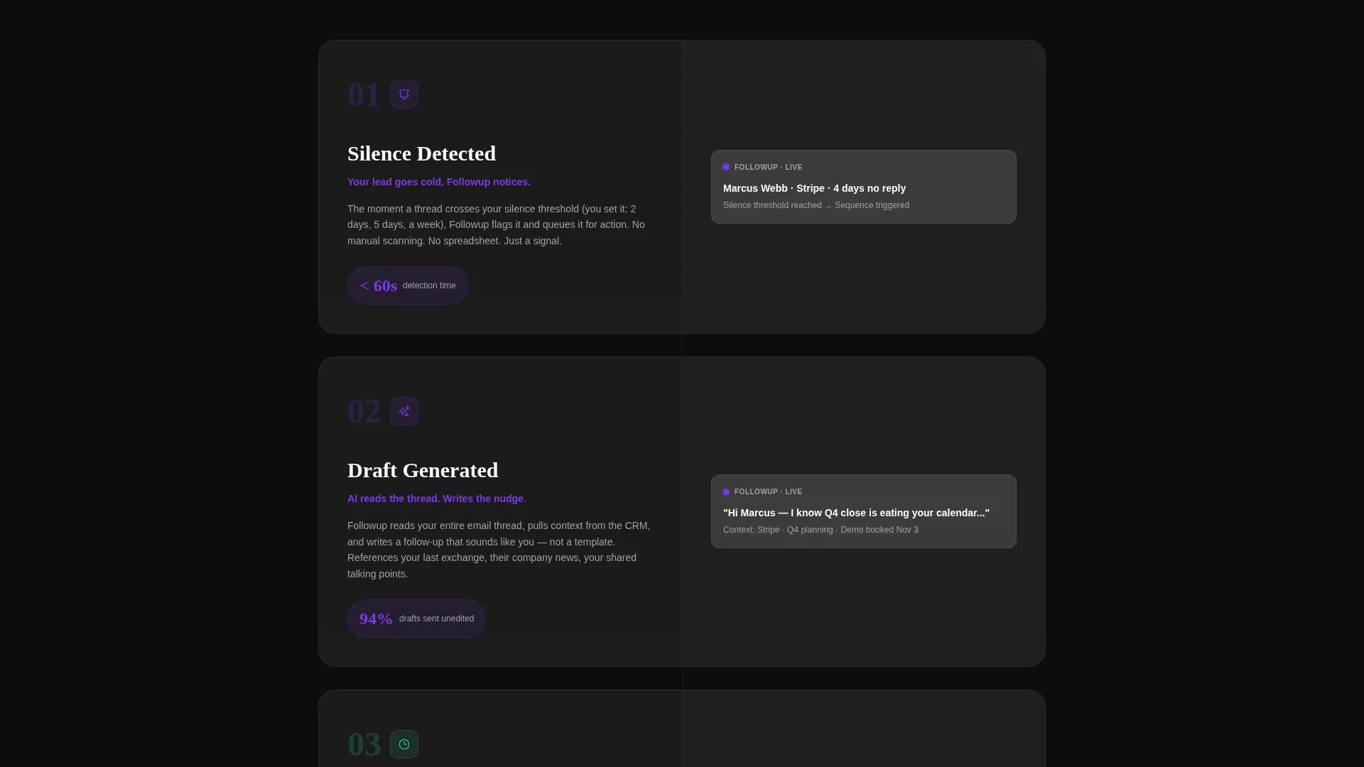
Every section is structured to reduce doubt and lower the effort required to act. The conversion logic is sequential: show the product working, prove it beats alternatives, then make installing it a single click.
- The product screenshot header eliminates the need to imagine the tool in action. The visitor sees real data, a real interface, and a real outcome before reading a single line of copy.
- The feature matrix removes objections one row at a time. By the time the visitor reaches the download bar, the case has already been made visually and the call to action feels like a natural next step rather than a sales pitch.
Other information about this template
This template is categorized under Technology and the SaaS email templates subcategory, with a specific focus on the SaaS follow-up email niche. It is a single-page landing page, not a multi-page website.
- The template style is a dashboard and data grid layout, making it well suited for tools where showing the product interface is the strongest sales argument
- The creative direction is a Feature Matrix, meaning the page builds its case through structured comparison rather than narrative storytelling
- The header concept is a Product Screenshot, which means no illustration budget is needed and no stock photo library is required
- The landing page direction is optimized for app download and direct install, not lead capture or demo scheduling
- The intersection of bold brutalist theme, glassmorphic color system, and dashboard template style is deliberately unusual and visually memorable in a category where most SaaS pages look identical
Theme
Bold Brutalist
Creative direction
Feature Matrix
Color system
Glassmorphic
Style
Dashboard/Data Grid
Direction
App Download
Page Sections
Product Screenshot Hero Header
Scrollable Feature Comparison Matrix
Single-stat Proof Point Cards
Scroll-triggered Persistent Call to Action Bar
Dual-path Install Flow
Typewriter Headline Animation
Related questions
Can I replace the product screenshot in the header with my own dashboard image?
Does this template include the typewriter headline animation?
How do I update the feature comparison grid with my own capabilities?
Do I need a developer to connect the dual install buttons?
Is this template suitable for a product that uses a direct sign-up instead of a Chrome extension?



