K-12 AI Inventory Forecasting Landing Page Template
Forecast is a single-page landing page template built for K-12 AI inventory forecasting platforms. It opens with a live estimator that calculates district-specific waste savings, then flows into a side-by-side comparison table and a 90-day onboarding timeline. The Carbon Fiber color system and Startup Velocity theme give it the feel of a precision tool, not a brochure.
by Rocket studio
Quick summary
Forecast is a high-converting landing page template for a K-12 AI-powered procurement forecasting platform. It leads with an interactive estimator, follows with a comparison table, and closes with a sticky free-pilot call to action. Every section is built to move operations directors, business managers, and superintendents from skepticism to signup.
Who this template is for
This template is designed for teams marketing an AI inventory forecasting tool to district-level procurement decision-makers. It speaks directly to the people who feel the pain of supply shortages and spreadsheet chaos every September.
- K-12 operations directors managing supplies across dozens of school buildings
- District business managers who have dealt with costly emergency purchases and backorders
- Superintendents who need to justify smarter spending to a school board
What problem this template solves
Procurement teams in school districts often rely on outdated spreadsheets and reactive ordering. The result is wasted budget, stockouts mid-semester, and staff hours lost to manual inventory checks. A landing page that simply lists features will not earn trust from buyers who have already been burned.
- No compelling proof of value above the fold to capture a skeptical buyer
- Generic landing pages fail to show district-specific impact in real numbers
- Visitors leave without understanding what the tool does differently or why it matters now
What you get with this template
This template gives you a fully structured, single-page layout designed around the buyer journey for a K-12 procurement platform. Each section earns the next click before asking for a commitment.
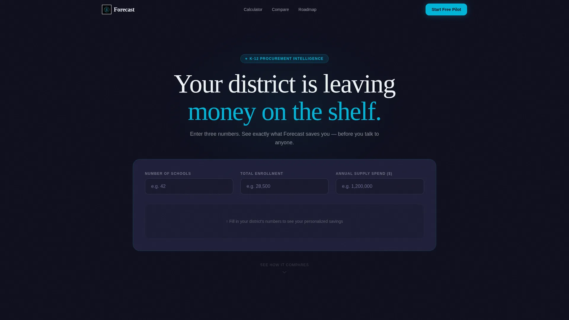
- A live calculator hero that returns personalized savings estimates using the visitor's own district inputs
- A side-by-side comparison table showing current-process pain points against platform benefits, row by row
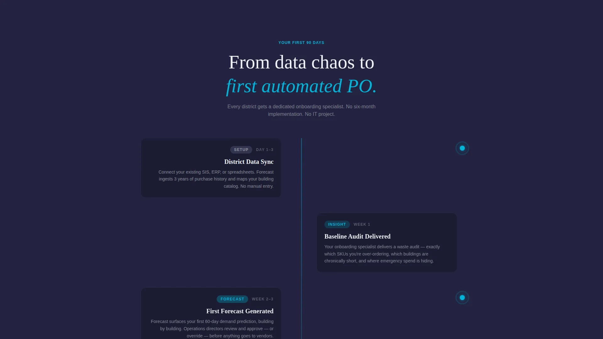
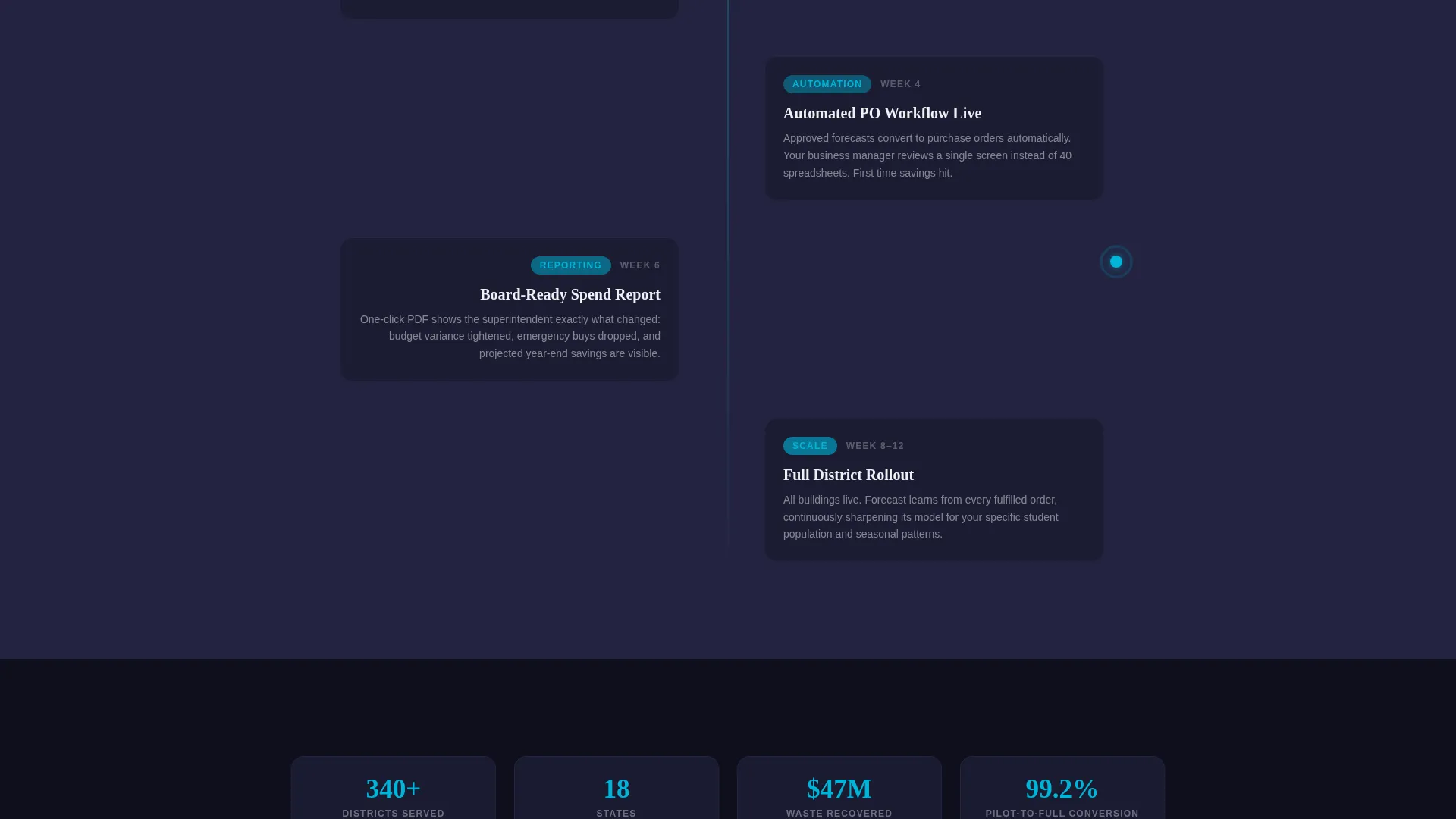
- A 90-day onboarding timeline that gives buyers a concrete picture of what happens after they sign up
Feature list
This template ships with purpose-built sections that work together as a conversion sequence, not a collection of disconnected blocks. Each component below addresses a specific objection or decision stage.
Interactive District Savings Estimator
Visitors enter their school count, total enrollment, and current annual supply spend. The estimator instantly returns projected waste reduction in dollars, stockout incidents prevented, and hours saved per month. The numbers animate upward against a carbon black background, with electric blue digits that make the output feel live and credible.
Side-by-Side Comparison Table
A structured table pits "Your Current Process" against "With Forecast" across rows including reorder accuracy, emergency purchase frequency, budget variance, and staff hours on inventory. Each row reveals with a left-to-right wipe animation. The Forecast column lights up in electric blue while the current-process column stays in titanium gray, making the contrast impossible to miss.
90-Day Onboarding Timeline
Below the comparison table, a week-by-week milestone section covers the first 90 days from data sync to the first automated purchase order. This section gives the scroll a narrative of momentum and removes the fear of a complicated rollout.
Sticky Free-Pilot Call to Action
A persistent call-to-action bar locks to the bottom of the viewport after the calculator interaction. It stays visible through every scroll section. Clicking it opens a three-field form asking for district name, number of buildings, and work email, keeping the signup barrier as low as possible.
Guided Demo Secondary Path
A second conversion path appears below the comparison table. The "See It With Your Data" link routes interested visitors to a guided demo booking flow, giving buyers who need more proof a clear next step without abandoning the page.
Carbon Fiber Visual System
The entire layout uses a dark-first design with carbon black section backgrounds, titanium row separators, electric blue interactive elements and checkmarks, and signal white body copy. The visual system communicates precision and intelligence without relying on stock photography or illustration.
Page sections overview
| Section | Purpose |
|---|---|
| Calculator Hero | Delivers personalized district savings estimates above the fold |
| Comparison Table | Shows current-process pain versus platform benefits row by row |
| 90-Day Timeline | Maps onboarding milestones from data sync to first automated order |
| Free Pilot Form | Captures district name, building count, and work email to start signup |
| Demo Booking Path | Offers a secondary route for visitors who want a guided walkthrough |
Design & branding system
The Carbon Fiber color system is built for a dark, precision-first aesthetic that feels like cracking open a new device. Every color has a defined role, and nothing competes with the electric blue accent that signals action and intelligence.
- Deep carbon black (#1A1A2E) dominates section backgrounds, titanium mid-gray (#4A4E69) separates comparison rows, electric launch blue (#00B4D8) marks every interactive element and winning checkmark, and signal white (#EDF2F4) carries all body copy and header type
- No stock imagery and no illustration are used anywhere; the calculator and comparison table are the visual centerpiece
- The Startup Velocity theme drives a sense of forward motion through wipe animations, animated digit counters, and a sticky bottom bar that never lets the call to action disappear
Mobile & speed optimization
The layout is structured to deliver its core value, the estimator and comparison table, clearly on smaller screens without losing the visual impact of the Carbon Fiber system.
- Input fields and the estimator output are stacked for thumb-friendly interaction on mobile viewports
- The comparison table is designed to scroll horizontally or reflow cleanly so both columns remain readable on narrow screens
- The sticky call-to-action bar is sized and positioned to stay usable on mobile without blocking critical content
How this template helps you convert
The page is structured as a deliberate conversion sequence. Each section reduces a specific objection before presenting the next ask.
- The calculator hero creates a personalized, dollar-denominated reason to keep reading before the visitor encounters a single marketing claim. Once a business manager sees a six-figure waste number built from their own inputs, the psychological friction to start a free pilot drops significantly.
- The comparison table reframes the buying decision. Instead of asking visitors to evaluate abstract features, it shows the concrete gap between their current process and the platform outcome, row by row, in a format familiar to operations-minded buyers.
- The 90-day timeline resolves the final major objection, implementation fear, by showing a clear, week-by-week path from signup to first automated purchase order, making the commitment feel manageable and reversible.
Other information about this template
This template is part of a curated set of Startup Velocity themed layouts designed for B2B software products that need to prove value fast. It is a good fit for platforms targeting district procurement teams who evaluate tools the same way they evaluate any capital purchase: with data, not emotion.
- The template style is a Comparison Table layout, which is well suited for buyers who are actively evaluating alternatives and need a direct side-by-side view
- The Freemium and Trial conversion direction means the primary call to action asks for low-commitment engagement, a free pilot, rather than a direct purchase, reducing signup hesitation
- The Calculator/Estimator header concept is one of the highest-engagement header formats for B2B SaaS landing pages because it gives visitors a reason to interact before they decide whether to read further
- This template does not include pre-built backend logic for the estimator; the calculation behavior is part of the front-end design and requires configuration to match the platform's actual data model

Theme
Startup Velocity
Creative direction
Launch Energy
Color system
Carbon Fiber
Style
Comparison Table
Direction
Freemium/Trial
Page Sections
Interactive District Savings Estimator
Side-by-side Comparison Table
Day Onboarding Timeline
Sticky Free-pilot Call to Action
Guided Demo Secondary Path
Carbon Fiber Visual System
Related questions
Who is the primary audience for this landing page template?
Does the estimator calculator work out of the box?
Can I change the comparison table rows to match my platform's features?
What does the 90-day timeline section include?
Is this template suitable for a broader education technology product?



