Fortify — Intelligent Risk Protection Landing Page Template
Underwrite is a dashboard-style landing page template built for insurance AI customer service platforms. It opens with a live-resolution console hero, builds a data-driven case through animated benchmarks and a comparison grid, and closes with a bold demo call to action. Designed for operations leaders, it turns platform metrics into immediate visual proof.
by Rocket studio
Quick summary
Underwrite is a single-page, click-through landing page template built for AI-powered insurance customer service platforms. The hero opens as a functioning resolution console, the scroll builds a data narrative using industry benchmarks and a carrier case study, and every call to action drives visitors toward a live product demo. No forms. Just proof.
Who this template is for
This template was designed for the people carrying the weight of high-volume insurance operations. It speaks directly to leaders who know the numbers and need to show them to others.
- Operations vice presidents at mid-market insurance carriers managing 40,000 or more monthly service calls
- InsurTech chief technology officers integrating AI tooling across legacy policy administration systems
- Contact center directors dealing with consistent agent attrition and rising cost-per-call figures
What problem this template solves
Most landing pages for insurance software describe features but never demonstrate them. Visitors arrive, read a list of capabilities, and leave without trusting the product. This template flips that model entirely.
- It shows the AI resolving a real policyholder conversation inside the hero section, before any persuasion copy appears
- It replaces marketing claims with animated counters, a live comparison grid, and a before-and-after carrier case study
- It removes the friction of a form and routes qualified visitors directly to a demo scheduling page
What you get with this template
You get a complete, production-ready landing page layout built around a Data Command visual theme and structured as an industry report that proves value through data. Every section is designed to add another row to the argument.
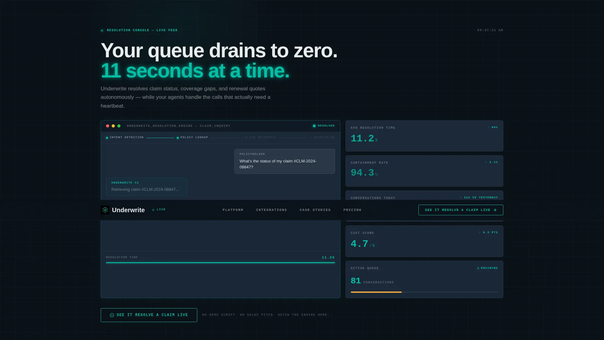
- A full-viewport dashboard hero with animated KPI panels, a live conversation thread, and a ghost-outlined call-to-action button
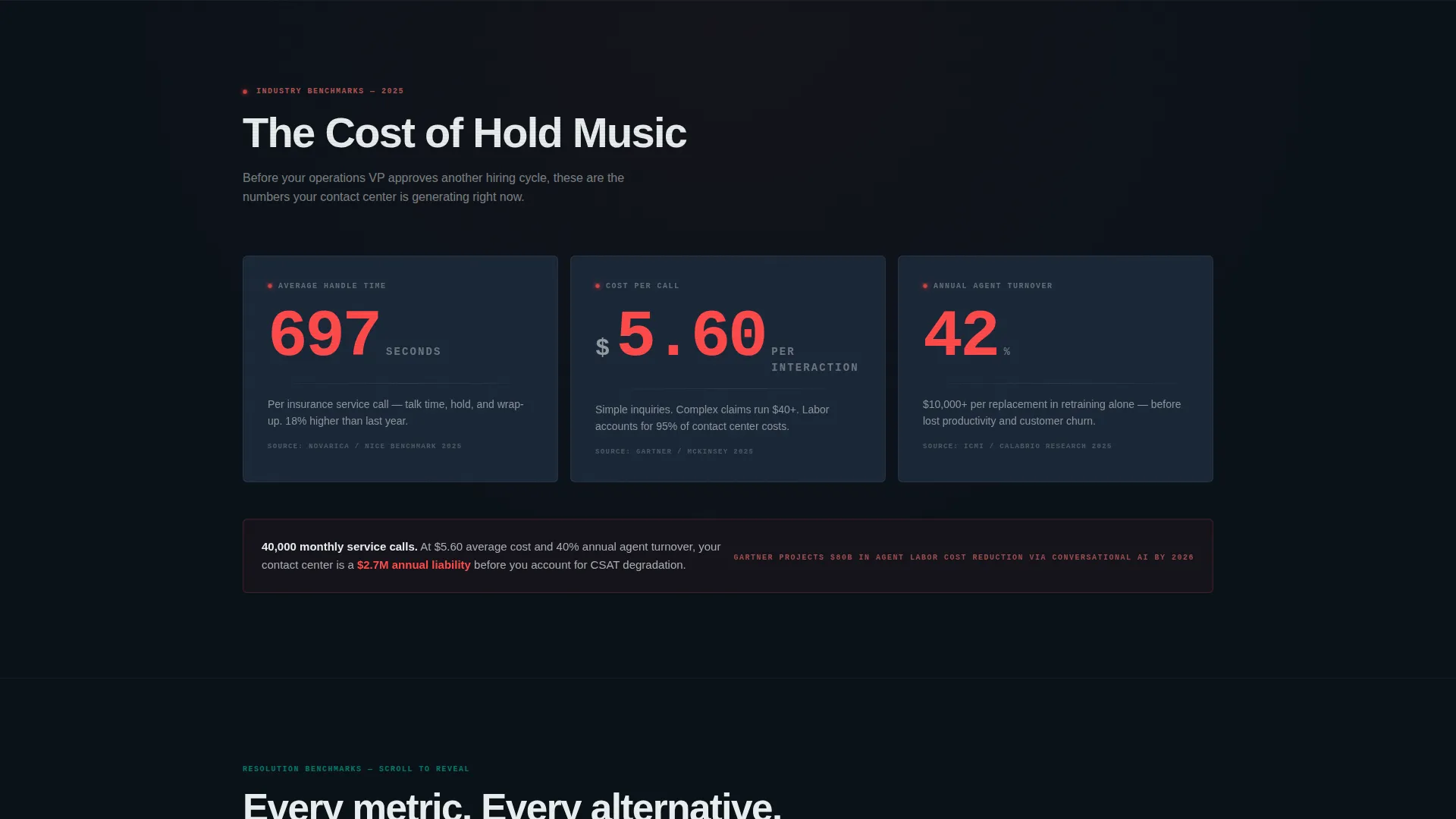
- A scroll-driven data narrative including the "Cost of Hold Music" section, an eight-metric comparison grid, and a carrier case study data card
- A three-stage call-to-action system: ghost button in the header, solid bar after the case study, and a sticky bottom rail for mobile visitors
Feature list
This template delivers a tightly coordinated set of components, each grounded in the brief and built to serve an insurance AI platform audience.
Live Resolution Console Hero
The header occupies the full viewport and recreates the platform's real-time console. The left panel shows a policyholder conversation being handled autonomously. The right panel streams four live KPIs: 11.2 seconds average resolution time, 94.3 percent containment rate, 2,847 conversations handled today, and a 4.7 customer satisfaction score. A small animated dot traces the AI reasoning path from intent detection through policy lookup to resolution.
Animated Industry Benchmark Counters
The "Cost of Hold Music" section presents three animated counters drawing from real industry benchmark figures. Average handle time, cost per call, and annual agent turnover build in real time as the visitor scrolls into view. The counters frame the cost of inaction before any product comparison appears.
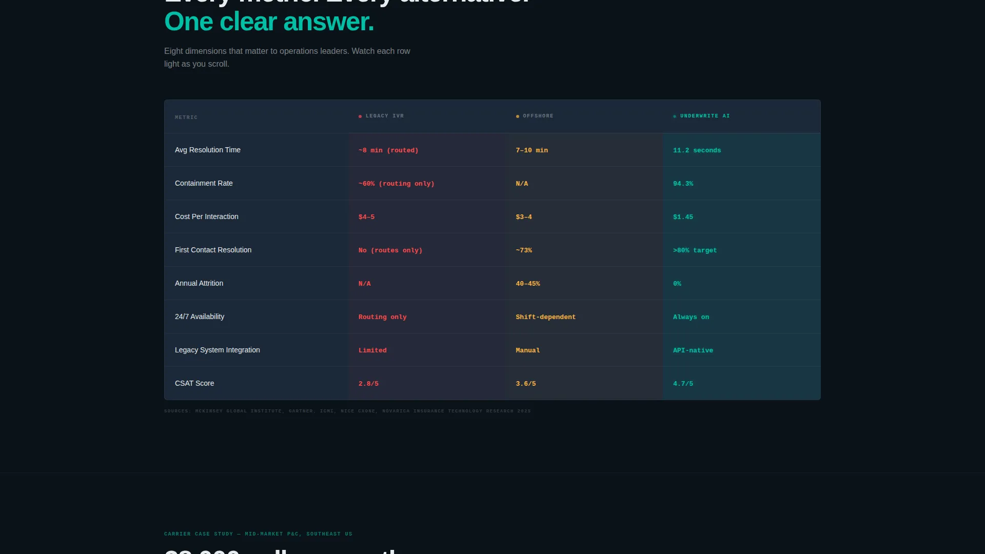
Eight-Metric Comparison Grid
A structured grid compares three approaches side by side: legacy interactive voice response systems, offshore outsourcing, and AI resolution. Eight metric rows light up in teal as the section enters the viewport. The layout makes the case visually without requiring the visitor to read a paragraph.
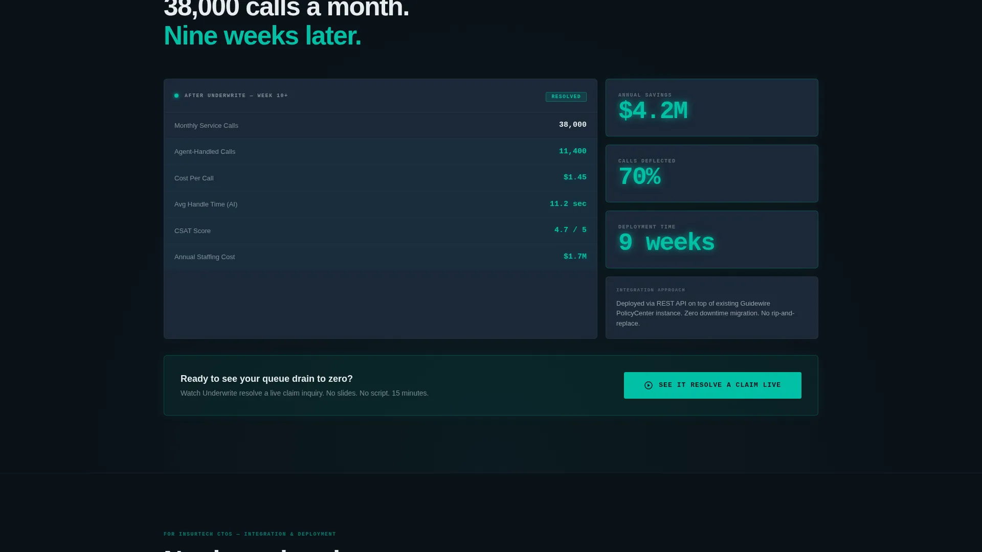
Before-and-After Carrier Case Study Card
A single carrier data card shows the transformation in plain numbers. Thirty-eight thousand monthly calls reduced to 11,400 agent-handled interactions. Four-point-two million dollars in annual savings. Deployment completed in nine weeks. The card is rendered as a before-and-after data layout, not a testimonial quote.
Three-Stage Call-to-Action System
The primary call to action, "See It Resolve a Claim Live," appears three times with increasing visual weight. It begins as a ghost-outlined teal button inside the dashboard hero, reappears as a solid teal bar after the case study section, and anchors a sticky bottom rail on mobile. Each instance clicks through to a demo scheduling page with calendar integration.
Dark Grid Dashboard Design System
The entire page uses a Data Command color palette: deep operations black for the base, signal teal for live-state indicators and key metrics, slate panel gray for card backgrounds, and catalyst white for typography and divider lines. No stock photography and no illustration are used anywhere. The product interface itself serves as the visual hero.
Page sections overview
| Section | Purpose |
|---|---|
| Dashboard Console Hero | Opens full-viewport with live AI resolution and animated KPI stream |
| Cost of Hold Music | Presents three animated counters using real industry benchmark data |
| Eight-Metric Grid | Compares legacy IVR, outsourcing, and AI across eight performance metrics |
| Carrier Case Study | Before-and-after data card showing call volume, savings, and deployment time |
| Solid call to action Bar | Resurfaces the demo call to action after the case study with full visual weight |
| Mobile Sticky Rail | Anchors the primary call to action at the bottom of the screen for mobile visitors |
Design & branding system
The visual identity follows a Data Command theme built for credibility with a technical operations audience. Every color choice is functional. Nothing decorates the page without earning its place through the data it represents.
- Core palette: deep operations black (#0B1219) as the base, signal teal (#00BFA6) for live metrics and indicators, slate panel gray (#1B2838) for card surfaces, and catalyst white (#E8ECED) for text and dividers
- The aesthetic references a network operations center at third shift: cool teal light against dark glass surfaces, metric panels that pulse gently, and a grid structure that feels pulled from a real monitoring dashboard
Mobile & speed optimization
The template is structured to work clearly on smaller screens without losing the dashboard impact that defines the desktop experience. The mobile layout prioritizes the call to action and the core data narrative.
- The sticky bottom rail call to action keeps "See It Resolve a Claim Live" persistently visible as mobile visitors scroll through the data sections
- The full-viewport console hero and animated counter sections are built to maintain their visual logic on narrower viewports without requiring horizontal scrolling
How this template helps you convert
This template earns the click before it asks for one. By the time a visitor reaches any call-to-action element, they have already watched the AI handle a real use case and reviewed hard numbers from a carrier deployment.
- The dashboard hero shows the product working in the first seconds of the visit, replacing marketing copy with live-state proof that operations leaders recognize immediately
- The data narrative builds a compounding case through the "Cost of Hold Music" counters, the comparison grid, and the case study card, so the demo request feels like a logical next step rather than a sales ask
Other information about this template
This template is built for a single-page, click-through flow with no embedded lead capture form. The conversion path ends at a demo scheduling page with calendar integration, keeping the handoff clean and qualified.
- The template is categorized under Technology, specifically the AI for Insurance subcategory, making it a strong fit for InsurTech product teams and insurance operations software vendors
- The Industry Report creative direction means the scroll is structured as a sequential data argument, not a standard feature list or marketing narrative
- The Dashboard Preview header concept positions the product interface as the hero element, which aligns with how technical buyers in insurance operations evaluate software before engaging a sales team
Theme
Data Command
Creative direction
Industry Report
Color system
Teal Catalyst
Style
Dashboard/Data Grid
Direction
Click-Through
Page Sections
Live Resolution Console Hero
Animated Industry Benchmark Counters
Eight-metric Comparison Grid
Before-and-after Carrier Case Study
Three-stage Call-to-action System
Data Command Dark Design System
Related questions
What type of company is this template designed for?
Does this template include a lead capture form?
Can I update the KPI figures shown in the dashboard hero?
What makes this template different from a standard software landing page?
Is this a single-page layout or a multi-page site?



