Franchise Proposal & Comparison Landing Page
FranchiseCommand is a modular, card-grid landing page template built for franchise proposal and comparison platforms. It opens with an animated metrics dashboard, drops visitors into an interactive comparison engine, and guides them through a progressive multi-step proposal form. The Tech Glass visual identity uses a Void and Violet color system to give the page a data-driven, high-trust presence.
by Rocket studio
Quick summary
FranchiseCommand is a single-page franchise proposal and quote template designed around a Calculator-first experience. Visitors land on a live metrics dashboard, compare franchise brands side by side in modular glass cards, and move through a progressive form that ends with a personalized downloadable proposal. The design is dark, data-dense, and built to earn commitment before asking for it.
Who this template is for
This template is built for teams and founders operating in the franchise discovery and financing space. It works equally well for platforms, consultants, and independent brokers who want to present franchise data with credibility.
- Franchise comparison platforms that need a high-converting front end for lead generation
- Independent franchise consultants presenting financial models to prospective buyers
- Franchise brokers targeting corporate professionals, multi-unit operators, and first-time buyers who need data before committing
What problem this template solves
Most franchise landing pages ask visitors to fill out a form before showing them anything useful. That friction kills trust early. This template flips the model by leading with the tool and gating only the personalized output.
- Prospective buyers cannot easily compare investment ranges, royalty rates, and break-even timelines in one place
- Generic contact forms fail to qualify serious buyers or segment them by capital readiness and territory interest
- First-time franchise buyers need visual, interactive financial models to decode complex disclosure data before they can commit
What you get with this template
You get a fully structured, modular landing page template designed around a franchise comparison and proposal workflow. Every section is purpose-built and visually consistent within the Tech Glass design system.
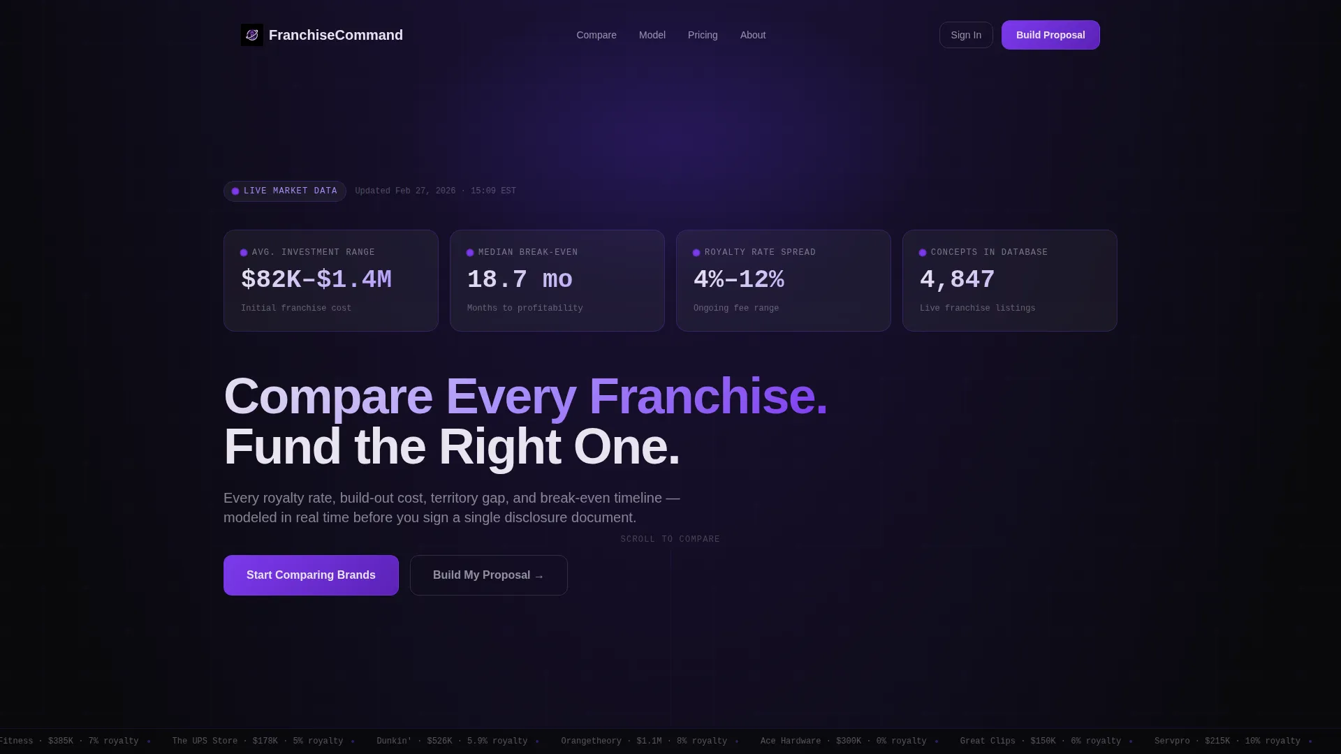
- An animated Stats and Metrics header that displays live-style counters for investment ranges, break-even months, and royalty rate spreads
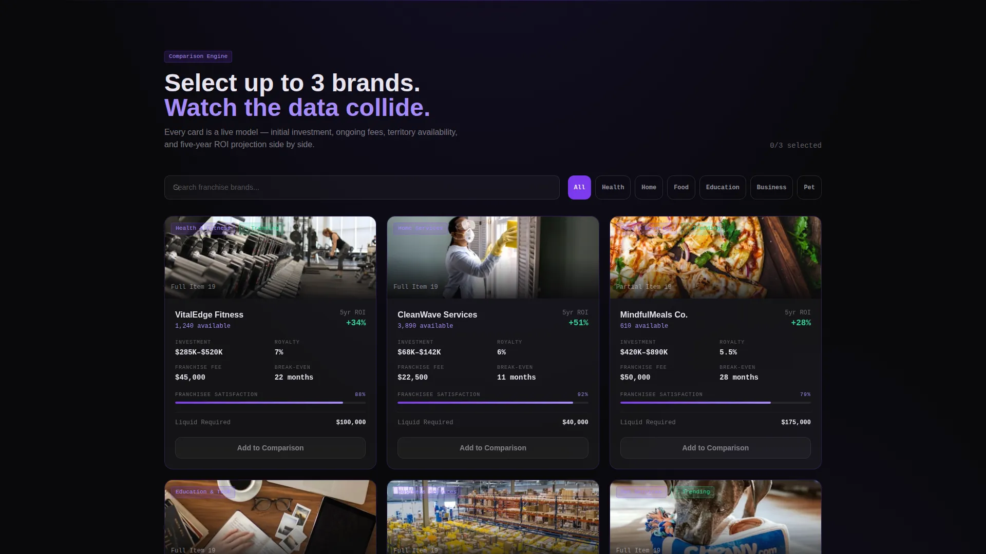
- A modular card-grid comparison engine where visitors select franchise brands and view side-by-side glass panel cards with financial data
- A three-step progressive proposal form that collects investment range, industry preference, and contact details to generate a downloadable PDF proposal
Feature list
This template ships with purpose-built components that drive the full comparison-to-proposal journey. Each feature is grounded in the tool-first, data-forward experience described in the brief.
Animated Metrics Dashboard Header
The page opens with a live-style statistics wall. Counters animate and resolve like a stock exchange opening, displaying average franchise investment range, median break-even month, royalty rate spread, and a franchise concept database count. The headline appears only after the counters settle, reinforcing the data-first tone.
Modular Franchise Comparison Cards
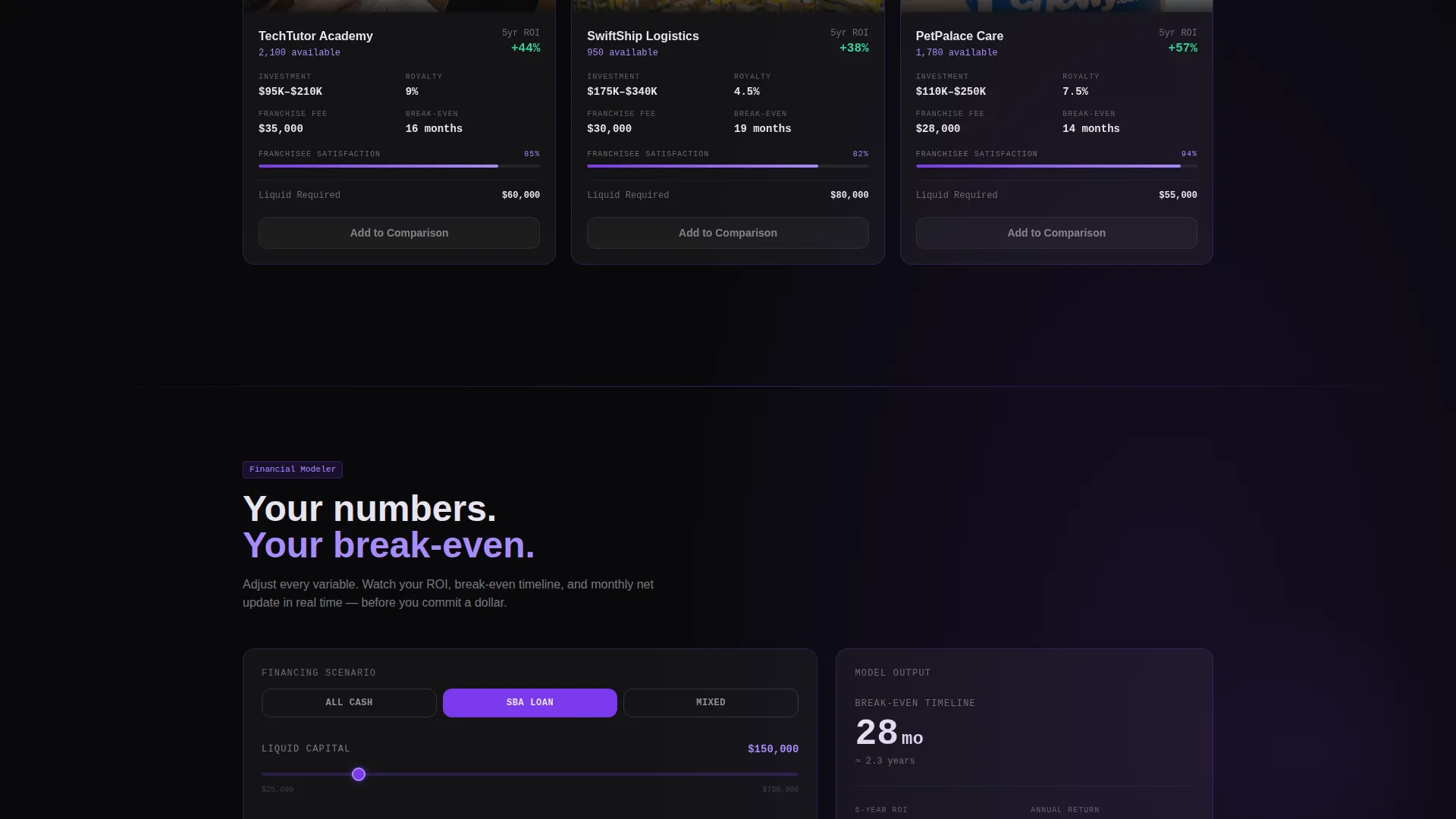
Visitors select two or three franchise brands from a search field. Each brand populates as a frosted glass card displaying initial investment, ongoing fees, territory availability, franchisee satisfaction score, and a five-year return on investment projection. Cards sit side by side for instant visual comparison.
Progressive Three-Step Proposal Form
The form escalates commitment gradually. Step one captures investment range and preferred industry vertical. Step two surfaces matched franchise cards for comparison. Step three collects name, email, liquid capital, and target market to generate a personalized downloadable PDF proposal.
Scroll-Driven Engagement Flow
As the visitor scrolls, the experience shifts from browsing to comparing to modeling to requesting a formal proposal. Each scroll section increases intent without forcing a hard gate early. The tool delivers value before asking for anything in return.
Floating and In-Card Call-to-Action Placement
The primary call to action, "Build My Franchise Proposal," appears at the bottom of every comparison card and pins as a floating button after the first scroll. A secondary path, "Just Compare Brands," lets uncommitted visitors explore freely, capturing email only on export or save.
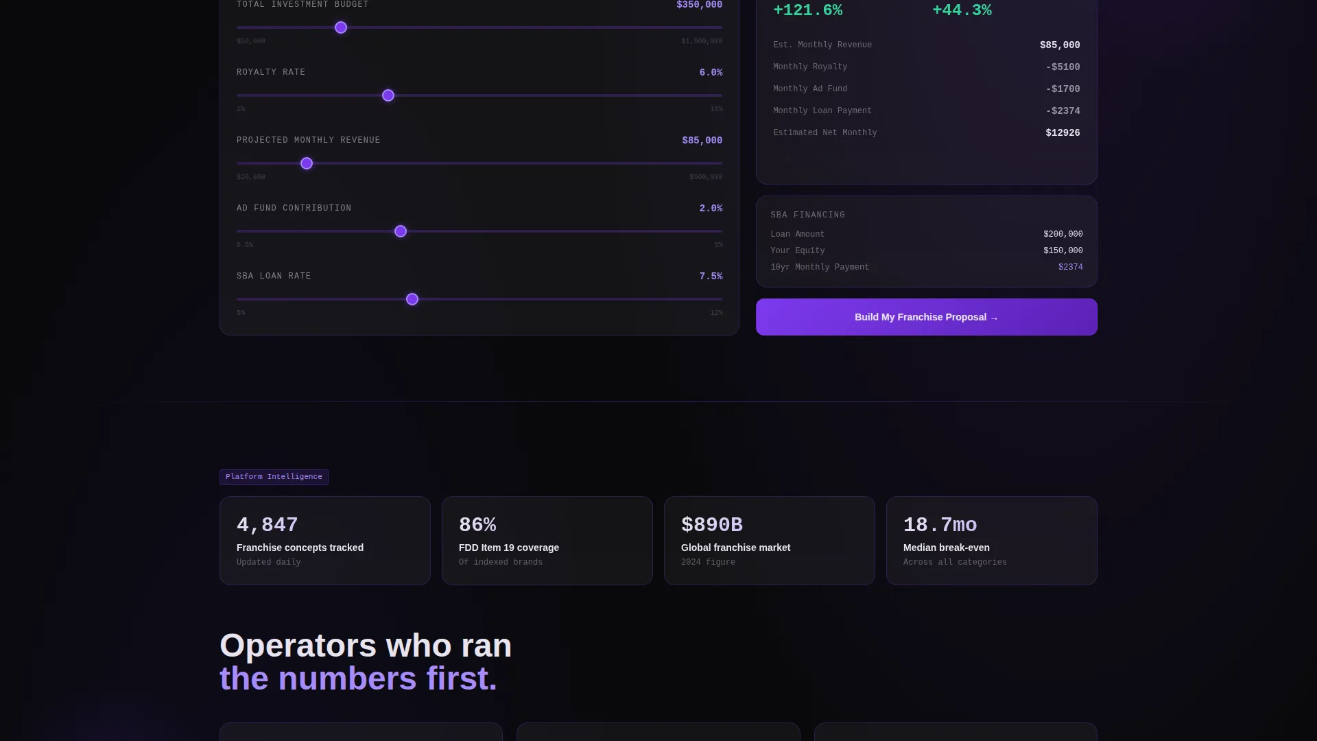
Financing Scenario Toggles and Territory Inputs
Proposal cards shift into personalized mode based on selected territory, liquid capital input, and financing scenario toggles. This gives each visitor a model that reflects their actual situation rather than generic averages.
Page sections overview
| Section | Purpose |
|---|---|
| Metrics Dashboard Header | Opens with animated counters and a data-first headline |
| Franchise Comparison Engine | Side-by-side brand cards with financial data |
| Proposal Mode Cards | Territory and capital inputs shift cards into personalized models |
| Progressive Proposal Form | Three-step form leading to a downloadable PDF proposal |
| Floating call to action Button | Persistent proposal trigger pinned after first scroll |
| Secondary Compare Path | Free tool access with email gate on export only |
Design & branding system
The template uses a Tech Glass visual identity built on the Void and Violet color system. Every design decision reinforces a sense of computational precision and high-stakes financial clarity.
- Color palette: absolute void black (#09090B) as the infinite background, deep ultraviolet (#2D1B69) for depth layers, electric violet (#7C3AED) on interactive elements and data highlights, and frosted glass white (#E8E4F0) for card surfaces and typography
- Card treatment: semi-transparent frosted backgrounds with violet-edged borders that glow on hover, giving each glass panel a floating, luminous quality against the void black backdrop
- Typography and contrast: frosted glass white text on dark backgrounds keeps financial data legible at a glance, while violet accents draw the eye to key metrics and interactive controls
Mobile & speed optimization
The card-grid layout is built modularly, meaning each component is self-contained and reflows cleanly across screen sizes. The template is structured to support responsive behavior without sacrificing the visual density that makes the comparison engine useful.
- Modular card components stack vertically on smaller screens, preserving the side-by-side comparison logic in a scrollable format
- The floating call-to-action button remains pinned and accessible on mobile viewports throughout the scroll experience
- Animated counter elements and glass card effects are scoped to individual components, keeping the layout structure intact on devices with varying display capabilities
How this template helps you convert
The conversion strategy is built into the architecture of the page itself. Every section earns the next click before asking for commitment.
- The animated metrics dashboard immediately signals credibility and data depth, giving visitors a reason to stay and explore rather than bounce on arrival.
- The free comparison tool delivers genuine value upfront, building trust before the form appears, so visitors who reach step three of the proposal flow are already pre-qualified and engaged.
- The dual call-to-action structure captures both high-intent buyers ready to request a proposal and exploratory visitors who want to compare brands first, widening the top of the funnel without weakening the bottom.
Other information about this template
This template is categorized under Technology, specifically within the Franchise Software subcategory and the Franchise Proposal and Quote niche. It is designed for platforms and consultants who need a front end that communicates financial sophistication to a demanding audience.
- Template style: Card Grid (Modular), allowing individual sections and comparison cards to be rearranged or extended without rebuilding the layout
- The creative direction follows a Calculator-first approach, meaning the interactive tool is the primary content layer rather than a supporting feature
- The header concept is Stats and Metrics, a deliberate departure from traditional hero images or tagline-led introductions
- The landing page direction is Comparison and Versus, structuring the entire scroll experience around side-by-side evaluation and decision support
- This template suits franchise discovery platforms, lead generation services for franchise consultants, and multi-brand portfolio operators who want a professional digital presence for buyer acquisition
Theme
Tech Glass
Creative direction
Calculator/Tool First
Color system
Void & Violet
Style
Card Grid (Modular)
Direction
Comparison/Versus
Page Sections
Animated Metrics Dashboard Header
Modular Franchise Comparison Cards
Progressive Three-step Proposal Form
Scroll-driven Engagement Architecture
Dual Call-to-action Conversion Structure
Financing Toggles and Territory Inputs
Related questions
Can I use this template without a live franchise database?
Is the three-step proposal form customizable?
Does the template include the downloadable PDF proposal feature?
Can uncommitted visitors use the comparison tool without filling out a form?
Who is this landing page template designed for?



