Graphedge - Powerful Consulting Landing Page Template
Graphedge is a hub-and-spoke consulting landing page built for graph database service providers. It leads with a live-metric header, a scrollable feature matrix, and two precision calls to action, one for booking an audit, one for capturing email leads. The Tech Glass visual system and electric indigo palette make complex data architecture feel immediately credible and compelling.
by Rocket studio
Quick summary
Graphedge is a single-page consulting template designed for graph database experts. It opens with an animated stats wall, guides visitors through a structured feature matrix across four consulting competencies, and closes each section with a persistent booking call to action. The layout rewards technical readers while staying approachable for executives evaluating whether to migrate off a legacy relational stack.
Who this template is for
This template is built for consulting practices that help enterprise clients move beyond brittle relational databases toward connected data architectures. It speaks directly to providers whose buyers are deeply technical and highly skeptical.
- Graph database consultants targeting enterprise engineering and architecture teams
- Data migration specialists advising clients on performance-critical platform transitions
- Consulting leads who need a page that proves technical depth before asking for a meeting
What problem this template solves
Most consulting landing pages look like brochures. They list services without demonstrating expertise, and they ask for a commitment before building any trust. That approach fails completely when your buyer is a CTO who has already read the documentation.
- Visitors leave before reaching the call to action because the page never earns their confidence
- Generic layouts cannot communicate the difference between surface-level advice and deep technical fluency
- No clear lead capture path exists for visitors who are interested but not yet ready to book
What you get with this template
You get a complete, single-page consulting landing page that progresses from executive-level framing to deeply technical content without losing either audience. Every section is purpose-built to move a skeptical technical buyer toward a decision.
- An animated metrics header with live-counting stats and a rotating 3D graph topology visual
- A four-spoke anchor navigation layout covering Migration, Modeling, Performance, and Training
- Two conversion paths: a direct booking call to action and a secondary email-capture call to action for the playbook offer
Feature list
This template is built around a deliberate architecture where every visual and structural choice serves the consulting firm's core credibility goal.
Animated Stats and Metrics Header
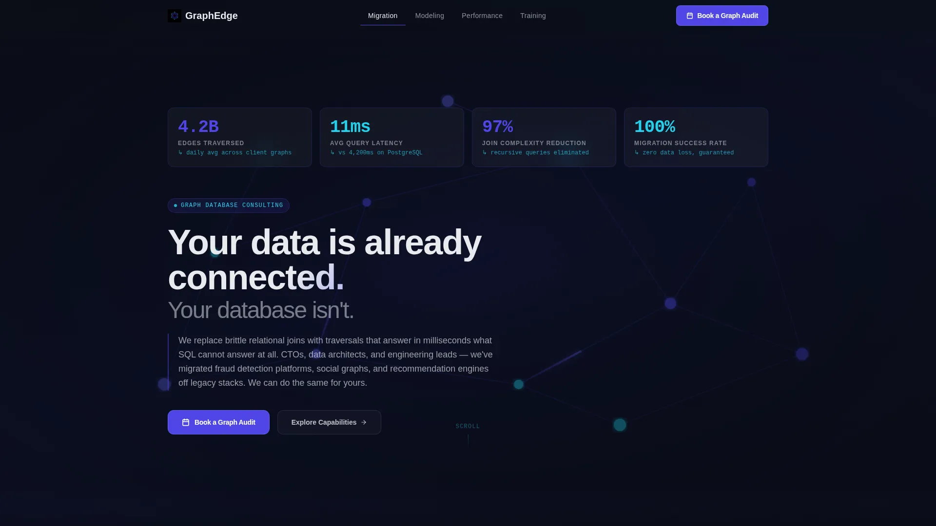
The header opens with a dark viewport filled with live-counting performance figures. Numbers like edge traversal counts, average query latency in milliseconds, and join complexity reduction percentages tick upward with easing animations. Behind the headline, a subtle 3D graph topology rotates slowly with depth-of-field blur on distant clusters, giving the impression of a live monitoring dashboard.
Hub-and-Spoke Anchor Navigation
A fixed anchor navigation bar lists four core consulting competencies as spoke labels. Each label scrolls the visitor directly to the corresponding section. This structure lets technical readers jump to the content most relevant to their role while keeping the overall page flow intact for those reading top to bottom.
Interactive Feature Comparison Matrix
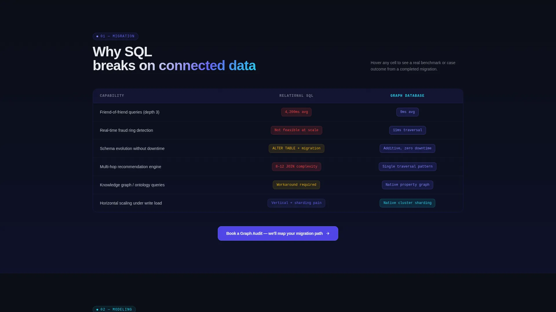
Each spoke section opens into a structured comparison grid. Hovering a cell reveals a tooltip with benchmark data or a one-sentence case outcome. The matrix escalates in complexity across spokes, starting with foundational concepts and finishing with advanced query optimization and sharding strategy content.
Persistent Dual-call to action System
The primary call to action, "Book a Graph Audit," appears in the anchor nav as a persistent button and again at the close of every spoke section. A secondary call to action, "Download the Migration Playbook," is positioned for visitors who want more information before committing to a call. No form lives on the main page; the primary call to action passes the visitor to an external scheduling flow.
Tech Glass Visual System
The Electric Indigo color system uses void black as the primary background, electric indigo as the dominant interactive accent, phosphor cyan for secondary highlights and data annotations, and frosted glass white for body text over translucent card surfaces. The palette projects technical authority without sacrificing readability.
Page sections overview
| Section | Purpose |
|---|---|
| Stats Metrics Header | Opens with animated performance numbers and a rotating 3D graph topology to establish immediate credibility |
| Anchor Navigation Bar | Provides fixed hub navigation linking to Migration, Modeling, Performance, and Training spoke sections |
| Migration Spoke | Introduces graph database concepts accessibly and frames the case for moving off legacy relational stacks |
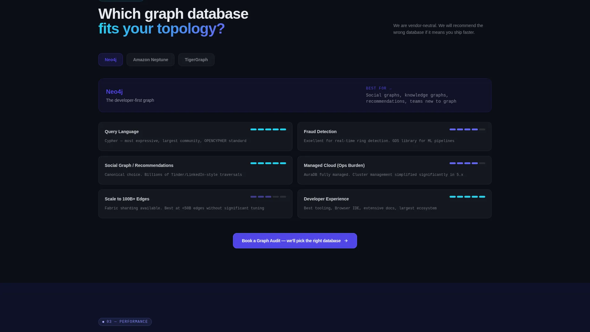
| Modeling Spoke | Covers graph data modeling approaches and maps them against common enterprise use cases |
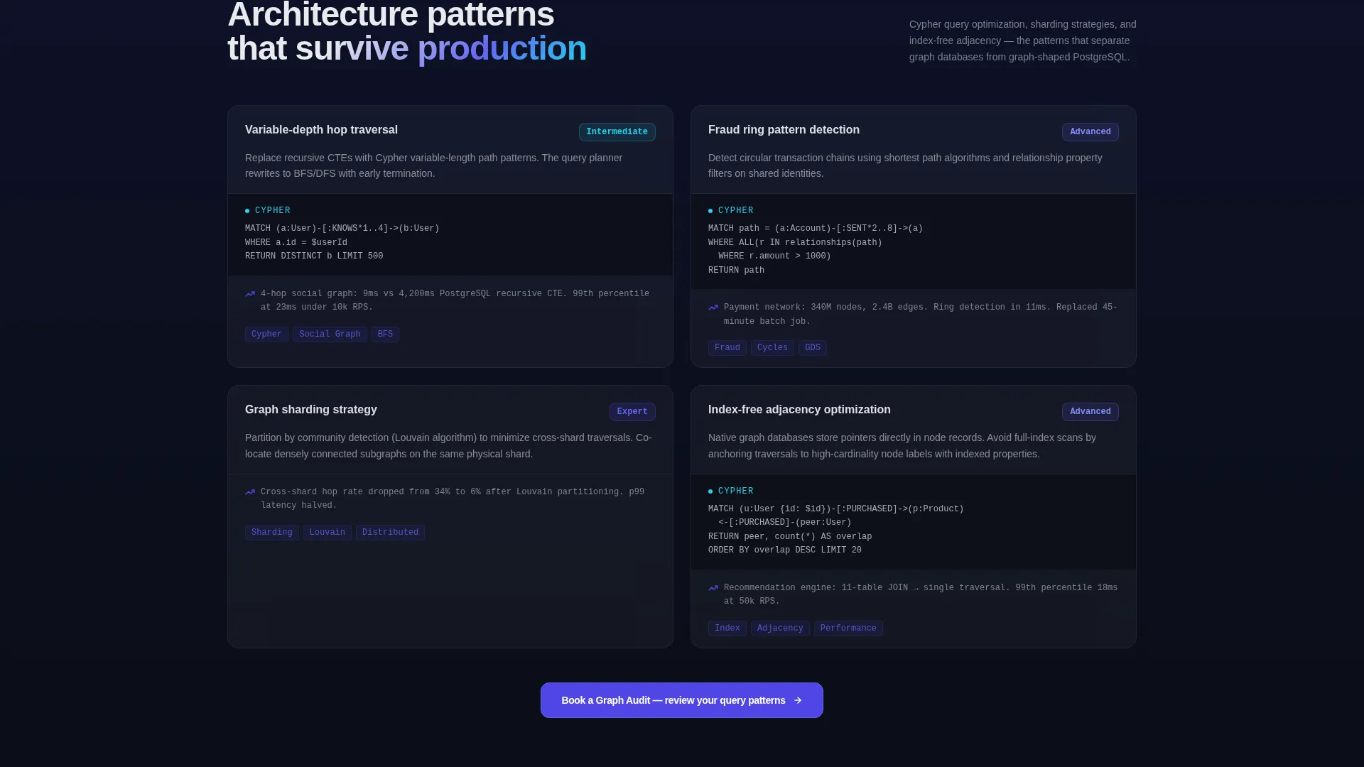
| Performance Spoke | Delivers technical depth with query latency comparisons, traversal benchmarks, and tooltip-level case data |
| Training Spoke | Addresses Cypher query optimization, sharding strategies, and team enablement for engineering leads |
| Playbook call to action Block | Secondary conversion surface capturing emails for visitors not yet ready to book a consultation |
| Section Booking call to action | Repeating "Book a Graph Audit" button closing each spoke, always styled indigo with cyan hover state |
Design & branding system
The template uses a Tech Glass theme built on the Electric Indigo color system. Every color choice is intentional: the dark background maximizes contrast for glowing user interface elements, while the translucent card surfaces create visual depth without clutter.
- Void black (#0B0E17) background, electric indigo (#4F46E5) accents, phosphor cyan (#22D3EE) highlights, and frosted glass white (#E8EAED) body text
- Translucent card surfaces with subtle glass-effect layering across comparison grid cells and tooltip components
- Interactive states use indigo fills with cyan hover transitions, giving every clickable element a consistent, confident visual response
Mobile & speed optimization
The layout is structured to remain scannable and functional at any screen width. The hub-and-spoke architecture adapts naturally because each spoke section is self-contained and vertically stacked on smaller viewports.
- The fixed anchor navigation collapses cleanly for mobile, keeping the core competency links accessible without obscuring content
- Animated elements including the rotating topology and counting metrics are designed to convey motion and energy without creating layout instability across devices
How this template helps you convert
The page is built around a specific conversion philosophy: prove technical depth first, then ask for the meeting. Every structural decision supports that sequence.
- The animated metrics header establishes numerical credibility within the first three seconds of a visit, reducing the friction a skeptical technical buyer brings to the page.
- The escalating complexity of the spoke sections keeps both executive and engineering audiences engaged long enough to reach the booking call to action with their confidence already built.
- The dual-call to action system captures two distinct buyer stages in a single page flow, ensuring that visitors who are not yet ready to book still enter the pipeline through the playbook offer.
Other information about this template
This template is particularly well-suited for firms advising clients on connected data platforms and graph query languages. It can support use cases that involve explaining the tradeoffs between leading graph database platforms, including comparisons relevant to teams evaluating options like Neo4j, Amazon Neptune, and TigerGraph. The tooltip-based comparison matrix is a strong fit for communicating benchmark differences between these platforms in context.
- The template ships as a single landing page, not a multi-page site, so all navigation stays within one scrollable document
- The Calendly-style scheduling integration is a click-through handoff; no scheduling embed lives on the page itself
- The "Download the Migration Playbook" secondary call to action is designed for email capture and would connect to a form or external landing step outside this template
Theme
Tech Glass
Creative direction
Feature Matrix
Color system
Electric Indigo
Style
Hub & Spoke (Anchor Nav)
Direction
Click-Through
Page Sections
Animated Stats Metrics Header
Hub-and-spoke Anchor Navigation
Interactive Comparison Matrix
Persistent Dual-cta System
Tech Glass Visual Identity
Escalating Content Complexity
Related questions
Does this template include a contact form or booking calendar?
Can I customize the metrics shown in the stats header?
How does the anchor navigation work on this page?
Is this template designed for a single page or a multi-page site?
What editing skill level is needed to set up this template?



