Fitness Digital Menu Landing Page Template
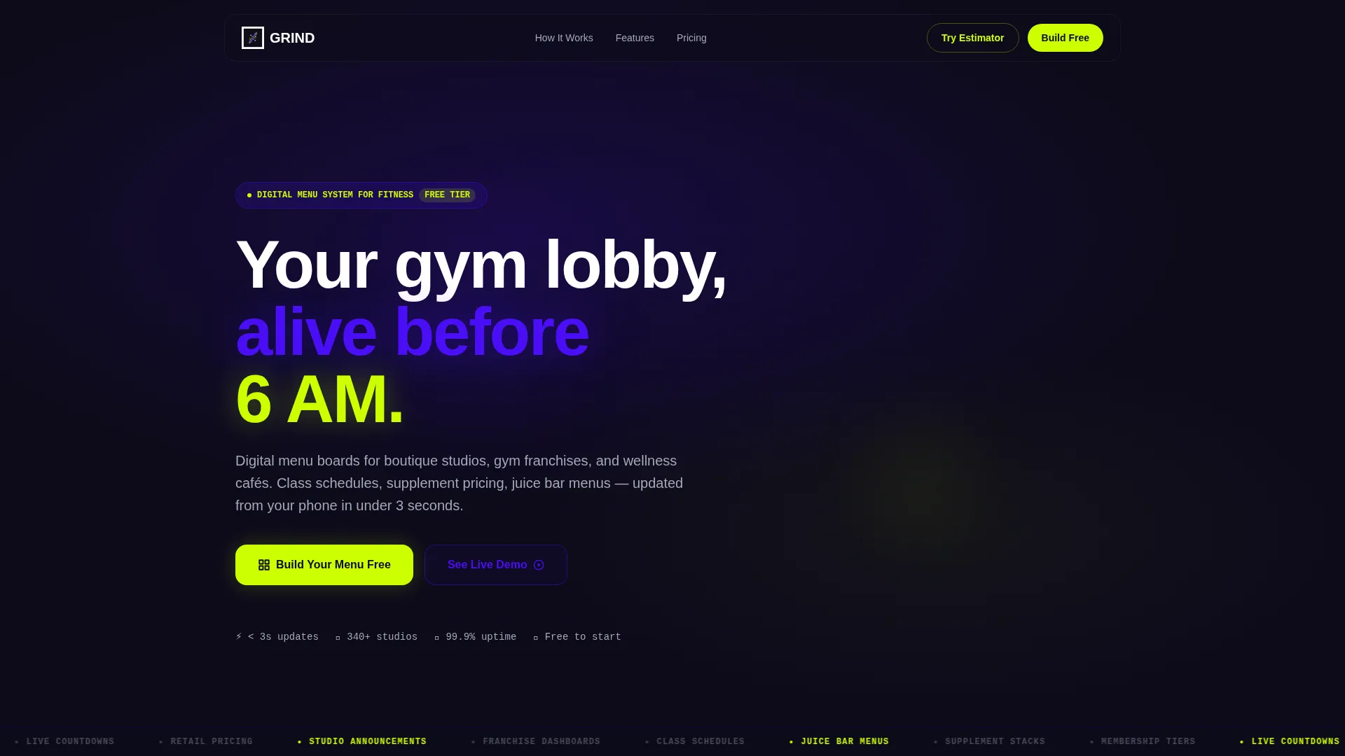
Grind is a dynamic fitness digital menu landing page template built for gym owners, studio operators, and wellness café managers who need their screens to work as hard as their members do. It combines an interactive screen-count estimator, a problem-to-solution card grid, and a neon-charged visual system into one high-energy, click-through landing page.
by Rocket studio
Quick summary
Grind is a single-page, card-grid template designed for fitness digital menu platforms. It opens with an interactive estimator that builds a real-time screen preview as visitors configure their setup. The Problem→Solution Arc card layout then walks owners from pain points to digital fixes, escalating from single-screen installs to full franchise dashboards.
Who this template is for
This template is built for fitness and wellness operators who manage multiple screens, schedules, or menus across one or more locations. If you need your lobby walls to communicate schedules, pricing, or promotions without touching a ladder or a printer, this page is for you.
- Boutique fitness studio owners juggling several class types and multiple instructors
- Gym franchise managers responsible for updating dozens of screens across locations
- Wellness café operators who rotate seasonal menus like açaí bowls and supplement stacks
What problem this template solves
Most gym and studio owners still update their pricing boards, class schedules, and retail menus by hand. That means paper printouts, marker corrections, and staff time spent on logistics instead of members. This template gives digital menu platforms a compelling sales page that speaks directly to that frustration.
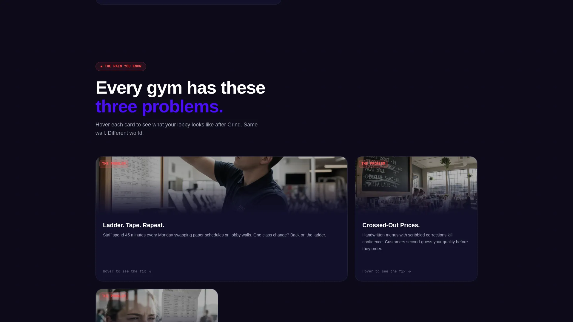
- Outdated paper schedules taped to glass confuse members and erode trust
- Handwritten juice bar prices and crossed-out items look unprofessional and slow down purchases
- Franchise managers have no practical way to push bulk updates across many screens at once
What you get with this template
You get a fully structured, modular card-grid landing page designed for a fitness digital menu platform. The layout is opinionated and sequential, guiding each visitor from curiosity to action through layered interactive moments.
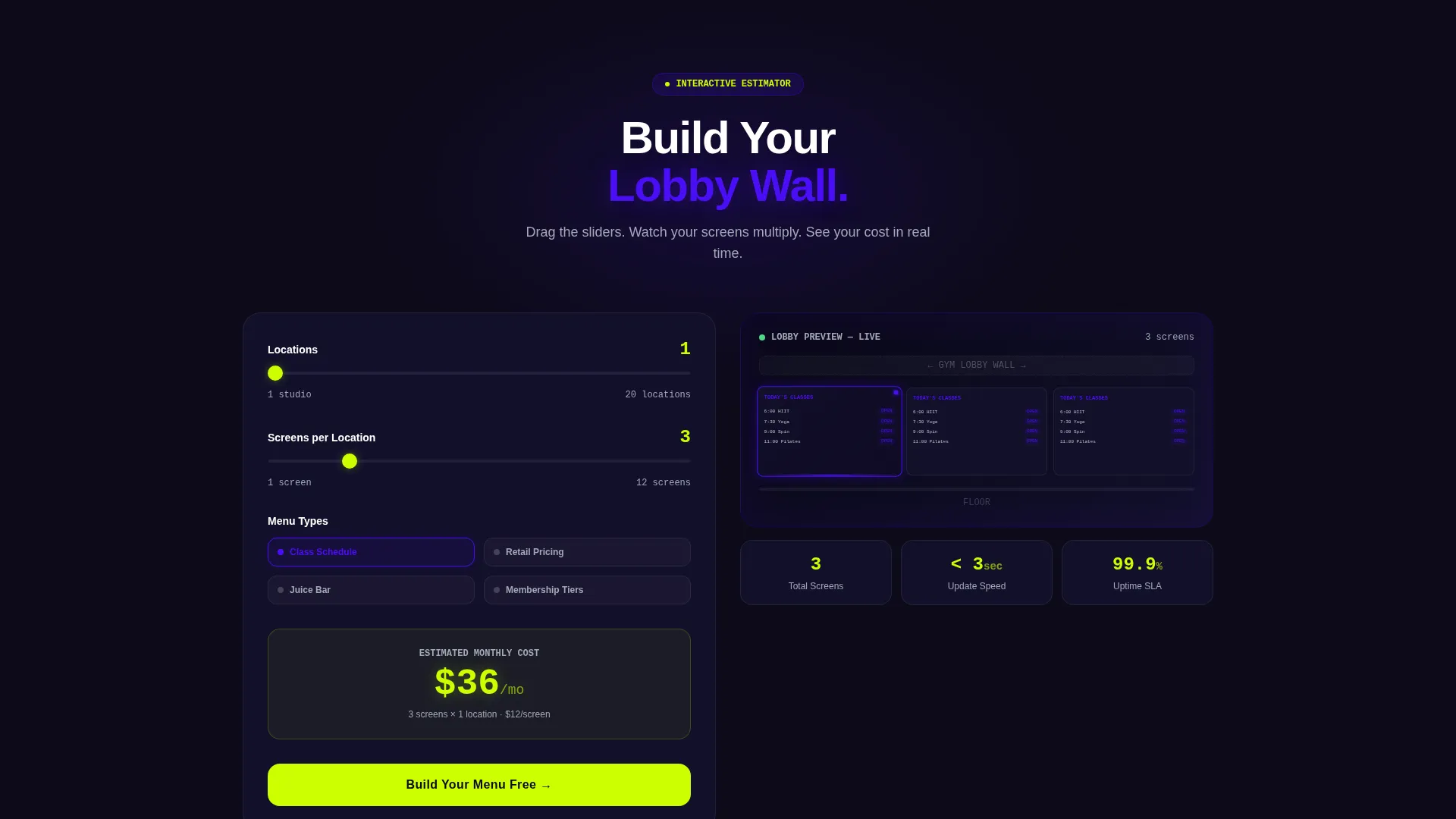
- An interactive screen-count estimator in the header with real-time mockup previews and a cost estimate
- A scrolling Problem→Solution card grid with flip animations and escalating use-case complexity
- A persistent sticky call-to-action button and a secondary augmented-reality style mockup upload path
Feature list
This template ships with a focused set of purpose-built interactive and visual components. Each one is designed to keep a fitness operator engaged and moving toward signup.
Interactive Screen-Count Estimator
Visitors enter their number of locations, screens per location, and menu types using sliders. As they adjust each input, a simulated gym lobby wall populates with a live screen grid mockup. A monthly cost estimate animates in neon lime below the preview in real time.
Problem→Solution Flip Card Grid
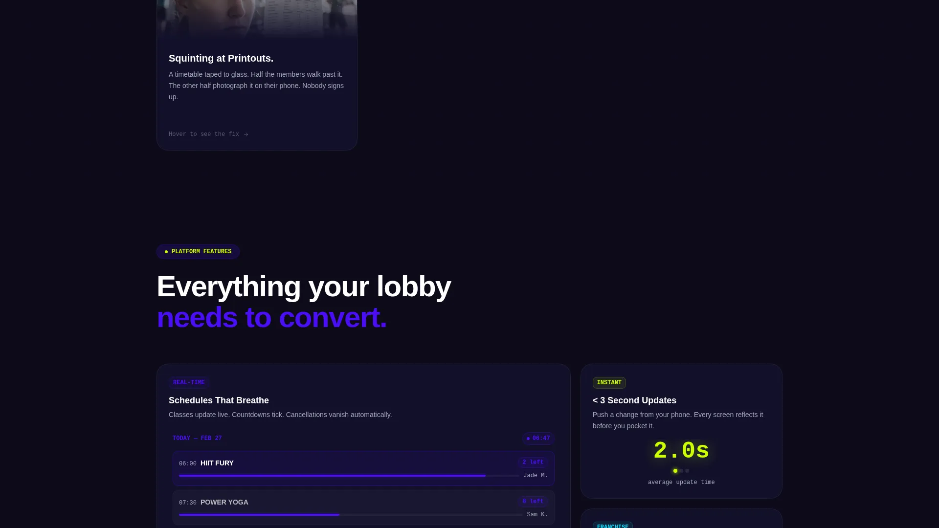
The first card row presents pain points as physical scenes: a staffer on a ladder, handwritten menus with crossed-out prices, a member squinting at a printed timetable. Each card flips on hover to reveal the same scene running a crisp animated digital screen. The grid escalates in scope with each row.
Escalating Use-Case Card Rows
Card rows grow in ambition as visitors scroll. Early rows address single-screen fixes. Later rows introduce multi-location command dashboards. The final row shows a franchise map with every location managed from one tablet view.
Sticky Neon Lime Call-to-Action
A "Build Your Menu Free" button appears first inside the estimator results, then floats as a sticky button from mid-scroll onward. Clicking routes to a free-tier signup with the screen count pre-filled from the estimator.
Secondary Augmented-Reality Mockup Path
A second conversion path labeled "See It On Your Wall" lets owners photograph their current lobby and see a digital menu composited into the image. This gives prospects a tangible visual before they commit to signing up.
Scroll-Triggered Motion System
Cards shift on scroll, screens within cards cycle through content, and progress bars fill as features are revealed. The motion system keeps the page feeling kinetic and alive without requiring any user action beyond scrolling.
Page sections overview
| Section | Purpose |
|---|---|
| Header Estimator | Configure screen setup and preview a live lobby mockup with cost estimate |
| Pain Point Cards | Show relatable manual-update frustrations as physical scenes |
| Solution Flip Cards | Reveal digital screen alternatives via hover flip animations |
| Single-Screen Row | Introduce entry-level digital menu fixes for small operators |
| Multi-Location Dashboard | Demonstrate command-level control across multiple gym locations |
| Franchise Map View | Show bulk screen management from a single tablet interface |
| Sticky call to action Bar | Persistent "Build Your Menu Free" button active from mid-scroll |
| AR Mockup Upload | Let visitors composite a digital menu onto their own lobby photo |
Design & branding system
The visual identity follows a Dynamic Motion theme built on an Electric Indigo color system. Every surface feels backlit and charged, evoking a darkened studio in the seconds before a session begins.
- Deep gym-dark black (#0D0B1A) as the primary background, electric indigo (#4B0EF6) for structural accents and LED-style highlights, and cool titanium gray (#A3A8B8) for secondary text and card borders
- Reactive neon lime (#CCFF00) reserved exclusively for calls-to-action, hover states, cost estimate pulses, and the sticky button
- A modular card grid layout with scroll-triggered motion, card-flip interactions, and in-card screen animations that keep the energy of the page consistent throughout
Mobile & speed optimization
The card-grid layout is structured to adapt across screen sizes without losing the layered motion experience. Interactive components like the estimator and flip cards are designed to work on touch devices.
- Slider-based estimator inputs and card interactions are touch-friendly for mobile gym owners reviewing on a phone
- The sticky call-to-action button remains accessible at all scroll depths on both desktop and mobile viewports
- Scroll-triggered animations are applied per card block, so the page loads progressively rather than demanding all assets at once
How this template helps you convert
Every design decision in Grind pushes a visitor closer to starting a free account. The template does not rely on copy alone; it uses interactive components to close the gap between curiosity and commitment.
- The estimator acts as the primary sales tool by letting prospects build their own screen setup before any salesperson is involved, creating personal investment in the result they see on screen.
- The Problem→Solution card arc mirrors the exact frustrations your buyers already feel, building credibility through recognition before presenting any feature claim.
- The pre-filled signup flow removes friction at the final step by carrying the visitor's estimator inputs directly into the free-tier registration, reducing the effort required to begin.
Other information about this template
Grind is delivered as a modular card-grid landing page, making it straightforward to reorder, duplicate, or remove card rows to match your platform's specific feature set.
- The template style is Card Grid (Modular), suited for platforms that need to present tiered use cases in a structured, scannable format
- The creative direction follows a Problem→Solution Arc, a proven structure for fitness technology products where the buyer already knows their pain but has not yet found a digital fix
- The header concept is a Calculator/Estimator, which replaces a static hero with an interactive tool that qualifies and engages visitors simultaneously
- The landing page direction is Click-Through, meaning every visual element is oriented toward a single primary action: starting a free account with screen count pre-filled
- The theme is Dynamic Motion, carried through scroll-triggered card shifts, in-card cycling screens, and progress bars that fill as content is revealed
- Color customization within the Electric Indigo system is straightforward since each color role is clearly assigned: background, accent, secondary text, and call-to-action
Theme
Dynamic Motion
Creative direction
Problem→Solution Arc
Color system
Electric Indigo
Style
Card Grid (Modular)
Direction
Click-Through
Page Sections
Interactive Screen-count Estimator
Problem-to-solution Flip Card Grid
Sticky Neon Lime Call-to-action
Ar-style Lobby Mockup Path
Scroll-triggered Motion System
Modular Card Grid Layout
Related questions
Who is this template designed for?
What makes the header estimator different from a standard contact form?
Can the card grid rows be reordered or customized?
What are the two conversion paths in this template?
Does this template include the screen management platform itself?



