Bold Brutalist Food Delivery App Landing Page
Grub is a bold brutalist food delivery landing page template built for mobile app launches. It uses a hub and spoke layout with anchor navigation, a Feature Tab Switcher header, and a head-to-head competitor comparison structure. The Void and Violet color system and heavy condensed typography make every section feel urgent, blunt, and impossible to ignore.
by Rocket studio
Quick summary
Grub is a single-page food delivery app landing page template with anchor navigation, a three-tab Feature Tab Switcher header, and a full competitor versus section. It is designed around a Bold Brutalist visual theme using void black, electric violet, and concrete white. Every section is built to make the case for switching fast.
Who this template is for
This template is built for food delivery app founders, product marketers, and mobile app launch teams who need a page that argues its case instead of politely explaining itself. It suits brands entering a crowded market and needing immediate credibility through contrast.
- Mobile app teams launching a food delivery product in a competitive local market
- Founders or marketers who want a comparison-led page that puts their numbers front and center
- Designers building aggressive, high-energy landing pages for app download campaigns
What problem this template solves
Most food delivery app landing pages look like every other app landing page. They describe features without proving value. Grub solves the trust gap by making the competitor comparison impossible to ignore and making the sign-up action feel effortless.
- Visitors leave before committing because the page never earns the click with hard proof
- Generic app landing pages fail to communicate local relevance or real price differences
- Standard templates cannot carry the visual weight needed for a bold, challenger-brand launch
What you get with this template
You get a fully structured, single-page brutalist layout with five anchor-nav spokes, a hard-cut Feature Tab Switcher, and a sticky conversion bar fixed to the bottom of the viewport. Every section is pre-built and content-ready for a food delivery app positioning.
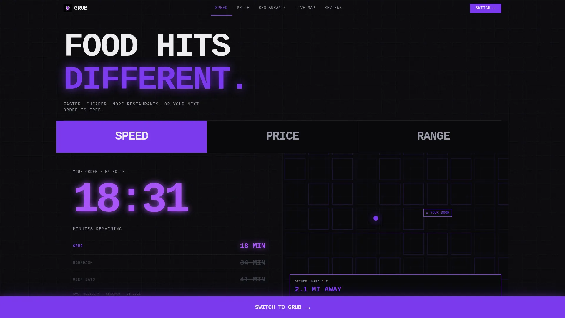
- A three-tab header switcher showing Speed, Price, and Range app screens with hard-cut swaps
- Five anchor-navigated spoke sections: Speed, Price, Restaurants, Live Map, and Reviews
- A fixed bottom call-to-action bar that expands into a phone number input field on tap
Feature list
This template is built around a specific set of components, each designed to do one job without compromise.
Three-Tab Feature Switcher Header
The header spans the full viewport with three oversized tabs labeled Speed, Price, and Range. Each tab slams in a different app screen with no transition easing. Speed shows a frozen delivery timer at 00:18:42 with a map pin. Price shows a side-by-side receipt with the savings line highlighted in violet. Range shows a dense restaurant grid packed like a show flyer.
Competitor Stat Comparison Tables
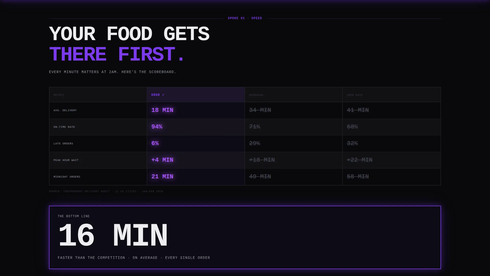
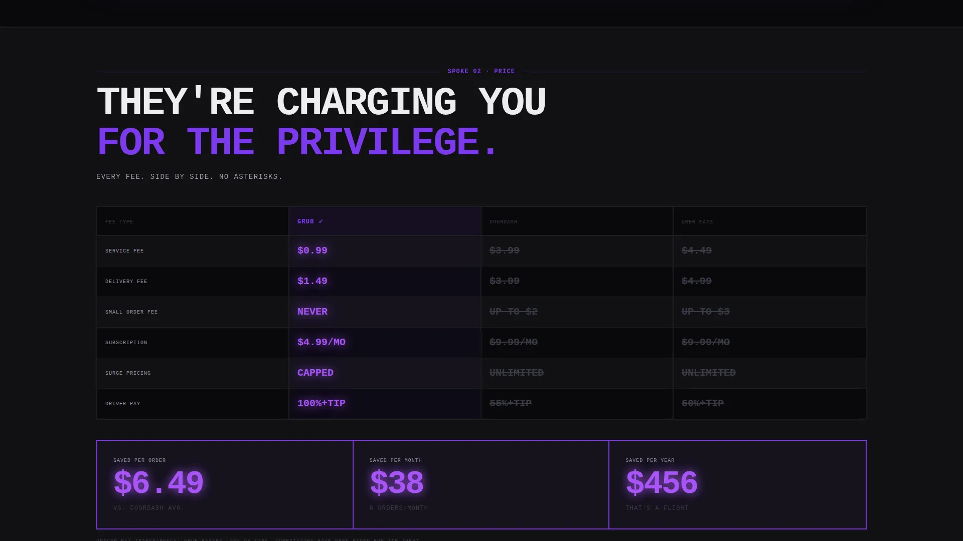
Every spoke section includes brutal side-by-side stat tables. Metrics covered include delivery time averages, service fee breakdowns, restaurant count by zip code, and driver pay transparency. Losing competitor numbers are struck through in dim gray. Winning Grub metrics pulse in electric violet. Numbers are set in enormous, heavy condensed type.
Anchor Navigation Bar
A persistent navigation bar ties all five spokes together: Speed, Price, Restaurants, Live Map, and Reviews. Users can jump directly to any section without scrolling past irrelevant content. The nav keeps the page scannable at every entry point.
Sticky "Switch to Grub" call to action Bar
A fat violet bar is fixed to the bottom of the viewport at all times. On tap, it expands into a single-field phone number input. The prompt reads "We'll text you the download link." The action feels like one step, not a funnel.
Zip Code Local Proof Field
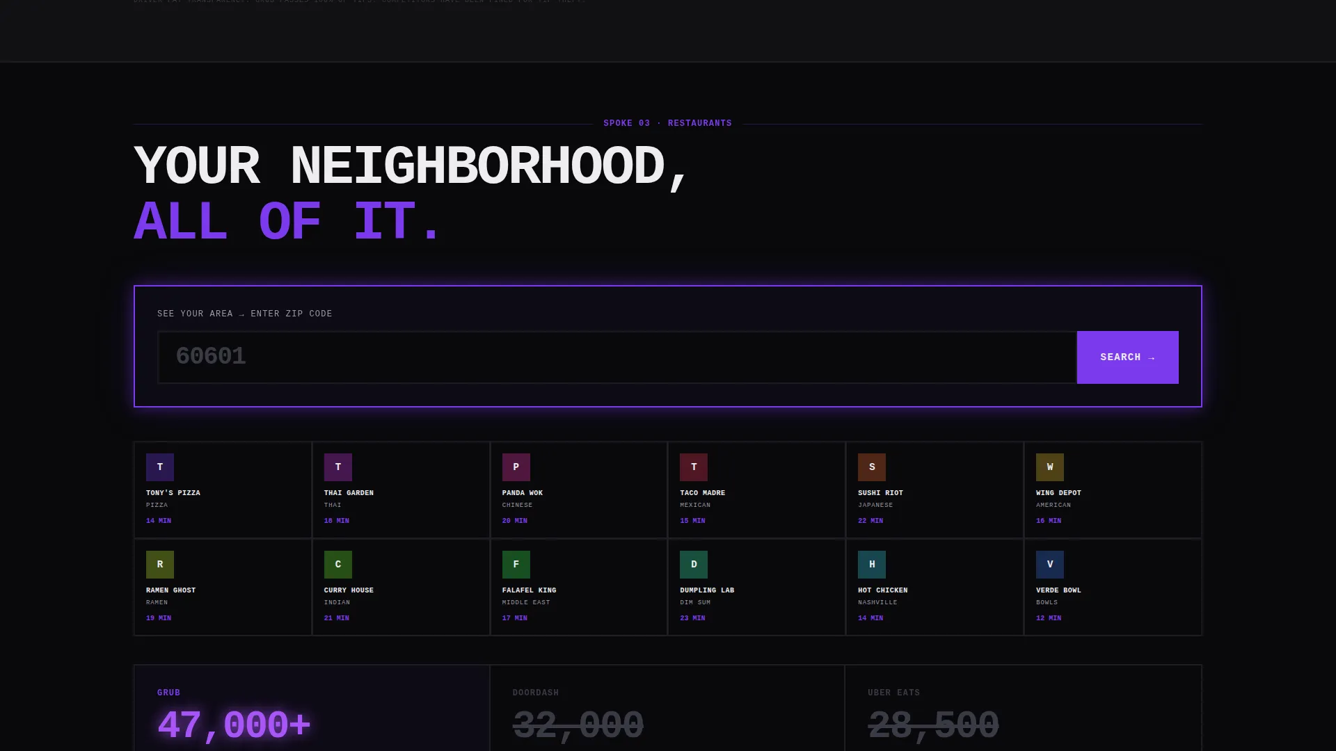
Embedded inside the Range spoke, a zip code input field returns a restaurant count and an average delivery time for that area. This builds local proof before asking for any commitment. It answers the question "does this work where I live" before the visitor has to ask.
Launch Energy Scroll Narrative
The page is structured as a product drop, not a feature tour. Each spoke section escalates the tension. Visitors move from understanding what the app does, to seeing it win head-to-head, to feeling the switch is already decided. The scroll reads like a scoreboard updating in real time.
Page sections overview
| Section | Purpose |
|---|---|
| Feature Tab Switcher | Introduces Speed, Price, and Range with hard-cut app screen swaps |
| Anchor Navigation Bar | Lets visitors jump directly to any spoke section |
| Speed Spoke | Shows delivery time proof with a live-counting timer visual |
| Price Spoke | Displays head-to-head receipt comparison with savings highlighted |
| Restaurants Spoke | Dense restaurant grid with zip code local proof input |
| Live Map Spoke | Shows active delivery coverage area context |
| Reviews Spoke | Builds social proof at the bottom of the argument |
| Sticky call to action Bar | Fixed phone-number input driving app download via text link |
Design & branding system
The Void and Violet color system is built around four values that work like a neon sign in a parking garage. Black owns every background. Violet owns every action. White is typographic only. The result is a visual identity with zero ambiguity.
- Colors: absolute void black (#09090B), electric violet (#7C3AED), bruised ultraviolet (#4C1D95), and bare concrete white (#EDEDF0)
- Typography: thick, monospaced, uppercase, condensed, set edge-to-edge with no padding relief
- Violet dominates interactive states, hover pulses, call to action fills, and winning metric highlights across all comparison tables
Mobile & speed optimization
The template is designed with thumb-first interaction in mind. The sticky call to action bar, the tab switcher, and the zip code field are all sized and placed for one-handed mobile use. The page layout scales from a small phone screen to a large desktop viewport without losing its edge.
- The fixed bottom call to action bar is tap-optimized and expands into a single input field without a page reload
- The Feature Tab Switcher uses hard cuts instead of CSS transitions, keeping the interaction feel instant and snappy
- All spoke sections are vertically stacked in mobile view with anchor nav remaining accessible at the top
How this template helps you convert
The page is built as a conversion argument, not a brochure. Every design and layout decision is in service of one outcome: getting a phone number and sending a download link.
- The competitor stat tables create urgency by making the cost of staying with the current service visible and specific before any call to action appears
- The zip code field in the Range spoke delivers personalized local proof, removing the most common reason a visitor would hesitate
- The sticky phone-number call to action bar removes every barrier to the final action by reducing sign-up to a single text message
Other information about this template
This template is part of the broader Bold Brutalist design direction, which prioritizes raw visual contrast over polish. It is well-suited for challenger brands that need to signal confidence without a large existing reputation. The Hub and Spoke with Anchor Navigation structure keeps long pages scannable, especially for users arriving mid-scroll from a paid ad or referral link.
- The template style is Hub and Spoke with Anchor Navigation, meaning each section functions as a self-contained argument
- The creative direction is Launch Energy, meaning the page is written and structured to feel like a product drop moment
- The Comparison and Versus landing page direction is the core layout logic, placing Grub next to competitors in every major section
- This template is categorized under Technology, Mobile App, and the Food Delivery App niche
Theme
Bold Brutalist
Creative direction
Launch Energy
Color system
Void & Violet
Style
Hub & Spoke (Anchor Nav)
Direction
Comparison/Versus
Page Sections
Three-tab Feature Switcher Header
Competitor Stat Comparison Tables
Anchor Navigation with Five Spokes
Sticky Phone-number Call to Action Bar
Zip Code Local Proof Input
Related questions
Can I change the competitor names in the comparison tables?
Does the tab switcher work on mobile devices?
Is the sticky call to action bar always visible while scrolling?
Can the zip code field be connected to live restaurant data?
Who is this template best suited for?



