K-12 AI Customer Service Landing Page Template
Homeroom is a modular card-grid landing page template built for K-12 artificial intelligence customer service platforms. It pairs a Tech Glass visual identity with a Feature Tab Switcher header, animated stat cards, a Comparison/Versus conversion layout, and a two-step savings calculator, giving district decision-makers a fast, credible path from curiosity to commitment.
by Rocket studio
Quick summary
Homeroom is a single-page, card-grid landing page template designed for K-12 AI customer service platforms. It opens with a three-tab Feature Tab Switcher, moves through animated stat and comparison cards, and closes with a projected savings calculator. The Slate and Sky color system keeps the design clean, credible, and easy to navigate for busy district stakeholders.
Who this template is for
This template is built for teams selling or showcasing AI-powered customer service tools inside the K-12 education space. It speaks directly to the people who carry the heaviest administrative load in a school district.
- District IT directors managing multiple legacy systems who need a clear ROI story to share upward
- Superintendents and school board communicators defending budget decisions with concrete data
- Front-office managers and registrars looking for relief from repeated phone calls and routine inbox volume
What problem this template solves
Front offices in K-12 districts are overwhelmed. Parents call at midnight about bus routes. Staff spend half their day repeating the same attendance policy. Multilingual families wait days for a translated response. This template gives a platform the right stage to show it can fix all of that.
- No clear way to demonstrate resolution speed and multilingual reach to skeptical decision-makers
- No conversion path for visitors who need proof before they will schedule a demo or enter district data
- No visual contrast that makes the old manual process look as costly as it actually is
What you get with this template
You get a fully structured, single-page layout that walks district buyers through a complete picture, from the problem to the proof to the math. Every section is purposeful and built around the decisions a superintendent or IT director actually needs to make.
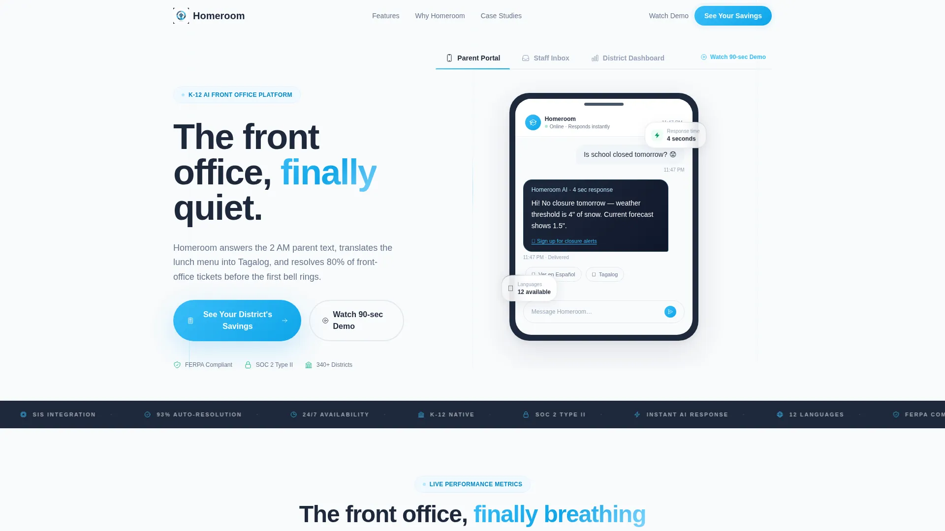
- A three-tab Feature Tab Switcher header with live-feeling user interface mockups for Parent Portal, Staff Inbox, and District Dashboard views
- Three animated stat cards, a six-card Comparison/Versus row with flip interactions, and a three-card district case study block
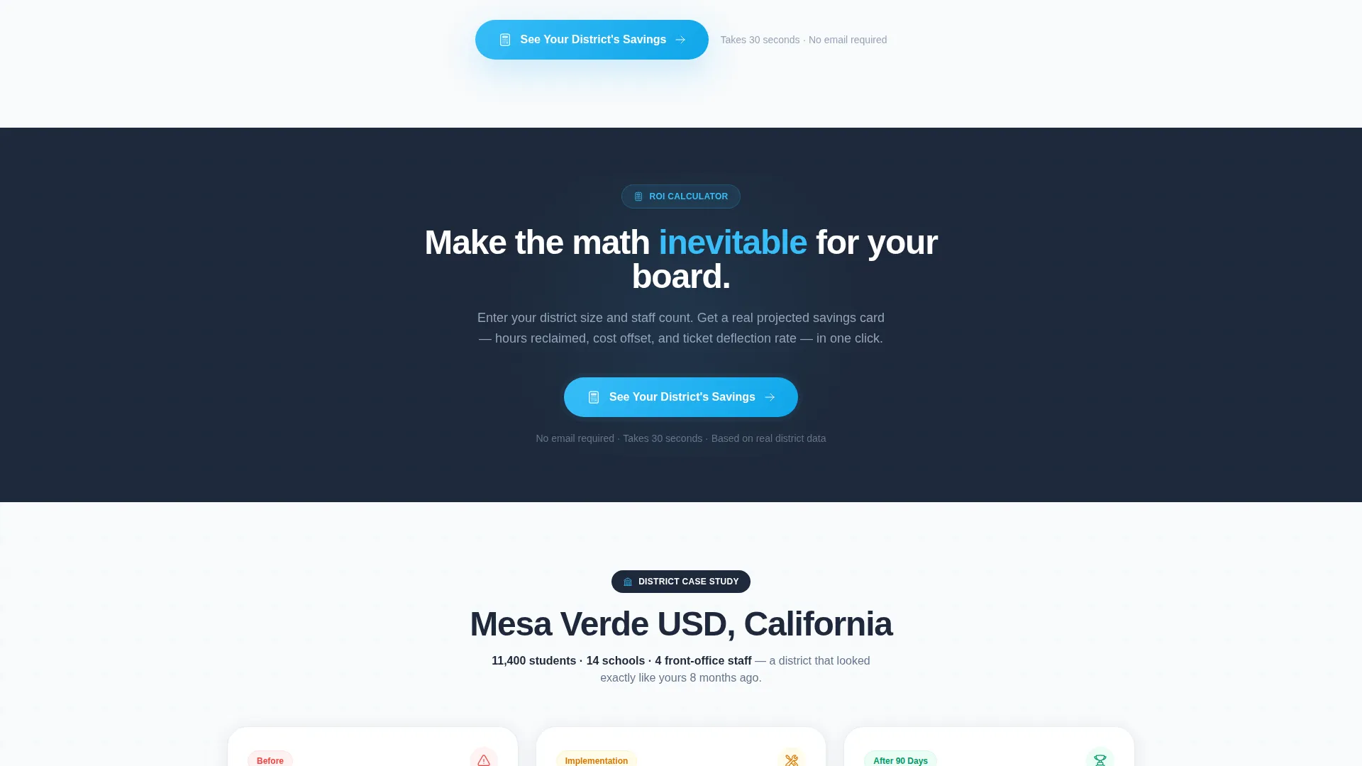
- A two-step savings calculator that takes enrollment size and support staff count, then renders a projected savings card with hours reclaimed, cost offset, and ticket deflection rate
Feature list
This section covers the core interactive and visual components included in the Homeroom template layout.
Feature Tab Switcher Header
The header contains three labeled tabs: Parent Portal, Staff Inbox, and District Dashboard. The default tab renders a late-night parent text exchange in which the AI responds in four seconds with a weather policy, a notification sign-up link, and a Spanish translation toggle. Each tab reveals a glass-style user interface mockup that feels like a live product demo rather than a static screenshot.
Animated Stat Card Row
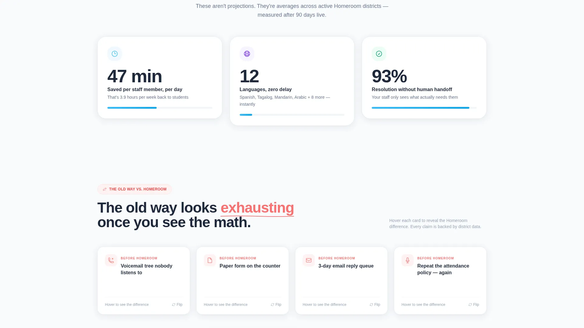
Three scoreboard-style stat cards open the main content area. The cards display "47 min avg. saved per staff member per day," "12 languages, zero delay," and "93% resolution without human handoff." Numbers count up on scroll entry, creating a sense of systems coming online and giving buyers a fast, memorable data snapshot.
Comparison Card Row with Flip Interaction
Six cards arranged in a before-and-after format contrast the old way with the Homeroom way. Examples include "Voicemail tree versus instant AI voice answer," "Paper form versus smart intake link," and "3-day email reply versus 4-second resolution." Each card flips on hover to reveal the metric behind the claim, reinforcing the cost of staying with the status quo.
Two-Step Savings Calculator
The primary call to action, "See Your District's Savings," opens a two-step calculator. Step one collects district enrollment size and current support staff count. Step two instantly renders a projected savings card showing hours reclaimed, cost offset, and ticket deflection rate, making the value case feel personal and data-driven for each visitor.
District Case Study Block
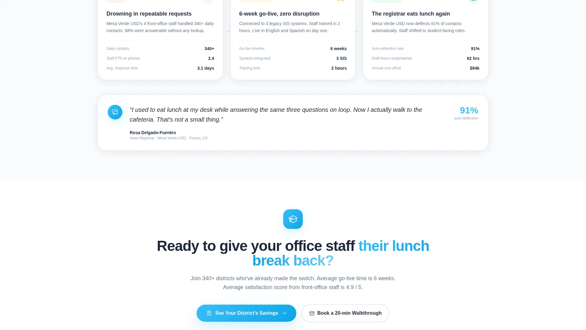
A three-card sequence closes the main content with a real-feeling district story. The cards show before stats, implementation timeline, and after stats, each labeled with a school name, state, and enrollment count. The specificity makes the outcome feel documented rather than hypothetical.
Floating Mobile Call-to-Action Bar
On mobile, the primary call to action is pinned as a floating bottom bar so it stays visible throughout the scroll. A secondary path, "Watch a 90-Second Demo," is embedded inside the header tabs for visitors who are not yet ready to enter district data.
Page sections overview
| Section | Purpose |
|---|---|
| Feature Tab Switcher | Shows Parent Portal, Staff Inbox, and District Dashboard mockups |
| Animated Stat Cards | Delivers three key performance numbers with scroll-triggered count-up motion |
| Comparison Card Row | Contrasts old manual processes with AI-powered resolution side by side |
| Savings Calculator call to action | Converts visitors by rendering a personalized projected savings card |
| District Case Study | Builds credibility with a before, timeline, and after card sequence |
| Floating Mobile Bar | Keeps the primary call to action visible on mobile throughout scroll |
Design & branding system
The template uses a Tech Glass visual identity built on the Slate and Sky color system. The overall feeling is a brand-new Chromebook opened on the first day of school: clean, bright, and just intelligent enough without being cold or intimidating.
- Core palette: deep chalkboard slate (#1E293B), brushed aluminum gray (#94A3B8), open-sky blue (#38BDF8), and classroom-white (#F8FAFC) for card surfaces
- Cards float on white with slate text, sky-blue interaction states, and thin glass-frosted borders that catch light like tablet screens in a charging cart
- Typography is crisp sans-serif throughout, supporting the translucent panel aesthetic and keeping data-heavy cards readable at a glance
Mobile & speed optimization
The layout is designed so mobile visitors never lose sight of the most important action on the page. The conversion flow is streamlined for smaller screens without removing any of the persuasion architecture.
- The primary "See Your District's Savings" call to action is pinned as a floating bottom bar on mobile, eliminating the need to scroll back up
- Card grid sections reflow naturally for single-column mobile views, keeping the comparison and stat cards readable and tappable
- The two-step calculator is compact by design, requiring only two inputs before rendering the savings output
How this template helps you convert
The entire page is structured as a Comparison/Versus conversion engine. Every visual and interactive decision is aimed at making the next step feel obvious rather than optional.
- The Feature Tab Switcher opens with a real-use-case scenario that immediately frames the platform as a relief solution, not just another software tool, pulling in visitors who recognize the problem at first glance.
- The animated stat and comparison cards build a cumulative case, first with proof points, then with side-by-side contrast, then with a verified district outcome, so that by the time a visitor reaches the calculator, the question is not whether to act but how much they stand to save.
Other information about this template
Homeroom is built specifically for the K-12 AI customer service niche, where the buyer journey involves multiple stakeholders and a high bar for credibility. The template supports that journey with layered proof at every scroll depth.
- The "Watch a 90-Second Demo" secondary path inside the header tabs provides a low-commitment entry point for visitors who are not ready to use the calculator
- The district case study block is designed to hold real data points such as school name, state, and enrollment count, making it easy to swap in an actual customer story at launch
- The Launch Energy creative direction is expressed through staggered card animations, count-up numbers, and a section-by-section sense of systems coming online, which keeps scroll momentum high from the first stat to the final call to action
Theme
Tech Glass
Creative direction
Launch Energy
Color system
Slate & Sky
Style
Card Grid (Modular)
Direction
Comparison/Versus
Page Sections
Feature Tab Switcher with Live Mockups
Animated Stat Cards with Count-up Motion
Comparison Cards with Flip Interaction
Two-step Savings Calculator
District Case Study Card Block
Floating Mobile Call-to-action Bar
Related questions
Who is this template designed for?
Does the savings calculator require a developer to set up?
How does the comparison card row work?
Is this a single-page layout or a multi-page template?
Can the district case study block be updated with real data?



