SaaS Thank You Email Intelligence Landing Page Template
Inbox is a split-screen SaaS landing page template built for a thank you email intelligence platform. It combines a dark full-bleed header, a live stat counter, and a data-first layout to pull growth-focused visitors straight into the product experience. The freemium call-to-action structure earns sign-ups by showing real insights before asking for anything.
by Rocket studio
Quick summary
Inbox is a single-page SaaS landing page template designed for a thank you email intelligence platform. It uses a 50/50 split-screen layout, a monochrome steel color system, and a stats-first creative approach. Visitors see live data, annotated email examples, and a frictionless single-field signup before they ever reach a traditional sales pitch.
Who this template is for
This template is built for product-led SaaS teams who need to communicate complex data value quickly and cleanly. It speaks directly to technical and growth-oriented buyers who distrust marketing fluff.
- Growth product managers at Series B startups launching or refining a new pricing tier
- Lifecycle marketers diagnosing a leaky trial-to-paid conversion funnel
- Developer tool founders who write and manage their own transactional emails without dedicated support
What problem this template solves
Most SaaS landing pages bury the value proposition inside paragraphs of narrative copy. Visitors have to read before they can judge. That delay kills conversion for data-heavy products where the data itself is the proof.
- Visitors leave before trusting the product because the page shows claims instead of evidence
- Freemium SaaS tools lose sign-ups when the barrier to trying the product feels unclear or high
- Technical audiences disengage from pages built around warm lifestyle imagery and vague benefit statements
What you get with this template
You get a fully structured, single-page landing page layout built around the Inbox brief. Every section is designed to reduce hesitation and pull the visitor forward using real data signals rather than persuasive copy alone.
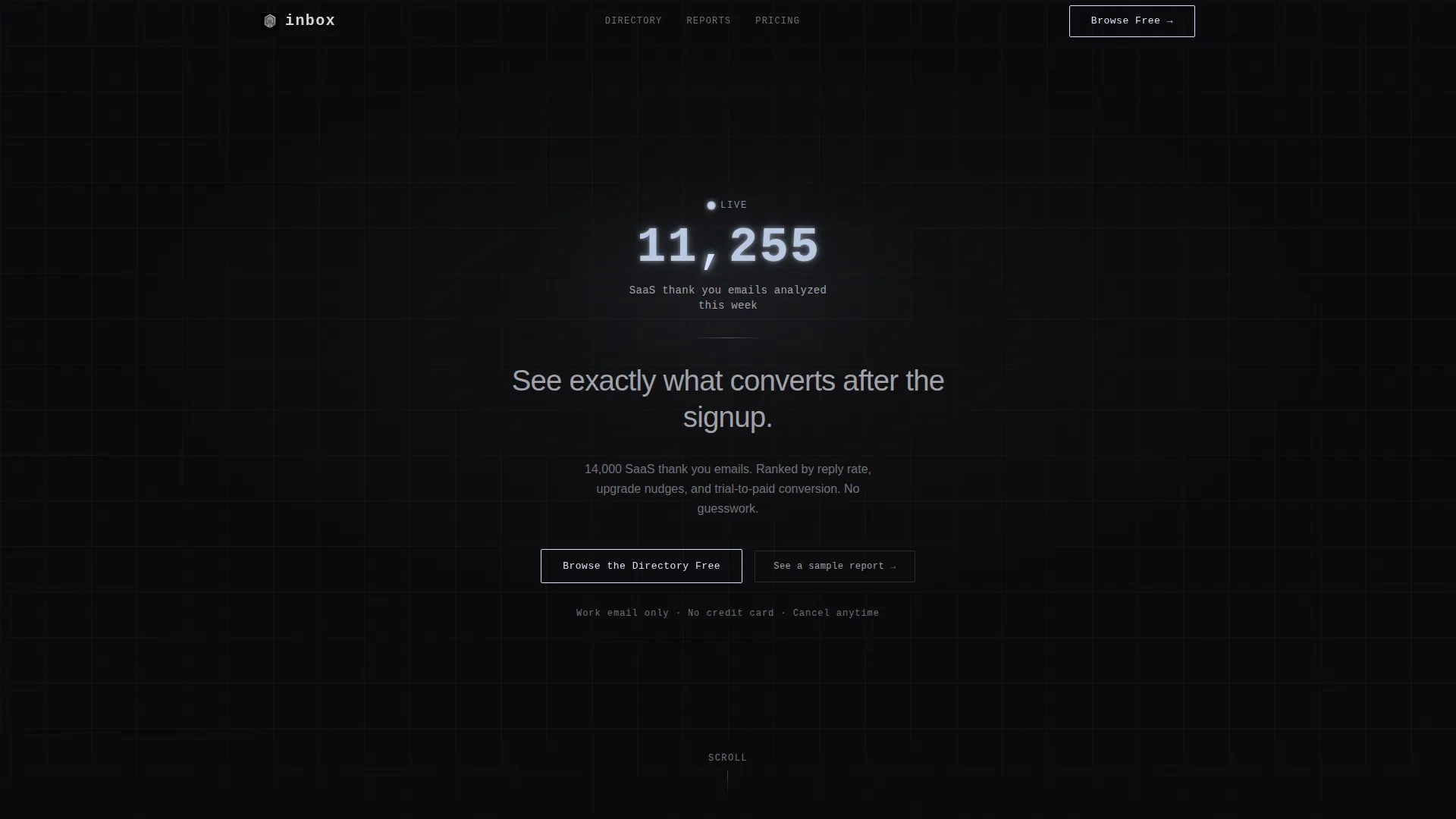
- A dark full-bleed header with a live-ticking stat counter and a single focused headline in brushed chrome
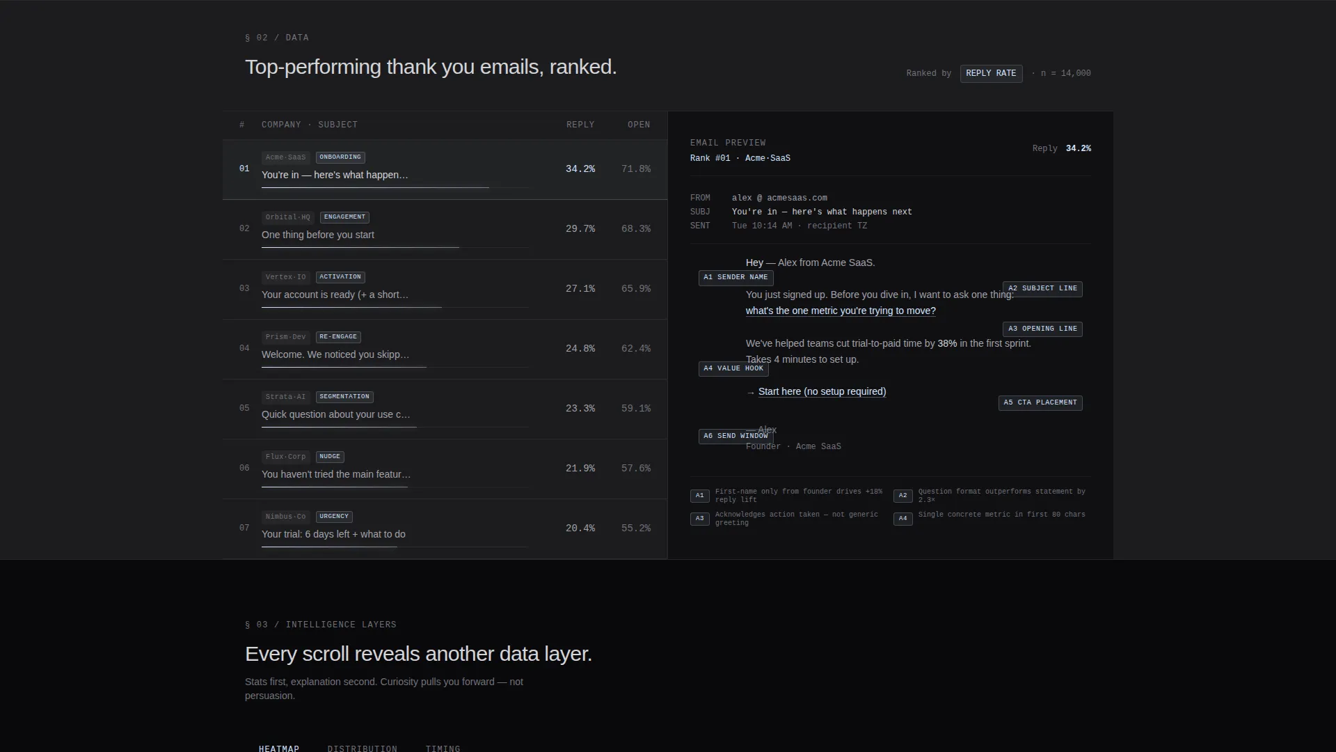
- A 50/50 split-screen section showing a ranked email leaderboard alongside an annotated expanded email view
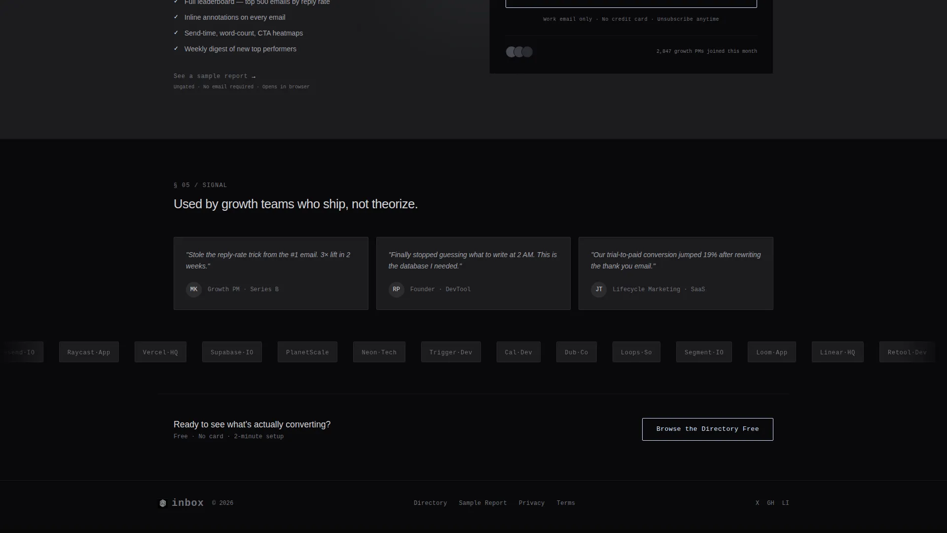
- Two strategically placed freemium call-to-action blocks with a single-field work email signup and a secondary ungated sample report path
Feature list
This template delivers a focused set of layout components designed to match the product's data-forward identity.
Live Stat Counter Header
The header section centers a single glowing number that represents emails analyzed in the current week. The digit display includes a soft phosphor bloom animation on each change, giving the impression of a live system actively running. A one-line headline in brushed chrome sits below the counter.
Split-Screen Email Intelligence Section
The core content section divides the viewport evenly. The left panel shows a ranked leaderboard of top-performing thank you emails, complete with anonymized company logos and truncated subject lines. The right panel displays a single email expanded with inline conversion annotations.
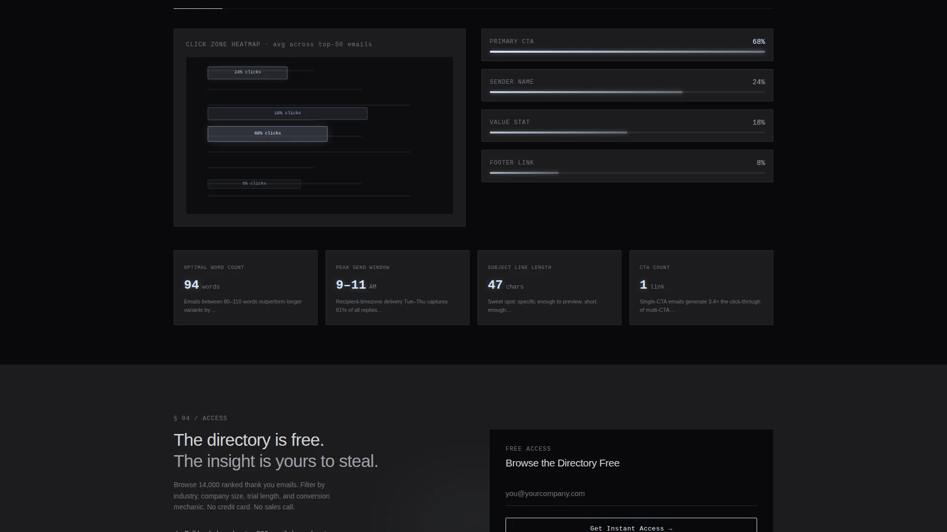
Progressive Data Layer Scrolling
Each scroll depth reveals a new layer of data: click-zone heatmaps, word-count distributions, and send-time clustering visuals. Each data point appears before its explanation, creating a curiosity-driven scroll experience that keeps visitors engaged without relying on persuasion copy.
Dual Freemium Call-to-Action Blocks
Two primary call-to-action placements appear on the page: one directly beneath the header counter and one after the annotated email section. Each opens a single-field signup prompt with a ghost-text placeholder. A secondary text link reads "See a sample report" and connects to an ungated example.
Monochrome Steel Visual System
The entire layout uses a four-color palette: void black, gunmetal, brushed chrome, and a cool white-blue reactive glow accent. The glow accent activates only on hover states, live counters, and call-to-action borders, keeping the visual hierarchy clean and intentional.
Directory and Discovery Theme Layout
The page is structured as a browsable intelligence directory, not a static pitch. The leaderboard format and annotated previews give visitors the feeling of exploring a real dataset rather than reading a brochure.
Page sections overview
| Section | Purpose |
|---|---|
| Full-Bleed Header | Anchors attention with a live ticking stat counter and focused chrome headline |
| Live Stat Counter | Shows real-time analysis volume to establish immediate platform credibility |
| Primary call to action Block | Invites visitors to browse the directory free with a single work email field |
| Split-Screen Leaderboard | Displays ranked thank you emails beside an annotated expanded email view |
| Scroll Data Layers | Reveals heatmaps, word-count charts, and send-time clusters as visitor scrolls |
| Secondary call to action Block | Repeats the freemium signup prompt after the annotated email section |
| Sample Report Link | Offers an ungated example report to demonstrate depth before commitment |
Design & branding system
The visual identity is built around a Monochrome Steel palette that feels like the interior of a server rack. Every color choice is intentional and functional, with no decorative elements competing for attention.
- Four-color palette: void black (#09090B) for backgrounds, gunmetal (#1C1C1E) for alternating sections, brushed chrome (#A1A1AA) for all body text, and cool white-blue (#D4E4FF) reserved strictly for hover states, live counter glows, and call-to-action borders
- Typography stays minimal and technical; nothing in the layout competes with the reactive glow accent
- Background alternation between void black and gunmetal creates clear section separation without borders or dividers
Mobile & speed optimization
The layout is designed with a lean component structure that translates clearly from desktop to smaller viewports. The split-screen format adapts to a stacked single-column view on mobile without losing the data-first hierarchy.
- The stat counter and headline remain above the fold on all common screen sizes
- Call-to-action blocks are positioned at natural pause points in the scroll flow, keeping them reachable without excessive scrolling on mobile
- The minimal palette and absence of decorative imagery keep the layout light and fast to render
How this template helps you convert
The page earns the conversion rather than demanding it. By the time a visitor reaches either call-to-action block, they have already interacted with real platform data.
- The live counter in the header establishes immediate credibility by showing active platform usage before the visitor reads a single line of copy
- The split-screen leaderboard and annotated email view let visitors experience the core product value directly on the page, reducing the perceived risk of signing up
- The secondary "See a sample report" path captures visitors who are not yet ready to commit, giving them a lower-stakes entry point that still moves them into the product funnel
Other information about this template
This template sits within the Technology category, specifically aligned with the SaaS email templates subcategory and the SaaS thank you email niche. It is a strong fit for teams building or relaunching a product in the email intelligence or lifecycle analytics space.
- The template style is a 50/50 split screen, making it well suited for platforms that need to show comparison, ranking, or side-by-side data views
- The Directory and Discovery theme means the page functions less like a pitch and more like a tool preview, which aligns well with freemium acquisition models
- The Stats-First Impact creative direction is intentional: data precedes explanation throughout, which mirrors how technical buyers evaluate new tools
- The freemium and trial landing page direction means the primary goal is low-friction sign-up, not a long sales cycle close
Theme
Directory & Discovery
Creative direction
Stats-First Impact
Color system
Monochrome Steel
Style
Split Screen (50/50)
Direction
Freemium/Trial
Page Sections
Live Stat Counter with Glow Animation
50/50 Split-screen Layout
Progressive Data Layer Scrolling
Dual Call to Action Blocks with Single-field Signup
Monochrome Steel Color System
Directory and Discovery Page Structure
Related questions
What kind of SaaS product is this template designed for?
Who is the intended audience for this landing page?
How does the freemium call-to-action work in this template?
Can I use this template for a different SaaS product category?
What makes the visual design of this template distinctive?



