SaaS Knowledge Base Landing Page Template
Index is a scroll-reveal SaaS landing page template built for B2B knowledge base platforms. It opens with a live, interactive search demo and an ROI calculator that together prove value before the visitor scrolls far. The dark Carbon Fiber visual system, phosphor green glow accents, and progressive section reveals create a cinematic product experience that drives free-trial signups.
by Rocket studio
Quick summary
Index is a single-page, scroll-reveal landing page template designed for B2B knowledge base software. It leads with a fully interactive search demo and an ROI calculator, so visitors experience the product before reading a single feature bullet. The Carbon Fiber color system and progressive animations give it the feel of a machine switching on.
Who this template is for
This template is built for SaaS founders and marketing teams selling internal knowledge management tools to business buyers. It speaks directly to the pain points of operations and IT leaders who need to prove ROI fast.
- Operations directors who lose hours chasing answers buried in Slack threads and outdated documents
- IT leads who field the same onboarding and process questions repeatedly each quarter
- Growth-stage startups that need to retain institutional knowledge as their teams scale
What problem this template solves
Most SaaS landing pages describe a product. This template lets visitors feel it. The challenge for knowledge base platforms is that the value is invisible until someone actually searches and gets an answer. Index solves that by front-loading the experience.
- Scattered internal documentation makes the product promise hard to visualize from a static page
- Prospects need to see time savings in concrete numbers before they trust a free-trial button
- Generic hero sections fail to differentiate knowledge tools that all claim to "centralize your docs"
What you get with this template
You get a complete, conversion-focused landing page ready to represent a B2B knowledge base platform. Every section is designed to build trust progressively as the visitor scrolls.
- A live interactive search bar in the header that queries a sample knowledge base and displays real results
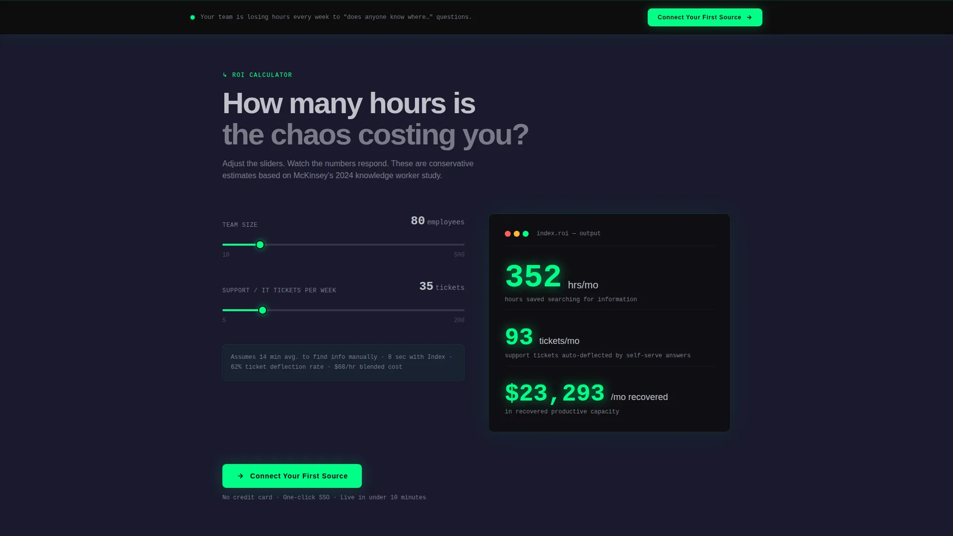
- An ROI calculator section that outputs hours saved per month based on team size and ticket volume
- Scroll-reveal animations that make each section materialize as the visitor reaches it, creating a sense of the product assembling in real time
Feature list
This template packages several distinct interactive and visual components, each serving a clear conversion purpose.
Live Search Demo Header
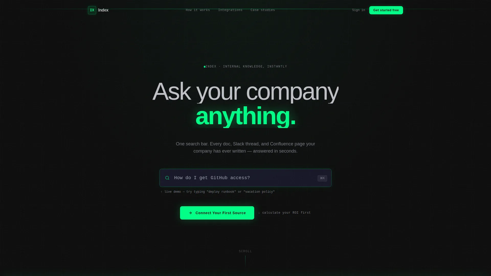
The full-bleed header centers a glowing search input on a pure carbon black canvas. Visitors type freely and see real results, article titles, confidence scores, and source tags, slide up from below the input field. The phosphor green halo intensifies with each keystroke, making the product feel alive before any scroll.
ROI Calculator Section
A dedicated calculator section asks two inputs: number of employees and weekly support ticket volume. It outputs estimated hours saved per month in glowing green digits. Letting the visitor calculate their own savings is more persuasive than any stated statistic.
Progressive Scroll Reveal Animations
Every section below the header stays invisible until the visitor reaches it. Sections materialize in sequence, creating the sensation of a page assembling itself. This pacing keeps attention focused and builds narrative momentum toward the call to action.
Ingestion Source Diagram
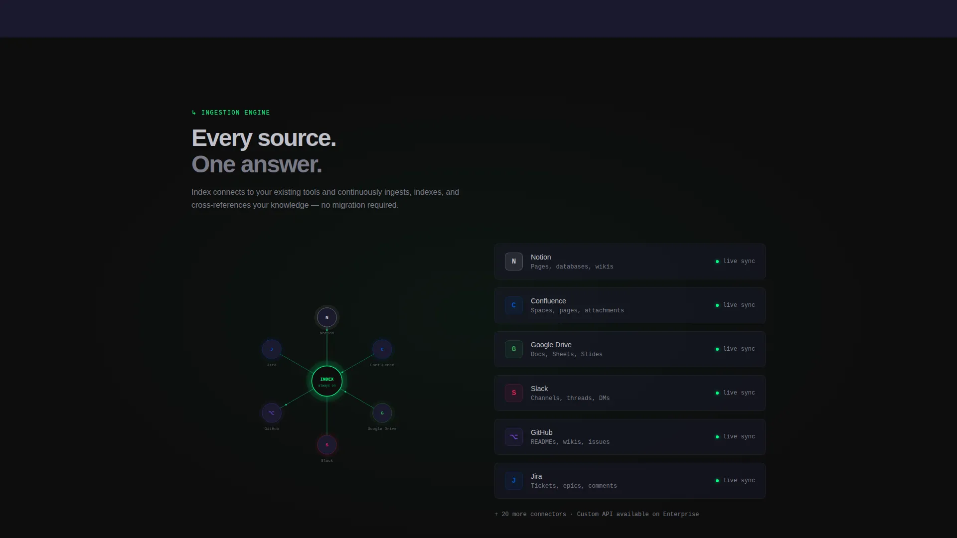
A layered visual diagram shows multiple document sources collapsing into a single unified node. The diagram communicates the platform's core value, consolidation, without requiring the visitor to read a paragraph of explanation.
Case Study Cards
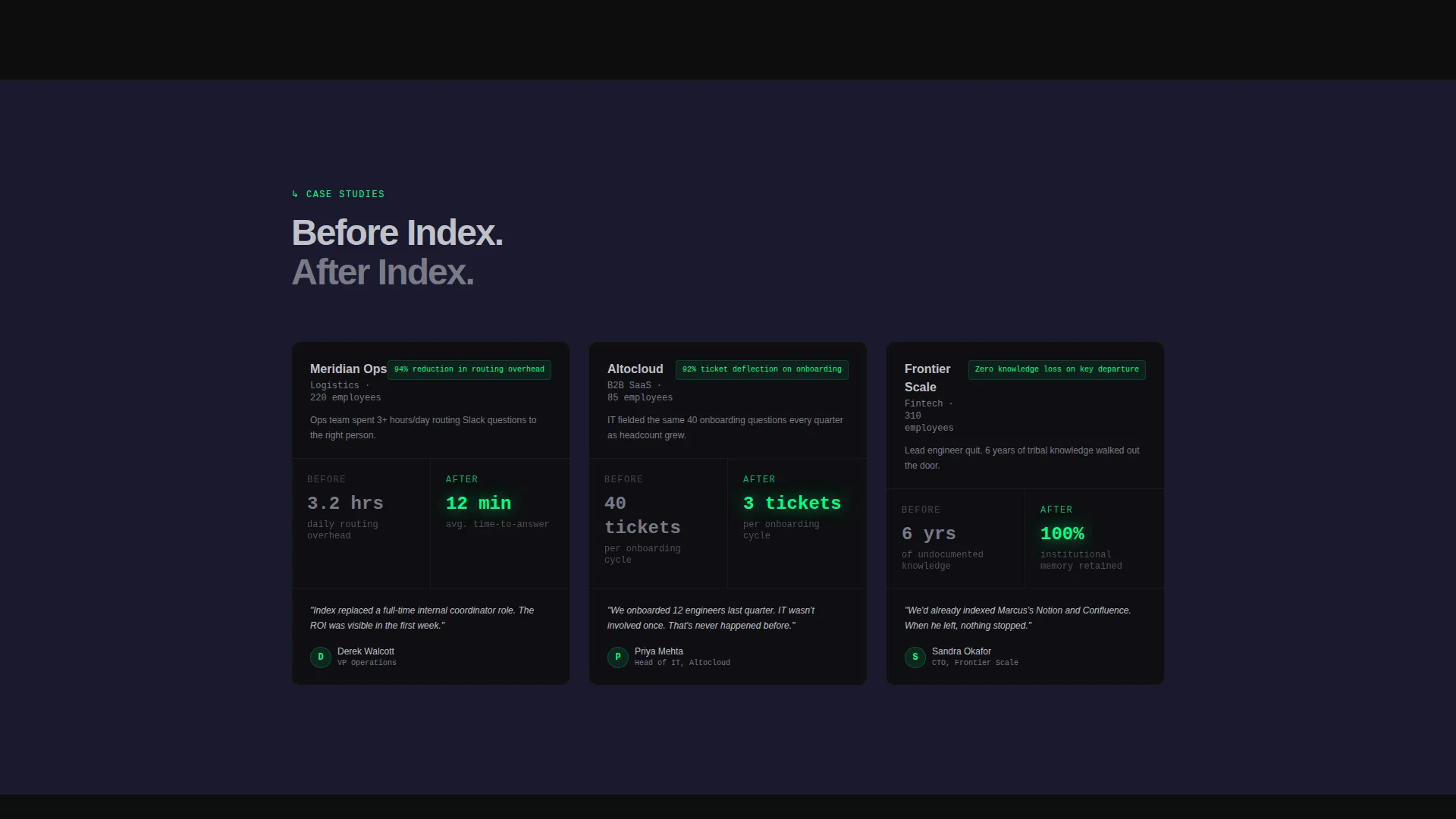
Three case study cards slide in one at a time as the visitor scrolls. Each card pairs a before metric in cool silver with an after metric in phosphor green. The color contrast makes the improvement immediately readable.
Sticky Call-to-Action Bar
After the ROI calculator, a sticky bottom bar carries the primary call-to-action button throughout the rest of the page. The button routes to a one-click sign-up flow, removing friction at the moment of highest intent.
Page sections overview
| Section | Purpose |
|---|---|
| Hero Search Header | Delivers the live interactive search demo as the first experience |
| ROI Calculator | Quantifies hours saved based on the visitor's own team inputs |
| Source Diagram | Shows how multiple doc sources collapse into one searchable node |
| Case Study Cards | Pairs before-and-after metrics to demonstrate real customer results |
| Sticky call to action Bar | Persists the primary sign-up button after the calculator section |
Design & branding system
The visual identity uses a Carbon Fiber color system that communicates precision, power, and calm control. Every design decision reinforces the idea of chaos becoming organized.
- Background surfaces stay in the deep carbon black (#0D0D0D) to graphite panel gray (#1A1A2E) range, with subtle crosshatch texture giving depth without distraction
- Phosphor green (#00FF87) is used exclusively for glowing accents, interactive hover states, search result highlights, and live metric outputs, it draws the eye exactly where it needs to go
- Cool silver (#C0C0C8) carries all body text, floating cleanly above dark backgrounds without feeling sterile or clinical
Mobile & speed optimization
The template is structured for clean rendering across device sizes. The dark surface palette and minimal image load keep the visual weight low even on smaller screens.
- Scroll-reveal animations are tied to viewport entry, so they trigger correctly on both desktop and mobile without requiring separate configuration
- The sticky call-to-action bar is positioned to remain visible and tappable on mobile viewports throughout the scroll journey
How this template helps you convert
The conversion strategy is built around letting visitors experience the product value twice before seeing the call to action a second time.
- The live search demo in the header lets visitors interact with a sample knowledge base immediately, making the platform's speed and accuracy tangible before any marketing copy appears
- The ROI calculator turns the visitor's own numbers into a personalized savings estimate, shifting the conversation from "this might help" to "this saves my team X hours a month"
- The primary call-to-action button routes directly to a one-click single sign-on signup, removing the form friction that typically kills momentum at the final step
Other information about this template
This template is part of a broader Directory and Discovery theme family, designed specifically for SaaS products where discoverability and instant answers are the core value proposition.
- The template style is Scroll Reveal (Progressive), meaning sections animate into view as the visitor reaches them rather than loading all at once
- The landing page direction is Click-Through, meaning no form appears on the page itself, the single goal is routing qualified visitors to a signup flow
- The header concept is Dark Full-Bleed with Glow, a high-impact pattern that makes the interactive search bar the undeniable focal point from the first second on the page
- This template fits knowledge base platforms targeting operations teams, IT departments, and scaling companies that need to reduce repetitive internal support requests
Theme
Directory & Discovery
Creative direction
Calculator/Tool First
Color system
Carbon Fiber
Style
Scroll Reveal (Progressive)
Direction
Click-Through
Page Sections
Live Interactive Search Demo
ROI Calculator with Live Output
Progressive Scroll Reveal Animations
Ingestion Source Diagram
Before-and-after Case Study Cards
Sticky Click-through Call to Action Bar
Related questions
Can I replace the sample knowledge base in the live search demo?
Does the ROI calculator require any back-end setup?
Is the sticky call-to-action bar easy to customize?
Who is this landing page template best suited for?
Can I adapt the Carbon Fiber color system to match my own brand?



