High-Performance Data Pipeline Landing Page Template
Ingest is a high-performance data pipeline landing page template built for big data processing platforms. It uses a split-screen layout, Dynamic Motion theme, and Monochrome Steel color system to stage a direct speed-versus-slowness confrontation. Four escalating versus rounds walk visitors through speed, cost, reliability, and developer experience before driving them to benchmark their current stack.
by Rocket studio
Quick summary
Ingest is a single-page template for big data processing platforms that need to win technical buyers fast. The layout pits the incumbent reality against your platform in four escalating split-screen rounds. Motion-blurred data streams, live-ticking counters, and pipeline diagrams animate the right panel while the left stays cold and static. The page ends with a clear call to action: run the benchmark yourself.
Who this template is for
This template is built for teams selling a high-performance data pipeline or real-time data processing platform to a deeply technical audience. If your buyers feel the pain before they read a word, this layout does its job.
- Data engineers who have debugged batch job failures at 2 AM and want a faster path forward
- Platform leads who need to justify infrastructure spend to finance teams focused on invoices
- Machine learning teams waiting hours for feature pipelines that should resolve in minutes
What problem this template solves
Most data infrastructure landing pages explain features. Ingest does something different. It makes the visitor feel the friction of their current stack first, then shows the relief on the right panel. That emotional sequence is the conversion engine.
- Generic product pages fail to connect with engineers who already know their pain points
- Static layouts cannot communicate the kinetic advantage of a streaming data pipeline platform
- No clear benchmark path leaves technical buyers without a low-friction way to self-qualify
What you get with this template
You get a fully structured, section-led landing page designed specifically for the big data processing market. Every layout decision serves the comparison-driven conversion flow described in the brief.
- A split-screen versus layout across four themed rounds: speed, cost, reliability, and developer experience
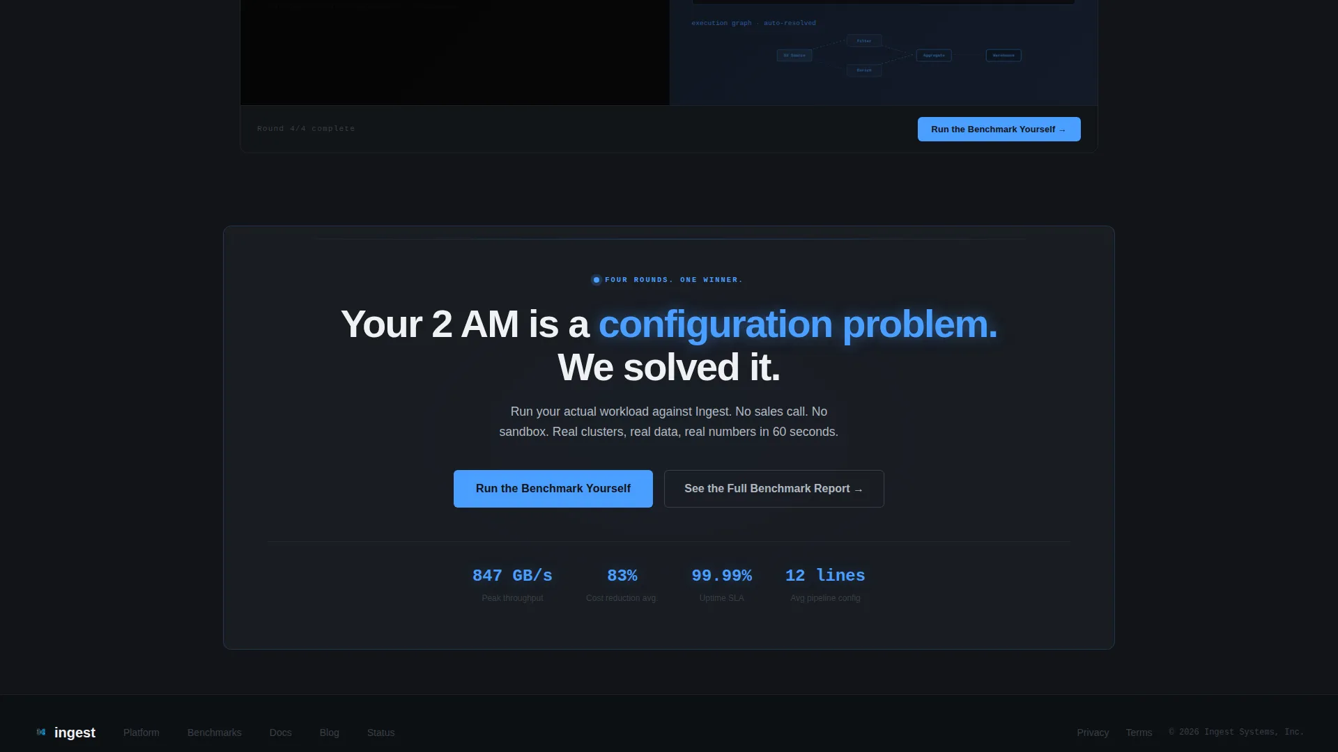
- Two conversion paths: a two-field benchmark form and a gated PDF report requiring only an email address
- A floating call-to-action bar that pins to the viewport after the third versus round
Feature list
This template is packed with purpose-built layout components. Each one is grounded in the source brief and designed to move technical visitors through the funnel without friction.
Animated Split-Screen Versus Sections
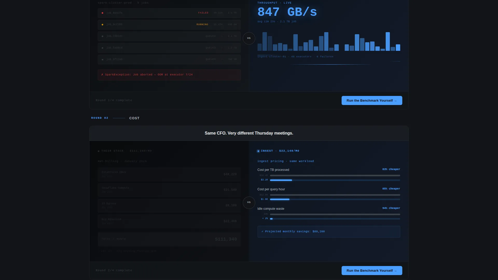
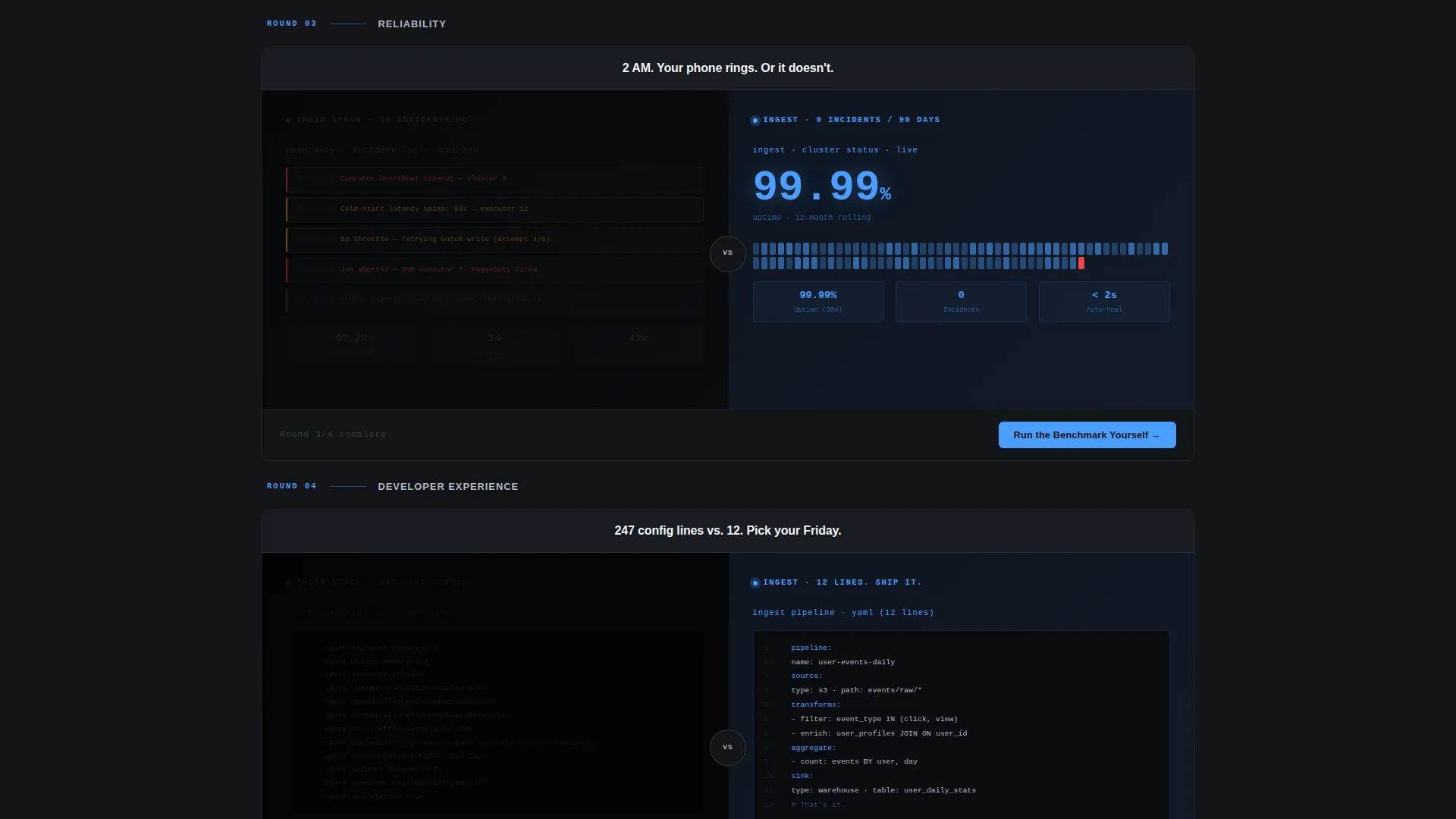
Four side-by-side comparison panels show the incumbent's frozen, failing world on the left and your platform's live, accelerating throughput on the right. Motion intensity escalates with each round so the energy compounds as the visitor scrolls.
Continuous Logo Bar Header
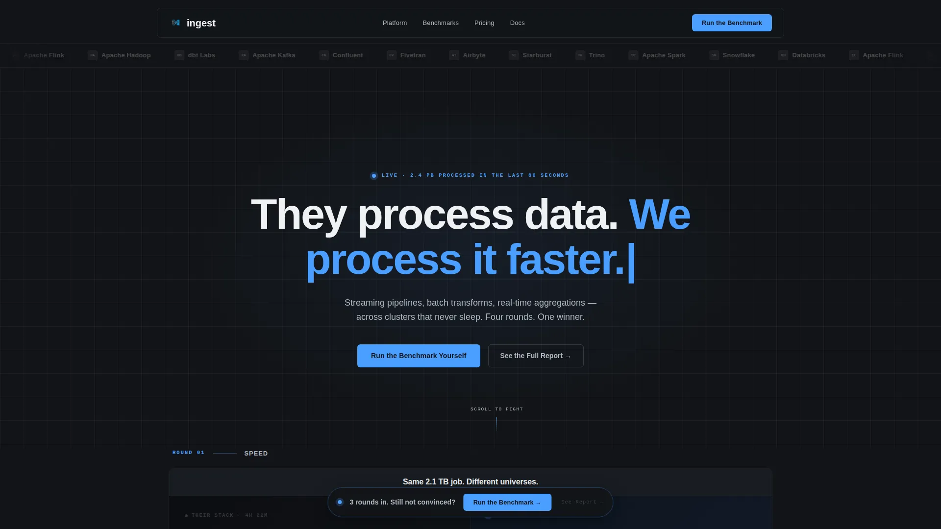
A horizontal ribbon of recognizable enterprise logos glides left to right in a continuous loop. Each logo is desaturated into the steel palette, framing them as the competition rather than social proof. The visual contrast sets the confrontational tone immediately.
Live-Ticking Throughput Counters
Right-panel sections feature animated counters that tick upward in real time, representing data volume processed. This motion-based storytelling communicates platform speed without a single technical specification needing to be read.
Two-Field Benchmark Form
The primary conversion action opens a compact form with a current-stack dropdown and a daily data volume slider. The dropdown lists common frameworks so the visitor self-identifies their pain. The slider runs from 100 gigabytes to 50 petabytes and beyond.
Floating Call-to-Action Bar
After the third versus round, a persistent bar pins to the bottom of the viewport and follows the visitor through the rest of the page. It keeps the primary benchmark call to action visible without interrupting the scroll narrative.
Gated PDF Secondary Path
Visitors who are not ready to trial can access a full benchmark report via an email-only gate. No phone number. No extra fields. The low-friction path captures leads at a different stage of the buying decision.
Page sections overview
| Section | Purpose |
|---|---|
| Logo Bar Header | Opens with competitor logos in motion to set the confrontational tone |
| Hero Headline | Locks a single terminal-style headline into place to anchor the versus narrative |
| Round One: Speed | First split-screen panel contrasts job queue backlogs against live streaming throughput |
| Round Two: Cost | Second panel shows config sprawl and invoice shock against efficient pipeline cost |
| Round Three: Reliability | Third panel pairs cold-start latency graphs against always-on cluster resilience |
| Round Four: Developer Experience | Final panel dims the left to near-black while the right blazes with signal blue |
| Floating call to action Bar | Pins after round three and follows the visitor through the remaining scroll |
| Benchmark Form | Two-field form captures current stack and daily data volume for self-qualification |
| PDF Report Gate | Email-only secondary conversion for visitors not ready for a live benchmark |
Design & branding system
The visual identity runs on a Monochrome Steel palette that feels like the interior of a live server rack. Every color choice reinforces the industrial, high-throughput character of the platform.
- Core palette: forge black (#121418), brushed gunmetal (#3A3F47), machined aluminum (#B0B8C1), and arc-weld white (#F0F1F3) for structure and typography
- Single accent color: molten signal blue (#4A9EFF) used exclusively for interactive states and animated data-in-motion elements
- The Dynamic Motion theme drives scroll progression, with right-panel animations accelerating in intensity while left panels remain static and muted
Mobile & speed optimization
The template is designed to maintain layout clarity across screen sizes. The split-screen structure adapts to narrower viewports without losing the versus narrative.
- Split-screen panels stack vertically on smaller screens so left and right comparisons remain legible and sequential
- Motion-based elements are scoped to their respective panels so animations do not interfere with scroll performance on mobile
- The floating call-to-action bar remains anchored and accessible regardless of device width
How this template helps you convert
The conversion architecture is baked into the layout sequence, not added as an afterthought. Every scroll event moves the visitor closer to a decision.
- The escalating versus structure makes visitors feel the cumulative cost of their current stack across four rounds before they reach a form, so the benchmark call to action lands with maximum relevance.
- Two parallel conversion paths capture visitors at different intent levels: the benchmark form targets trial-ready engineers, while the gated PDF captures researchers and decision-influencers with a single email field.
Other information about this template
This template is categorized under Technology, Data and Analytics, and targets the big data processing platform niche. It is a strong fit for any go-to-market team competing against established players in the streaming and batch processing space.
- The template style is Split Screen (50/50) with a Launch Energy creative direction
- The header concept uses a Logo Bar to immediately position the page as a competitive alternative
- The landing page direction is Comparison/Versus, making it well suited for teams displacing tools in the Spark, Flink, Databricks, and Snowflake ecosystem
- The theme is Dynamic Motion, which relies on CSS and layout-level animation cues rather than heavy media assets
Theme
Dynamic Motion
Creative direction
Launch Energy
Color system
Monochrome Steel
Style
Split Screen (50/50)
Direction
Comparison/Versus
Page Sections
Escalating Split-screen Versus Layout
Continuous Competitor Logo Bar
Animated Throughput Counters
Two-field Benchmark Conversion Form
Viewport-pinned Floating Call to Action Bar
Email-only Gated PDF Path
Related questions
Who is the primary audience for this landing page template?
Can I customize the versus round topics?
What conversion actions does this template include?
Do I need animation or motion design skills to use this template?
Is the floating call-to-action bar always visible?



