Ingest - Powerful Edtech Landing Page Template
Ingest is a K-12 AI document processing landing page template built for platforms that turn school paperwork into structured data. It targets district operations directors, registrars, and special education coordinators. The design uses a high-contrast Acid Digital palette and a dashboard-style layout to move visitors from felt pain to confident action in a single scroll.
by Rocket studio
Quick summary
Ingest is a single-page landing page template for a K-12 AI document processing platform. It takes visitors from the chaos of compliance paperwork, IEPs (Individualized Education Programs), transcripts, enrollment packets, 504 plans, to a clear view of structured, searchable outcomes. The layout is built around a Problem-to-Solution arc that earns the click before it asks for one.
Who this template is for
This template speaks directly to the people buried under school district paperwork. It is built for teams who process high volumes of student records and need a faster, more reliable way to handle them.
- District operations directors managing compliance documentation across multiple schools
- Registrars processing large batches of transfer and enrollment packets every semester
- Special education coordinators responsible for IEPs, 504 plans, and accommodation tracking
What problem this template solves
School districts generate thousands of documents per student, and almost none of those documents connect to each other. Staff spend hours on manual data entry instead of supporting students, and compliance errors are a constant risk.
- No central way to search, sort, or act on scattered student records
- Enrollment and transfer cycles create seasonal backlogs that overwhelm small teams
- Filing time crowds out the work that actually serves students
What you get with this template
You get a fully structured, conversion-focused landing page that walks visitors through the problem and the solution in a single scroll. Every section is designed to reduce friction and push toward a clear action.
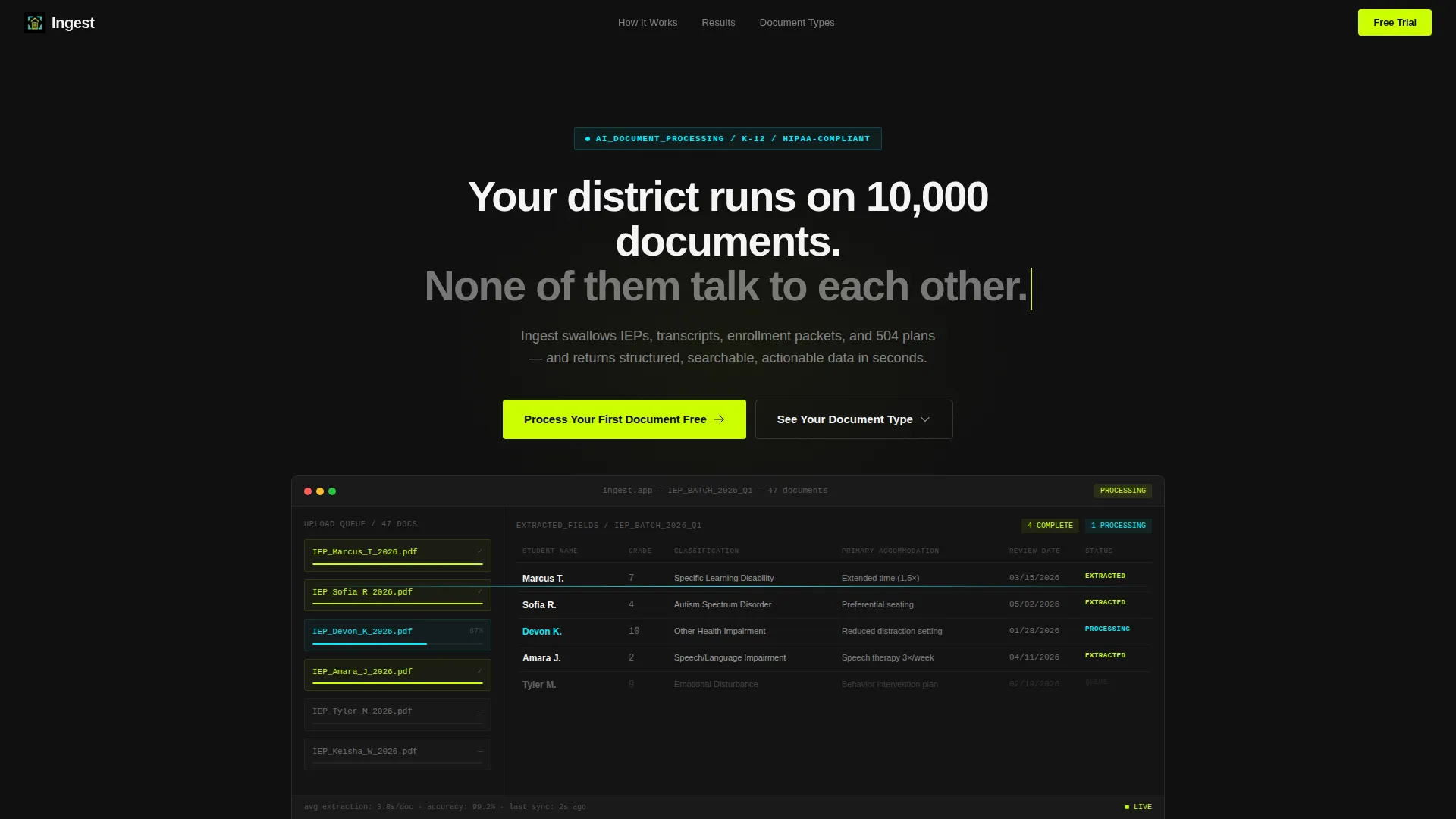
- A hero section with a product screenshot, animated data grid, and a headline that names the pain immediately
- A three-stage Problem-to-Solution arc with animated counters, a processing pipeline flow, and outcome metrics
- Two strategically placed calls to action and a document-type selector grid that routes visitors to specific demo pages
Feature list
This template is built around six core design and structural features. Each one works together to deliver a focused, high-contrast experience that converts district staff into trial signups.
Live Dashboard Hero Section
The header displays a pixel-sharp product screenshot of the Ingest dashboard mid-processing a stack of IEP documents. Progress bars fill in real time. Extracted fields populate a data grid on the right, showing student name, disability classification, accommodation list, and review date. A chartreuse cursor blinks at the end of the headline like a command prompt.
Animated Problem Metrics Grid
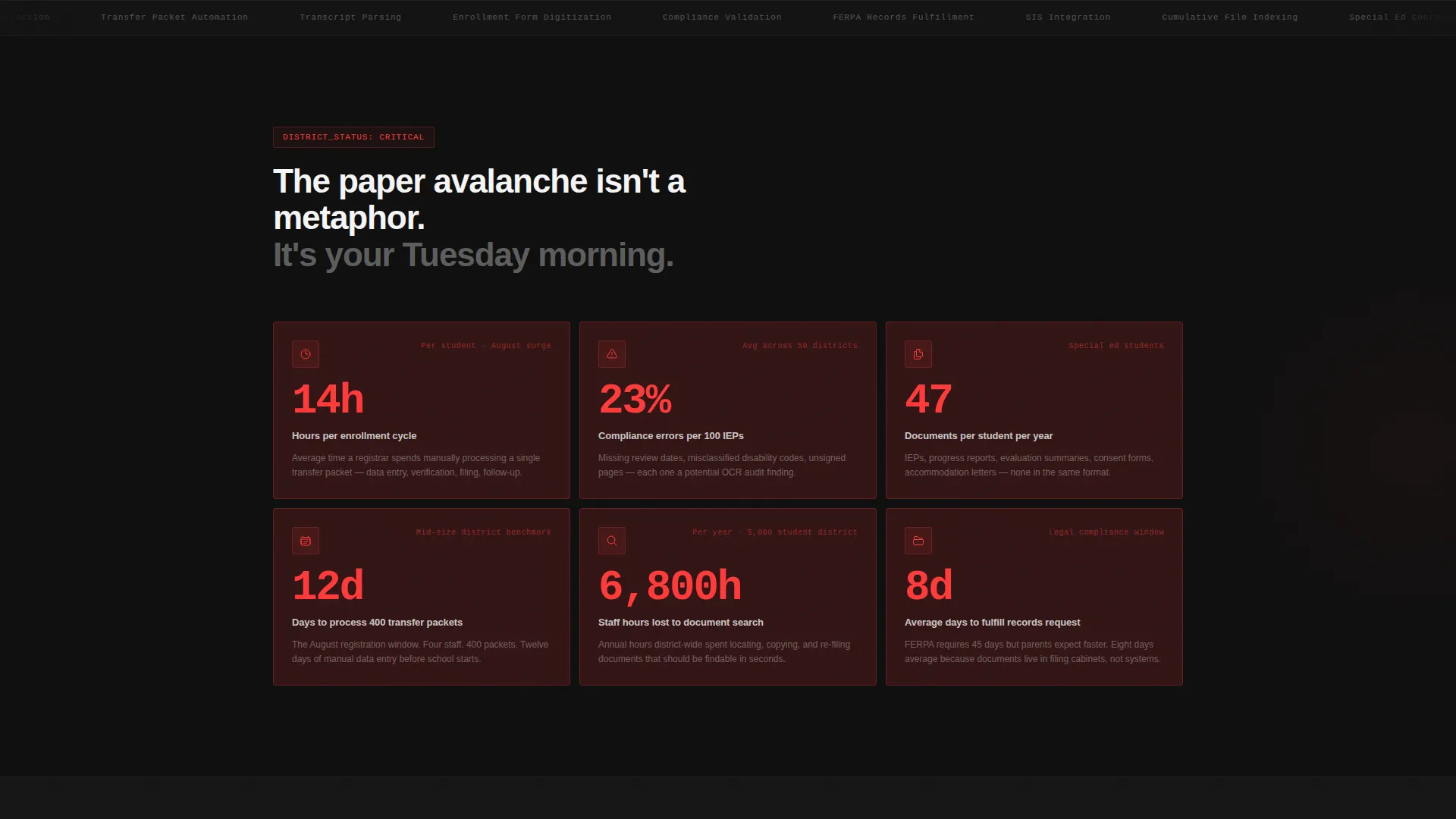
Section one renders pain as data. Animated counters display average hours per enrollment cycle, compliance error rates, and documents per student per year. These are styled as data grid cards that feel like a district's worst dashboard, making the cost of the status quo impossible to ignore.
Processing Pipeline Flow
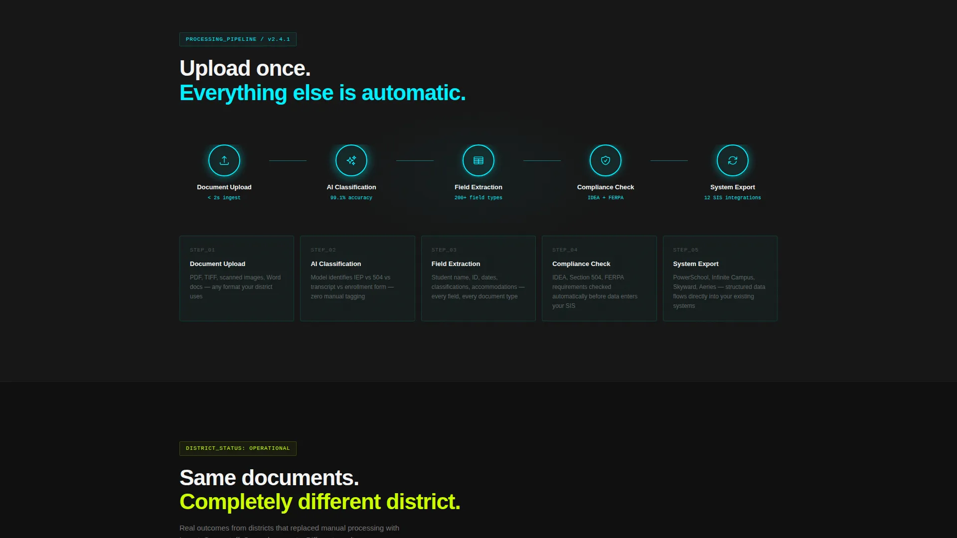
Section two introduces the AI pipeline as an animated node sequence: document upload, AI classification, field extraction, and system export. Each node lights up in scanner-line cyan as the visitor scrolls past it, turning an abstract technical process into a visible, trustworthy workflow.
Before-and-After Outcome Grid
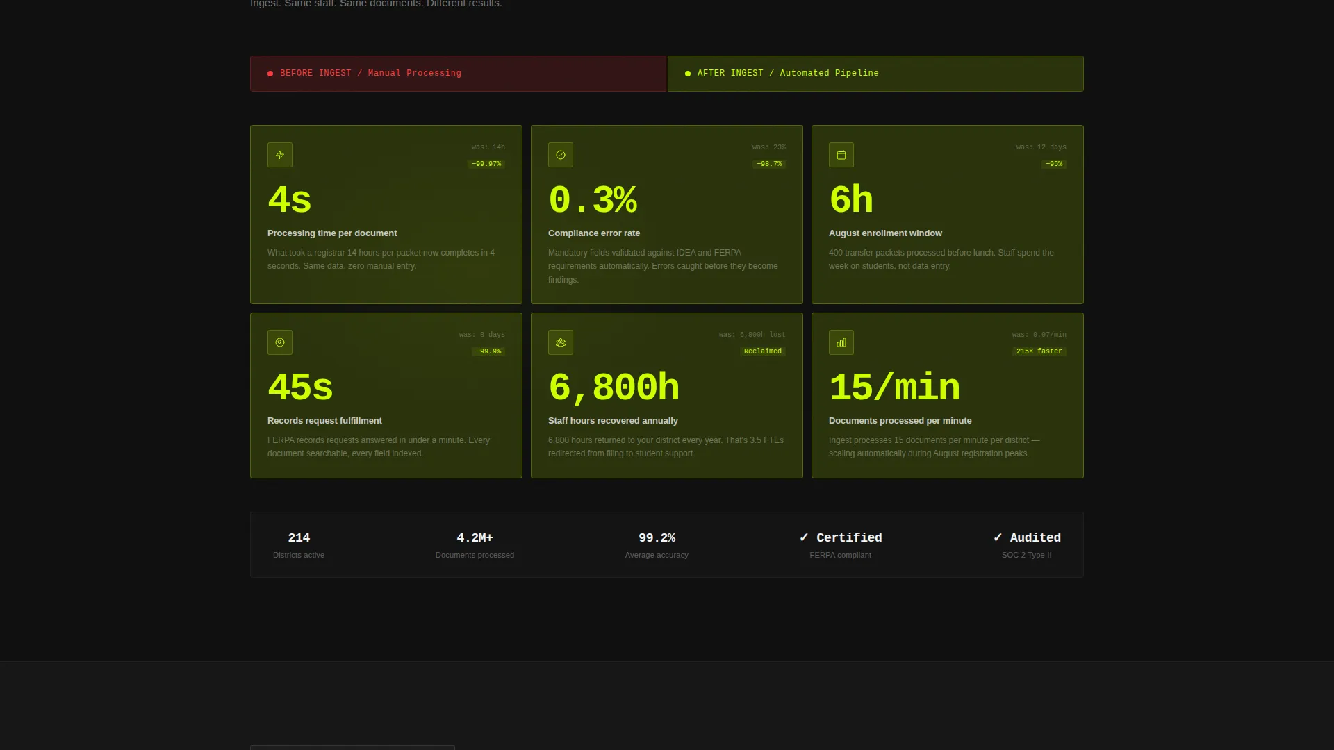
Section three uses the same card layout as the problem metrics but flips the data. Processing time collapses from days to minutes. Error rates approach zero. Cards that glowed warning red now glow chartreuse. The contrast between the two states makes the value gap feel real.
Sticky and Block Call-to-Action Placement
The primary call to action, "Process Your First Document Free," appears in a sticky chartreuse bar immediately after the hero and again as a full-width block after the outcome metrics grid. No form is required. The click routes to a free trial signup with district email verification.
Document-Type Selector Grid
A secondary call to action lets visitors choose from a grid of document categories: IEPs, transcripts, enrollment forms, and 504 plans. Each selection routes to a type-specific demo page, letting visitors see real extracted data from their actual document type before committing to anything.
Page sections overview
| Section | Purpose |
|---|---|
| Hero with Dashboard | Open with the product in action and name the core pain |
| Problem Metrics Grid | Quantify the cost of the current paperwork process |
| Processing Pipeline Flow | Show how the AI handles documents step by step |
| Outcome Metrics Grid | Contrast before-and-after results with the same card layout |
| Sticky call to action Bar | Keep the primary action visible throughout the scroll |
| Document-Type Selector | Route visitors to demos matched to their specific document type |
| Full-Width call to action Block | Close with a high-contrast, commitment-free trial invitation |
Design & branding system
The visual identity runs on an Acid Digital color system built for maximum contrast and zero decoration. Every color has a job, and nothing else earns a place on the page.
- Void black (#0D0D0D) dominates all backgrounds, keeping focus on data and action
- Electric chartreuse (#CCFF00) fires on calls to action, progress indicators, and positive outcome states
- Scanner-line cyan (#00F0FF) highlights data states, hover interactions, and pipeline nodes
- Interface white (#F4F4F5) carries all body text and card surfaces for clean readability
Mobile & speed optimization
The template is designed to remain visually sharp and structurally clear on smaller screens. The high-contrast palette keeps data grids and calls to action readable without needing large type sizes.
- Sticky call to action bar stays accessible on mobile scroll without blocking content
- Data grid cards reflow cleanly to single-column layout on narrow viewports
- Pipeline flow nodes stack vertically on mobile while preserving the scroll-trigger animation logic
How this template helps you convert
This template earns the click by showing real value before making any request. Every structural decision reduces hesitation and increases the visitor's confidence that the product is right for them.
- The animated before-and-after data grid makes the outcome concrete and personal before the visitor reaches a single call to action
- The document-type selector lets visitors self-identify, routing them to a demo that matches their exact workflow
- The no-form call to action removes the biggest friction point in a B2B (business-to-business) signup flow, lowering the barrier to a first action
Other information about this template
This template is part of a broader category of edtech landing page templates built for AI-powered platforms. It is a strong fit for teams launching or repositioning a K-12 document automation product.
- The Startup Velocity theme gives the layout an aggressive, high-energy feel suited to early-stage or growth-stage edtech products
- The Click-Through landing page direction means every design decision supports a single goal: getting the visitor to start a free trial
- The Dashboard and Data Grid template style makes it easy to communicate complex processing workflows at a glance
- The template is well-suited for edtech marketing teams preparing for back-to-school campaign cycles when registrar workloads peak
Theme
Startup Velocity
Creative direction
Problem→Solution Arc
Color system
Acid Digital
Style
Dashboard/Data Grid
Direction
Click-Through
Page Sections
Live Dashboard Hero with Data Grid
Animated Problem Metrics Section
Scrolling AI Pipeline Visualization
Before-and-after Outcome Grid
Sticky Call to Action Bar and Full-width Call to Action Block
Document-type Selector Grid
Related questions
Who is this landing page template designed for?
Does the template include a contact form or lead capture form?
Can I customize the document-type selector grid for my product?
What makes this template different from a standard SaaS landing page?
Is this template suitable for a product launch or just ongoing marketing?



