Time Series Database Training Landing Page Template
Ingest is a comparison table landing page template built for a time series database training and certification platform. It targets backend engineers, IoT architects, and DevOps leads who need to master high-volume timestamped data at scale. The design follows a Tech Glass aesthetic with a Carbon Fiber color system, monospaced type, and teal highlights that pulse with live-data energy.
by Rocket studio
Quick summary
Ingest is a single-page, section-led landing page template for a time series database training platform. It uses a dark carbon and teal visual system to create the feeling of a live terminal. Engineers land here, see a database comparison table, explore curriculum modules, and move toward a free-tier signup with minimal friction.
Who this template is for
This template is built for training platforms and technical education products that serve engineering audiences. If your offer involves deep, hands-on technical content, this layout is designed to earn trust quickly and convert skeptical visitors.
- Backend engineers who work with high-cardinality metrics and need structured, database-specific training
- IoT architects managing sensor pipelines that struggle under real-world write volume
- DevOps leads who inherited monitoring infrastructure and need to build genuine query expertise
What problem this template solves
Technical learners distrust generic landing pages. They want proof that a platform understands the actual problem before they hand over an email address. This template is built to close that trust gap fast.
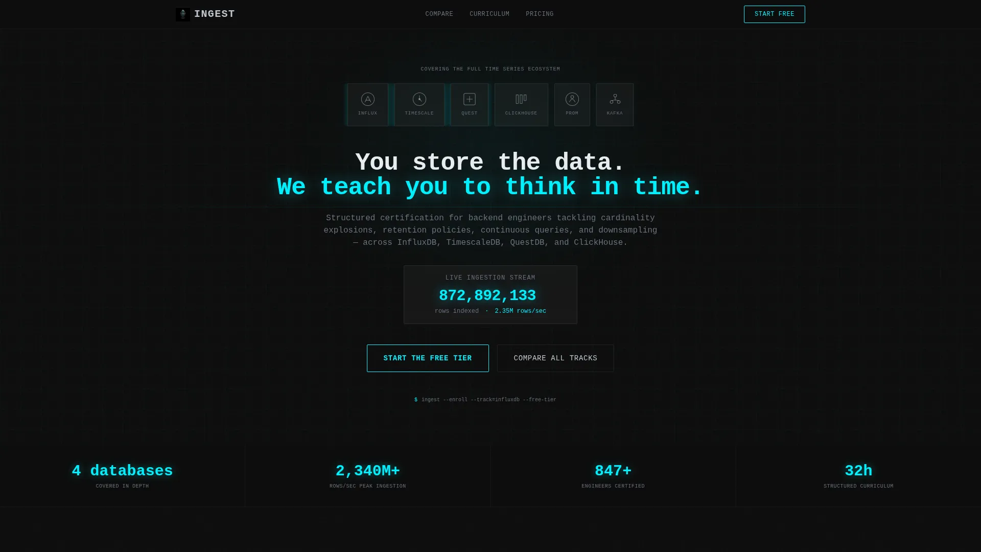
- It signals deep domain knowledge from the first screen, using a live ingestion counter and database logo bar
- The comparison table gives engineers a concrete decision aid rather than forcing them to scroll through marketing claims
- The friction-reduced signup form and free-tier call to action remove the biggest barriers for skeptical, senior engineers
What you get with this template
You get a fully structured single-page layout with every section mapped to a specific stage of the visitor journey, from first impression through conversion. The design system is cohesive and ready to deploy.
- A header with a logo bar, monospaced headline, and an animated ingestion counter
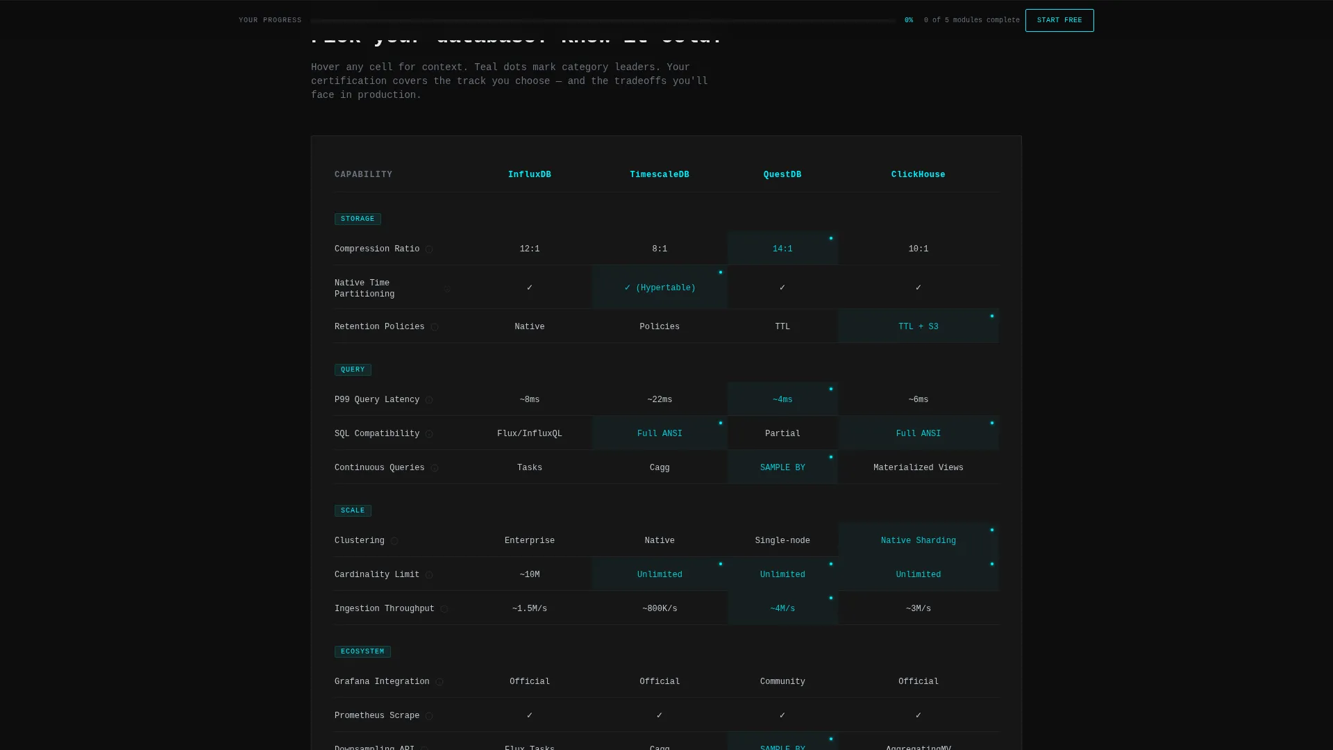
- A database comparison table with hover-activated teal cells and micro-explanations
- Curriculum module sections styled as unlocking stages, terminal-style testimonials, a low-friction conversion form, and a persistent scroll-triggered progress bar
Feature list
This template delivers a set of purposefully engineered sections and interaction patterns. Each one is grounded in the brief and designed to serve the specific conversion context of a technical training platform.
Database Comparison Table
The core section of the page places databases across the top and capabilities down the side. Cells light up in teal on hover and surface micro-explanations. Engineers can evaluate compression ratio, query latency, SQL compatibility, clustering, and ecosystem fit without leaving the page.
Animated Ingestion Counter
A simulated rows-per-second counter ticks upward in the header. It grounds visitors in the scale problem immediately, before any curriculum copy appears. This creates visceral context for why structured training matters.
Curriculum Module Unlock Flow
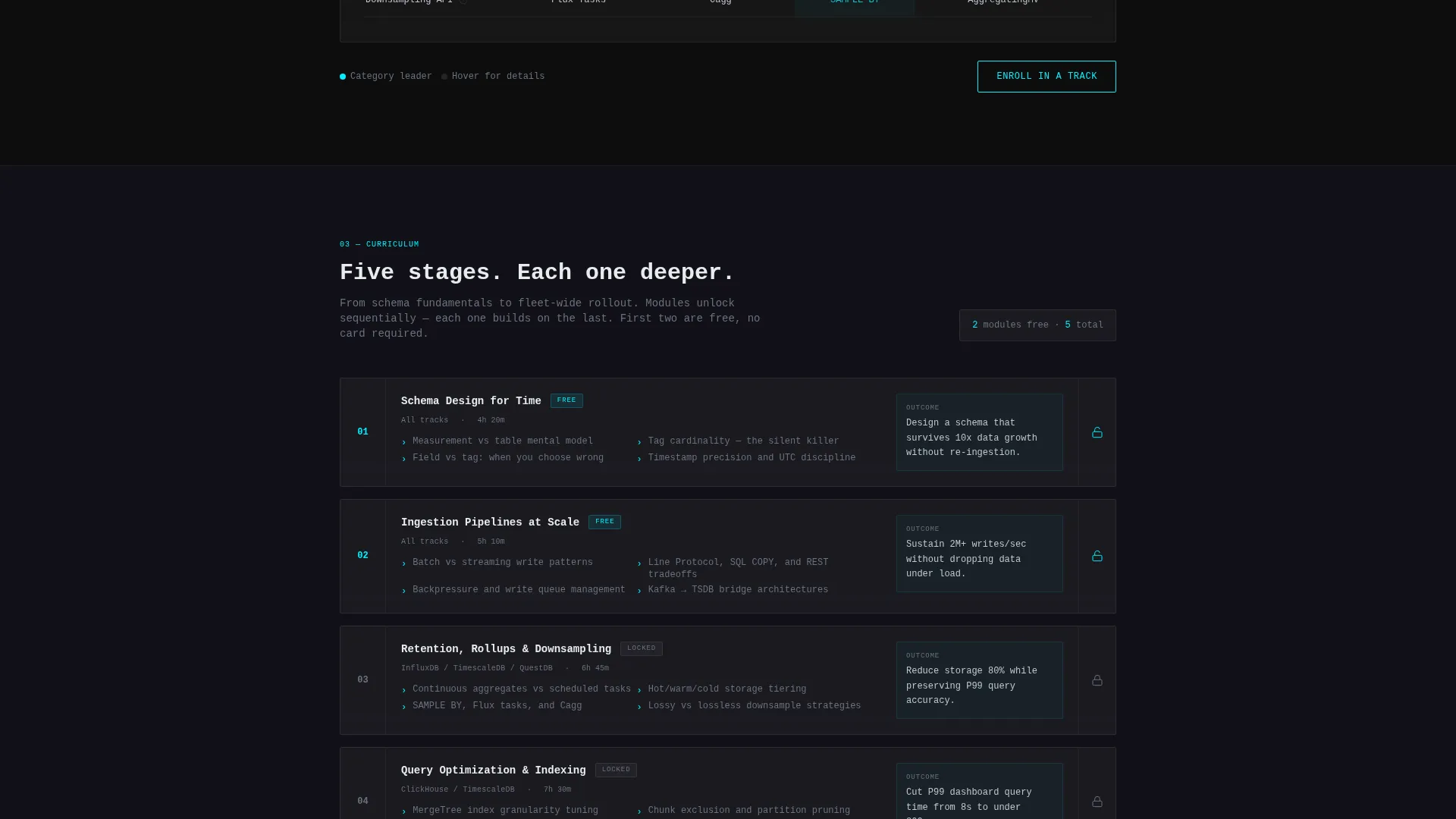
Training modules are presented as progressive stages, each one revealing a deeper layer of mastery. The visual structure communicates a clear learning path, from schema design through fleet-wide rollout, without requiring a long explanation.
Terminal-Style Testimonial Blocks
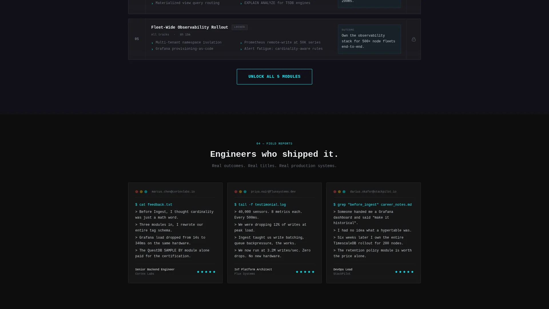
Social proof arrives as monospaced terminal quotes attributed to engineering titles at real-sounding companies. The format matches the audience's mental model and keeps the page visually consistent with the Tech Glass theme.
Persistent Progress Bar Footer
After 40 percent scroll, a bottom bar appears showing module completion at zero. The empty teal progress bar creates quiet urgency. It visually communicates the gap between where the visitor is and where the certification takes them.
Low-Friction Conversion Form
The signup form asks only for a work email and a primary database interest dropdown. The estimated interaction time is twelve seconds. This reduces hesitation for senior engineers who are evaluating multiple options before committing.
Page sections overview
| Section | Purpose |
|---|---|
| Logo Bar Header | Establishes platform credibility with recognized database logos and a live ingestion counter |
| Monospaced Headline | Sets the platform's core promise in a single, memorable line of type |
| Database Comparison Table | Helps engineers evaluate database tracks side by side before choosing a learning path |
| Curriculum Module Stages | Shows the full learning progression as unlocking layers of depth and mastery |
| Terminal Testimonial Blocks | Builds trust through peer-voice social proof formatted for a technical audience |
| Freemium Signup Form | Converts visitors with minimal fields and a no-credit-card free-tier offer |
| Persistent Progress Bar | Reinforces momentum and signals the gap between current state and certification |
Design & branding system
The visual identity uses a Tech Glass theme built on a Carbon Fiber color system. Every design decision is calibrated to feel authoritative and precise, the way a well-configured monitoring stack looks at 2 AM.
- Deep carbon black (#0D0D0D) and woven graphite (#1A1A2E) form the background range, with translucent frosted panel overlays (#FFFFFF0A) for card depth
- Cool silver (#C0C7D0) handles all body and label text, keeping readability high without breaking the dark atmosphere
- Ignition teal (#00F0FF) is reserved exclusively for interactive and data-in-motion elements: progress bars, cursor blinks, active table cells, call to action button edges, and hover states
Mobile & speed optimization
The template is structured for clean rendering across screen sizes. The layout uses section-led stacking that adapts well to narrower viewports without losing the visual logic of the comparison table or module flow.
- The comparison table is designed to scroll horizontally on smaller screens, keeping all database columns accessible without collapsing content
- The persistent progress bar footer and sticky call to action remain visible without covering critical content on mobile viewports
How this template helps you convert
Every section of this landing page is sequenced to raise the stakes and reduce hesitation. The design moves visitors from recognition to action through a clear escalation of value.
- The header section creates immediate scale awareness through the ingestion counter and logo bar, so engineers feel the platform understands their reality before reading a word of curriculum copy
- The comparison table gives analytical visitors a structured way to self-select their learning track, reducing the cognitive load of choosing and making the free-tier call to action feel like a natural next step
Other information about this template
This template is built specifically for the time series database training and certification niche. It is most effective for platforms that teach database-specific skills to working engineers rather than general programming audiences.
- The template supports four primary database tracks in its comparison structure: InfluxDB, TimescaleDB, QuestDB, and ClickHouse
- The curriculum module design also accommodates coverage of related tooling such as Prometheus and Apache Kafka in the ecosystem column of the comparison table
- The "Compare All Tracks" secondary call to action anchors directly to the comparison table, giving evaluation-stage visitors a path that does not require immediate signup commitment
- The Freemium/Trial conversion model is baked into the layout: the primary call to action unlocks the first two modules of any database track with no credit card required
Theme
Tech Glass
Creative direction
Launch Energy
Color system
Carbon Fiber
Style
Comparison Table
Direction
Freemium/Trial
Page Sections
Interactive Database Comparison Table
Live Ingestion Counter in Header
Progressive Curriculum Module Sections
Terminal-format Testimonial Blocks
Scroll-triggered Progress Bar Footer
Minimal-field Conversion Form
Related questions
Who is this landing page template designed for?
Can I customize the comparison table for different database tracks?
Does the template support a free-tier or trial conversion model?
What does the persistent progress bar in the footer do?
Is the Carbon Fiber design system easy to adapt to an existing brand?



