System Integration Comparison Table Landing Page
Integrate is a comparison table landing page template built for system integration companies. It opens with an interactive cost-of-integration estimator, then walks visitors through benchmark data, a detailed competitor comparison table, and real-world case architectures. The dark Void & Violet design makes complex data feel sharp and credible, and every section is built to earn the audit request before asking for it.
by Rocket studio
Quick summary
Integrate is a single-page template designed for companies that connect enterprise software stacks. It leads with an interactive estimator, flows into an industry-report-style comparison table, and closes with a persistent audit call-to-action. The design uses a dark, focused color system that keeps every data point readable and every scroll purposeful.
Who this template is for
This template is built for system integration companies that sell to technical and operational buyers inside mid-size to enterprise organizations. If your pitch relies on showing prospects the real cost of doing nothing, this page structure is designed for that exact conversation.
- Chief Technology Officers (CTOs) managing inherited, incompatible platforms across multiple acquisitions
- Operations directors losing productivity to manual data re-entry between disconnected systems
- Growth-stage startups whose lightweight automation chains have broken under increasing scale
What problem this template solves
Integration buyers are skeptical. They have already tried in-house builds, off-the-shelf integration platforms, and point-to-point connectors. They need to see real data before they trust a new vendor. A generic hero section and a contact form do not answer the questions they actually have.
- Visitors leave without understanding the true cost of their current disconnected setup
- Comparison pages often feel rigged, so buyers discount the data before reading it
- Research-mode visitors need a PDF or benchmark report to bring back to their team
What you get with this template
This template gives you a full single-page layout that moves a skeptical technical buyer from curiosity to a booked audit. Every section is sequenced to deliver value before asking for anything in return.
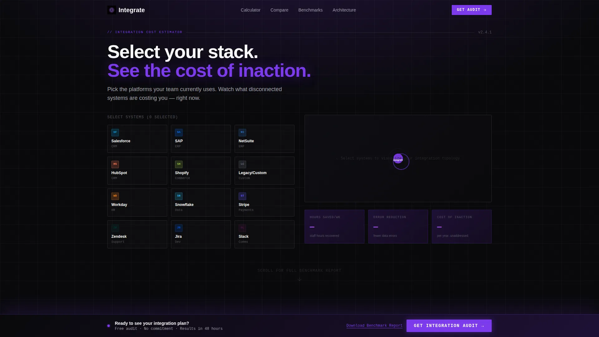
- An interactive cost-of-integration estimator as the opening section, replacing a static hero
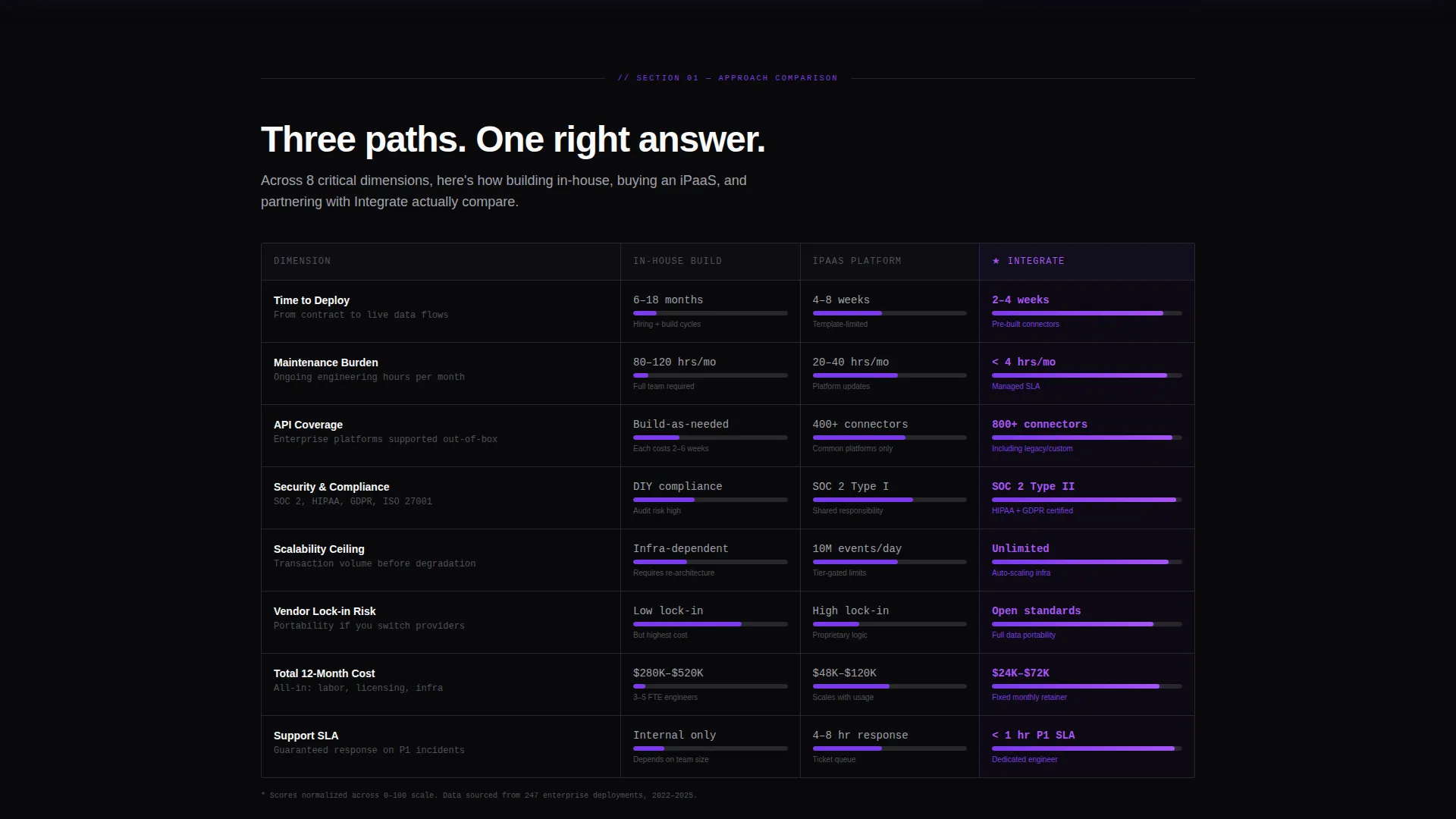
- A structured eight-dimension comparison table covering in-house builds, integration platforms, and dedicated integration partners
- A persistent bottom-bar call-to-action that activates only after meaningful visitor engagement
Feature list
This template is built around a specific conversion logic: give real data first, then ask for the meeting. Each feature below reflects a component described in the source brief.
Interactive Integration Cost Estimator
Visitors select their current platforms from a visual grid of logo tiles and drag them into a central node map. The estimator instantly displays estimated hours saved per week, error reduction percentage, and projected annual cost of inaction. Numbers animate upward in electric violet as more connections are added, making the visitor's own tech stack the opening argument.
Eight-Dimension Comparison Table
The core comparison table pits in-house integration against integration platform-as-a-service (iPaaS) tools and dedicated integration partners across eight measurable dimensions. These include time-to-deploy, maintenance burden, application programming interface (API) coverage, security compliance, scalability ceiling, vendor lock-in risk, total twelve-month cost, and support service-level agreement (SLA). Each row uses violet progress bars and checkmarks against void-black rows, making the partner column visually prominent without appearing manipulated.
Anonymized Benchmark Data Section
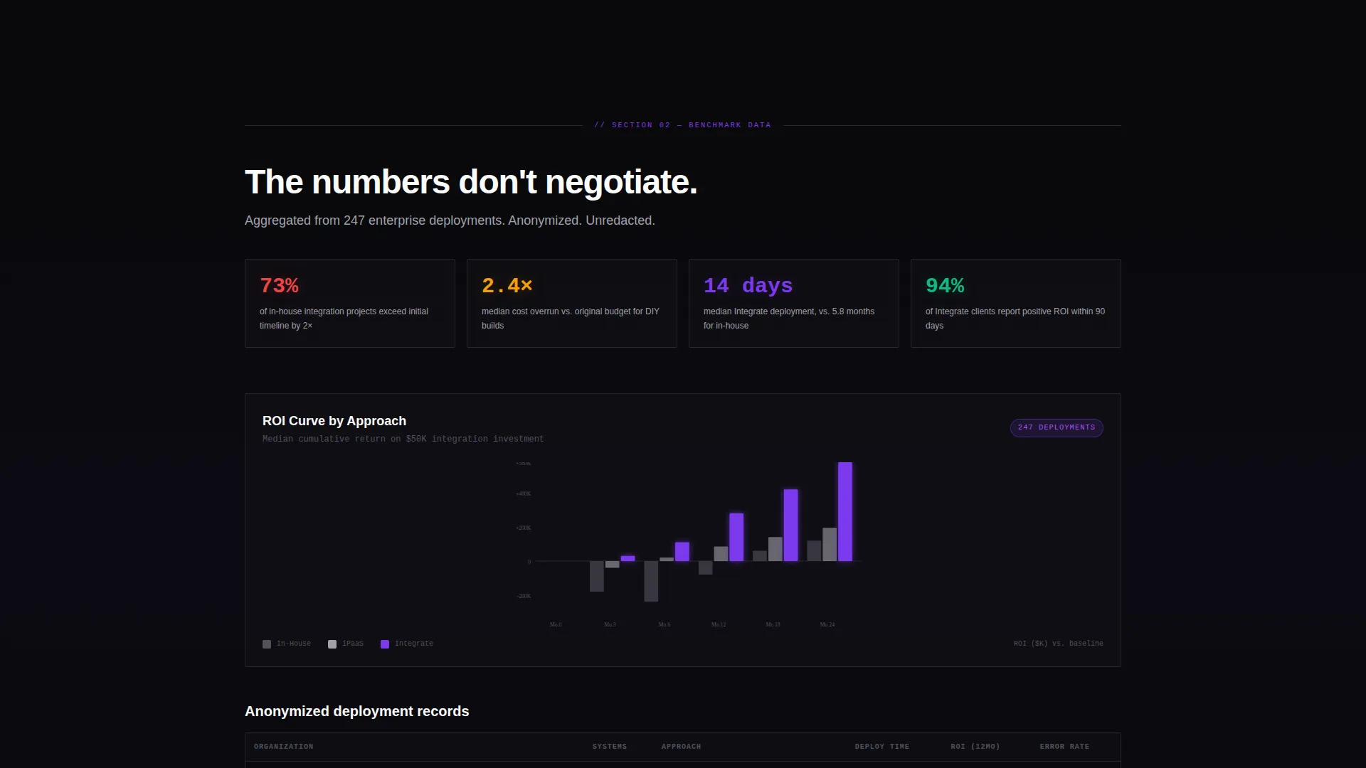
After the comparison table, the page presents anonymized case data presented in an industry-report format. This includes median deployment timelines, failure rates by integration approach, and return-on-investment (ROI) curves charted at six, twelve, and twenty-four months. The format mirrors a research publication visitors would normally find behind an email gate.
Before and After Architecture Maps
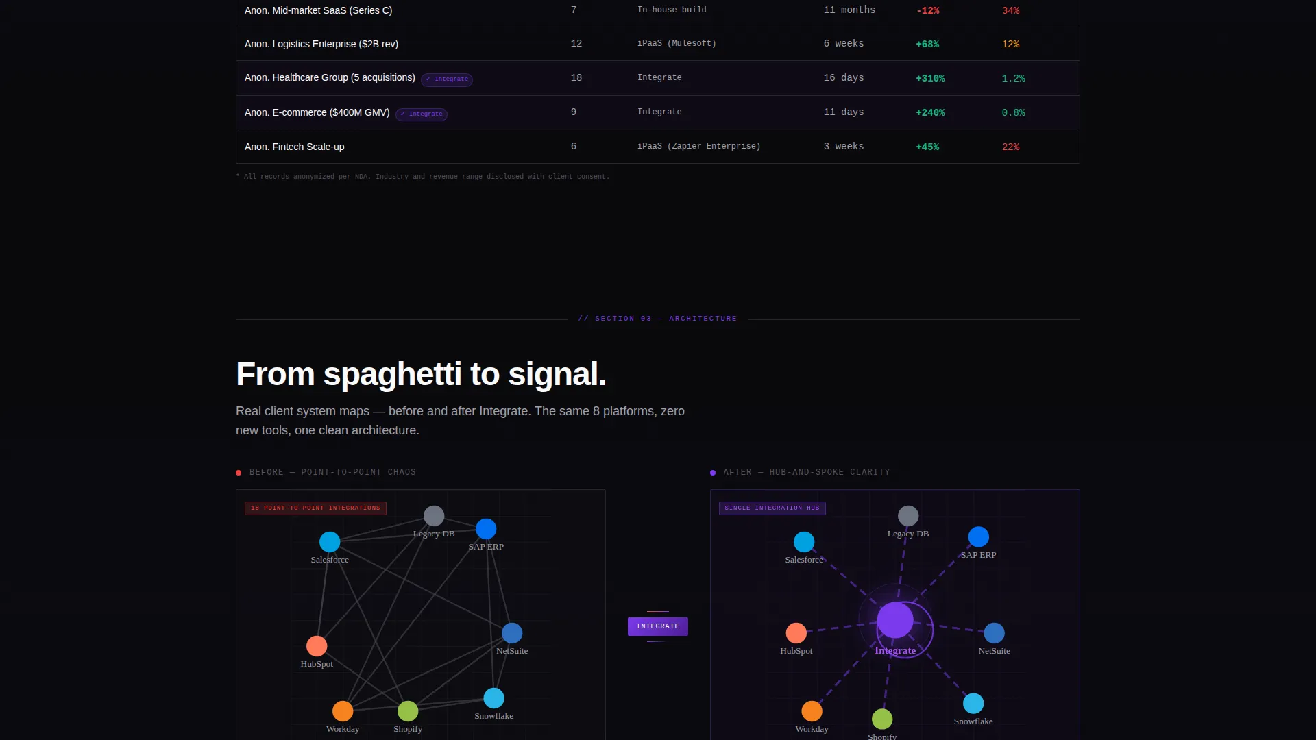
A dedicated section stacks client system diagrams showing the before state, a tangled spaghetti of point-to-point connections, next to the after state, a clean hub-and-spoke architecture. These visual maps make the value of professional integration immediately concrete without requiring technical explanation.
Persistent Audit Call-to-Action Bar
The primary call-to-action, labeled "Get Your Integration Audit," is pinned as a persistent bottom bar. It activates only after the visitor has interacted with the estimator or scrolled past the comparison table, so it appears at the exact moment engagement is highest.
Dual Conversion Path Layout
Alongside the audit request, a secondary conversion path offers a downloadable benchmark report as a portable document format (PDF) gate. This captures research-mode visitors who are not yet ready to book a call but want data to share internally.
Page sections overview
| Section | Purpose |
|---|---|
| Cost Estimator Header | Opens with personalized integration cost data to replace a static hero |
| Comparison Table Section | Benchmarks three integration approaches across eight dimensions |
| Anonymized Case Data | Presents deployment timelines, failure rates, and ROI curves |
| Architecture Maps Section | Shows before-and-after system diagrams for integration outcomes |
| Persistent Audit Bar | Pins the primary call-to-action after meaningful visitor engagement |
| Benchmark Report Gate | Captures research-mode visitors with a downloadable PDF offer |
Design & branding system
The visual identity follows a Startup Velocity theme built on the Void & Violet color system. The palette is deliberately minimal and dark, designed to feel like a mission control interface where only the most important data draws the eye.
- Core colors: absolute void black (#09090B) for backgrounds, deep space indigo (#1E1035) for panel depth, electric violet (#7C3AED) for active states and animated data highlights, and cool zinc white (#FAFAFA) for text and table cells
- No stock imagery is used anywhere; all visual content is generated by the interactive estimator, the comparison table, and the architecture diagrams
- Typography and layout follow an industry-report cadence, keeping the scroll feel like reading a research publication rather than a marketing page
Mobile & speed optimization
The template is structured to keep data-heavy sections readable and functional across screen sizes. The comparison table, estimator node map, and architecture diagrams are all laid out with responsive behavior in mind.
- The comparison table stacks cleanly on smaller screens so all eight dimensions remain readable without horizontal scrolling
- The persistent bottom-bar call-to-action is sized and positioned to remain accessible on mobile without obscuring the main content
- The estimator slider and dropdown form fields are designed for touch-friendly interaction on mobile devices
How this template helps you convert
This template earns the conversion by delivering value before making any request. The sequence is deliberate: show the visitor their own cost of inaction first, then present the comparative data, then ask for the meeting.
- The estimator opens with the visitor's own data, making the problem personal and specific before any sales claim is made
- The comparison table and benchmark section remove objections by presenting structured, research-style data that buyers can take back to their teams
- The dual conversion paths, audit request and PDF download, capture both decision-ready visitors and those still in the research phase
Other information about this template
This template is purpose-built for the system integration niche and fits naturally into the technology and IT services and consulting category. It is designed for companies whose sales cycle involves multiple stakeholders and a high degree of technical scrutiny.
- The template style is a comparison table layout, matched to a Comparison/Versus landing page direction
- The header concept is a Calculator/Estimator, replacing a conventional hero section with an interactive tool
- The creative direction follows an Industry Report format, giving the page credibility with data-driven buyers
- The Startup Velocity theme is paired with the Void & Violet color system for a focused, high-contrast visual experience
- This template works well for integration partners competing against do-it-yourself approaches and iPaaS platforms such as tools in the enterprise middleware and workflow automation space
Theme
Startup Velocity
Creative direction
Industry Report
Color system
Void & Violet
Style
Comparison Table
Direction
Comparison/Versus
Page Sections
Interactive Integration Cost Estimator
Eight-dimension Comparison Table
Anonymized Benchmark Data Display
Before and After Architecture Diagrams
Persistent Audit Call-to-action Bar
Dual Conversion Path Structure
Related questions
What kind of company is this template built for?
Can I replace the logo tiles in the estimator with my own supported platforms?
How does the persistent call-to-action bar work?
Is the benchmark report download a separate page?
What fields does the audit request form include?



