Funeral Analytics Dashboard Landing Page Template
Interment is a funeral analytics landing page template built for multi-location funeral home operators and regional consolidators. It uses a Data Command visual identity with glassmorphic card surfaces, a live API code snippet header, and a hub-and-spoke anchor navigation. Five capability modules guide visitors from operational data to a confident app install decision.
by Rocket studio
Quick summary
Interment is a single-page funeral analytics dashboard landing page template. It opens with a terminal-style API code snippet, flows through five discrete capability modules via anchor navigation, and closes with a primary app download call to action. The design uses a deep charcoal and frosted glass palette that feels precise, calm, and built for professionals who read data before sunrise.
Who this template is for
This template is designed for operators and decision-makers inside the funeral services industry who need to present a data-driven SaaS platform with authority and clarity.
- Multi-location funeral home operators running six to forty locations who need unified performance reporting
- Regional consolidators acquiring independent family firms and requiring benchmarked visibility across acquired sites
- State association directors presenting anonymized cohort performance data to member firms
What problem this template solves
Funeral operations generate significant data, but most directors have no structured way to read it between arrangements. This template solves the presentation challenge of making a complex analytics platform feel immediately credible and operationally relevant.
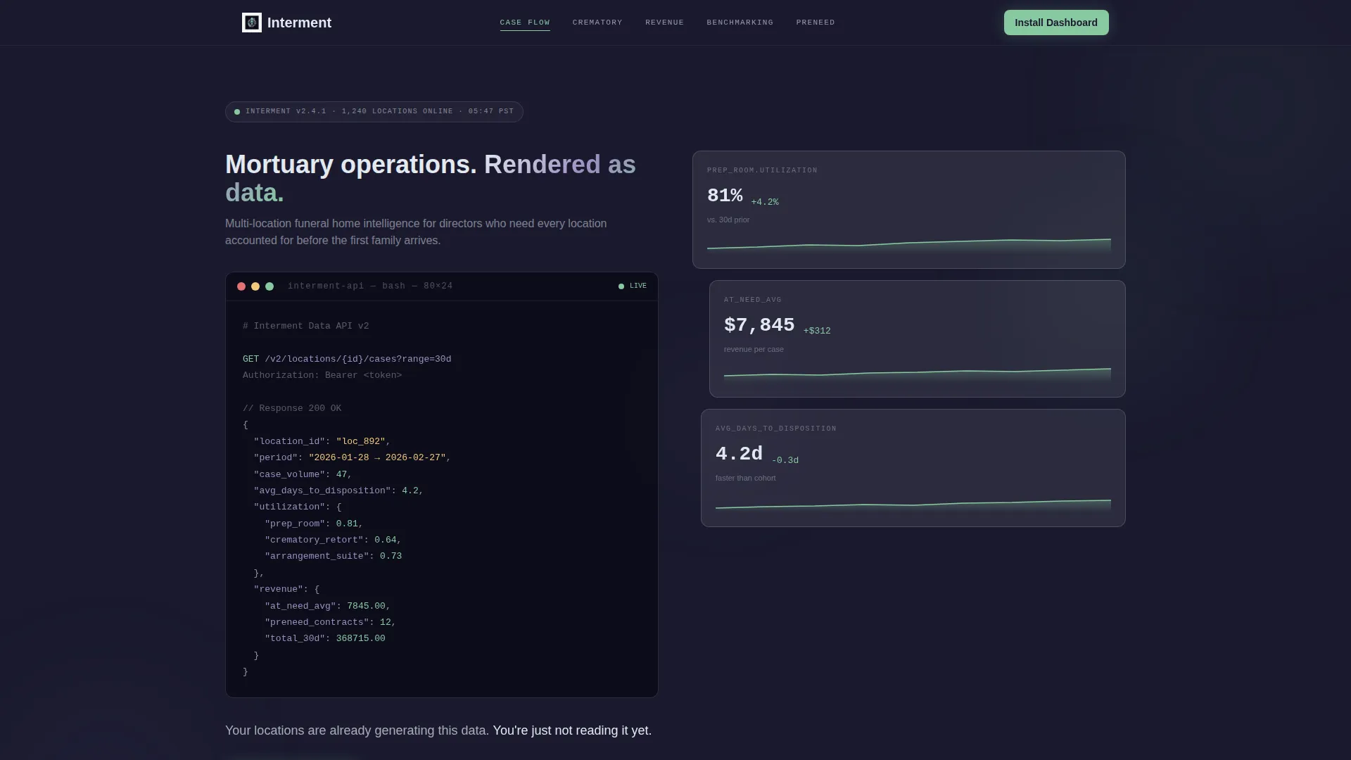
- Visitors arrive skeptical; the live API code snippet proves the platform is real and the data is already there
- Operators managing multiple locations need to see that every site is accounted for before they commit to an install
- The spec sheet architecture removes emotional persuasion and replaces it with technical conviction, section by section
What you get with this template
You get a fully structured single-page layout that carries a funeral analytics SaaS product from first impression to app download without a single wasted section. Every element is grounded in operational language funeral directors recognize.
- A header code block showing a real API call with funeral-specific metric responses including case volume, prep room utilization, and average at-need revenue
- Five anchor-navigated capability modules covering Case Flow, Crematory Ops, Revenue Intelligence, Benchmarking, and Preneed Pipeline
- A primary call-to-action block with App Store and Google Play badges plus a celadon-on-charcoal QR code for immediate mobile capture
Feature list
This template is built around a tight set of purposeful components. Each one earns its place on the page.
Terminal-Style API Header Block
The header renders a live-styled code block showing a real platform API call: GET /v2/locations/{id}/cases?range=30d. The JSON response includes funeral-specific metrics like avg_days_to_disposition, utilization.prep_room, and revenue.at_need_avg. Characters animate in sequence against the charcoal substrate using lavender and celadon syntax highlighting. A single humanist-type line fades in below: "Your locations are already generating this data. You're just not reading it yet."
Hub and Spoke Anchor Navigation
Five named capability modules anchor the page structure: Case Flow, Crematory Ops, Revenue Intelligence, Benchmarking, and Preneed Pipeline. Each module is reachable via a persistent anchor navigation bar, letting visitors jump directly to the capability most relevant to their operation without linear scrolling.
Spec Sheet Capability Modules
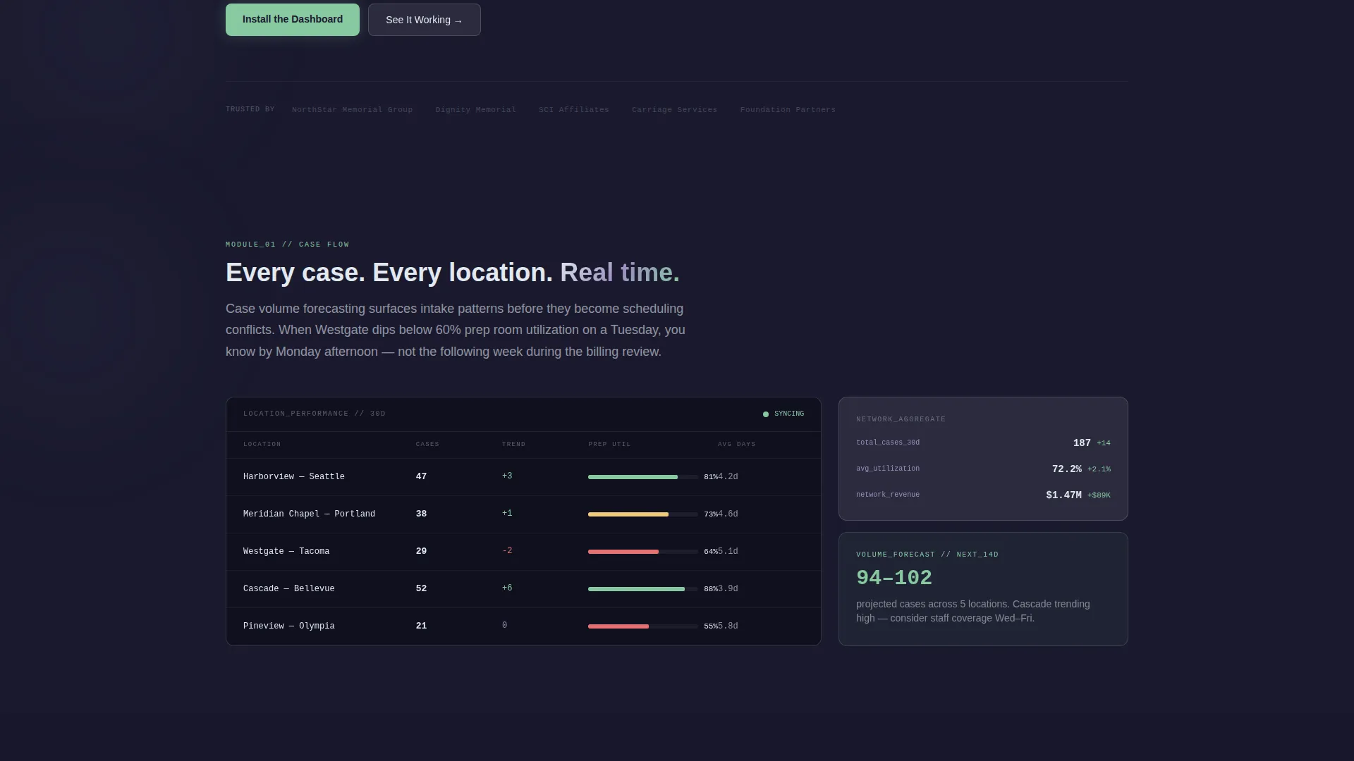
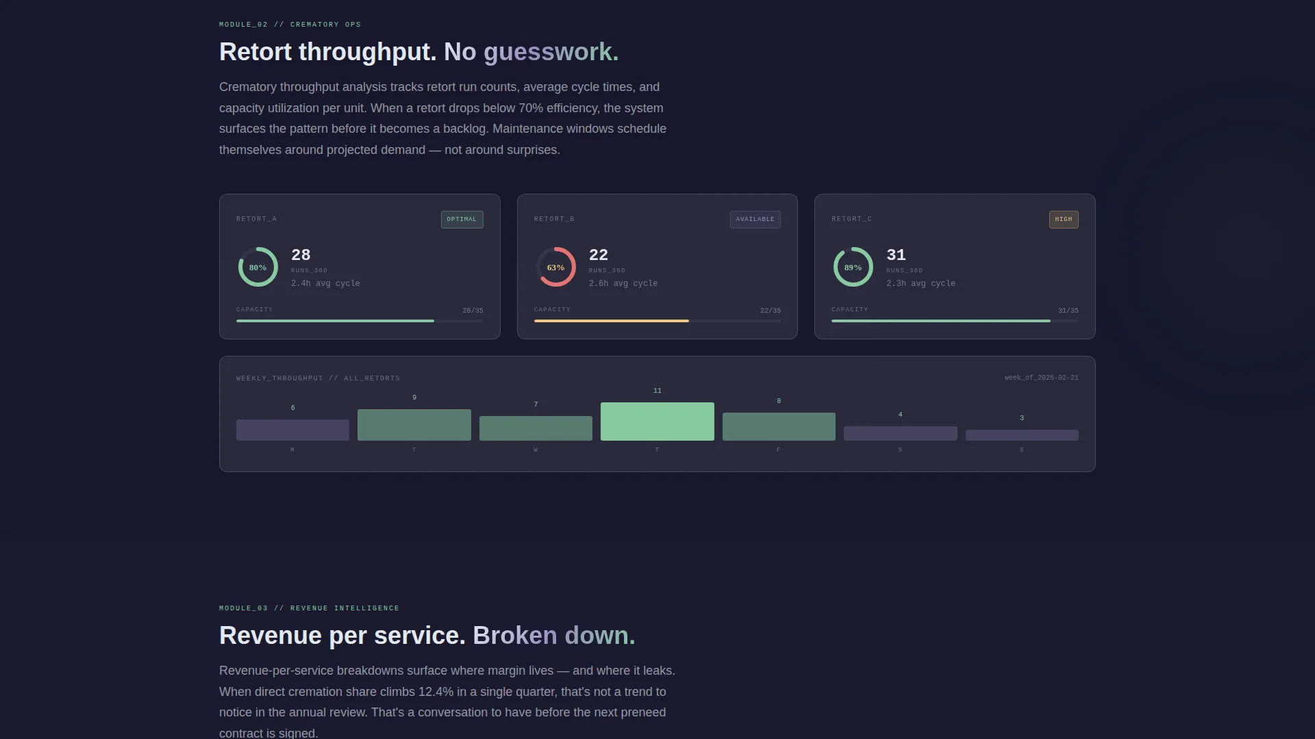
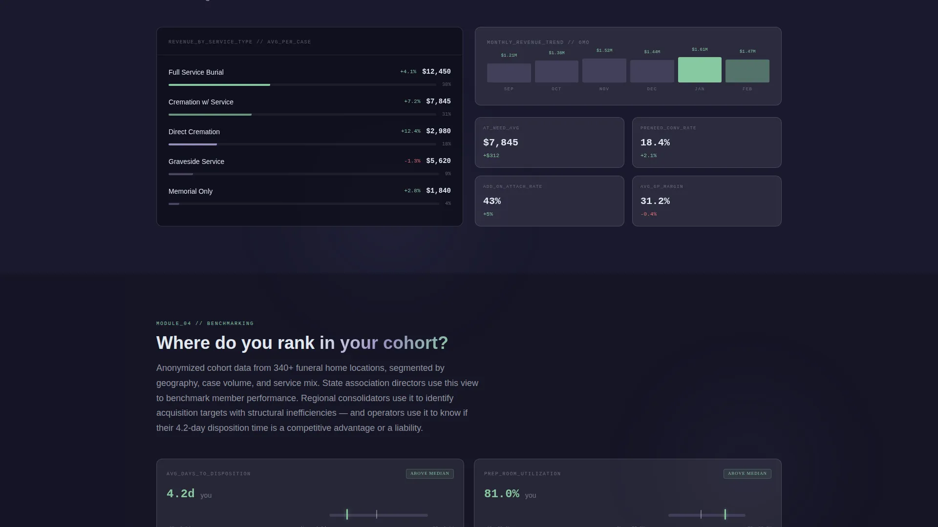
Each capability module is presented as a technical specification card. Cards include metric labels, sample data visualizations behind frosted glass panels, and a single operational paragraph written in the language funeral directors use daily. The format builds conviction incrementally, not through marketing language.
Glassmorphic Card Depth System
Cards use frosted translucent surfaces rendered at 8% white opacity with a 12-pixel blur. Cards stack and overlap slightly at section transitions, creating visible depth without decoration. Borders are 1-pixel rgba white at 15%, keeping edges crisp against the deep charcoal substrate.
App Download Conversion Block
The primary call to action reads "Install the Dashboard" and pairs App Store and Google Play badges with a QR code rendered in soft celadon on charcoal. A secondary path labeled "Try the Demo Instance" links to a sandboxed browser version pre-loaded with synthetic data from a fictional three-location firm.
Dual Typography System
Monospaced type is used for all metric values and code elements, reinforcing the data-terminal aesthetic. Humanist sans-serif type handles all narrative copy, keeping operational explanations readable at a glance. The contrast between the two type styles creates a clear visual hierarchy.
Page sections overview
| Section | Purpose |
|---|---|
| API Code Header | Opens with a live-styled terminal block proving real data exists |
| Anchor Nav Bar | Persistent jump links to all five capability modules |
| Case Flow Module | Shows case volume forecasting and disposition timeline metrics |
| Crematory Ops Module | Displays crematory throughput and scheduling utilization data |
| Revenue Intelligence Module | Breaks down revenue per service and average at-need figures |
| Benchmarking Module | Presents anonymized cohort comparisons for multi-location firms |
| Preneed Pipeline Module | Surfaces preneed contract volume and conversion indicators |
| App Download Block | Primary call to action with app badges, QR code, and demo instance link |
Design & branding system
The visual identity follows a Data Command theme executed through a glassmorphic color system. The palette is intentionally restrained, with every color choice tied to a specific informational function.
- Deep charcoal substrate at
#1A1A2Eanchors every layer; frosted card surfaces use white at 8% opacity with a 12-pixel blur for the floating panel effect - Muted lavender at
#7B6F9Eis used for data lines and syntax highlighting; soft celadon at#88C9A1is reserved exclusively for positive-delta indicators and primary call-to-action elements - Typography pairs monospaced fonts for metrics and code with humanist sans-serif for all narrative and explanatory copy
Mobile & speed optimization
The template is structured for fast, clean rendering on mobile screens, which matters when a funeral director checks numbers from a tablet in a back office at dawn.
- The hub-and-spoke anchor navigation collapses cleanly for smaller viewports, keeping all five capability modules reachable without excessive scrolling
- The QR code in the app download block is sized and positioned for direct mobile capture, removing friction from the install path
How this template helps you convert
The page is engineered to earn the install before it asks for it. Six real data views appear before any call to action, so visitors arrive at the download block already convinced.
- The API code header delivers immediate proof of concept in the first five seconds, using real metric names and real response values that operators recognize from their own workflows
- Each spec sheet module adds one more layer of "we already thought of that," so by the time a visitor reaches the app download block, the decision feels like a confirmation rather than a commitment
Other information about this template
This section covers additional context that helps buyers understand the full scope of the template before customizing it.
- The template is built as a single-page hub-and-spoke layout with anchor navigation, not a multi-page site
- The synthetic demo data path references a fictional three-location funeral firm, giving prospects a hands-on preview without requiring a live account
- The celadon accent color is used sparingly and deliberately; overusing it outside its defined role would dilute the visual signal system the template depends on
- The "Try the Demo Instance" secondary call to action is designed to capture visitors who are not yet ready to install, reducing drop-off without weakening the primary conversion path
Theme
Data Command
Creative direction
Spec Sheet
Color system
Glassmorphic
Style
Hub & Spoke (Anchor Nav)
Direction
App Download
Page Sections
Terminal-style API Code Header
Hub and Spoke Anchor Navigation
Spec Sheet Capability Modules
Glassmorphic Depth Card System
App Download Conversion Block
Dual Typography Hierarchy
Related questions
Who is this landing page template designed for?
What does the API code header section include?
Can I update the content inside each capability module?
Does the template support both an app install path and a browser demo option?
How is this template structured as a single page?



