Expert Restaurant Software Cost Estimator Website Template
Ledger is a restaurant accounting landing page template built for operators who need their numbers fast and clean. It combines a Feature Tab Switcher header, detailed comparison tables, and a margin-impact calculator into one high-converting single-page layout. The Carbon Fiber color system and Industry Report creative direction make every metric feel credible and every call to action feel earned.
by Rocket studio
Quick summary
Ledger is a single-page template designed for restaurant accounting software. It opens with a live-user interface tab switcher, builds through operator-language comparison tables, and closes with two conversion paths. The dark Carbon Fiber palette and Industry Report scroll give the page the credibility of a financial briefing, not a generic SaaS pitch.
Who this template is for
This template is built for teams selling restaurant-specific financial software to operators who already know what prime cost and period-end variance mean. It speaks directly to buyers who have outgrown generic accounting tools.
- Multi-unit restaurant operators managing ten or more locations who need consolidated financials fast
- Independent owners still reconciling vendor invoices by hand and losing hours every week
- CFOs at emerging fast-casual chains who need investor-ready profit and loss statements on demand
What problem this template solves
Most accounting software landing pages speak in general business terms. Restaurant operators tune them out immediately. This template is built around the specific language and pain points that operators actually recognize.
- Manual bookkeeping consuming hours that should go toward running the floor
- Comparison pages that use generic feature labels instead of terms like "pour cost," "comps and voids," or "tip reconciliation"
- Prospective buyers who cannot quickly see how a platform stacks up against the tools they already know
What you get with this template
You get a fully structured, section-led landing page that takes a visitor from a sharp data hook all the way through to a demo booking or a gated PDF download. Every section is designed to do specific conversion work.
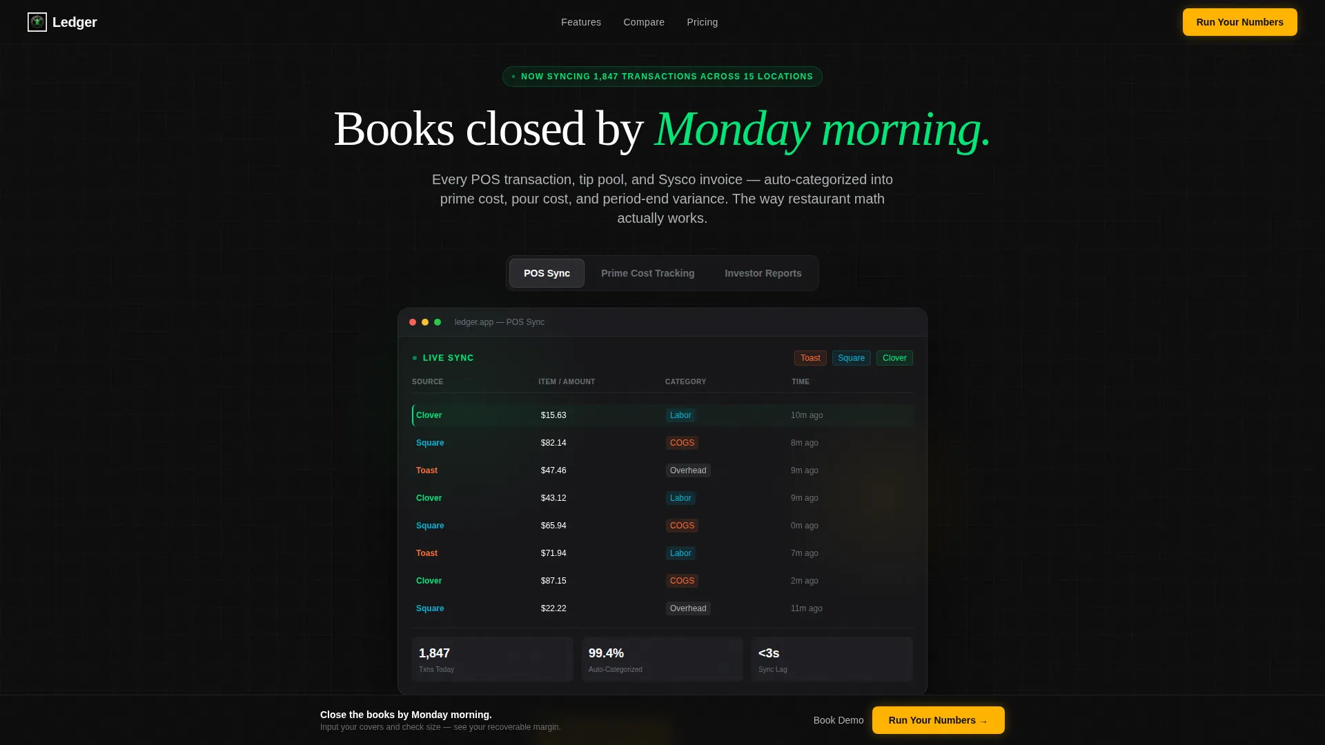
- A Feature Tab Switcher header with three tabs and a live-user interface dashboard mockup showing real-time transaction syncing
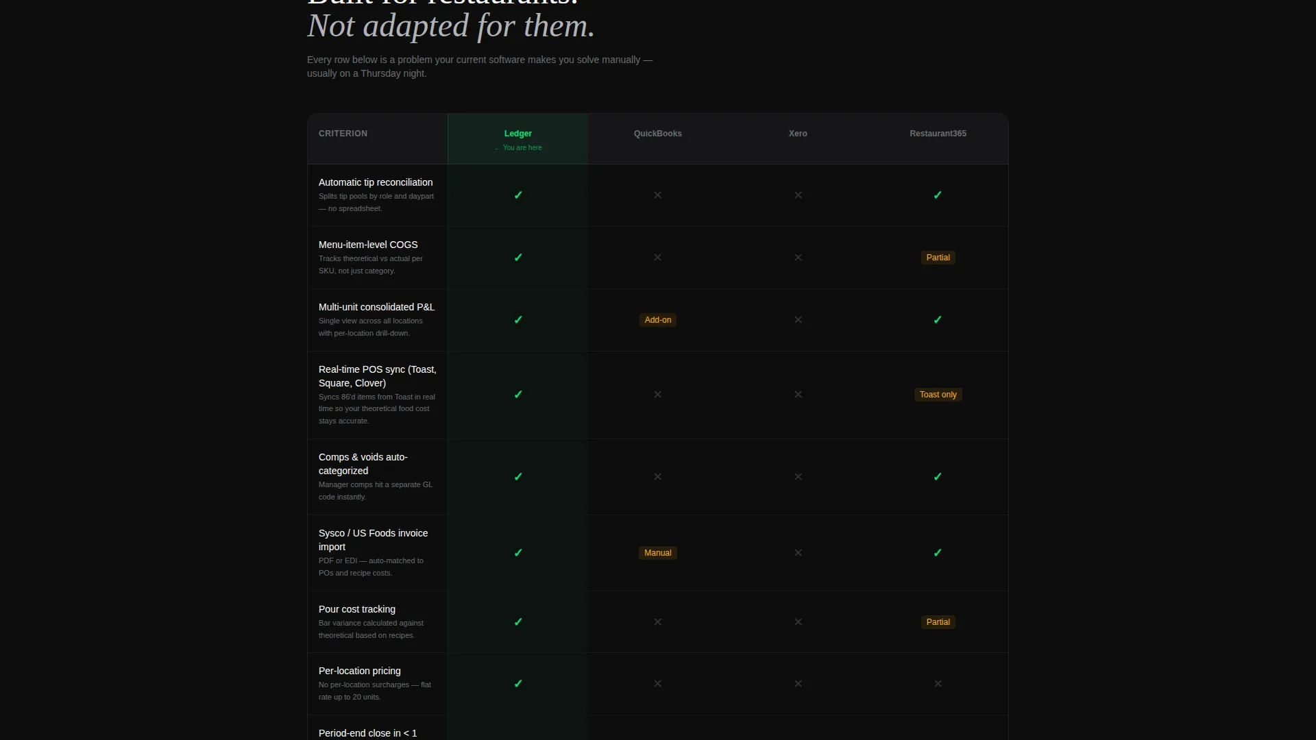
- Side-by-side comparison tables using operator-specific criteria, green checkmarks, and proof-point footnotes
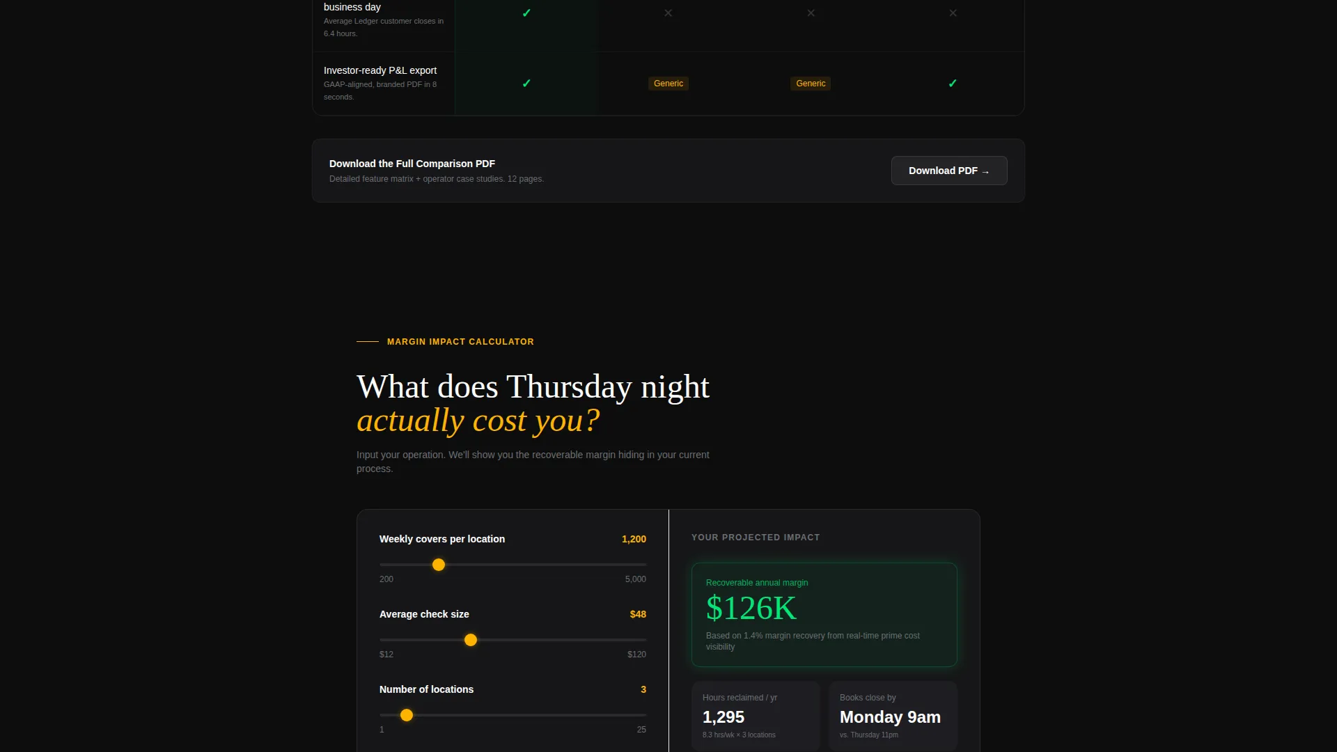
- A margin-impact calculator where operators input weekly covers and average check to see projected annual savings
- A sticky bottom bar with the primary call to action and a two-step inline form for demo bookings
- A secondary conversion path gating a full comparison PDF behind an email capture
Feature list
This template includes purpose-built components that are grounded in restaurant finance logic, not generic SaaS layouts.
Feature Tab Switcher Header
Three clickable tabs sit over a live-user interface dashboard mockup on a near-black background. Each tab reveals a different operational view without a page reload, making the software feel active and immediate from the first scroll.
Side-by-Side Comparison Tables
The comparison section pits the platform against competing tools across restaurant-specific criteria. Each row uses visual indicators and proof-point footnotes written in operator language, such as references to syncing voided items in real time to keep theoretical food cost accurate.
Margin-Impact Calculator
Operators enter their weekly covers and average check into a simple input form. The page returns a projected annual savings figure, making the value proposition concrete before any conversation with a sales team.
Sticky Call-to-Action Bar
A bottom bar appears after the first comparison table scrolls into view. It anchors the primary call to action persistently, so the visitor always has a clear next step without scrolling back to the top.
Two-Step Inline Demo Form
The primary conversion form is split into two steps. Step one collects point-of-sale system type and number of locations using dropdowns and a counter. Step two asks for email and preferred demo time, keeping friction low throughout.
Gated PDF Download Path
A secondary conversion entry sits beneath the final comparison table. Visitors who are not yet ready to book a demo can download a full comparison document in exchange for their email address, capturing leads earlier in the evaluation process.
Page sections overview
| Section | Purpose |
|---|---|
| Tab Switcher Header | Introduces platform capabilities through interactive POS sync, prime cost, and investor report views |
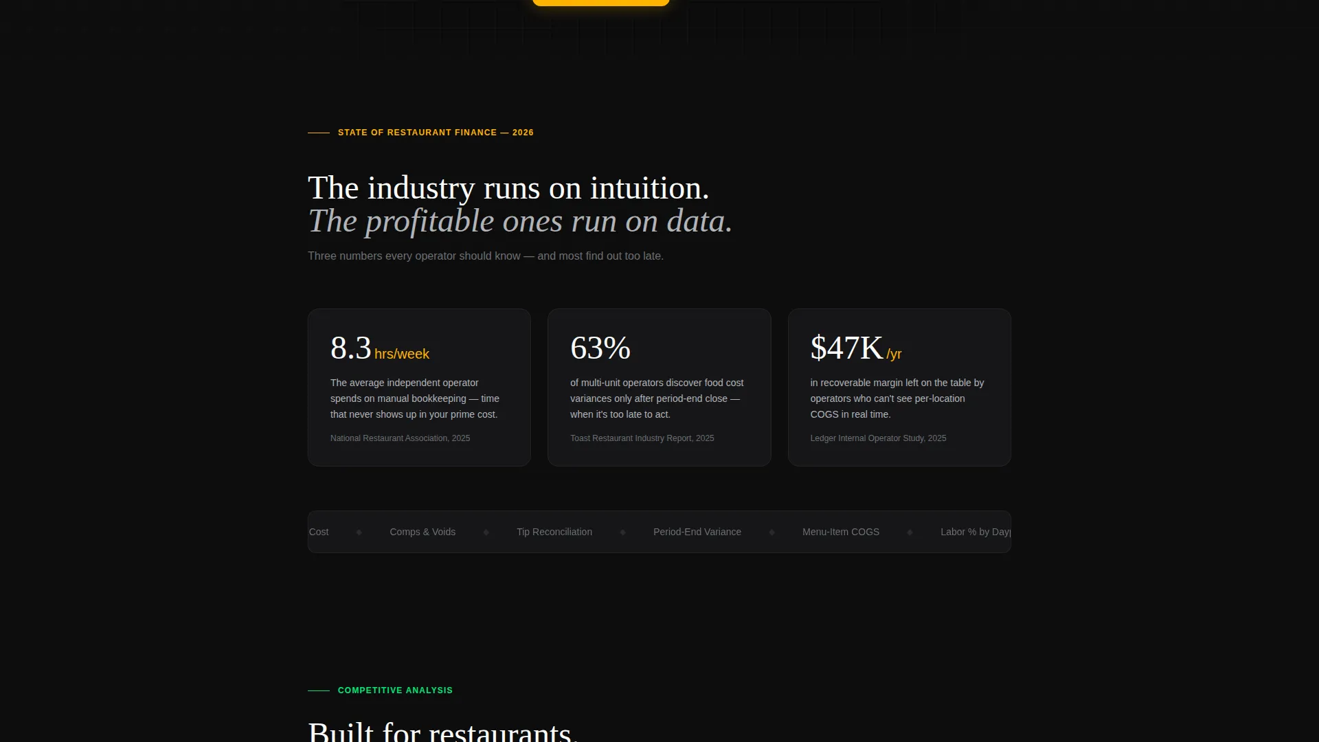
| Data Callout Hook | Opens the scroll with a stark industry statistic to establish urgency and credibility |
| Comparison Table One | Compares platform features against alternatives using operator-specific criteria and proof footnotes |
| Margin-Impact Calculator | Lets operators calculate projected savings based on their own covers and average check |
| Comparison Table Two | Extends the feature comparison with additional criteria and a secondary PDF download prompt |
| Sticky call to action Bar | Persists the primary call to action after the first comparison table enters the viewport |
| Two-Step Form Modal | Captures demo intent through a low-friction dropdown and email flow |
Design & branding system
The visual identity follows a Startup Velocity theme using a Carbon Fiber color system. Every color choice reinforces a sense of precision and financial authority.
- Deep cockpit black (#0D0D0D) and brushed graphite (#2A2A2E) form the page background, giving the layout a data-dense, instrument-panel feel
- Status green (#00E676) marks positive metrics and winning comparison rows, while cool titanium gray (#B0B3B8) keeps body text readable without softening the mood
- Electric amber (#FFB300) is reserved exclusively for calls to action and hover states, so every interactive element stands out without competing with the data
Mobile & speed optimization
The layout is structured to remain clear and scannable on smaller screens, where many operators check their numbers between shifts.
- The comparison tables are designed to stay readable at mobile widths, with enough visual hierarchy to distinguish winning rows at a glance
- The sticky call-to-action bar and two-step form are built to work cleanly on touch interfaces, keeping the conversion path intact regardless of device
How this template helps you convert
This template earns the click by proving it understands restaurant operations before it ever asks for anything in return.
- The Industry Report scroll builds trust progressively, moving from a credible data hook through detailed comparison evidence to a personalized savings calculation, so visitors arrive at the call to action already convinced
- The dual conversion paths serve two distinct buyer stages: the sticky bar and demo form capture operators who are ready to act, while the gated PDF captures those still evaluating, ensuring no visit goes to waste
Other information about this template
This template is specifically positioned for restaurant accounting software platforms that compete on operator-specific depth rather than general bookkeeping breadth.
- The comparison criteria include terms like automatic tip reconciliation, menu-item-level cost of goods sold, multi-unit consolidation, and per-location pricing, all drawn from real operator evaluation checklists
- The proof-point footnote style throughout the comparison section is designed to handle objections inline, so visitors do not need to leave the page to verify claims
- The template style is Comparison Table, the creative direction is Industry Report, and the header concept is Feature Tab Switcher, all under the Startup Velocity theme
- Platforms competing against tools like QuickBooks, Xero, and Restaurant365 will find the comparison table structure particularly well suited to surfacing their differentiators in language operators already use
Theme
Startup Velocity
Creative direction
Industry Report
Color system
Carbon Fiber
Style
Comparison Table
Direction
Comparison/Versus
Page Sections
Feature Tab Switcher Header
Operator-language Comparison Tables
Margin-impact Calculator
Sticky Call to Action Bar with Two-step Form
Gated PDF Download Conversion Path
Industry Report Scroll Structure
Related questions
What type of business is this landing page template designed for?
Can I customize the comparison table criteria for my platform?
How does the two-step form reduce drop-off?
Does the template include both a demo booking path and a lead capture path?
Is the margin-impact calculator included as a ready-to-use component?



